

The 2016 palette is soft and ethereal, thanks to a couple of key players. To get your creative juices flowing, we gathered the best of our images that incorporate these divine hues.
Introducing Serenity & Rose Quartz

Absolutely stunning when used separately or together, this soft-hued pair blends well with other pastel tones and all shades of gray and brown—from beige to chocolate. So don’t be afraid to mix things up!
Here, the rose-colored bedding was our catalyst for a serene and soothing bedroom. With a color this lovely, all you need to create a bit of balance is lots of crisp white accessories.
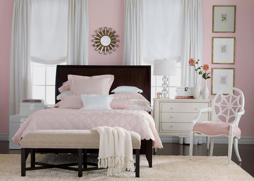
Shown: Gramercy bed, custom bedding (ask a designer for details), Julian chest, Cristal chair
In this dining room, the blue used on the chairs and walls perfectly complements the warm wood table. A dramatic black display cabinet nearby lends visual weight and a modern edge to the otherwise traditional furnishings.
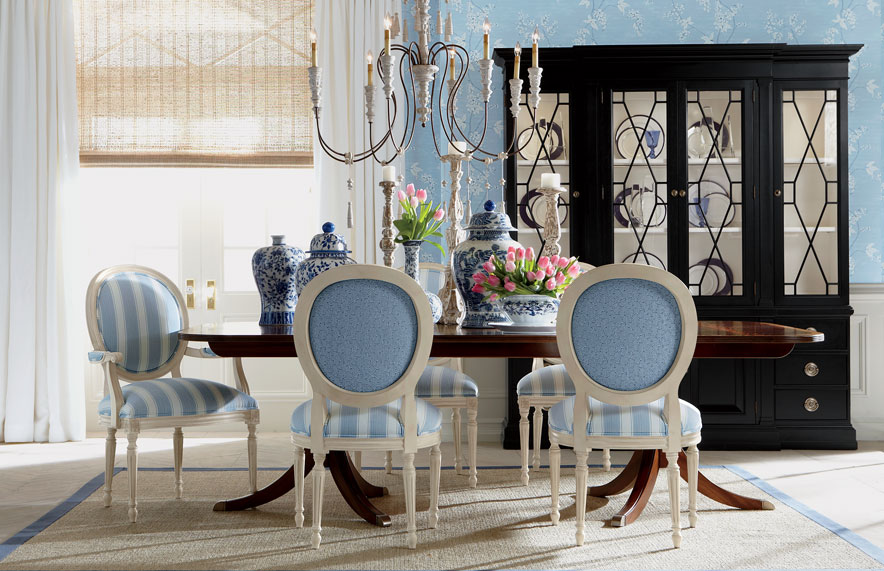
Shown: Abbott dining table, Cassatt armchairs and side chairs, Wooster china cabinet
Here, we built a living room around the rose tones in our Turkish-knotted ikat rug. The space gets its splash and sparkle from bright, saturated coral fabrics and lots of metallic touches.
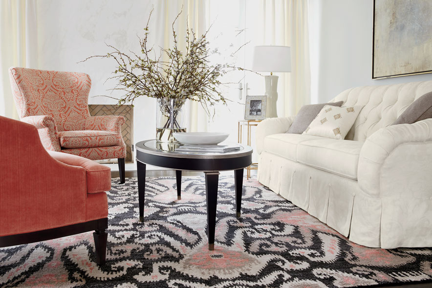
Shown: Peyton Sofa, Wilder and Beckett chairs, Winston and Tracery tables, Ikat rug
Dusty rose speaks to our Pinterest fans, too! Check out the home office ranked one of our top pins for 2015 here.
