Meet Design Star Colleen Gahry-Robb

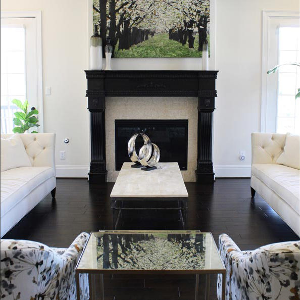
Colleen Gahry-Robb is homegrown—in the best possible way. She’s lived in Michigan nearly her whole life and she joined the Ethan Allen family fresh out of college—seventeen years ago. Colleen, who works in our Design Center in Auburn Hills, Michigan, is our latest Ethan Allen Design Star. She has been an Ethan Allen Gold or Diamond Spirit award winner for the last five years, and a Best of Houzz winner since 2015. When Colleen’s not designing, she enjoys golfing, biking, dining out, and traveling. She lives with her husband of fifteen years, Craig, and their two cats, Pete and Lucy. Recently Colleen shared some of her thoughts on design, and walked us through a whole-house project she completed for a pair of empty nesters.

What’s the one thing you’d like our readers to know about you?

I believe creating a beautiful, comfortable home shouldn’t be overwhelming, but rather fun and exciting. The most important skill any designer can bring to a project is the ability to listen, successfully transforming ideas into reality.

What is your favorite design tip?

Choose things because you love them, not because they are in style. If you stay true to who you are, then your choices will continue to reflect your personality regardless of what everyone else is doing. Keep things simple, choose a single piece that you love, and build a room around it.

What Ethan Allen piece is your favorite?

I’m currently loving the Dynasty coffee table. I love the Asian-inspired design and the variety of distressed finish options.

Complete this sentence: Every room needs …

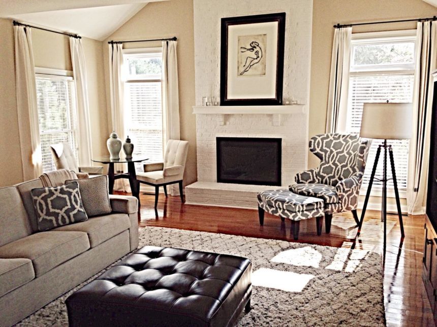
A focal point! It’s the first thing you (should) notice you walk into a room. It could be anything: a favorite piece, a fireplace, a fabulous view.

What is the color you can’t live without, and why?

Definitely black! Black can be elegant, sophisticated and edgy—and it goes with everything.

If you could do any project, anywhere, on any budget, what would it be?

Having experienced my share of Michigan’s long and gloomy winters, I think nothing is more beautiful and serene than the beach. Decorating a beachfront home in Florida would be my dream come true! From natural elements and weathered textures like driftwood, seashells, and sunwashed finishes, I’d find it very easy to be inspired by the relaxing vibe of such a beautiful place.

Tell us about the soup-to-nuts project you completed in June.

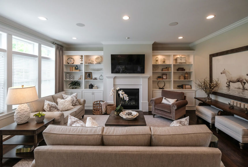
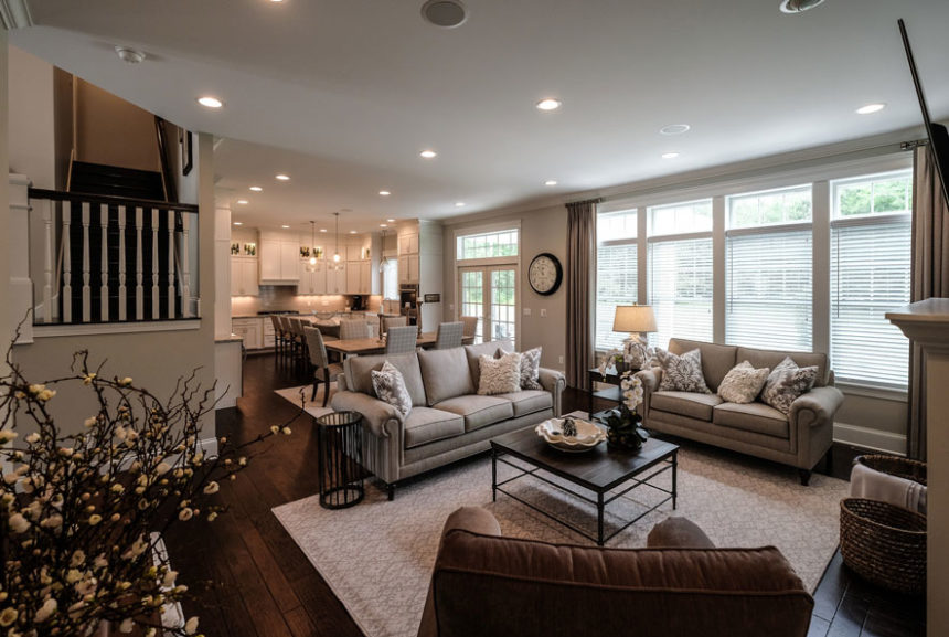
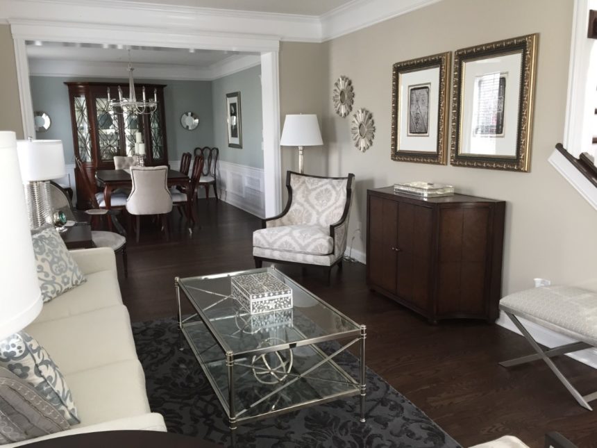
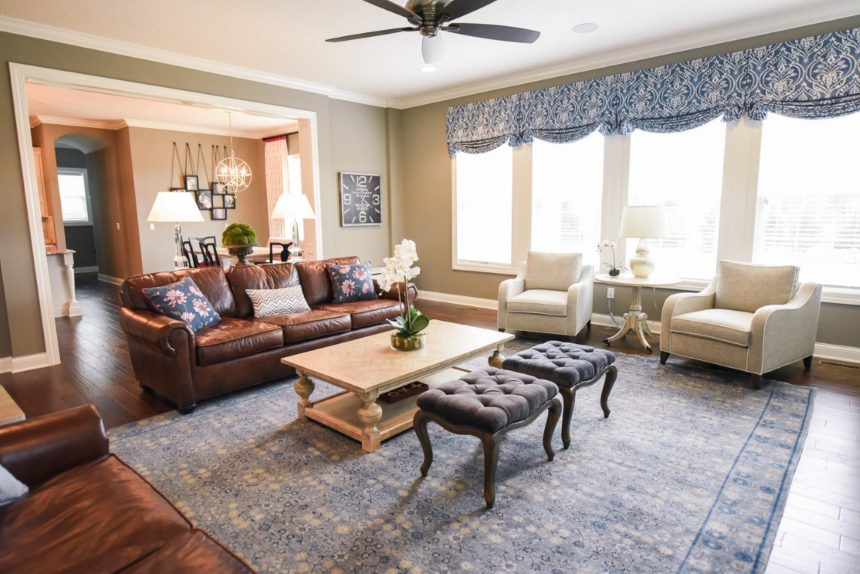
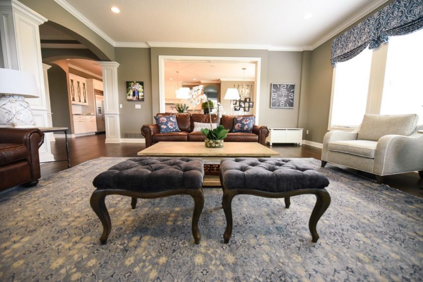
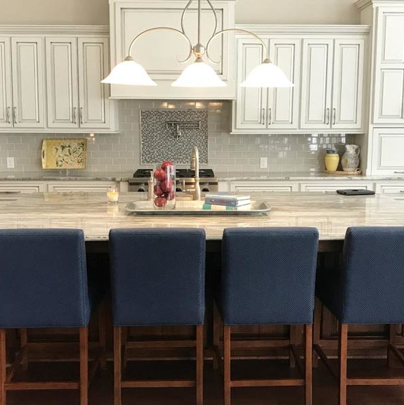
My clients found me on Houzz; they were in the process of renovating a two-year-old home and wanted a designer to help them furnish it from top to bottom—including every accent. We talked until I had a good understanding of the styles they liked and how they wanted to live in the home. The palette and style were inspired by the newly designed kitchen, which has white cabinets, gray walls, dark floors, and gray quartz countertops. They gave me a lot of design freedom, and it really helped that they were quick decision-makers; we had everything selected—including window treatments, custom area rugs, and lighting—within a month. I paid close attention to sight lines when it came to placing art and accessories. The result is a great flow from room to room.

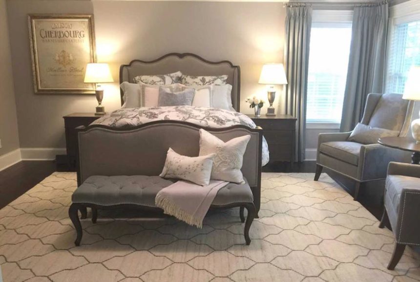
MASTER BEDROOM
Because “you start and end each day in the bedroom,” Colleen chose the calming and beautiful Beau bed, with its seductive French curves, as the inspiration for the clients’ serene master bedroom. A soft mineral blue, gray, cream, and taupe palette gave the space a sophisticated look.

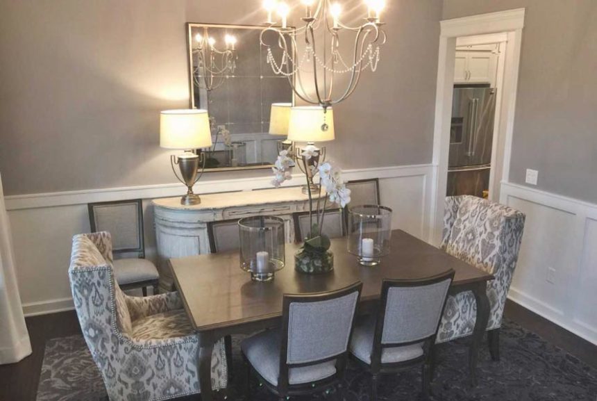
DINING ROOM
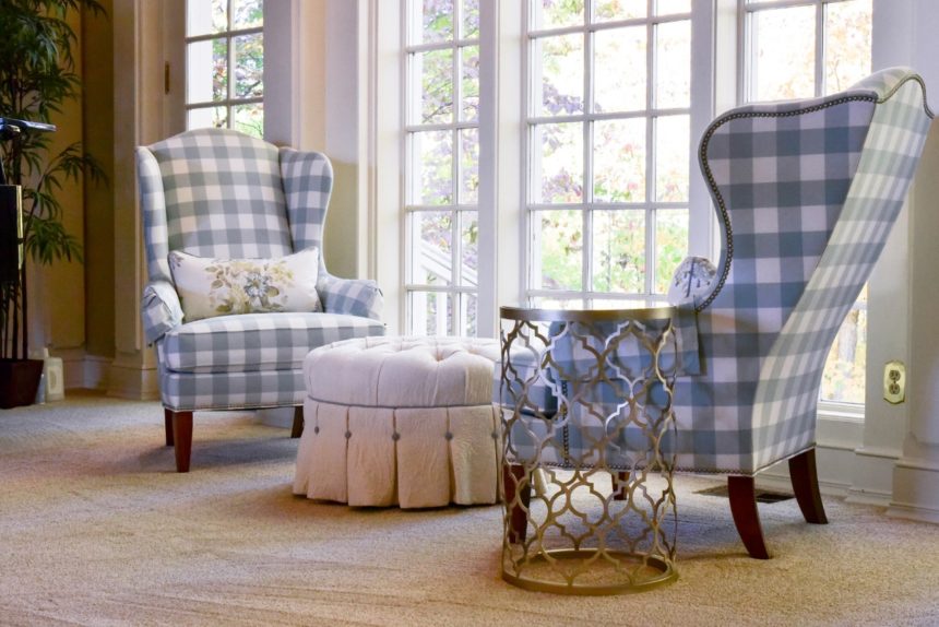
Inspired by the entertaining potential of such a beautiful dining room, Colleen decided on the show-stopping—and oh, so, comfortable—Larkin host chairs, with their short wings and lovely architectural lines.

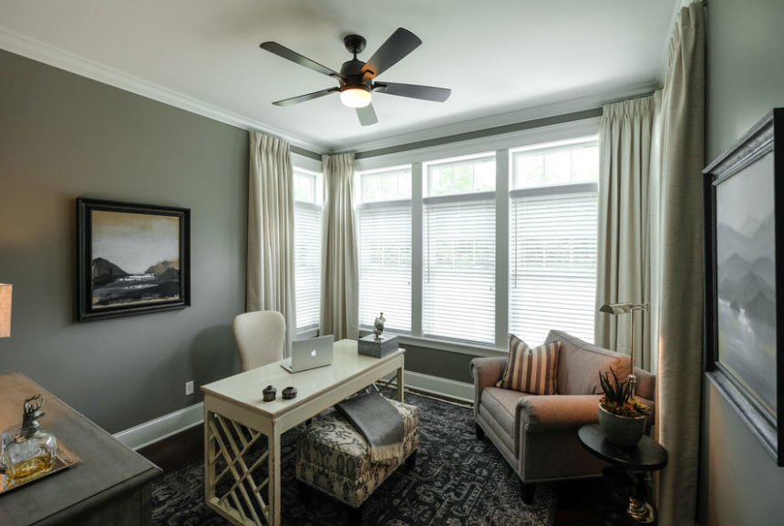
DEN
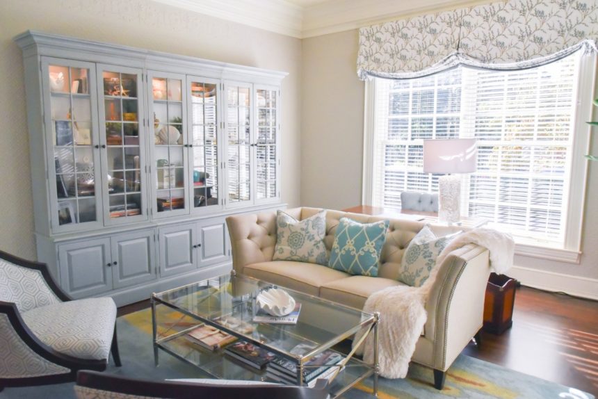
A soft palette of grays and ivory creates an ideal neutral and calming work environment. With its dramatic fretwork, the Dynasty desk adds modern notes to the space.

GREAT ROOM
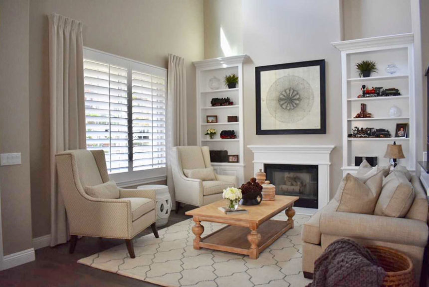
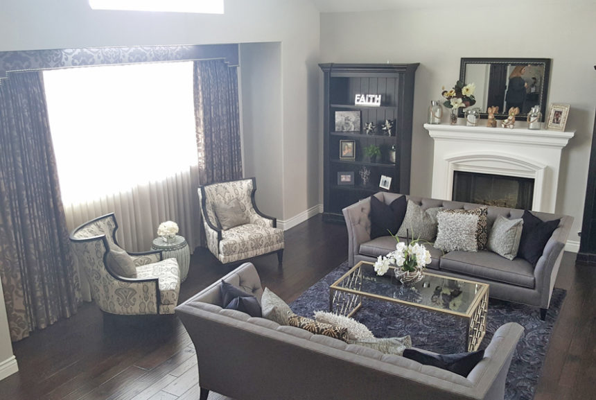
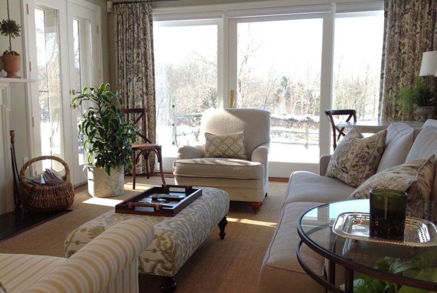
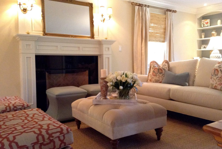
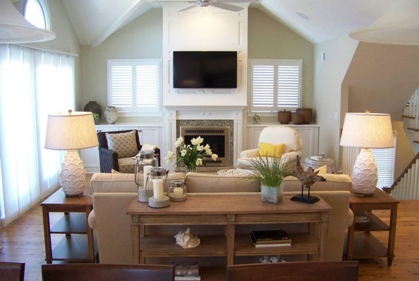
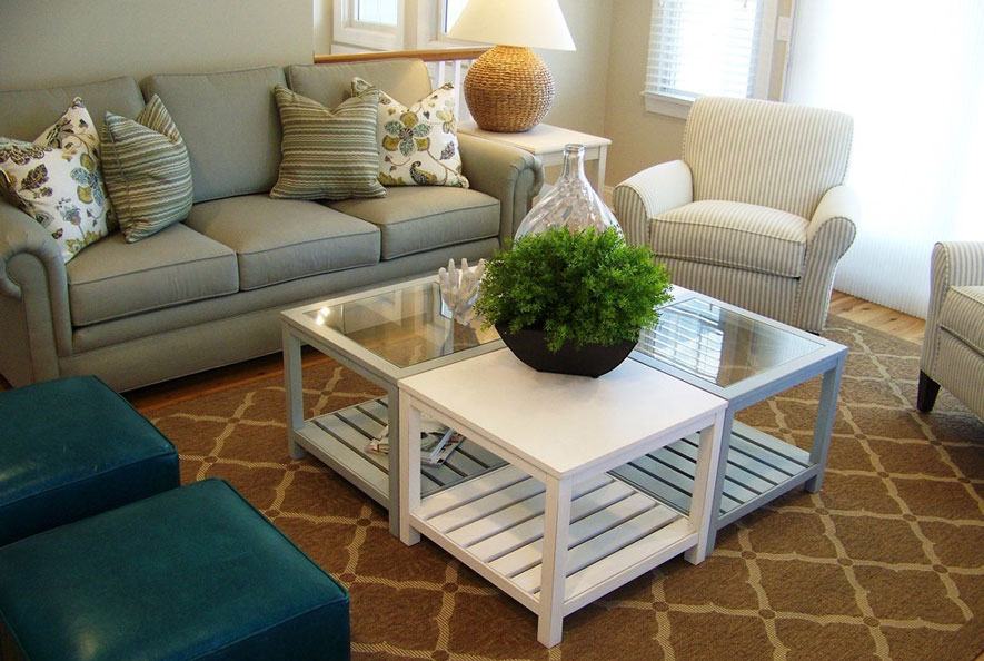
An ideal conversation space, the great room’s casual vibe was created by layering an array of textures and natural elements. And it’s not just pretty to look at; its inviting comfort comes from plush seating, pillows, and a versatile accent table.

Find more of Colleen Gahry-Robb’s work on Instagram @colleengahry.interiordesigner and on Houzz www.houzz.com/pro/gahry. To see more beautiful rooms by designers like Colleen, subscribe to The Art of Making Home.


Sharon Crudele has been earning a living as an interior designer for fifteen years, but she’s been decorating rooms for as long as she can remember (she wallpapered her bedroom when she was nine). A member of the Interior Design Society, Sharon has been a consultant at our Ethan Allen Design Center in Worthington, Ohio for twelve years; she’s a four-time Diamond Spirit award winner—and has just been named our most recent Design Star.

Sharon loves living in Granville, a picturesque town east of Columbus, where she enjoys “a quiet, country life complete with a chicken coop and a menagerie of pets.” She winds down by listening to music while she cooks, and likes to hike, garden, and travel—when she’s not designing rooms, that is.

“It’s an understatement to say that interior design is my passion,” says Sharon. “If I’m not working on client projects or my own home, my nose is in design magazines or I’m planning my next trip around the opening of a showhouse. I never stop.”

We recently asked Sharon to share her thoughts on her work and on design in general.

What is your favorite Ethan Allen project?

Last summer I met a kind woman, recently widowed, who wanted to make a fresh start.  She was building a new home and needed to furnish it from top to bottom, but didn’t know where to begin (or even what her style preferences were). She was overwhelmed. There were some tears along the way, but in the end, we created a stunning home together. It was a beautiful and sweet experience for both of us.
[fyi: this project is on houzz: https://www.houzz.com/projects/2647363/ferguson-new-home]

What Ethan Allen piece is your favorite?

I really love the Callum home office collection, especially in the sunwashed gray finish. The antique gold hardware against that perfect shade of gray is stunning. I have to say I’m thrilled to see that gold is trending again!

What is your favorite design tip?

Don’t be afraid to mix metals; the era of using only one finish—in lighting, hardware, plumbing, etc.—throughout the home is over. And remember, if you really love something, there’s always a way to make it work.

Complete this sentence: Every room needs …

A contrast in textures; soft, rough, shiny, vintage, chunky, refined—the more the merrier. Oh, and at least one piece of whimsy; it loosens up a space and infuses it with a bit of your personality.

What is the color you can’t live without, and why?

White. White makes every other color look good!  It quickly brightens a space and makes any room feel fresh, current, clean. It makes artwork shine … I could go on and on!

If you could do any project, anywhere, on any budget, what would it be?

I love Alys Beach, a seaside town on the Florida panhandle, and would love to do a beachfront home there. The colors of the sea, sky, and clouds are so ethereal; it would make such a magical canvas!

Is there anything else you’d like our readers to know about you?

I believe that every home should reflect the people who live there. A beautiful home that mirrors your personality is an affordable luxury that everyone deserves.

Find more of Sharon Crudele’s work on Instagram @sharoncrudele_design, and on Houzz, where she was named a Best of Houzz winner in Client Satisfaction in 2017 and 2018. To see more beautiful rooms by designers like Sharon, subscribe to The Daily Muse.


Our latest Design Star is Nikki Brouillette of our San Marcos, California, Design Center. Nikki earned a certificate in Interior Design from the American Institute of Interior Design and has worked in the field since 2001. Nikki ran her own design firm before launching her career at Ethan Allen in 2013. When she’s not designing, cooking, or crocheting, Nikki manages an Instagram account for her dog, Oliver, who has 15,000 loyal followers. She recently took a break and shared her thoughts on design.

What is your favorite Ethan Allen project?

I worked with the same couple on their formal living and dining rooms, family room, a guest bedroom, and some pieces for the kitchen, along with lighting throughout their home. The wife really wanted a rustic, yet modern feeling, a stylish look that was comfortable. The husband wanted his wife to be happy. They were a delight to work with, and I was overjoyed to learn how pleased they were after everything came together. Their happiness at home is my true reward.
What Ethan Allen item is your favorite?

I have fallen in love with the Ming display cabinet! It’s perfect for displaying china in the dining room, of course. But it’s also a beautiful choice for displaying books in an office, family room, or den.

What is your favorite design tip?

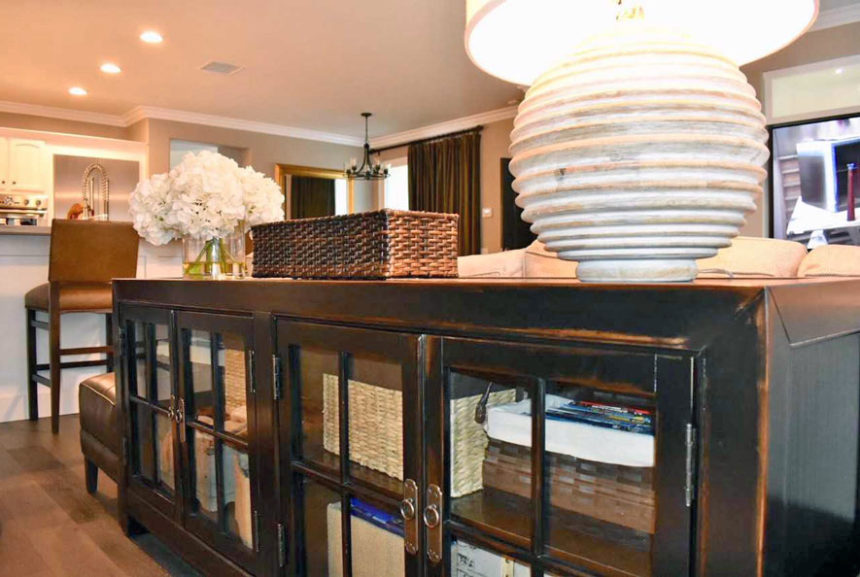
I always recommend doing something unexpected to inspire conversation in a space, like pairing a tapestry fabric with a faux leather for a textural surprise. I also like to use a desk behind a sofa instead of a console table; it adds storage and function while creating visual interest.

Complete this sentence: Every room needs …

Every room needs something natural! It brings a bit of life into a room, and a layer of comfort as well. I always include a permanent botanical, or a natural fiber such as linen or sisal, or even leather.

What color can’t you live without?

I need the color plum in my life. It’s rich, romantic, and warm, and it works well with neutrals, grays, and taupes, making it the perfect pop of color for nearly every design. It’s also right on trend with the dusty purples we’re seeing in fashion and design. See blog post, PURPLE PASSION: HOW WE’RE STYLING THE COLOR OF THE YEAR.

If you could do any project, anywhere, on any budget, what would it be?

I’ve always wanted to design a New York City brownstone! I love the architectural details and built-ins that add character to a classic, urban space. I imagine French doors leading to a patio off the master bedroom. I would hang elegant, yet very tailored draperies and bring contrasting textures into a room, from statement furniture pieces and large floor mirrors to detailed carvings on picture frames. I’d pair clean whites with rich browns. My vision would include classic patterns, as well as a little chinoiserie, for that unexpected touch.

Before we let you go, can you tell us a little about Oliver and how he became so popular on Instagram?

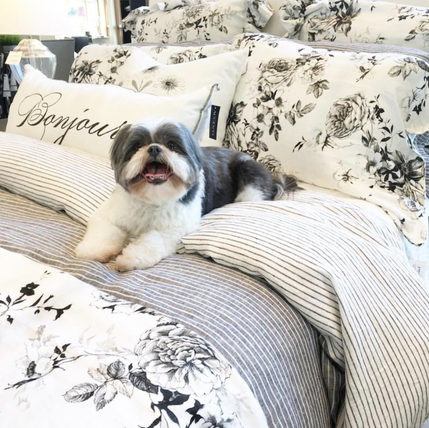
I got Oliver as a puppy a year after my mom passed away; he was a huge help to me in my grieving process. He is a Shih Tzu, and now almost 10 years old (his birthday is March 25). I decided on his name the day I met him. I picked him up and looked at his sweet little face and said, “You look like an Oliver.” I decided to make his own account on Instagram because I was following a couple of dogs and thought, “he’s just as adorable as these other pups.” I started his account in May 2016 and he slowly began to get followers. One day I posted a video of him begging for a minute straight sitting on his back paws and he got over 30,000 views! Follow adorable Oliver on Instagram @oliver_in_charge.


You can find more of Nikki’s work on Houzz and Instagram @eadesignernikki


Passion Meets Patience: Design Star Natalie Anderson

Natalie Anderson is a ten-year Ethan Allen veteran and manager of our Design Center in The Woodlands, Texas. She’s also our latest Design Star.

Community involvement is important to the Texas native, who is president of a professional networking group in the greater Houston area. Natalie lives in Cypress, Texas, with her husband, John, and their six children; she recently took a breather from her busy schedule and shared her thoughts on design.

What is your favorite Ethan Allen project?

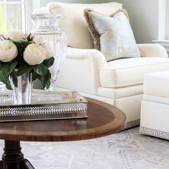
I worked with another designer on several spaces for clients who gave us a lot of freedom to design several beautiful rooms. The conservatory was my favorite, a space with lots of windows and light. We chose airy upholstery fabrics, and by adding contrast welting and beautiful trims, we made it all about the details. The magnificent mahogany Thorton coffee table was adorned with White Roses in a Julep Cup and our Traditional Mirrored Silver Tray. A Heriz area rug in gray/ivory served as an anchor to the space, really pulling it together by balancing texture, color, and pattern.

What Ethan Allen item is your favorite?

The Monterey chair, hands down; I had it on my wish list for years. I finally purchased a pair, and when they were delivered it felt like Christmas. I put them in Sundance Saddle leather to give them a worn, comfortable look.  I tell everyone who comes to our home to sit in them because I know they’re the best seats in the house!

What is your favorite design tip?

Be patient! The perfect piece is always worth the wait. Never buy something because you can get it sooner than the piece you really want. I practice this myself and with my clients. I love developing long-term design plans and doing things right the first time. The result will be exactly what the client wanted.
Complete this sentence: every room needs. . .

Light! Lighting has such an important psychological effect and should never be an afterthought. Ambient lighting creates a homey feel and enhances the overall look of a space. I love our lighting selections because they’re so versatile. You have the option of making a statement—or using it as a backdrop for other important pieces.
What is the color you can’t live without?

Black. It goes with everything and everything looks good in black. Black can be crisp and modern or it can add an edgy flair to a more classic space.  Any way you look at it, black is always a good idea!

If you could do any project, anywhere, on any budget, what would it be?

A sprawling ranch in Texas Hill Country. I love wide open spaces, the perfect backdrop for a beautiful home. I’d aim for Texas style: Livable luxury meets rustic elegance. Antique rugs would anchor sleek upholstery, and modern art would be hung on the walls. The best part would be the gorgeous views of rolling hills—what a dream come true!

You can find more of Natalie Anderson’s work on her blog, perrylaneblog.com, on Instagram @perrylaneblog, and her Facebook page.


The Perfect Fit of Metal and Wood Furniture Create a Truly Eclectic Style

When homeowners Pat and Dan Stankey tapped Betty Swenson from our Ann Arbor, Michigan, Design Center for help in furnishing their home, they didn’t know what to expect. The home is unique, with lots of metal and wood, vaulted ceilings, and rustic touches. They were worried that she’d want to replace all their furniture with Ethan Allen. They were in for a very pleasant surprise. Inspired by the couple’s preferences and the architecture of the house, Betty helped Pat and Dan choose a combination of mostly casual pieces that gave their home the fresh, contemporary look they were after.


New House, New Look

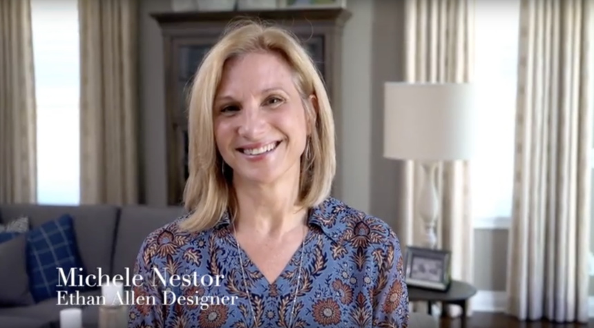
Rick and Donna Devore were ready for what they call “a lifestyle change.” They’d been married for 38 years when they decided to downsize and move into a charming Victorian in the walkable city of Birmingham, Michigan. The couple wanted a new home that was casual and livable, comfortable, with coastal notes. Lucky for them, designer Michele Nestor of our Design Center in Birmingham was up to the challenge of furnishing the house from top to bottom. Michele delivered the cool look and fresh start they were after—and so much more. Take a look and see how this lifestyle change, changed their life.


Behind the Design: How One Partnership Turned into a Friendship

When design consultant Gabriella met her client, Renee, to go over ideas for her master bedroom, the women had no idea that a “wow factor” project would bloom into a fabulous friendship. Renee is now married with a baby—and she’s still happy to call Gabriella a friend.  “As my life has grown and evolved, Gabriella has grown and evolved with me,” she says.

At Ethan Allen, we like to think of it as added value!


Tips From the Design Star

Our latest Design Star, Peggy Fortuna, has been an award-winning design consultant in our Danbury, Connecticut, Design Center since 2012. Before that, the Baltimore native owned and operated her own design and color consulting business. Peggy and her husband have three grown daughters, one grandchild, and a chocolate lab with his own Instagram account. We caught up with Peggy recently and she shared her thoughts on design.

EA: What is your favorite Ethan Allen project?

PF: I had complete design freedom to decorate a client’s four-bedroom home in New Milford, Connecticut—including a large outdoor space. Every room, completely furnished with Ethan Allen furniture and accessories, is both beautiful and livable.

EA: What Ethan Allen item do you currently covet, and why?

PF: I love all the Dynasty and Ming pieces for all their finish options. I also love the sculptural shape and versatility of the Corbin ottoman. It can be used in both traditional and transitional spaces, and it looks great in all kinds of fabrics!

EA: What is your favorite design tip?
PF: I always say the rule is: There are no rules.

EA: Complete this sentence: Every room needs—

PF: Negative space. Color, light, volume, and pattern are important—but don’t forget the space that surrounds it all.

EA: Is there a color you can’t live without, and why?

PF: I love rooms that are all white, but I design using a varied palette. White is needed to balance the other colors in the room.

EA: If you could do any project, anywhere, on any budget, what would it be, and why?

PF: To me, nothing is more beautiful and serene than the beach—so, selfishly, I’d have to say I’d love to decorate a beach house for my family. It would be awesome. And while I am dreaming, let’s say it would be on Seven Mile Beach on Grand Cayman!


Pattern in Interior Design: Q&A With Tad Donovan

Designers know that pattern is a powerful decorating tool; some would argue that it has even more currency than color. Tad Donovan is someone who knows the importance of pattern—and he uses it often when he designs spaces for Ethan Allen. Tad, who is based in Fort Lauderdale, is our latest Design Star.

We caught up with him recently and asked him to share his strategies for making the most of pattern in his projects.

EA: What does pattern bring to the design table?

TD: Pattern brings visual interest and an element of excitement to a room. It offers infinite possibilities for creating a space that really suits a client. It allows us to seamlessly integrate their personalities.

EA: How did you develop such a comfortable relationship with pattern?

TD: I give my parents credit; both were very talented. I was in my teens when they were building a new home, and I remember the binder my mother kept with all the samples she liked. I saw how she pulled different patterns together, making sure that each room made sense and related to the rest of the house. I think of pattern in the same way; it’s like pulling together a wardrobe—selecting ties, shirts, jackets, and accessories—with an eye toward everything working together.

EA: What are your rules for designing with pattern?

TD: Don’t be afraid of them!  If a client can point me in the direction of one fabric they like, I can help them conquer their fears. It not only gives us a starting point, but it also gives me a sense of who they are. From there, I can interject ideas to expand on their interests.

EA: How about mixing patterns?

TD: Yes, please!

EA: What are some of the common pattern mistakes people make?

Using too much of a similar pattern.


EA: What’s the difference between pattern and a print?

Patterns are everywhere—they appear in all kinds of materials, not just fabric. A print is technically a textile that has had dye applied to it—in the form of a pattern. Informally, I think of pattern as more geometric, or a series of repetitive lines/circles/colors. When I think of prints, I think more of a floral or toile.

EA: You say patterns are everywhere—where do you find them in the home?

They can be in architectural details such as dentil molding; tiles (a Moroccan motif, for example); flooring (think parquet wood floors); even in brick or stone walls.

EA: Do you live with patterns at home?

Let me think … that would be a yes!

PILLOW TALK

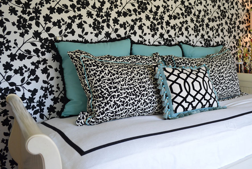
TD: My client wanted to update a teenage girl’s room using her existing EA furniture. The daughter wanted a palette of black, white, and “Tiffany blue.” I centered the trundle bed on the papered wall and framed the custom bedcovering with grosgrain ribbon on all four sides. The pillows pull everything together: We chose a small-scale print on two pillows for a positive/negative contrast with the walls. The smaller pillow features a black-and-white geometric pattern and a fun tassel trim. We went directly to the source for the larger pillows and trims—using a box from Tiffany to get the blue just right.

MASTER PLAN

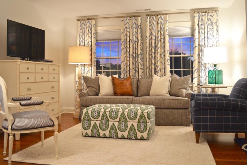
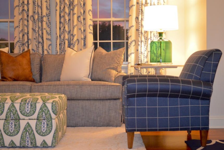
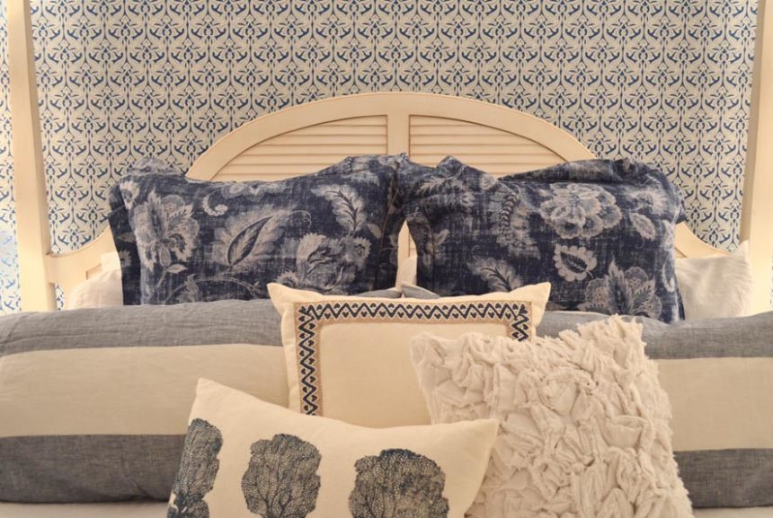
TD: Believe it or not, these are two views of the same room, a rather spacious master suite where my clients go to unwind. Their favorite color is blue and they already owned some pieces (which they still love) from our Swedish Home collection. We used wallpaper sparingly to separate the sleeping area from the sitting “room.”  It defined the space and gave importance to the patterns layered on the bed. We used green as an accent hue (note: the ottoman provides contrast and storage). The Adam chair in a bold windowpane fabric provides a powerful punch of color.

RED ALERT

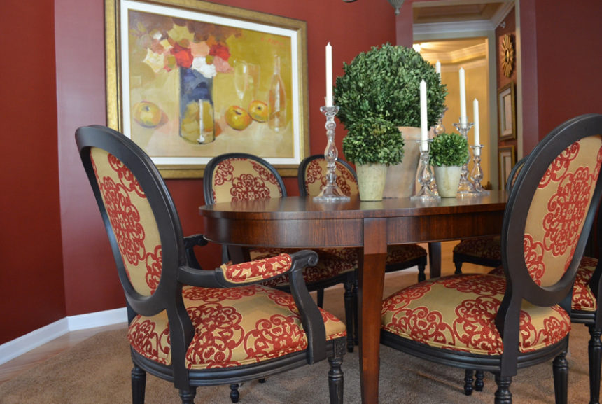
TD: This dining room is open to the living room at right. The very sophisticated space was inspired by the geometric pattern on the red sofa pillows. The client loved it so much, we used the same fabric for the window treatments. We picked up the rich red hue as an accent wall in the dining room, along with the fabric on the dramatic Cassatt chairs done in a distressed black finish.

BEAUTY AND THE BATH

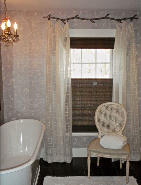
TD: Pattern plays a subtle but significant role in this children’s bathroom in an antique farmhouse. Geometric sheers hung from a metal “branch” rod complement the floral pattern in the wallpaper while adding a bit of softness.  The lined, natural woven shades provide texture and contrast, plus privacy.

WALL-TO-WALL WOW

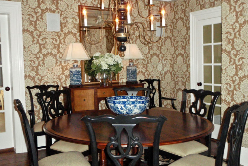
TD: This classic patterned wallpaper acts like artwork in a dining room full of doorways. It provides a lovely backdrop for our Hansen Indonesian mahogany dining table—the star of the room.  The blue and white porcelain lamps and bowl add a touch of color and, yes, another pleasing pattern.