Meet Ethan Allen Design Star Edyta Szlezak

Edyta Szlezak is being honored this month as our latest Design Star—in time for her five-year anniversary at Ethan Allen! Edyta earned a bachelor’s degree in interior design from Harrington College of Design in Chicago in 2012, and soon after went to work in our Design Center in Schaumburg, Illinois.

Edyta was born in Poland and moved with her family to Chicago when she was a teenager.  Fitting in wasn’t always easy, she says, and because she spoke no English, making new friends was a challenge. “I had to grow a backbone very quickly and adjust to a new culture and a new life,” she remembers.

Over the years Edyta adjusted quite nicely, made friends—and found her niche. She loves her work as an EA designer and today is as fluent in design as she is in English (style-savvy, too).

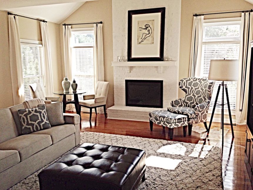
She makes her home in a newly renovated house on a wooded lot in Barrington, just north of Schaumburg. “I love that my daughters can catch toads and go swimming in a nearby lake,” she says. Like her, they’re creative. “They sew pillows and cushions out of discontinued fabric samples I bring from work,” she says. Edyta enjoys painting and drawing in her free time. “I have always had a good eye for color, and expressing my creativity is a perfect way for me to relax,” she says.

Edyta took some time to chat with us recently, sharing her thoughts on design and the work she does so well.

What is your favorite Ethan Allen project?
I worked on a renovation of a 12,000-square-foot house, handling everything from furniture selection and window treatments to accessories and bedding. From the beginning, I established a very close working relationship with my clients, who had just purchased the home. Because the effort was so collaborative, I was able to help them design a home that truly reflected their lifestyle and personal taste. Managing a project of this scope was a great way of challenging myself and it was a great experience from start to finish!

What Ethan Allen item is your favorite?
There are so many Ethan Allen items that I just love and it’s hard to choose only one … but I would have to say the Turner swivel chair is my favorite.  It’s my go-to spot when I’m looking for comfort, time to meditate, or get creative. It’s just perfect for everything—from working on a laptop to simply relaxing.

What is your favorite design tip?
I like to start with a favorite item and build on it. It could be a pillow with brilliant colors, a piece of art, sculpture, or an inspiration that I found online or in a magazine. If you start with one thing and go from there, most ideas will develop naturally, cohesively, with a sense of style.

What is the color you can’t live without, and why?
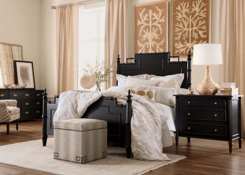
Some people say black is not a color, but no matter: I simply can’t live without it. Black adds instant sophistication and makes a statement, whether it’s an accent in a room or a piece in your wardrobe! It’s a bold color that can define a space. I also love the high-contrast combination of black and white, a simple and classic palette that never goes out of style.

If you could do any project, anywhere, on any budget, what would it be?
I love big changes, so I’d like to take a space from appealing to unexpectedly beautiful. I’m good at uncovering potential. I love to mix different textures with patterns and tone-on-tone colors. Starting with a neutral palette, I’d add accent colors and a lot of eclectic items for visual interest. My dream project would be to use these strategies and turn a very traditional space into a modern classic!
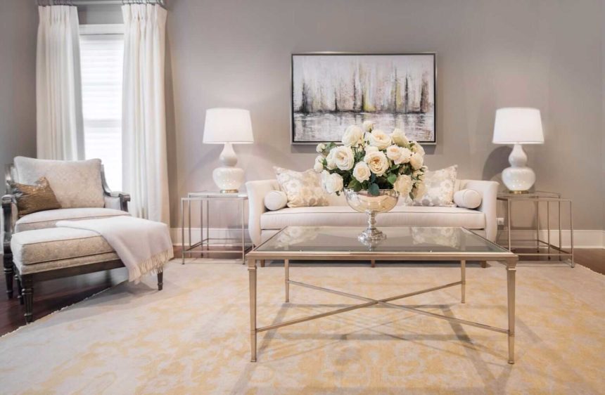
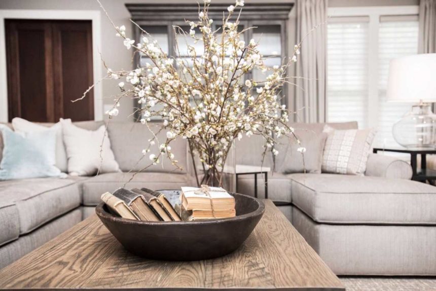
Find more of Edyta Szlezak’s work on Instagram @edytak45 and Houzz at houzz.com/pro/eszlezak. To see more beautiful rooms by designers like Edyta, subscribe to The Art of Making Home.

“There’s a song I’ve carried with me for years, just looking for the place it belonged.”

That’s what Ethan Allen creative director Kemper Johnson says about “Putting It Together,” the song that inspired our new commercial, “Details.” It’s about the age-old struggle between art and business, the tension between carrying out a creative vision and earning enough approval (and cash) to keep doing the work, and the drive to keep creating work that’s fresh and inventive.

Let’s time travel behind the scenes to 1982, when Poltergeist was in theaters, “Eye of the Tiger” was burning up the charts, and Stephen Sondheim got an idea for a new kind of musical.

Sondheim in a Slump, Circa 1982

After a string of Broadway hits in the 1970s—Company, Follies, and Sweeney Todd among them—Stephen Sondheim’s first musical of the 1980s, Merrily We Roll Along, was a flop. The lackluster showing spelled the end of his collaboration with longtime partner Hal Prince. In 1982, he launched a tentative project with off-Broadway playwright James Lapine.

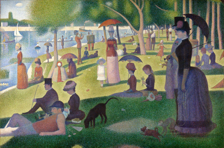
The two found inspiration in the pointillist painter Georges Seurat and his 1884 work A Sunday Afternoon on the Island of Grande Jatte.

To Lapine, the painting looked like a stage set without a main character. He and Sondheim decided that the artist was the missing character, so they went about imagining a Seurat-like persona named George. Lapine started writing and adding song cues, but when he had finished the first act and gathered the actors in for a reading, Sondheim had only just written the opening chords of Sunday in the Park with George.

Art Isn’t Easy

By the time rehearsals started for the off-Broadway workshop, Sondheim was still lagging behind; he had only completed the score for the first act. In fact, the play launched incomplete, with Sondheim and Lapine coming out on stage giving nightly speeches about how the work was still in progress. Although it may sound like a crazy way to write a show, for Sondheim, the process was ideal; he was able to meet the actors and get a sense of who they were before composing songs for them.

By the time the show made its official Broadway debut in May 1984, the second act had only been complete for a few days, and those who saw it had a range of opinions about it. The New York Daily News said it didn’t bear looking at or listening to for very long, but New York Times columnist Frank Rich loved it, calling it “a contemplative modernist musical that, true to form, is as much about itself and its creators as it is about the universe beyond.”

Sunday went on to win a Pulitzer Prize and two Tony awards. “Putting It Together” also got a boost from Barbra Streisand, who decided to record the song for her 1985 Broadway Album. Sondheim himself came to the recording studio and helped Streisand and her collaborators personalize the lyrics and the score. The musical also enjoyed a second Broadway run in starting 2017, with Jake Gyllenhaal reprising Mandy Patinkin’s role as George.

Working out the Vision

For “Details,” Kemper wanted to reimagine the song with a less agitated, more modern feel. He tapped vocalist Anna Dellaria, who infused the piece with a warmer, more laid-back aesthetic while still capturing the excitement of watching a work of art—or a room, in this case—come together.

For Ethan Allen, “Putting It Together” was a welcome reminder of our core values: bit by bit, putting it together—every detail matters in the art of what we do.

And in the spaces you create, the artist is you.

If you haven’t seen the commercial yet, here it is:

For more on the story of how “Details” came to be, check out our interview with Kemper and director Joe Wright.


Meet Design Star Colleen Gahry-Robb

Colleen Gahry-Robb is homegrown—in the best possible way. She’s lived in Michigan nearly her whole life and she joined the Ethan Allen family fresh out of college—seventeen years ago. Colleen, who works in our Design Center in Auburn Hills, Michigan, is our latest Ethan Allen Design Star. She has been an Ethan Allen Gold or Diamond Spirit award winner for the last five years, and a Best of Houzz winner since 2015. When Colleen’s not designing, she enjoys golfing, biking, dining out, and traveling. She lives with her husband of fifteen years, Craig, and their two cats, Pete and Lucy. Recently Colleen shared some of her thoughts on design, and walked us through a whole-house project she completed for a pair of empty nesters.

What’s the one thing you’d like our readers to know about you?

I believe creating a beautiful, comfortable home shouldn’t be overwhelming, but rather fun and exciting. The most important skill any designer can bring to a project is the ability to listen, successfully transforming ideas into reality.

What is your favorite design tip?

Choose things because you love them, not because they are in style. If you stay true to who you are, then your choices will continue to reflect your personality regardless of what everyone else is doing. Keep things simple, choose a single piece that you love, and build a room around it.

What Ethan Allen piece is your favorite?

I’m currently loving the Dynasty coffee table. I love the Asian-inspired design and the variety of distressed finish options.

Complete this sentence: Every room needs …

A focal point! It’s the first thing you (should) notice you walk into a room. It could be anything: a favorite piece, a fireplace, a fabulous view.

What is the color you can’t live without, and why?

Definitely black! Black can be elegant, sophisticated and edgy—and it goes with everything.

If you could do any project, anywhere, on any budget, what would it be?

Having experienced my share of Michigan’s long and gloomy winters, I think nothing is more beautiful and serene than the beach. Decorating a beachfront home in Florida would be my dream come true! From natural elements and weathered textures like driftwood, seashells, and sunwashed finishes, I’d find it very easy to be inspired by the relaxing vibe of such a beautiful place.

Tell us about the soup-to-nuts project you completed in June.

My clients found me on Houzz; they were in the process of renovating a two-year-old home and wanted a designer to help them furnish it from top to bottom—including every accent. We talked until I had a good understanding of the styles they liked and how they wanted to live in the home. The palette and style were inspired by the newly designed kitchen, which has white cabinets, gray walls, dark floors, and gray quartz countertops. They gave me a lot of design freedom, and it really helped that they were quick decision-makers; we had everything selected—including window treatments, custom area rugs, and lighting—within a month. I paid close attention to sight lines when it came to placing art and accessories. The result is a great flow from room to room.

MASTER BEDROOM
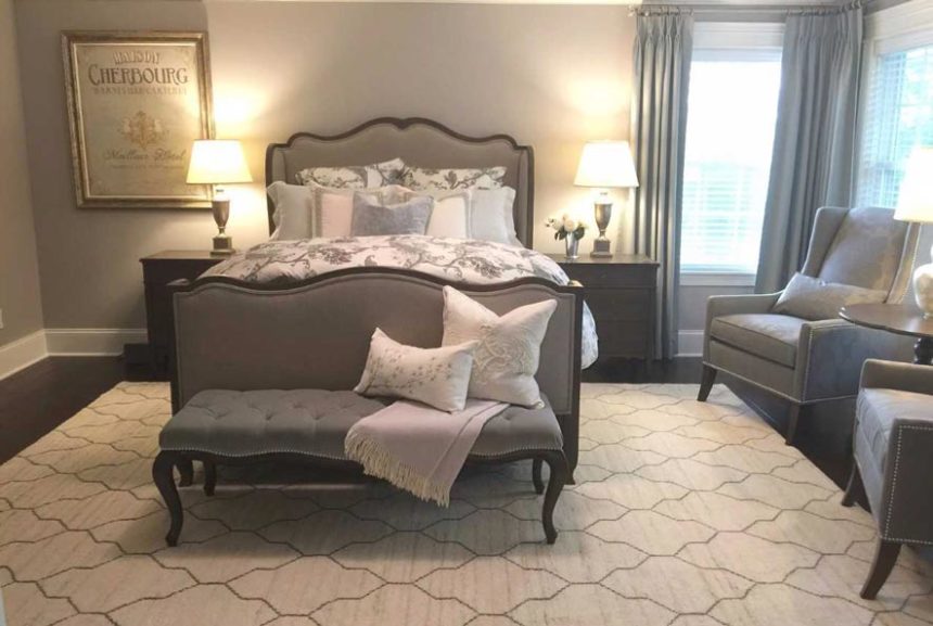
Because “you start and end each day in the bedroom,” Colleen chose the calming and beautiful Beau bed, with its seductive French curves, as the inspiration for the clients’ serene master bedroom. A soft mineral blue, gray, cream, and taupe palette gave the space a sophisticated look.

DINING ROOM
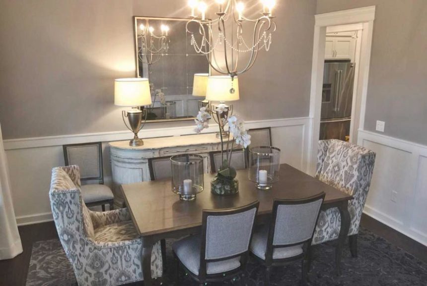
Inspired by the entertaining potential of such a beautiful dining room, Colleen decided on the show-stopping—and oh, so, comfortable—Larkin host chairs, with their short wings and lovely architectural lines.

DEN
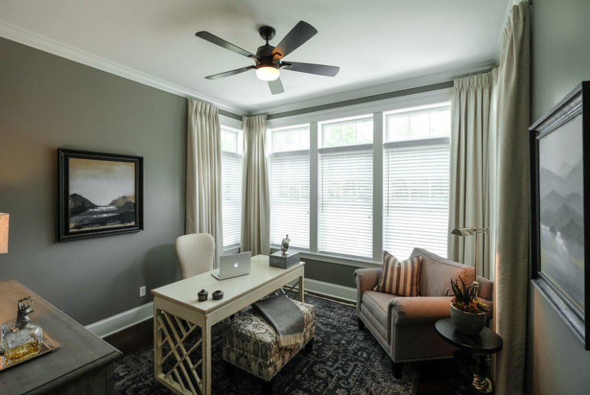
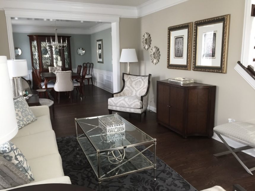
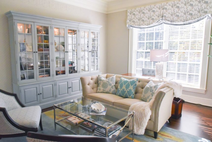
A soft palette of grays and ivory creates an ideal neutral and calming work environment. With its dramatic fretwork, the Dynasty desk adds modern notes to the space.

GREAT ROOM
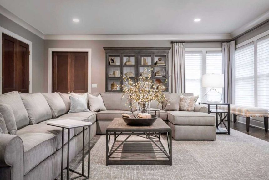
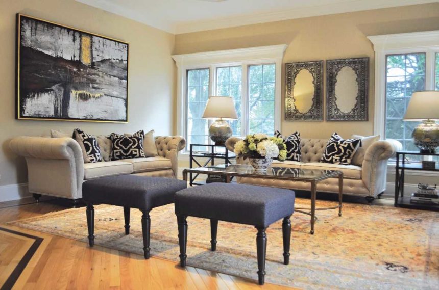
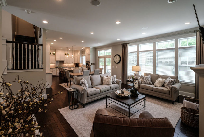
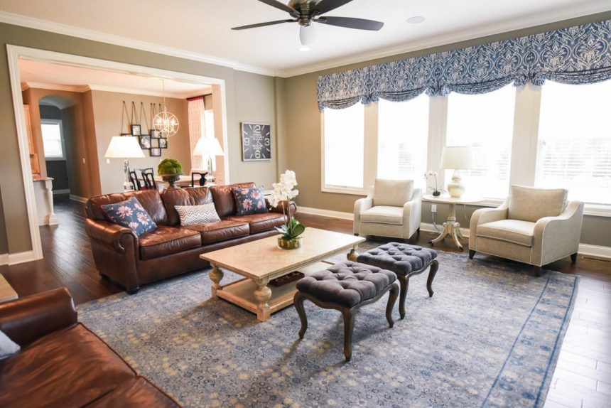
An ideal conversation space, the great room’s casual vibe was created by layering an array of textures and natural elements. And it’s not just pretty to look at; its inviting comfort comes from plush seating, pillows, and a versatile accent table.

Find more of Colleen Gahry-Robb’s work on Instagram @colleengahry.interiordesigner and on Houzz www.houzz.com/pro/gahry. To see more beautiful rooms by designers like Colleen, subscribe to The Art of Making Home.


“Having just a vision’s no solution / Everything depends on execution…”

Ethan Allen creative director Kemper Johnson knows a few things about bringing a vision to life. One of the minds behind the fun, fashion-forward Bull’s-Eye World campaign that reenergized Target, Kemper was also responsible for launching Sean John’s fragrance line at Estee Lauder, rebranding Coach, and revitalizing brands like Cole Haan, Express, and Kohl’s, to name a few.

Since September, he’s been crafting a vision for the future of Ethan Allen…and he didn’t have to look far for inspiration. “Immediately after I started here in September, the company was preparing for a huge conference of our retailers and designers. We had to think, What are we going to focus on? What matters today? What will matter tomorrow? There are the Ethan Allen pillars, you know: the craftsmanship and the quality, the variety of styles, the level of service, the personalization, the environmental sustainability – the details that make Ethan Allen Ethan Allen. The details are what matters. Every detail matters.” And so a tagline was born.

Chief marketing officer Bridget O’Brien walks by as Kemper shares his story and leans into the recorder. “It’s more than a tagline, even. It’s not a message, it’s the DNA of our brand. We’ve always been innovators – we changed the way furniture was sold in stores. We’ve always cared about craftsmanship and quality. We’re going to keep the tradition of making beautiful things and making them well – and we’re evolving, expanding, making room to delight an even larger audience.”

Once every detail matters came into focus, things really got rolling. “I’m a big Stephen Sondheim fan, and there’s a song that I’ve carried with me for years, just looking for the place it belonged,” Kemper confides. The song, “Putting it Together,” from Sunday in the Park with George, couldn’t have been a more perfect fit.

“It all started to come together in my mind: putting it together, bit by bit, piece by piece – the lyrics from the song, which is about the art of making art and seeing your vision come true. From there we got to the idea of The Art of Making Home, which is also all about the details, all about letting your personality shine.”

After getting the go-ahead for a major national TV commercial, Kemper turned to Joe Wright of Sibling Rivalry, who Kemper describes as “one of the A+ directors in the industry. He does, oddly enough, a lot of car commercials. He’s brilliant at bringing life to inanimate objects. So I presented the concept to him – I had boarded it in a way that it was basically about details.” [Boarding = storyboarding, a way to visually present a concept for video production.]

Joe had thoughts on it almost immediately. “I always get excited when someone comes to you with a brief and you … can create something with it that no one would have expected,” he shared.  “For me, it just felt like a very exciting project to get involved in, because I knew I could do something really interesting with it.”

See what else Joe had to say about the vision and the execution of our gorgeous collaboration in this behind-the-scenes chat!


Humans spend roughly one-third of their lives in dreamland. Yet according to the World Sleep Society, sponsors of World Sleep Day, 35 percent of people say they don’t get enough sleep, and poor sleep quality is seriously impacting their physical and mental health.

When you don’t snooze, you lose, especially during the daylight hours. In the U.S. alone, the annual cost of insomnia is estimated to be between $92.5 billion and $107.5 billion. What those figures don’t show you, however, is the personal cost exacted by restless nights. Forty-six percent of people say sleep disturbance causes them to miss work or events or to make errors they wouldn’t otherwise make.

Quality sleep has three elements: duration, continuity, and depth. In other words, good sleep lasts, it’s uninterrupted, and it’s deep enough to be restorative. When we develop Ethan Allen bedding and mattresses, we’re always thinking about how to create the best conditions for a good night’s sleep. World Sleep Day, which is March 16 this year, is a good time to take stock of how well you’re sleeping—and to do something about it if the answer is, “not so well.”

Start with a Great Mattress

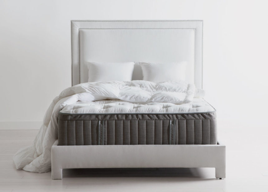
A lot of details go into crafting an Ethan Allen mattress. All of our mattresses are made by hand, and we’ve developed multiple mattress options with specific features personalized to different body types and sleep preferences.

The key to a good night’s sleep starts with choosing a mattress that meets your unique sleep requirements. When you sleep with proper postural alignment, you experience fewer pressure points, you get better sleep quality throughout the night, and you can wake up feeling refreshed and alert. A mattress doesn’t necessarily have to be firm to provide a good night’s sleep; let the proper support guide you.

So how do you know when you need a new mattress? According to the National Sleep Foundation, if your current mattress is worn or sagging in the middle or at the edges, if you’re feeling every turn your partner makes, or if you’re waking up feeling achy and stiff, it’s probably time to shop for something new. We recommend starting with our exclusive Sleep by DesignTM survey to choose the right mattress type for your needs.

>>Take our sleep survey


Don’t Forget the Foundation!

We craft our flat foundations from kiln-dried Canadian spruce in both standard and low-profile options, depending on the height you prefer. In the U.S., we also offer TEMPUR-ErgoTM adjustable motion bases, which you can control with a wireless remote or a smartphone app—think endless head and foot positions and multiple massage settings for crazy-good comfort.

Our sleep survey makes proper support recommendations, but it’s always a good idea to test out mattress and foundation combos before making a purchase.

  • Head into a Design Center to test out your Sleep by DesignTM survey recommendations. Find your nearest Design Center.
  • Chat with a designer online if you have more in-depth questions, so you can purchase your mattress with confidence. Visit our website and click the Chat Live button at the top of the home page to connect with a designer.

Create a Relaxing Environment

Seventy-five percent of people surveyed by the National Sleep Foundation said that comfortable sheets and bedding are essential for great sleep. Choose pillows that support your neck and head so that they line up in a neutral position. If your pillow has lumps or sags, it’s time to replace it with something better.

A great sleep environment isn’t just about sheets and pillows. It’s also about choosing beautiful bedcoverings and a soothing palette. A bedroom that speaks to your style sensibilities becomes a much easier place to relax and unwind.

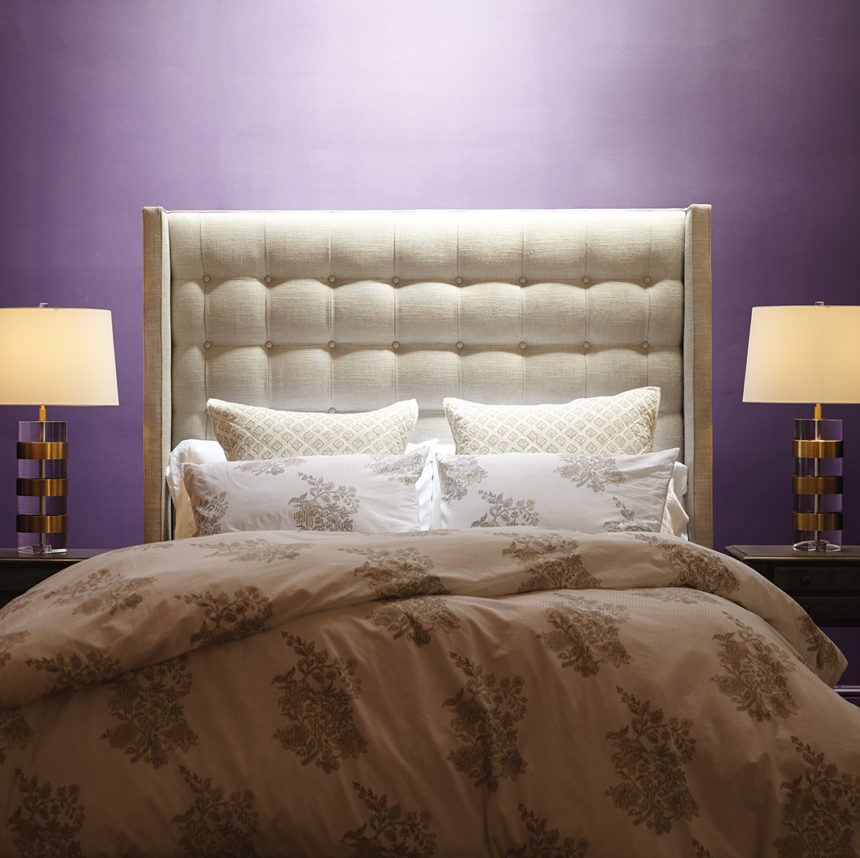
  • If you like rich colors, paint your walls a lush blue, emerald green, or blue-based purple.
  • Some people find neutrals calming. If that sounds like you, go with a light tan or gray on your walls, or choose a pastel hue of a strong color, like a pale sage green or light lavender.
  • Others like a bedroom that reminds them of a special place; in this context, even bold colors can feel soothing. Transport yourself to your favorite island getaway with bold turquoise, bright coral, or sunny yellow wall color.

Once your wall color is in place, choose bedcoverings and decorative pillows that set the right mood. If you prefer solid or neutral colors, make them special with a beautiful pattern or texture. In a blue or neutral room, our Lorelle paisley duvet cover offers a soft paisley pattern, while our Gresham coverlet gives you the chance to dress your bed in sumptuous blue velvet.

>>Check out this look

Make Your Bed

A National Sleep Foundation poll found that many people say a neat, clean bedroom is critical to a good night’s sleep. People who make their bed are 19 percent more likely to report fewer sleep problems. We recently published a post on how to make your bed like a design pro. It includes can’t-miss, step-by-step instructions for inserting a coverlet into a duvet cover quickly and easily—not wrestling with a duvet cover sounds mighty relaxing!

If you’re not getting the rest you need, the right mattresses and bedding can mean less time counting sheep and more time getting quality Zzzs.  And if you like expert tips like these, don’t miss out! Subscribe to our blog by adding your email address in the box to the right.


Get a behind-the-scenes peek at the “Details” behind our biggest ad ever.

Get a behind-the-scenes peek at the “Details” behind our biggest ad ever. And if you haven’t seen the commercial yet, click the link below! Does the music sound familiar? It’s Stephen Sondheim’s catchy tune from his musical “Sunday in the Park with George.”  We are working on a story about this award winning American composer and lyricist- so stay tuned! We hope you enjoy watching it as much as we enjoyed creating it.


THINK INSIDE THE JEWEL BOX

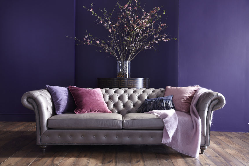
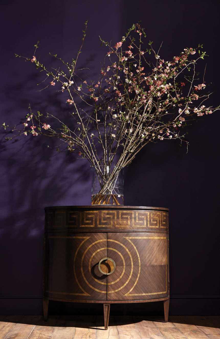
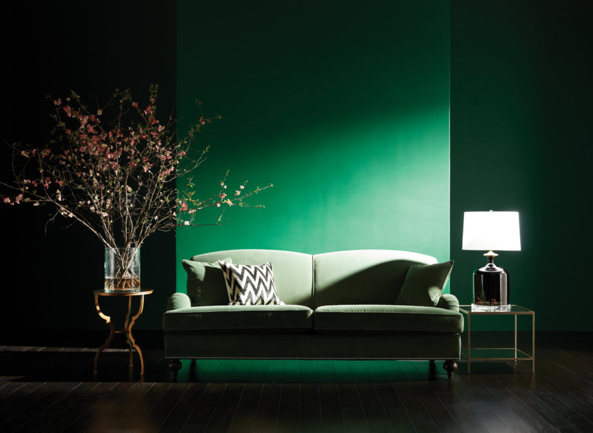
Garnets and rubies and sapphires, oh my! Such precious stones. Such rich colors. What a  way to add a glint of gorgeousness to a room! Decorating with jewel tones instantly infuses a space with sophistication and luxury, but it can have a cozying effect, too. Warm hues naturally give a room an intimate feel. From topaz to tourmaline, jewel tones create a stylish palette with tons of potential. We love using deeply saturated shades to define a room; think vivid emerald walls (not just one, thank you). But even a single piece, like our mouth-blown Lucira emerald vase, can add a lavish touch. Nothing lights up a room faster than jewel-toned accents, from lamps and throws to pillows and trays.

All jewel tones are gems in our book—but two of our favorites are emerald (surprise!) and amethyst. They’re the stars of our new national advertising campaign—just take a look at our TV commercial and the stills we’ve captured here. See for yourself how the gem-inspired colors we love can embellish a room. Do try this at home.
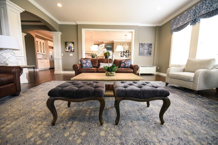


Bit by bit, piece by piece, we put together this game-changer of an ad to let the world know that Ethan Allen’s designers – and the free design service they provide – are the best in the business. Every detail matters is Ethan Allen’s brand statement. It’s a promise that what we stand for – from manufacturing to logistics to the Design Center floor; from service to the stitching on a sofa to the finish on a well-crafted coffee table – is attention to every little thing. It’s kind of a big deal!

Music: Putting it Together, Sondheim; arranged and recorded by Anna Dellaria.


When we last met up with Jonathan Parks, he was packing for a month-long trip to China, Shanghai, Thailand and India. As Ethan Allen’s Senior Director of Hard/Soft Accents & Outdoor Living, Jonathan takes two to three trips a year, to meet with the artisans and vendors who supply the unique products we offer. As always, he was looking forward to his travels because he loves exploring, meeting people – and most of all, seeing how things are made. Here are just a few photos from his trip – enjoy!


Sharon Crudele has been earning a living as an interior designer for fifteen years, but she’s been decorating rooms for as long as she can remember (she wallpapered her bedroom when she was nine). A member of the Interior Design Society, Sharon has been a consultant at our Ethan Allen Design Center in Worthington, Ohio for twelve years; she’s a four-time Diamond Spirit award winner—and has just been named our most recent Design Star.

Sharon loves living in Granville, a picturesque town east of Columbus, where she enjoys “a quiet, country life complete with a chicken coop and a menagerie of pets.” She winds down by listening to music while she cooks, and likes to hike, garden, and travel—when she’s not designing rooms, that is.

“It’s an understatement to say that interior design is my passion,” says Sharon. “If I’m not working on client projects or my own home, my nose is in design magazines or I’m planning my next trip around the opening of a showhouse. I never stop.”

We recently asked Sharon to share her thoughts on her work and on design in general.

What is your favorite Ethan Allen project?

Last summer I met a kind woman, recently widowed, who wanted to make a fresh start.  She was building a new home and needed to furnish it from top to bottom, but didn’t know where to begin (or even what her style preferences were). She was overwhelmed. There were some tears along the way, but in the end, we created a stunning home together. It was a beautiful and sweet experience for both of us.
[fyi: this project is on houzz: https://www.houzz.com/projects/2647363/ferguson-new-home]

What Ethan Allen piece is your favorite?

I really love the Callum home office collection, especially in the sunwashed gray finish. The antique gold hardware against that perfect shade of gray is stunning. I have to say I’m thrilled to see that gold is trending again!

What is your favorite design tip?

Don’t be afraid to mix metals; the era of using only one finish—in lighting, hardware, plumbing, etc.—throughout the home is over. And remember, if you really love something, there’s always a way to make it work.

Complete this sentence: Every room needs …

A contrast in textures; soft, rough, shiny, vintage, chunky, refined—the more the merrier. Oh, and at least one piece of whimsy; it loosens up a space and infuses it with a bit of your personality.

What is the color you can’t live without, and why?

White. White makes every other color look good!  It quickly brightens a space and makes any room feel fresh, current, clean. It makes artwork shine … I could go on and on!

If you could do any project, anywhere, on any budget, what would it be?

I love Alys Beach, a seaside town on the Florida panhandle, and would love to do a beachfront home there. The colors of the sea, sky, and clouds are so ethereal; it would make such a magical canvas!

Is there anything else you’d like our readers to know about you?

I believe that every home should reflect the people who live there. A beautiful home that mirrors your personality is an affordable luxury that everyone deserves.

Find more of Sharon Crudele’s work on Instagram @sharoncrudele_design, and on Houzz, where she was named a Best of Houzz winner in Client Satisfaction in 2017 and 2018. To see more beautiful rooms by designers like Sharon, subscribe to The Daily Muse.