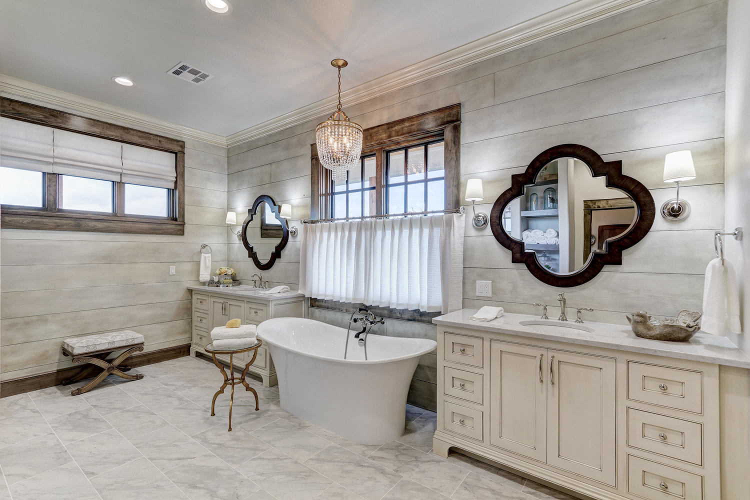
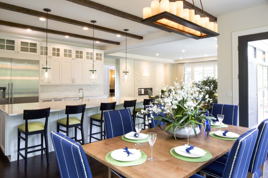
The Power of Home Fragrance

It’s one of the first things you notice when you enter a room. It evokes memories: a grandmother’s cooking, a mother’s embrace, a day at the beach. It’s powerful enough to stir emotions and yet often overlooked when designing a room.

Fragrance.

A pleasing fragrance can soothe or energize; it can even suggest a completely different atmosphere (e.g., a candle with the fragrance of a mountain forest burning on a kitchen table in Manhattan). Because everyone experiences scent differently, it’s a good idea to choose more complex scents so each person can detect their favorite note. The best fragrances achieve a perfect balance of top, middle, and bottom notes.

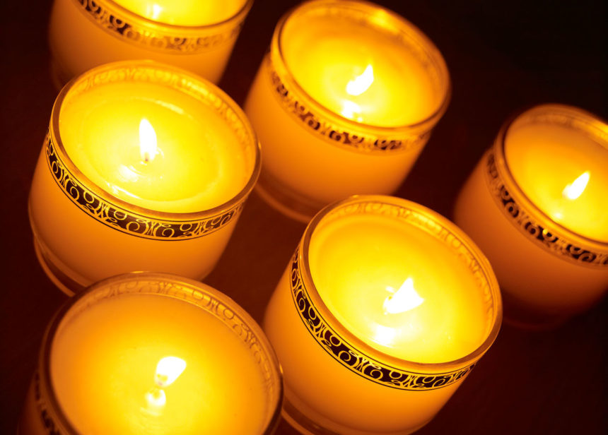
  • The top note is the first thing you detect when taking the lid off a candle or opening a jar of essential oils. Good top notes suggest freshness: citrus, herbs, a touch of ginger.
  • The middle note usually emerges about fifteen minutes after a candle is lit. The middle notes give a fragrance its personality, whether it’s a fruity, floral, or spicy note.
  • The base note is the scent remaining in the room long after the candle has been extinguished. Woodsy, musky aromas add elegance and depth and often work well in this layer.

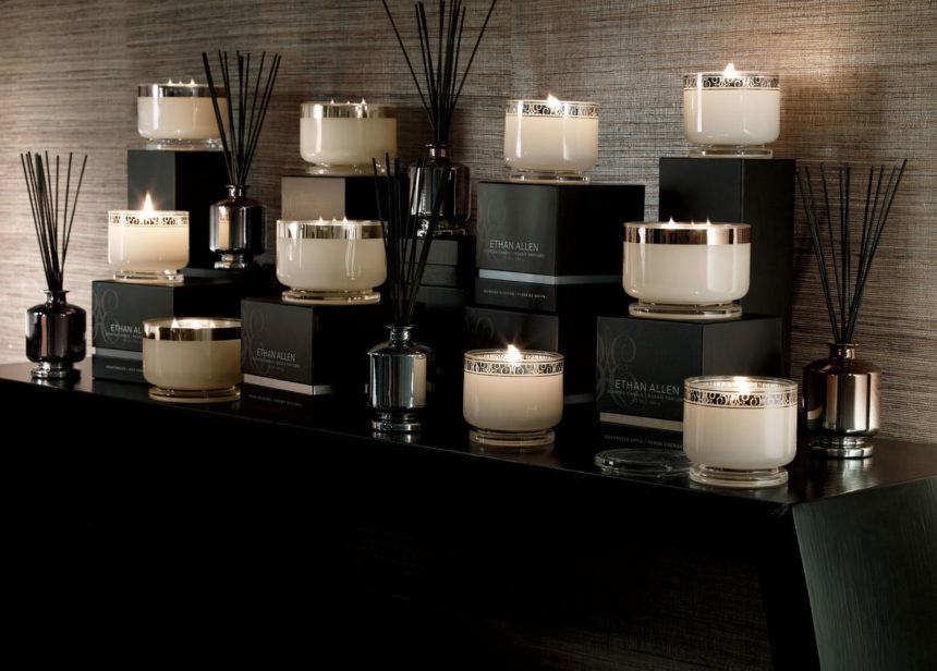
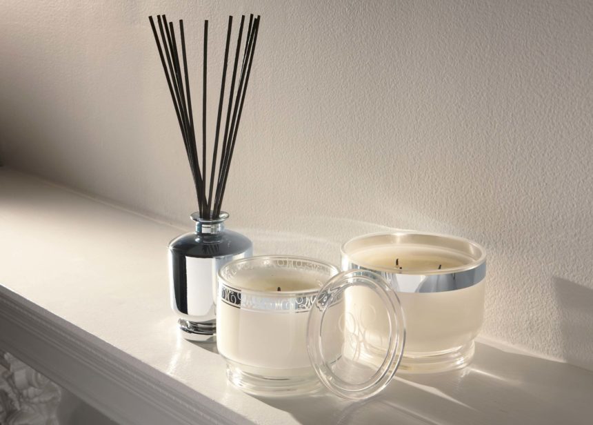
When we design fragrances at Ethan Allen, we draw from five categories of scents and present them in varying sizes of candles, each with a minimum burn time of 40 hours. We also create diffusers, in which reeds are immersed in scented oil to soak up fragrance and disperse it throughout the room. Diffusers last until all the oil has evaporated and are easily refreshed by adding more oil.

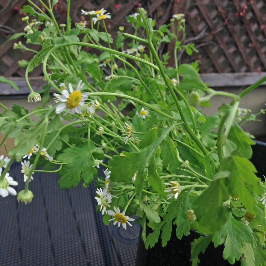
  • Floral. Morning Blossom blends an initial top note of citrus with a heart of jasmine and violet over base notes of patchouli and vanilla.
  • Ozonic or spa. The freshness of coconut, the sweetness of honey, jasmine, and vanilla, and a hint of sandalwood make our Cashmere Petals fragrance unforgettable.
  • Citrus. With Sparkling Citrus, we blend strong top notes of tangerine and citrus zest with jasmine middle tones and a base of white woods.
  • Woodsy or smoky. In Hearthwood, a top note of orange blends with a heart of clove and heliotrope; the base note of warm spice lingers long after the candle has been blown out.
  • Fruit. To keep a fragrance like Enchanted Apple from being too overpowering, we add notes of lilac, peach nectar, tonka bean, and oak moss.

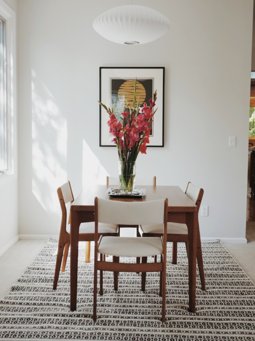
Whatever your reason for selecting a home fragrance—setting a mood, creating an atmosphere—don’t forget to include your favorite fragrance in your final room design. It’s an invisible touch that makes all the difference.


The couple walked into the West Des Moines Design Center on a whim. They weren’t at all sure they were in the right place. They told design associate Paige Mongar they had a statement room to furnish, with a very particular look in mind: modern, with midcentury and Scandinavian notes.

“They thought Ethan Allen was only associated with traditional and classic design,” says Paige, our latest Design Star, but they knew our quality was unparalleled, so they were curious to see our product line.”  Without hesitation, she reassured them that Ethan Allen offered the chic, minimalist styles they were after.

“They needed to furnish the vaulted living room of their 1988 contemporary,” she explains. “There’s a balcony above, and the living room is open to a well-defined dining area. They wanted to improve the flow and make the space more conducive to entertaining.”

The couple “favored a monochromatic palette with minimal pops of color,” says Paige. “They were looking for furniture that would reflect their love of Scandinavian and midcentury design. They wanted to highlight their artwork—and a beloved midcentury dining set and bookcase they’ve had since the 1960s.”

Paige confidently pointed them in the direction of modern, streamlined pieces, such as the delicately curved Apollo sofa, the Elgin chair, and Rowan buffet. She followed up with a house call and a detailed proposal—and the end result is this stylish and sophisticated space.


Facing Apollo sofas provide pleasing symmetry; their subtle curves invite conversation.


The scale of the room allows for generous seating—and good flow.

The Elgin chair is a midcentury-style icon; a variety of textures adds warmth to the room.

The Rowan buffet provides storage, a serving surface, and a base for showcasing art.

The vintage midcentury dining set is complemented by a Woven Symmetry Rug.

Corinne chairs create a lovely vignette—and an appealing corner reading nook.


Ethan Allen Design Star, Paige Mongar


Art, like beauty, is in the eye of the beholder. Art is personal. What moves one person may do nothing at all for someone else. Enter our custom art program, an opportunity for you to enjoy art—from landscapes, abstracts and pop art to portraits, geometrics, photographs and more—on your terms.

Shawn Lang spearheaded the development and launch of our custom art program while director of wall décor for Ethan Allen (he’s now a social media consultant for us). We asked him a few questions about how he conceptualized it—and what makes it unique.

How did you visualize the custom art program before you launched it?

Shawn: When we decided to update the existing custom art program, we knew we wanted to design a simple, user-friendly program for both our designers and clients. We wanted it to have a fresh look and offer a wide variety of artwork to capture all lifestyles, so we included traditional landscapes, contemporary abstracts, photography, and transitional pieces that can work in any room.

Did you work with artists who already have pieces in the Ethan Allen collection?

Shawn: We did include artists we’ve worked with in the past. At the same time, we also added new artists to the mix—we thought they would provide the new assortment with a fresh update. All in all, we added more than 180 new images to the collection.

From your perspective, what makes the new program special?

Shawn: I think the best thing about it is that we can refresh the assortment quickly. We can easily add new imagery as trends evolve, so the collection is always relevant.


How does it work?

Shawn: We designed the process to be easy for anyone to do in just a few quick steps:

  • First, launch the custom art creation tool.
  • Then browse our selection of works. You’ll find a wide array of styles and genres.
  • Choose to have your work printed on either paper or canvas.
  • Decide on the scale that works best for your room: small, medium, or large.
  • Preview your art in dozens of frames, in a wide range of styles to match your décor.
  • Add options like mats, pen lines, bevels, fillets, or liners to really make it your own.
  • Preview your artwork so you can see exactly what the finished piece will look like. You can even view it against different wall color samples to get an idea of how it will look in your room—before you buy.

What happens once it’s ordered?

Shawn: Once your custom art piece is created, it’s sent to our Passaic, New Jersey, workshop to be framed by hand. In the workshop, mats are cut by hand, and pen lines are drawn by hand. Our artisans have learned and honed their skills over many years, and I think the quality they produce really differentiates us from other custom art programs out there. No detail is too small for them.

If you have any questions about our custom art program, visit a Design Center, or chat with a designer online. At the end of the process, you’ll have a piece of art that’s truly your own.


No matter the style or scope of a project, Rose T. Bien-Aime says her goal is always to provide her clients with “a place of peace and comfort.” Rose, who is a consultant in our Rockville, MD, Design Center—and our latest Design Star—also believes we should infuse our homes with a little romance every chance we get.

“My goal is to make my clients feel sophisticated and romantic every day,” she says. “As a designer, I love to create spaces that are timeless—and sexy!”

Rose adds romance by layering rooms with classic pieces and curated touches of glam. She prefers pleasing palettes that lean toward neutral, with unexpected pops of color. She loves to marry clean lines and shapely silhouettes and thinks no space is finished until it shines—literally (she adores silver and gold finishes).

When Rose is designing a room, every element matters. “Window treatments, carpeting, lighting, mirrors, accents, and art—they all play significant roles in raising levels of sophistication and romance,” she says. “But it’s the perfect mix of materials, finishes, and furnishings in a room that come together to lift your mood and warm your heart. For me, that’s romantic.”

HONEYMOON SUITE
Rose’s client wanted a room that exuded the luxury of a five-star hotel, “an environment that made her feel like a queen at night and even more glamorous in the morning.” Rose did it with Hollywood-inspired metallic wallpaper, wall-to-wall silk drapery panels in charcoal gray, and an oversized crystal Whitney chandelier over the bed. Gideon chairs complement the upholstered Charlton Bed. The finishing touch: All that reflected light!

IN A MIDCENTURY MOOD
This sophisticated living room has all the hallmarks of a period piece. It’s designed around a pair of Corrine chairs, which Rose describes as “sexy from every angle.” The cool gray-and-cream palette is inherently elegant. The perfect complement to Corrine: the curves on the glass Cirque coffee table and the Gracie end tables. The Vivica console and the Xanadu bench add midcentury drama.

WINE AND DINE

Rose’s clients wanted a timeless dining space that works as well for large parties as it does for as candlelight dinners for two. The stunning Barrymore table sets an elegant tone with its graceful saber legs and exotic wood finish. The antiqued mirror glass and circular-cut mullions of the Brandt buffet provide instant ambience. Rose mixed Verlaine side chairs with Verlaine armchairs for a whimsical touch. Glass, crystal, and nickel provided sparkle!

GREAT EXPECTATIONS

Just how romantic is a double staircase foyer?  “It’s ‘Gone with the Wind’ all over again,” says the designer. The balustrade is very refined, while the gorgeous millwork speaks for itself. Rose played up the room’s symmetry with two Wellesley benches in a neutral patterned fabric. She added glitz with the placement of Starburst mirrors above the benches, officially setting a romantic tone for the rest of the home.

STYLE IN THE ROUND

What happens when a dining room doubles as the entryway to a home? For Rose, the answer is “a quiet storm of classic elegance, romance, and undeniable flair.” The modern, sexy lines of the Ashcroft dining table paired with the curvaceous Penelope chairs deliver just the combination she was after. Everything else—from the chandelier and area rug and to the simple Cora bowl—enhance the core design.

URBAN GLAM

This space is all about modern drama, with the tufted Shelton sofa setting a sophisticated mood. Rose chose it to gracefully anchor the Kyle wing chairs, as well as the uniquely styled Grayson chair in the foreground. The


We’re so in love with these pressed botanicals, we decided to repost this again for everyone to enjoy!

Julie Franklin’s classic botanicals are naturally lovely. Natural, because they’re made from genuine sprigs, leaves, and stems—and lovely, because the artist chooses the delicate specimens carefully, then preserves and presses them herself.

Julie started gathering flowers and leaves in her native Georgia with her cousin, a botanist who collected specimens for research, and soon learned how to preserve her pretty finds. First, she places a fresh botanical specimen between leaves of paper in an old-fashioned wood press, then hand-tightens the press as the specimen dries. When the press is opened, it often reveals exaggerated curves and colors—unexpected beauty captured in two dimensions.

We frame Julie’s botanicals in our New Jersey workshop—as befit these distinctive works of art. Our artisans mount a pressed specimen onto deckle-edge archival paper, along with an identifying card, and float it in a solid wood frame with an aged gold fillet, under museum-quality UV glass. Our botanical collections include 26 unique specimens set against a white background, and 12 set against black. Hang them alone, in pairs, or in groups to create a stunning gallery wall.


The ancient art of block printing has been around for 2,000 years. As a traditional method of textile design, it’s held up surprisingly well. Block printing is essentially the transfer of an image or design (in this case, coral) to a surface (a soft, white linen-and-cotton blend fabric) from a carved material (rubber, although wood is widely used) covered in ink (ours is water-based and nontoxic).

PRINTING OUR PILLOW, STEP BY STEP
An artist starts by carving the coral design into a piece of rubber to create a stamp that can be used again and again. The stamp is then glued to a piece of plexiglass, and ink is rolled out onto the raised stamp, ensuring the pigment is applied evenly. The pillow face fabric is placed on a padded surface, and the plexiglass is then turned over and positioned onto the fabric, inked side down. Pressure is evenly applied to the back of the plexiglass. While the fabric is held down, the plexiglass is then cleanly lifted away. The fabric is hung to dry before being sewn into the finished pillow.

Our Fan Coral Pillow is a contemporary example of the time-honored technique that’s widely associated with India, China, and Japan. The beauty and fine details of the natural sea fan coral are printed by hand onto cloth to produce an original, strikingly modern design—done the old-fashioned way. Our gorgeous block-printed pillows are made close to home, in a workshop in downtown Chicago. Each print is inked by hand, so variations will occur—only adding to the natural beauty of the piece.


There’s a science to symmetry, and a host of reasons why we humans like it so much.  It’s a design principle that has guided artists and architects for millennia. Symmetry is what happens when the elements on both sides of an axis are the same. It’s restful. It creates balance. And balance creates harmony. Too much symmetry can feel forced or fussy, but when it’s done well, it’s both visually agreeable and subliminally soothing.

Alicia Zupan knows this instinctively, which is why she does symmetry better than most. And that’s one of the reasons Alicia, a member of the Ethan Allen design team in Oklahoma City since 2012, is our latest Design Star.

For many designers like Alicia, symmetry is a go-to tool that never disappoints. “Symmetry is found in nature through reflection, repetition, and rotation,” explains Alicia.  “and I use all three in many of my projects.” But while symmetry creates balance, it’s not the only path to harmony. “I also use asymmetrical pieces to create balance,” she says, “but they must be chosen well. It’s important they are of same scale or visual weight to create a feeling of equilibrium.”

This is how Alicia does it:

AZ: “This entry wall was large, open to the living and dining rooms, so it needed a statement that said, ‘Welcome, come have a seat!’ To create that, I used mirroring Lucca chests and aged bronze industrial mirrors on either side of the Evette settee, the focal point of the space. The repetitive use of artwork above the settee is called translational symmetry. To add interest and break up the uniformity, I added asymmetry in the form of tabletop accents and a patterned pillow.”

AZ: “This is one of my favorite bathrooms. There’s lots of symmetry here. We wanted the freestanding bathtub to be the focal point of the room. The two Quatrefoil mirrors over the matching vanities established support and structure for the focal point. Custom sheers and the Alexa chandelier created an element of romance; a small bench and Belle table deliver function and interest.”

AZ: “Two matching Rand chairs flanking the fireplace and twin Jocelyn coffee tables create powerful symmetry in this room. The Mansfield and Oxford sofas are similar in scale, so they add balance. The use of different fabrics and accents brings in asymmetrical notes.”

AZ: “The statement-making cabinets behind the Mansfield sofa anchor this space with pure symmetry. I balanced out the visual weight of the Bradford Rent table and clear glass lamp with the Emerald drum table on the other side of the sofa. The simple basket and Aubergine Plum vases are very different, but nevertheless add equilibrium.”

AZ: “Here I used ‘radial symmetry’ in the way I positioned the Chrystiane and Dayton chairs around the Cooper table, which is the central axis in the room, along with the Navesink chandelier overhead.”

AZ: “I love using pairs to create symmetry in a vignette. Here I hung a pair of pressed botanicals over the Wayfarer console and tucked a pair of Corbin ottomans underneath.”

AZ: “Two Vivica chests and matching lamps on each side of the Jensen bed create balance and serenity. The graceful Belfiore bench softens the lines of the headboard and repeats the rosette motif of the artwork above the bed.”


Farmhouse style has been a mainstay of interior design forever—or at least it seems that way! It’s easy to see why: It’s homey, relaxed, and authentic. Every region has its own take on it—from ranch (think Texas) and plantation (Georgia) to homestead (New England). There are style subsets, too, from traditional to Tuscan. With so many ways to crush on farmhouse style, it’s no surprise it’s branched out far beyond the countryside. Julie Goss, a designer in our Vienna, Virginia, Design Center, recently helped a downsizing couple furnish a new home in farmhouse style—in a penthouse in the heart of Washington, D.C.

We caught up with Julie, one of our Design Stars, recently and asked her to share her story.

EA: A farmhouse and a penthouse are as different as any two homes can be! How did you make the space into something it’s not?
JG: The architecture was on our side: wood floors, French doors, nice ceiling height. It was neutral enough to let us move it in the direction we wanted.

EA: What was the look your clients were going for?
JG: Traditional farmhouse with a black-and-white color palette. The wife is an avid photographer, so we needed to “hide” a home office in plain sight, which we did with two Sayville double-door cabinets that flank the fireplace, and the petite Turner desk in another corner. It’s the perfect blend of style and function, in a space where every inch mattered.

EA: What existing pieces did they want to incorporate?
JG: There was a long list: a sofa, trunk/coffee table, a drop leaf table, ladderback chairs, an art collection, and lots of antiques.

EA: What do antiques bring to the design table?
JG: I love working with antiques. They deliver an extra layer of character, texture and history. Things that are handmade bring soul and make a space special. Antiques can be integrated into any type of project. I especially love to juxtapose them with very modern or tribal pieces. Antiques wake it all up.

EA: How did you embrace farmhouse style with the new pieces?
JG: We chose styles that are relaxed and eclectic. Twin Devonshire swivel gliders in a bold check add style without overwhelming the space. The neutral rug gives the room a cozy, cohesive feel. Many of the accents feel vintage, so they blend right in. The weathered iron armillary, which was designed to impart a feeling of age, is a perfect example.

EA: The space is lovely; was there one secret to its success?
JG: The black and white color palette was the “special sauce” here. It’s timeless; it works with every style: traditional and modern, casual and formal. By keeping to a disciplined palette, we could make the space feel modern. Sometimes it’s daunting to bring in so much black, but it was needed to make the white pop. It turned out to be a very airy, open, and happy space. They love it!


How do you pull together a variety of traditional styles to create a fresh modern look? Ask our Design Star Brittany Whitney, who brilliantly balances myriad elements to create simple, stylized interiors. The award-winning designer from our Bellevue, Washington, Design Center believes less is more, and she’s passionate about expressing her clients’ ideas in ways that free them from clutter. See how Brittany blends different looks to create a crisp, sophisticated style.

We love how beautifully Brittany balanced traditional, fashionable, dressy, and casual styles to create this semiformal living room for a multigenerational family. Facing pairs of Suzette and Grayson chairs, upholstered in a fashionable blue and green ikat and Greek key pattern, respectively, complement the sleek style of the blue Abington Leather sofa with eye-pleasing symmetry.

Brittany opted for a pair of Corbin ottomans to allow traffic flow while keeping an open visual line to the kitchen. She strikes a balance once again, trimming them in a nickel nailhead for a more traditional twist.

The streamlined Hadley dining chairs complement the kitchen’s sleek style and are dressed in a classic navy-and-white stripe outdoor fabric to add a punch of fade-resistant color. Nickel nailhead trim echoes the traditional touch on the Corbin ottomans while the green fabric on the counter stools ties to the living room’s fashionable color story.

A bedroom by the water gets a chic nautical nod with a navy blue and white palette. Brittany creates a contemporary feel, balancing bordered custom window treatments and pillows with a floral Boucle Linen pillow and Blue and White Porcelain vase.

Blue accents make simple yet powerful design moments throughout the space. A blue contrast welt on the Nassau ottoman makes a striking statement while small and large Brayton Indigo vases capture the natural daylight from the window and add a cool, luminous touch.

Brittany balances the simplicity of the office space with a blend of patterns in the Tulu rug, Stamp art, Greek key upholstery fabric, and custom striped window treatments.