How do you pull together a variety of traditional styles to create a fresh modern look? Ask our Design Star Brittany Whitney, who brilliantly balances myriad elements to create simple, stylized interiors. The award-winning designer from our Bellevue, Washington, Design Center believes less is more, and she’s passionate about expressing her clients’ ideas in ways that free them from clutter. See how Brittany blends different looks to create a crisp, sophisticated style.
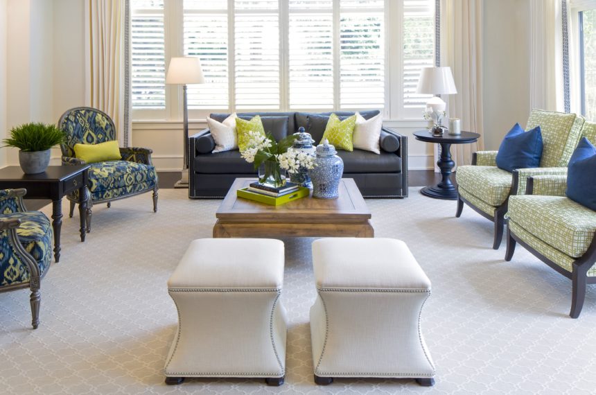
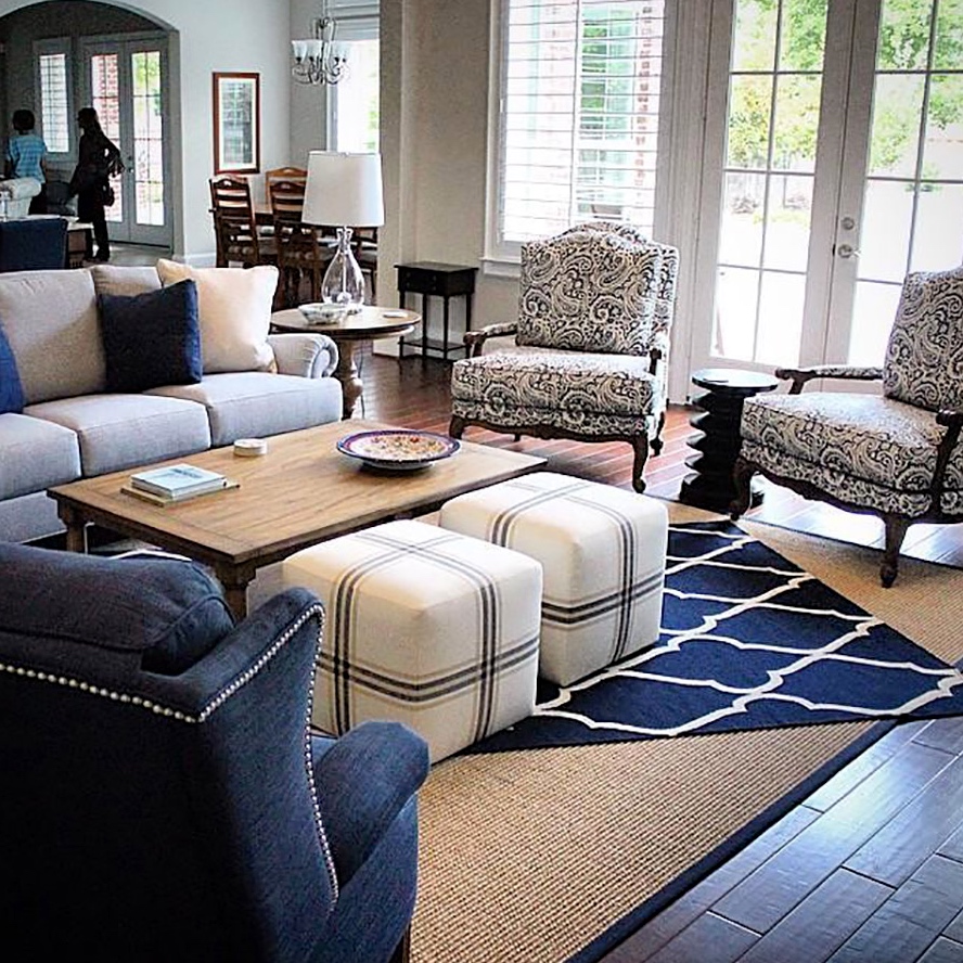
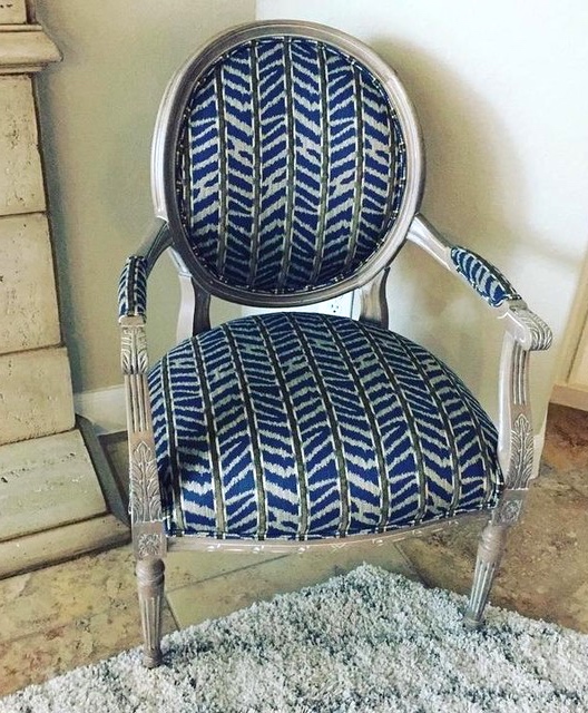
We love how beautifully Brittany balanced traditional, fashionable, dressy, and casual styles to create this semiformal living room for a multigenerational family. Facing pairs of Suzette and Grayson chairs, upholstered in a fashionable blue and green ikat and Greek key pattern, respectively, complement the sleek style of the blue Abington Leather sofa with eye-pleasing symmetry.
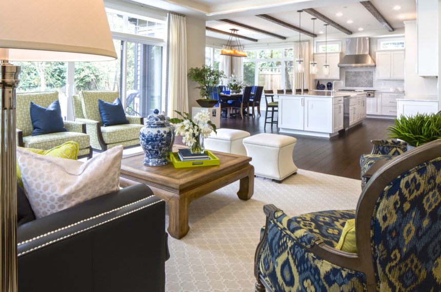
Brittany opted for a pair of Corbin ottomans to allow traffic flow while keeping an open visual line to the kitchen. She strikes a balance once again, trimming them in a nickel nailhead for a more traditional twist.
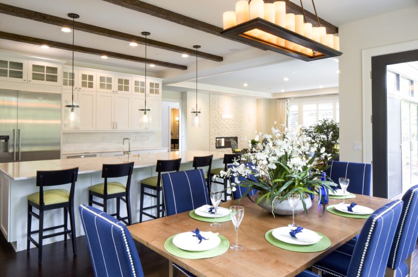
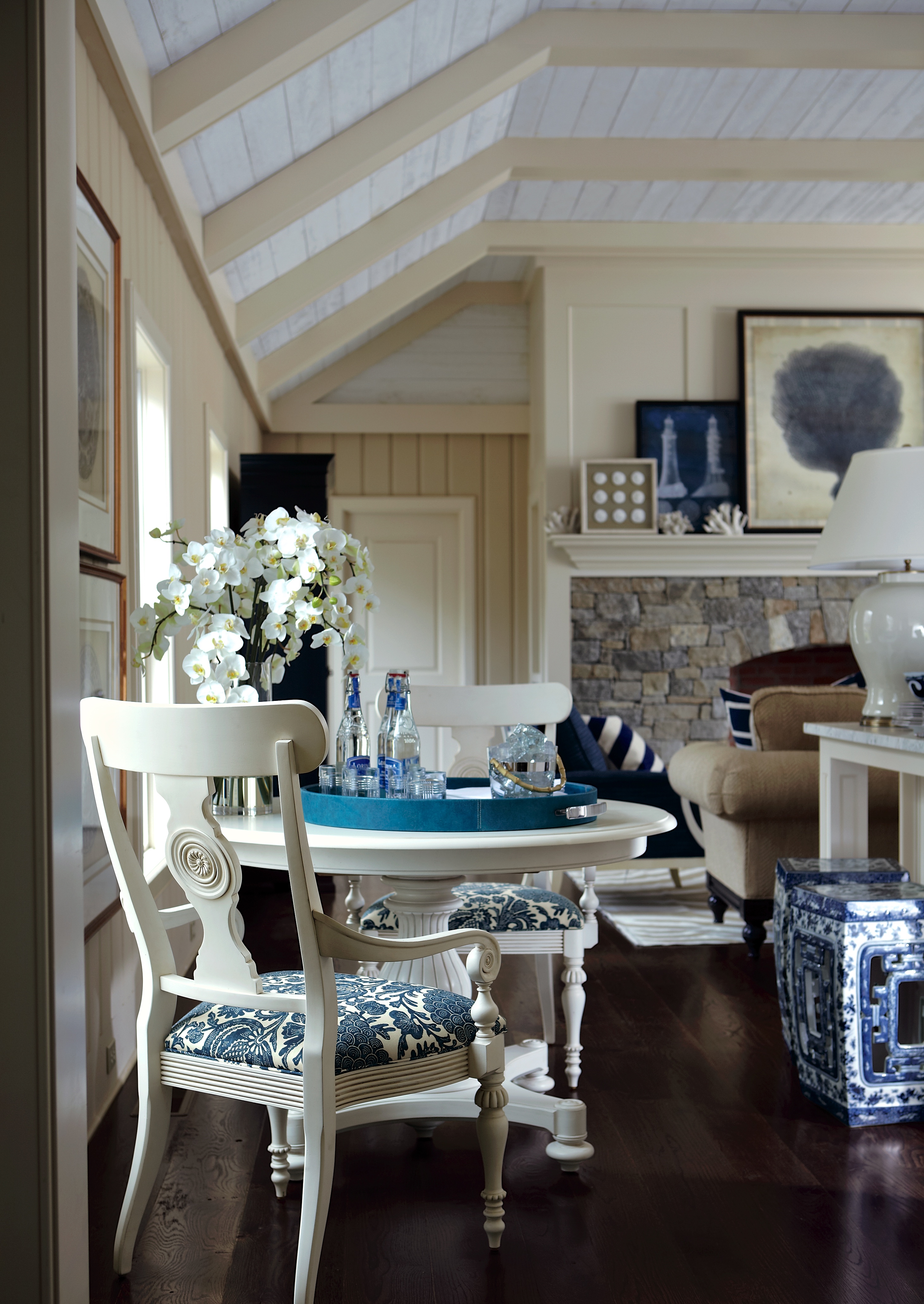
The streamlined Hadley dining chairs complement the kitchen’s sleek style and are dressed in a classic navy-and-white stripe outdoor fabric to add a punch of fade-resistant color. Nickel nailhead trim echoes the traditional touch on the Corbin ottomans while the green fabric on the counter stools ties to the living room’s fashionable color story.
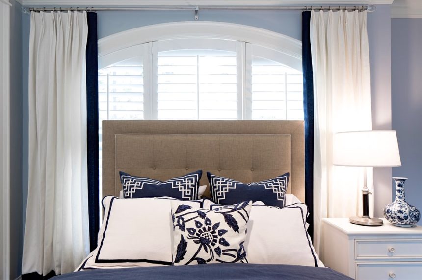
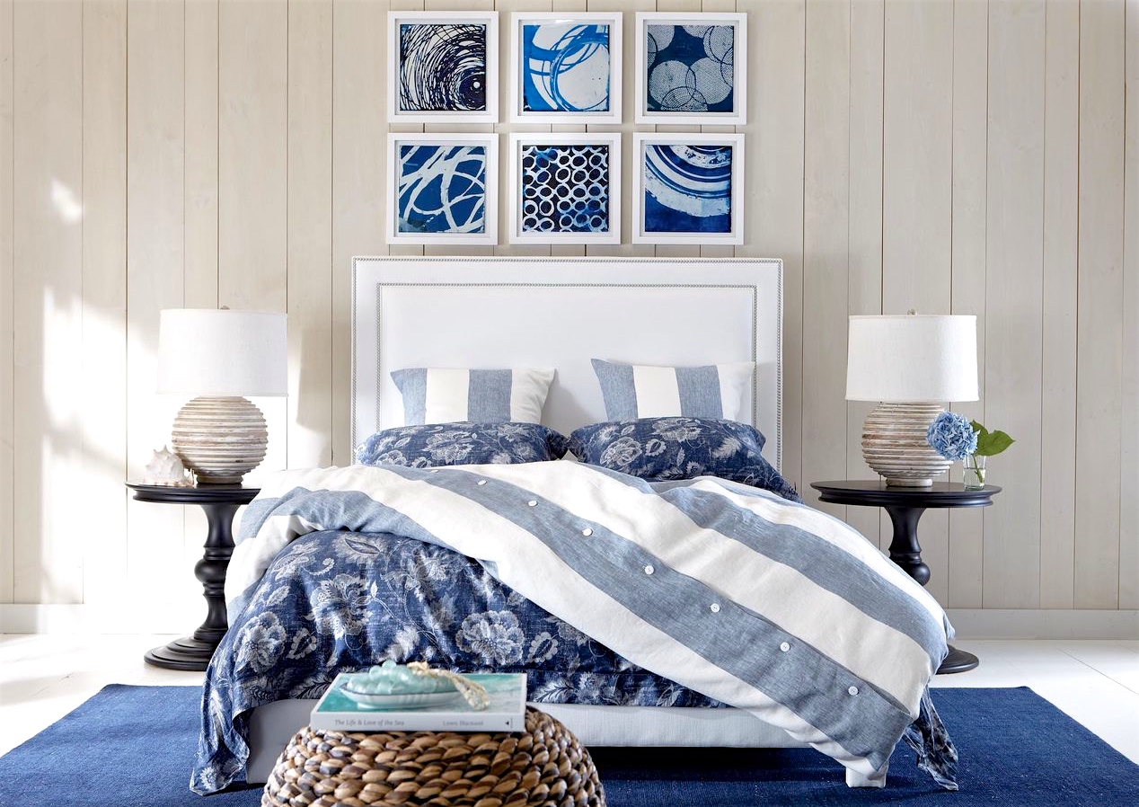
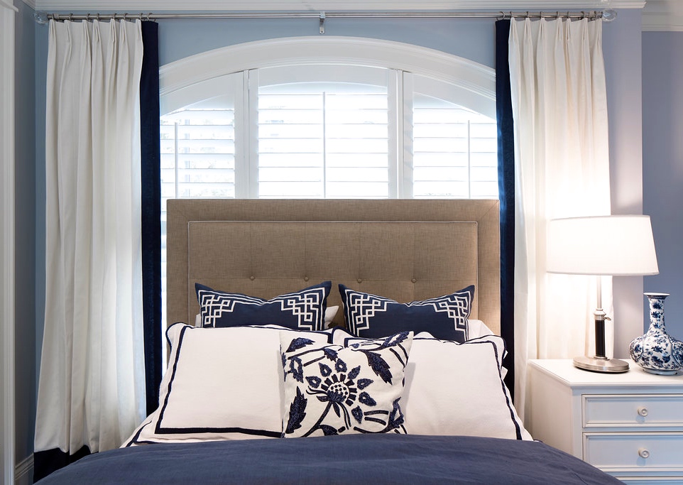
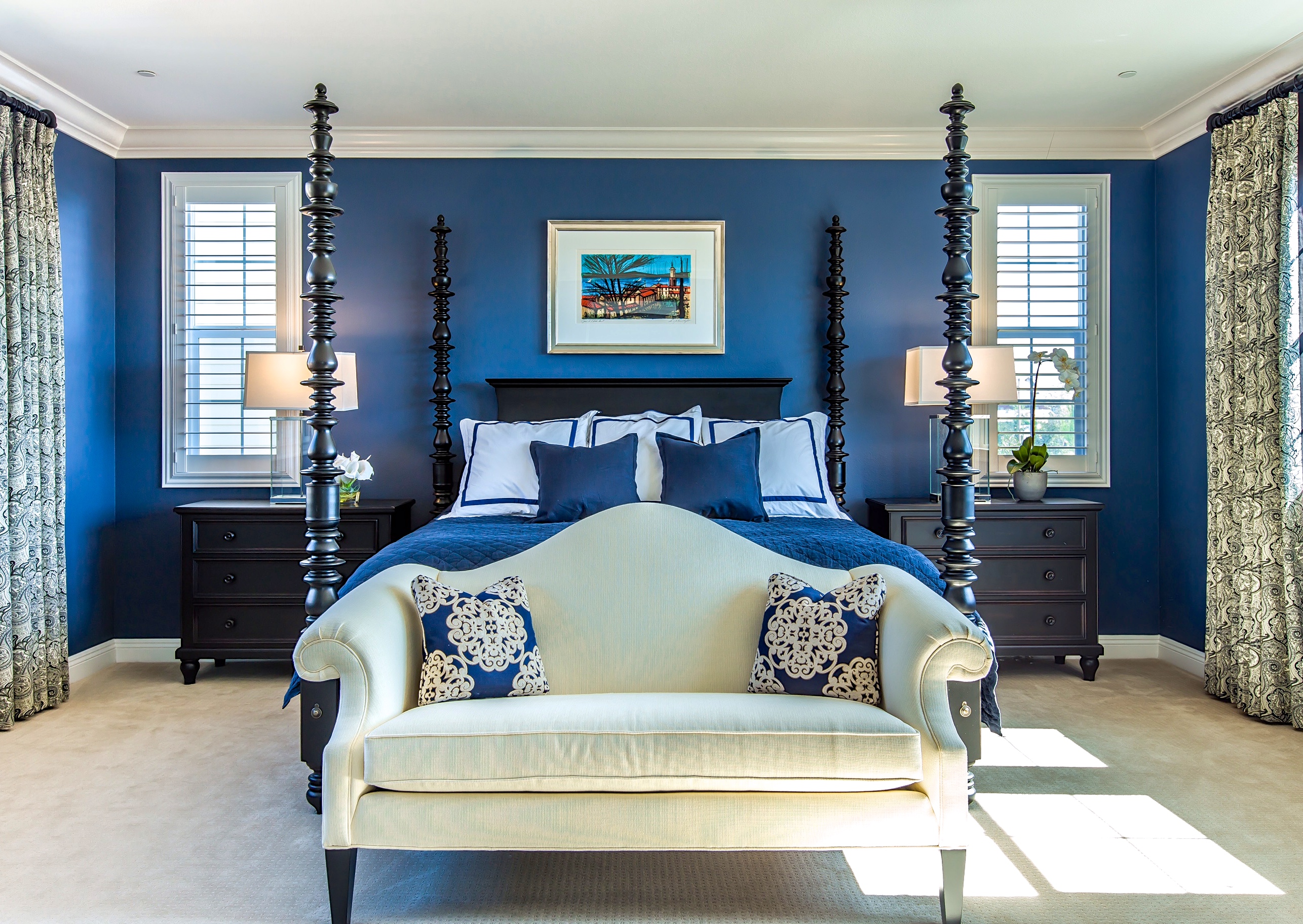
A bedroom by the water gets a chic nautical nod with a navy blue and white palette. Brittany creates a contemporary feel, balancing bordered custom window treatments and pillows with a floral Boucle Linen pillow and Blue and White Porcelain vase.
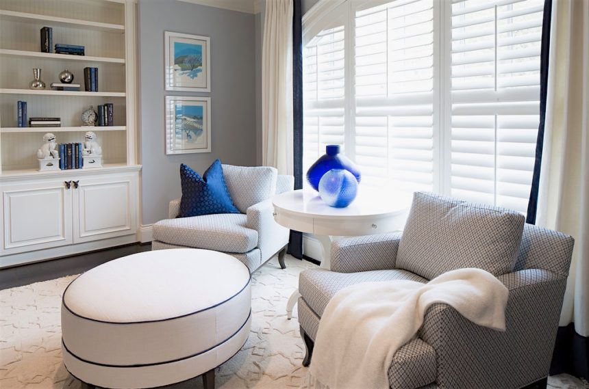
Blue accents make simple yet powerful design moments throughout the space. A blue contrast welt on the Nassau ottoman makes a striking statement while small and large Brayton Indigo vases capture the natural daylight from the window and add a cool, luminous touch.
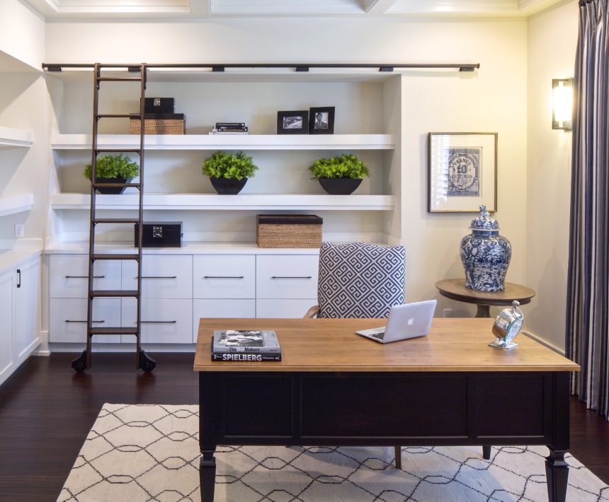
Brittany balances the simplicity of the office space with a blend of patterns in the Tulu rug, Stamp art, Greek key upholstery fabric, and custom striped window treatments.



Design Star Janet Morganti knows a thing or two about using the color blue in the home. Ok…she knows a lot more than that! The award-winning designer has been with Ethan Allen for twenty years creating interiors in the U.S. and abroad. Her design philosophy is, and always has been, to make clients happier and more comfortable in their homes—and that’s exactly what she did in two notable projects, where she used the classic blue and white color combo to create two very different desired looks.

“Blue can be very cool, but very calming,” says Janet. While she points out that pairing it with white can really make it pop, her projects demonstrate that the color combo isn’t just a nautical style. With the right mix of tones, textures, and styles, blue and white can be anything from dress-down to dressy. Take a look at how she used blue and white and pick up some pointers for yourself!

FARMHOUSE FORMALITY

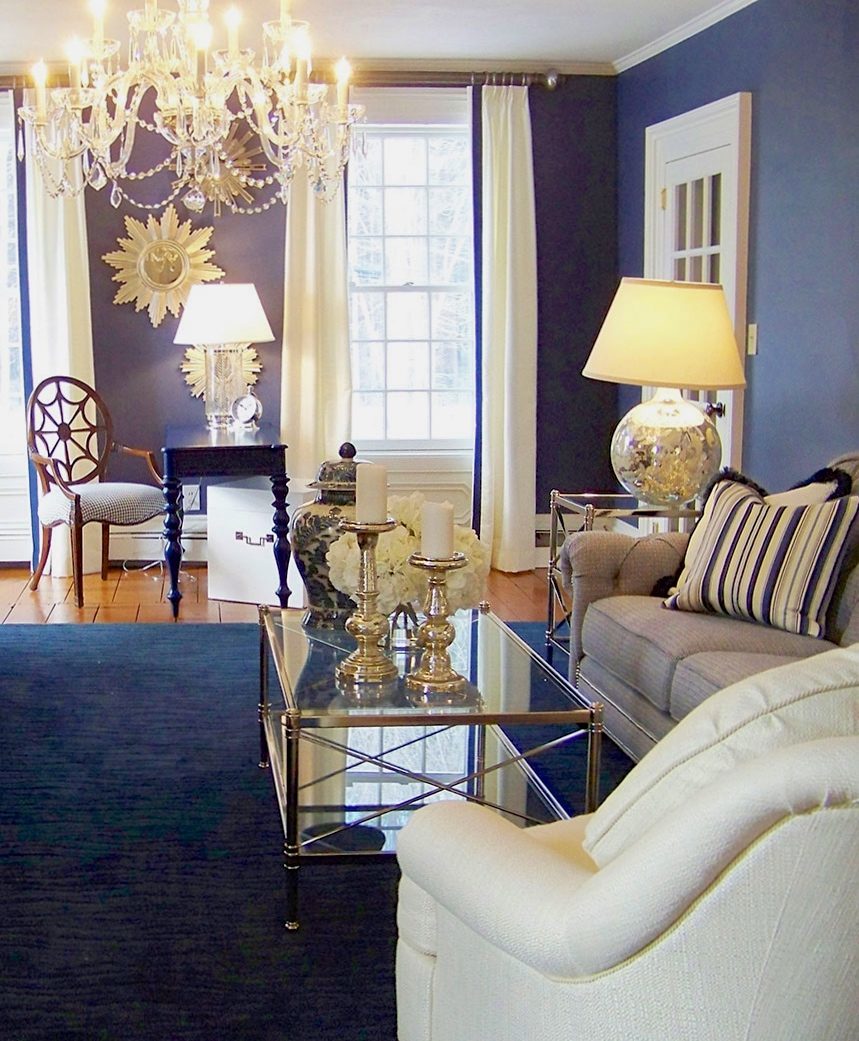
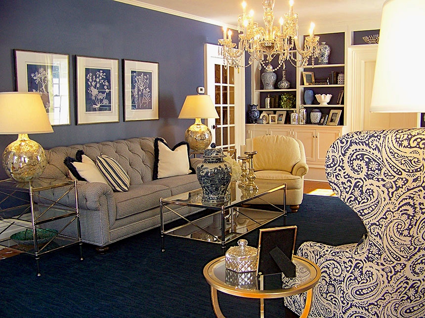
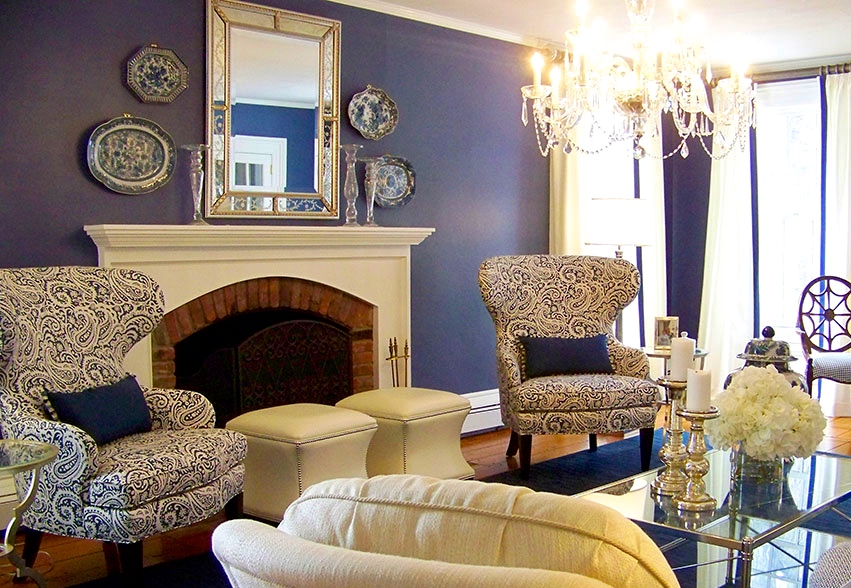
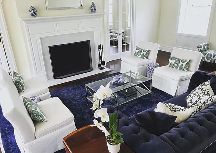
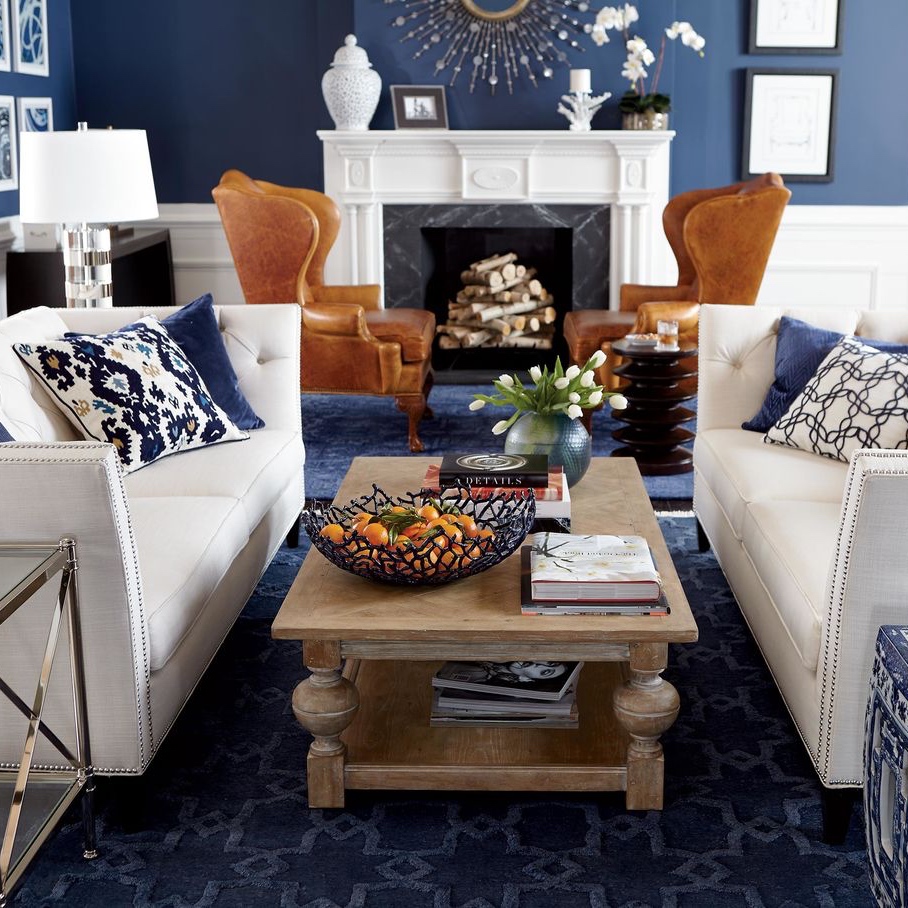
Janet took an unexpected formal twist in an older farmhouse-style home, choosing an inky blue and white palette to create a bright and cheery elegant look in the living room. Its well-appointed style is a mix of old and new—combining the client’s existing Ethan Allen pieces with new furniture and accessories in updated traditional styles.

Janet enhanced the glamorous quality of the blue with a tufted Chadwick sofa. She dressed the rest of the room up with metallic and glass Jocelyn coffee and end tables, along with dazzling accents. The deep blue wall color and lustrous Loomed Wool rug in navy create a rich backdrop for the room’s elegant furnishings.

A pair of Rand wing chairs upholstered in a blue and white paisley print fabric inspired the room’s overall style. Also a pair of white leather Corbin ottomans by the fireplace, as well as the spider back Cristal Chair by the windows, provide everyday functionality with a fashionable flair.

BEACHY KEEN COMFORT

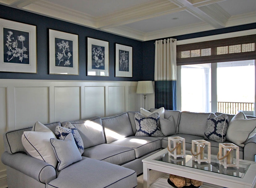
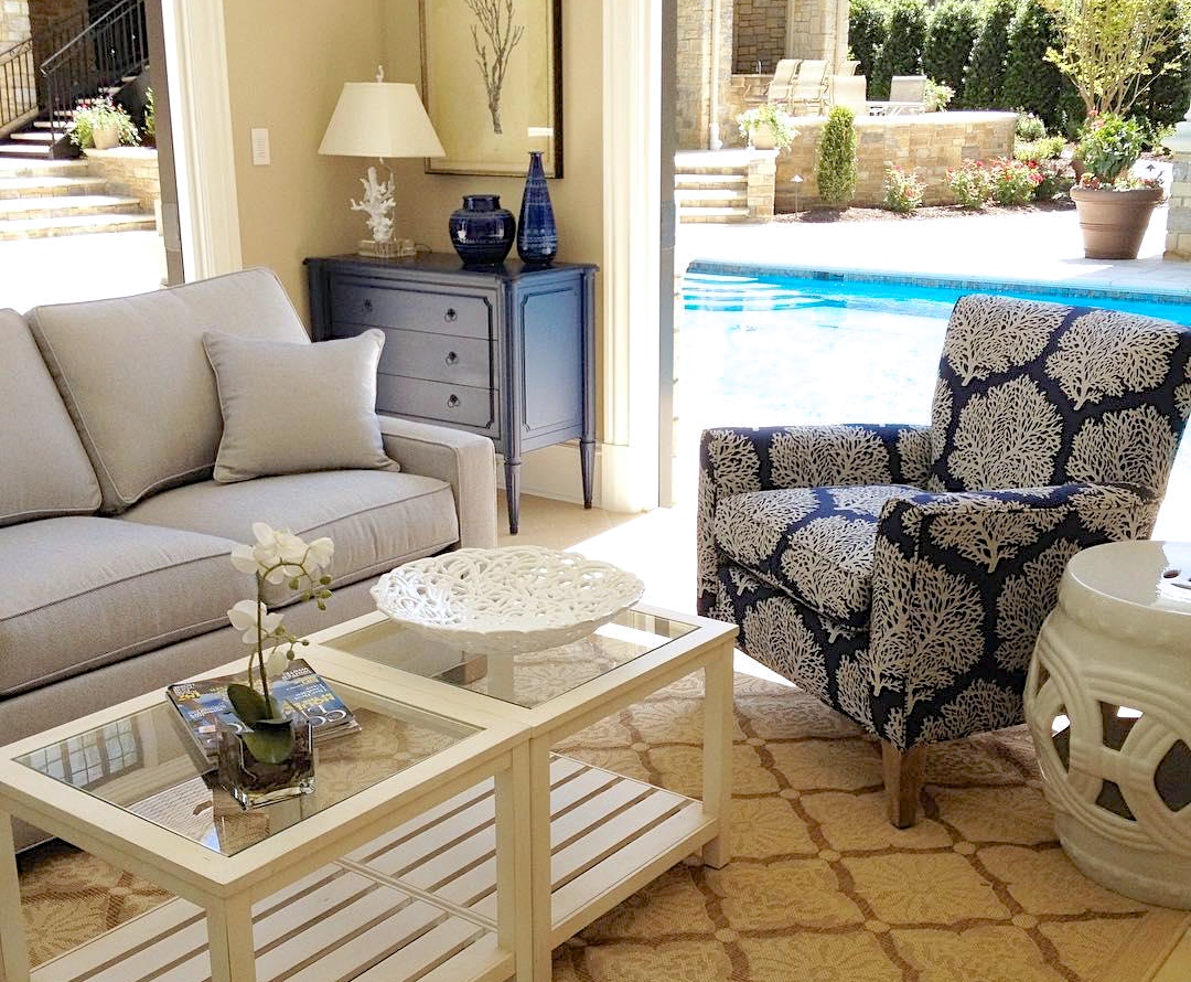
For a client with eight grandchildren and aging parents, a beach house family room needed to be comfortable (and resilient) for everyone from the age of eight to eighty. Janet turned to the crisp and classic navy blue and white color palette to create a coastal comfort zone for beach days to rainy days.

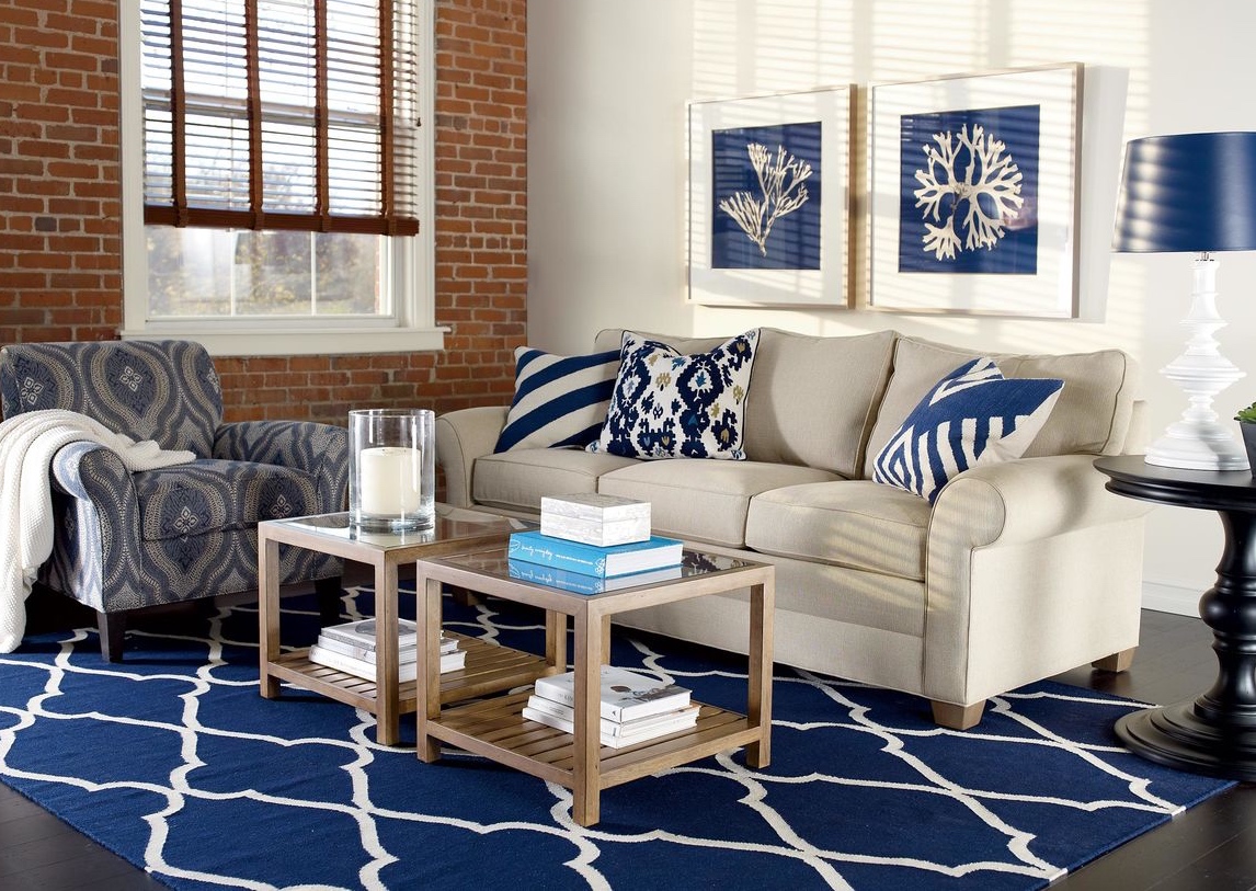
Janet strikes a perfect balance between comfort and style—and it’s all in the details. The Retreat sectional with chaise is upholstered in a soft, easy-care outdoor fabric with contrast welting, and accented with fashionable outdoor pillows. The artwork and custom drapery on the windows weave the blue and white story throughout the space with clean, crisp symmetry.

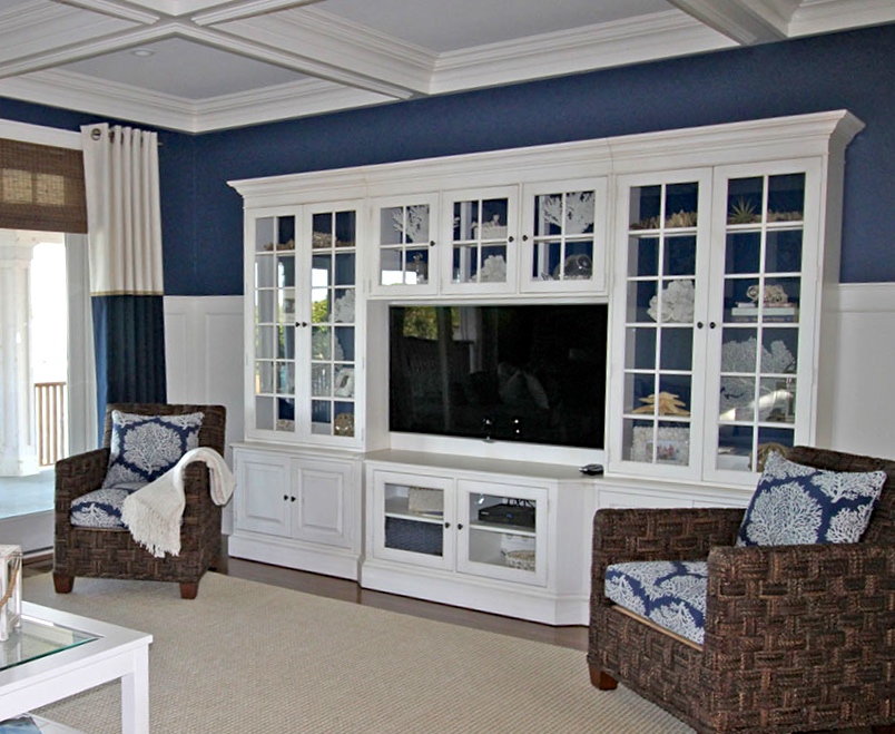
High performance meets high style: the indoor/outdoor rug handles all the high traffic beautifully while the Villa media center—finished in a striking white with contrasting navy blue interior—provides ample storage for kids’ games and electronics and displays chic coral accents.


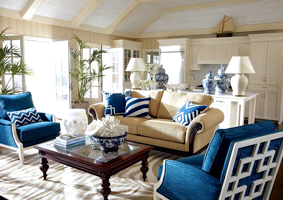
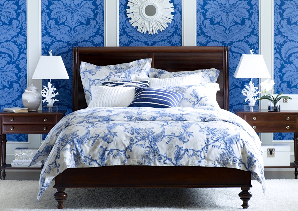
Blue and white. It’s a beloved combination with a rich history and global appeal. Think Chinese porcelain, delftware from Holland, French toile, Laura Ashley anything—and crisp, coastal interiors everywhere. You can’t help but appreciate blue and white for its versatility. We love blue and white for its “anything goes” charm, so throughout July the Daily Muse will be celebrating this primo palette, featuring Ethan Allen designs as well as rooms our readers have shared with us. Stop by often to discover new ways to use blue and white in your home.


Ethan Allen Style Team

Ethan Allen Interior Designer: Brittany Whitney

Ethan Allen Style Team

Ethan Allen Interior Designer: Natalie LeMier

Ethan Allen Style Team

Ethan Allen Interior Designer: Lorraine Wong

Ethan Allen Style Team

Ethan Allen Interior Designer: Annette Nielsen

Ethan Allen Style Team

Ethan Allen Interior Designer: Jessica D’Arpino

Ethan Allen Style Team

Ethan Allen Interior Designer: Kellily Johnson

Ethan Allen Style Team


This bookshelf makeover was part of a larger project completed by Julie Goss of our Vienna, VA, Design Center. She transformed the space with a few simple moves.

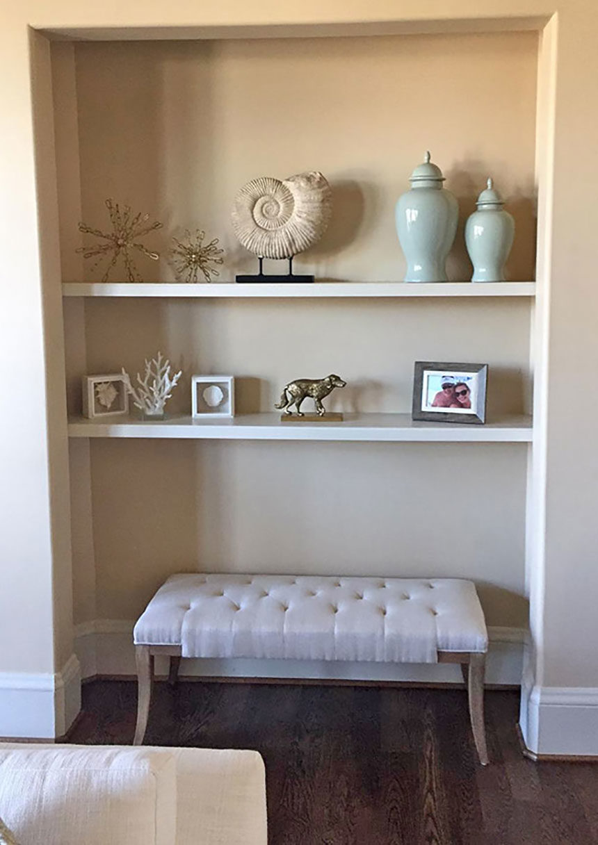
BEFORE: Recessed shelving lends itself to a well-composed vignette. Unfortunately, it was styled more like a stiff repository than a compelling display space. A bunch of disparate pieces, similarly scaled, does not a pretty sightline make

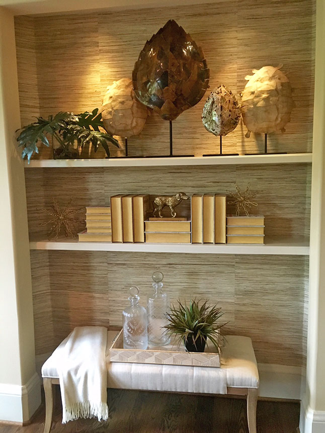
AFTER: Hanging grass cloth on the walls of the alcove was transformative. It introduced texture and warmth and set the tone for a more organic look. Julie kept the client’s bench but gave it life by adding a tray, soft throw, decanters, and some greenery. For the shelves, she chose pieces that were better scaled to fit the space, including objet d’art and some sculptural books. Accent lighting brought everything into sharp focus. Done!