Farmhouse style has been a mainstay of interior design forever—or at least it seems that way! It’s easy to see why: It’s homey, relaxed, and authentic. Every region has its own take on it—from ranch (think Texas) and plantation (Georgia) to homestead (New England). There are style subsets, too, from traditional to Tuscan. With so many ways to crush on farmhouse style, it’s no surprise it’s branched out far beyond the countryside. Julie Goss, a designer in our Vienna, Virginia, Design Center, recently helped a downsizing couple furnish a new home in farmhouse style—in a penthouse in the heart of Washington, D.C.

We caught up with Julie, one of our Design Stars, recently and asked her to share her story.

EA: A farmhouse and a penthouse are as different as any two homes can be! How did you make the space into something it’s not?
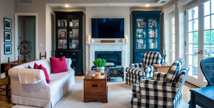
JG: The architecture was on our side: wood floors, French doors, nice ceiling height. It was neutral enough to let us move it in the direction we wanted.

EA: What was the look your clients were going for?
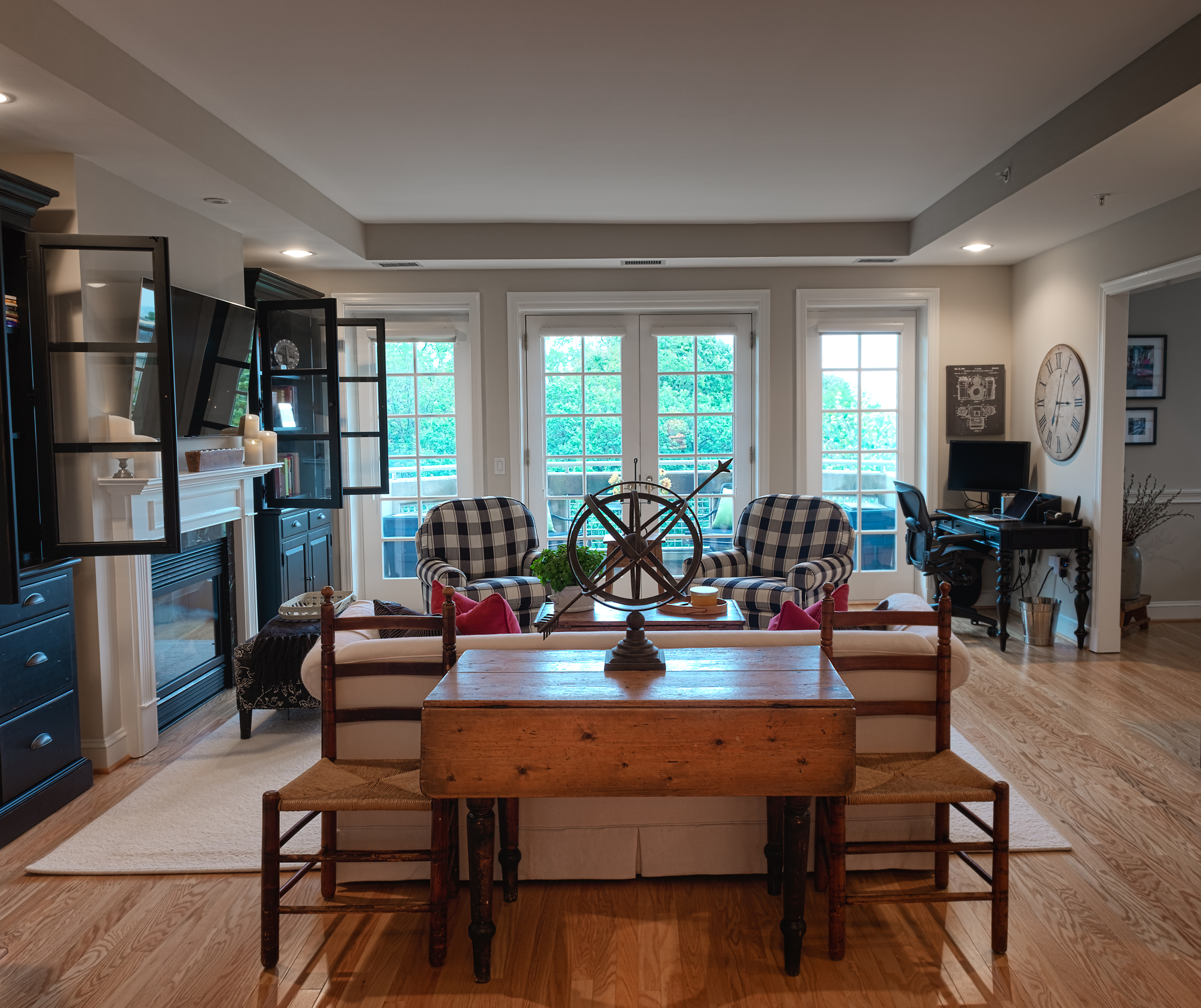
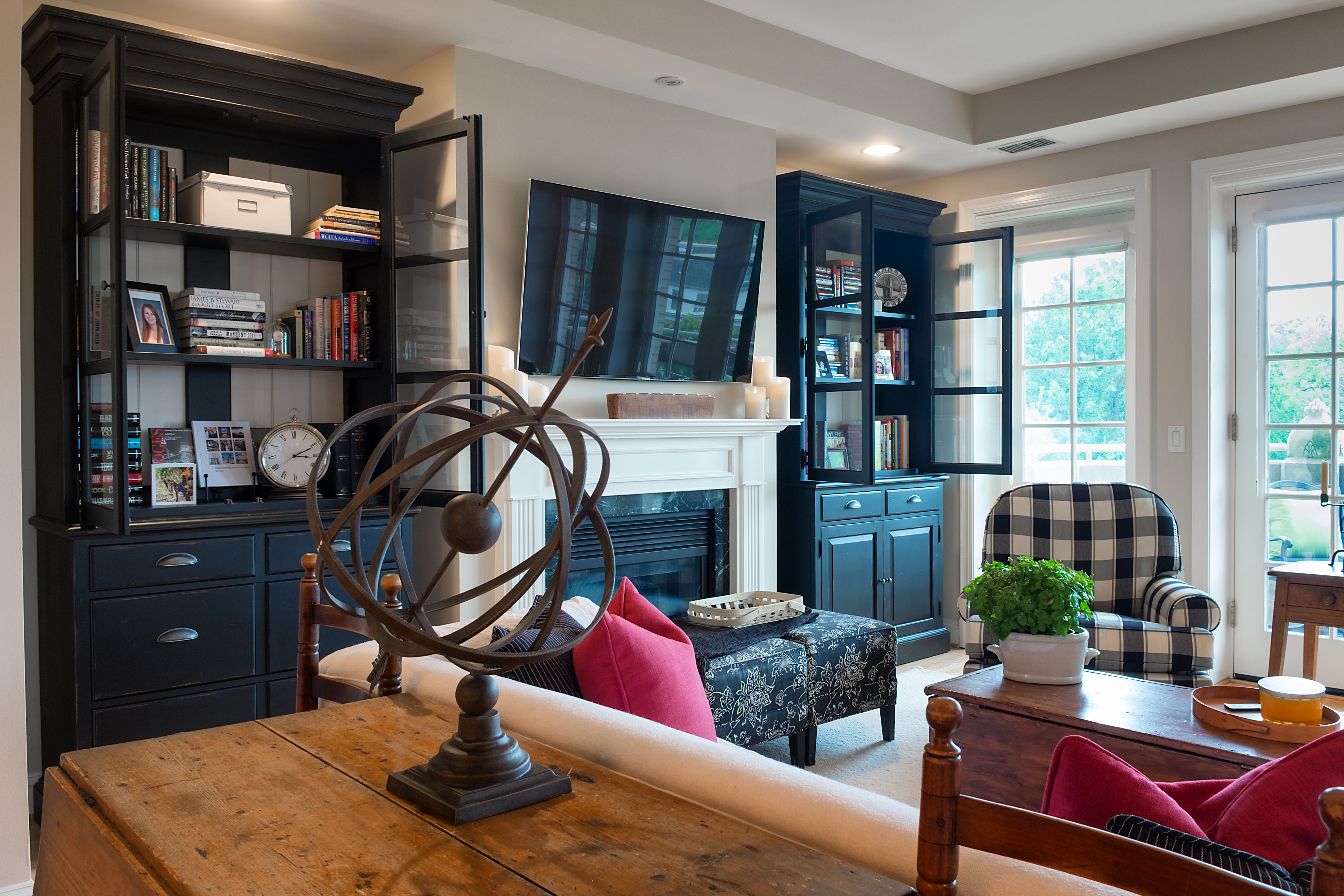
JG: Traditional farmhouse with a black-and-white color palette. The wife is an avid photographer, so we needed to “hide” a home office in plain sight, which we did with two Sayville double-door cabinets that flank the fireplace, and the petite Turner desk in another corner. It’s the perfect blend of style and function, in a space where every inch mattered.

EA: What existing pieces did they want to incorporate?
JG: There was a long list: a sofa, trunk/coffee table, a drop leaf table, ladderback chairs, an art collection, and lots of antiques.

EA: What do antiques bring to the design table?
JG: I love working with antiques. They deliver an extra layer of character, texture and history. Things that are handmade bring soul and make a space special. Antiques can be integrated into any type of project. I especially love to juxtapose them with very modern or tribal pieces. Antiques wake it all up.

EA: How did you embrace farmhouse style with the new pieces?
JG: We chose styles that are relaxed and eclectic. Twin Devonshire swivel gliders in a bold check add style without overwhelming the space. The neutral rug gives the room a cozy, cohesive feel. Many of the accents feel vintage, so they blend right in. The weathered iron armillary, which was designed to impart a feeling of age, is a perfect example.

EA: The space is lovely; was there one secret to its success?
JG: The black and white color palette was the “special sauce” here. It’s timeless; it works with every style: traditional and modern, casual and formal. By keeping to a disciplined palette, we could make the space feel modern. Sometimes it’s daunting to bring in so much black, but it was needed to make the white pop. It turned out to be a very airy, open, and happy space. They love it!
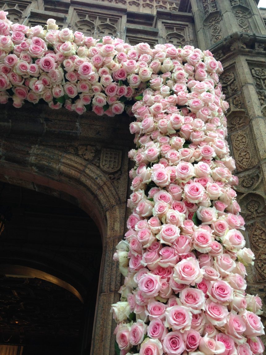
This spring, designers Kate Marchesini and Andrea Pinto from our Somerville, New Jersey, Design Center participated in the area’s prestigious Mansions in May Showhouse and Gardens to benefit the Women’s Association for Morristown Medical Center.

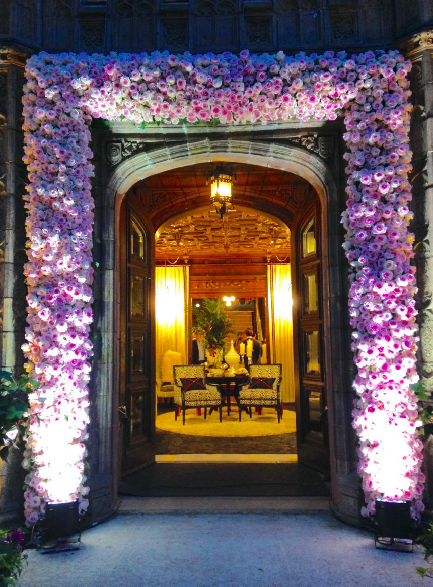
The designer duo had the honor of transforming the Grand Foyer of the historic Alnwick Hall  – The Abbey mansion into an impressive statement of modern glamour.  Check out how they reimagined the entranceway of this spectacular estate—and steal some of their ideas!

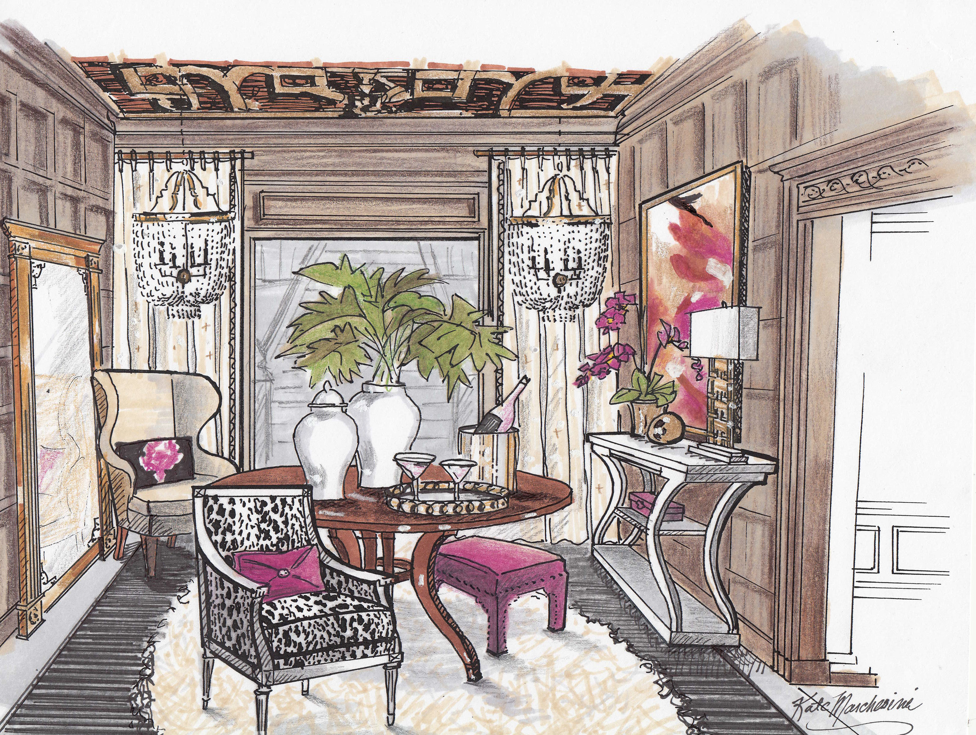
Built in 1904, Alnwick Hall is an example of Tudor Gothic design. Its interior draws from several historical periods and boasts ornate quatrefoil ceilings with gold leafing and mahogany raised paneled walls. To complement this opulent space, Kate and Andrea conceptualized a dynamic, glamourous design, choosing stylized silhouettes and a high-fashion, high-contrast color scheme of black, fuschia, and gold.

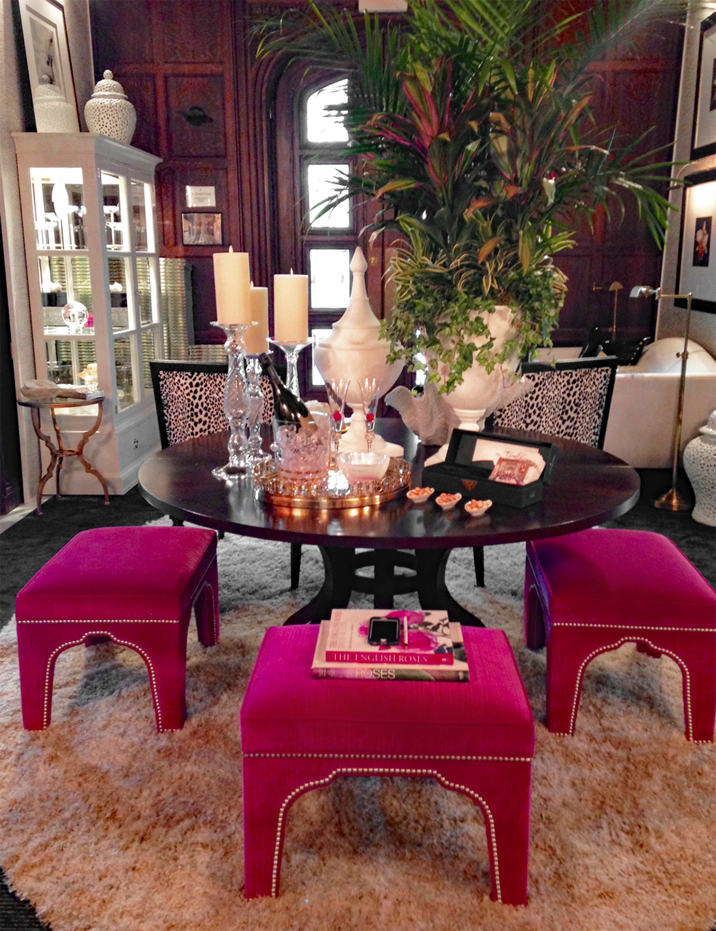
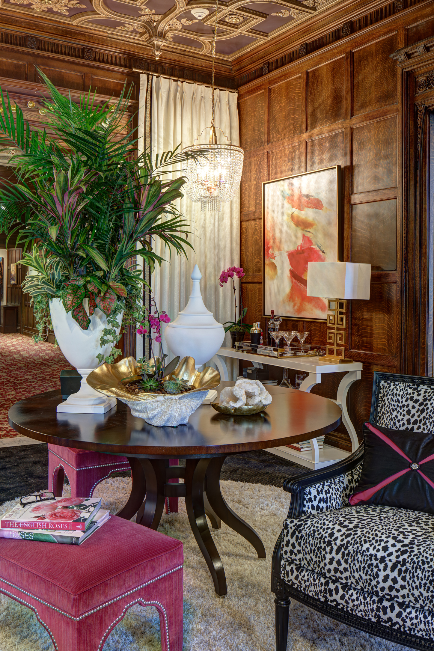
As the first room in the showhouse, the Grand Foyer serves as a place for imagined guests to await reception. Kate and Andrea chose the rich and refined Ashcroft table in a mahogany finish to serve as a focal point. Then, they gave it a fashionable twist with a luxurious shag rug, a trio of Gavin bunching ottomans upholstered in a hot pink velvet, and dazzling white, gold, and glass tabletop accents. The designers also added the Brighton cabinet with interior lighting to display artifacts they envisioned to be of interest to the imagined guests of the estate.

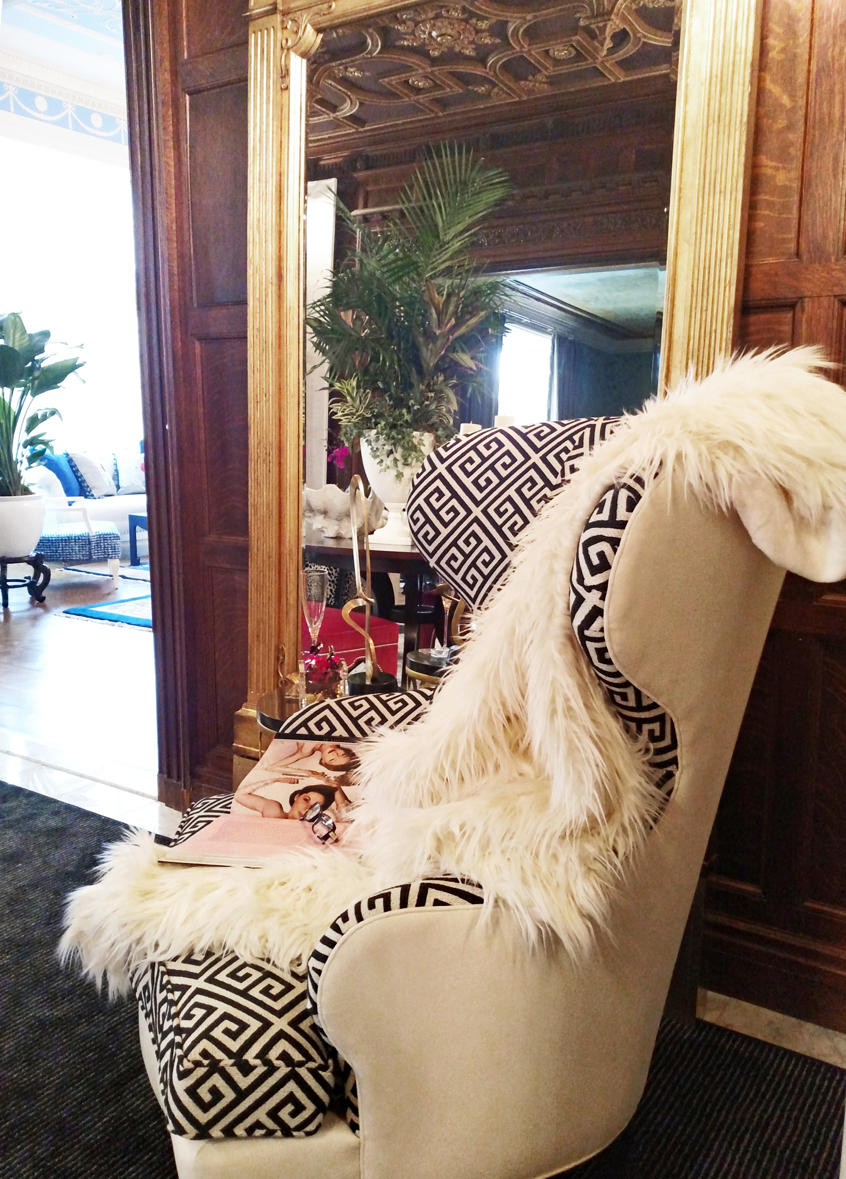
The sinuous Selby wing chair in a dual Greek key and solid fabric treatment, paired with the Madeleine Trumeau floor mirror in antique gold, echoes the rich decorative motifs of the mansion while adding a fresh glamorous vibe.

To lighten up the heavy Gothic architecture in the space, the designers framed the archway leading to the rest of the home by adding overscaled panels of cream and gold wallpaper and white floor-to-ceiling drapery. The curvy Donatella console table in white and the vibrant abstract artwork add a modern, glossy pop to the traditional space.


You don’t have to have a Grand Foyer to make a grand style statement. Here three tips for making a great entrance of your own:

  • CREATE A FOCAL POINT

A focal point draws guests in the moment they arrive. A console table or cabinet with a work of art is a quintessential and powerful pairing. Give it your own twist with additional pieces that fit your space, such as accent wallpaper, a chandelier, ottomans, or chairs.

  • GO FOR “WOW”

The entryway is an opportunity to make a great first impression about your style—so don’t be afraid to be daring! Consider pieces with striking silhouettes, captivating color and finishes, and unexpected details.

  • INTRIGUE YOUR GUESTS

Take a cue from Kate and Andrea’s creative use of the Brighton cabinet and add intriguing accents that spark conversation. Just one small unique piece can have an unforgettable effect.