On With The Show! How To Style an Open Display Cabinet

Display cabinets offer a creative and sophisticated way to showcase your style and interests, and they add lots of personality to your home. Go beyond traditional curio cabinets or glass door styles and choose open display cabinets; they offer an updated, casual feel that complements many of today’s lifestyles.

Here are a few ways to put your best style on display, right out in the open.

COLLECT YOURSELF

Mix and match your favorite curiosities or unique accents to create a curated look. Treat each shelf as a little vignette, combining artful pieces, books, and other decorative objects you love. Be sure to create a focal point in each space, playing with various heights and coordinating colors for balance. Love the well-traveled look? So do we! Decorate your display cabinet with treasures you’ve collected from your travels and globally inspired accents from our latest look, Passport .
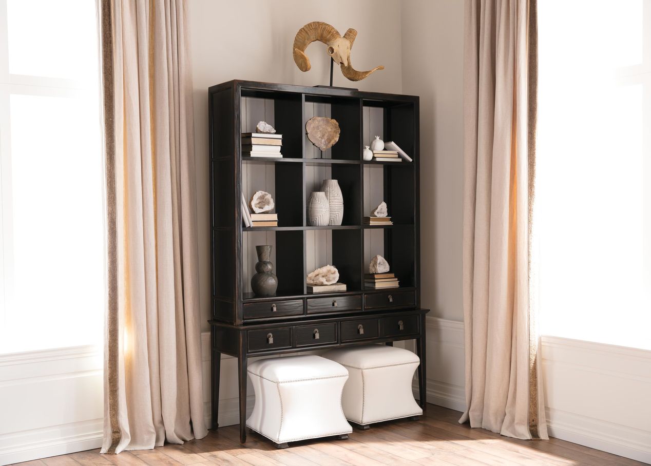
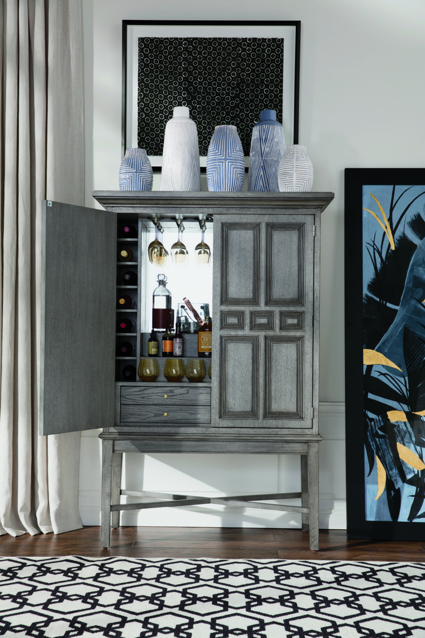
Our Ming display cabinet, decorated with hand-sculpted vases and accents inspired by faraway places, becomes the perfect setting for an intriguing showcase.

GET ECLECTIC

Incorporate a variety of pieces into your collection, but choose a common theme for your cabinet, such as color, subject, type of piece, or material—this helps you avoid a cluttered look. Hand-painted porcelain jars and vases or ceramic platters make stunning choices. If your style leans more on the contemporary side, display one distinct piece per shelf to create a striking art gallery effect.
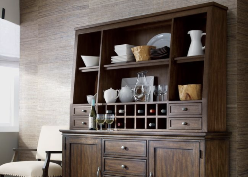
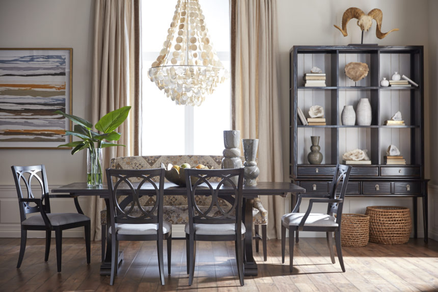
This themed display of dinnerware and entertaining pieces in our Christopher china and buffet cabinet makes a perfect complement to everyday dining style.

DO IT BY THE BOOK

If you have a ton of books lying around or in boxes, pick your favorites and display them for all to admire. Coffee table books are the best choices to create this look, and they make great conversation pieces! When arranging your books, play with proportion. Stack them vertically or horizontally, or organize them by color to create a curated look.
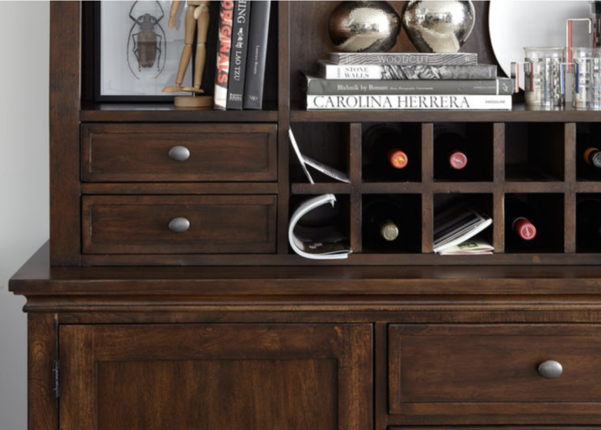
Unique artwork and dazzling silver accents add visual interest and dimension to stacks of books.

Whatever your style, opt for pieces that speak to you and you won’t go wrong. If you’re not sure where to start, just talk with one of our design pros. They can help you find pieces to complement your personal treasures or build your collection entirely from scratch, and their help is always on the house.

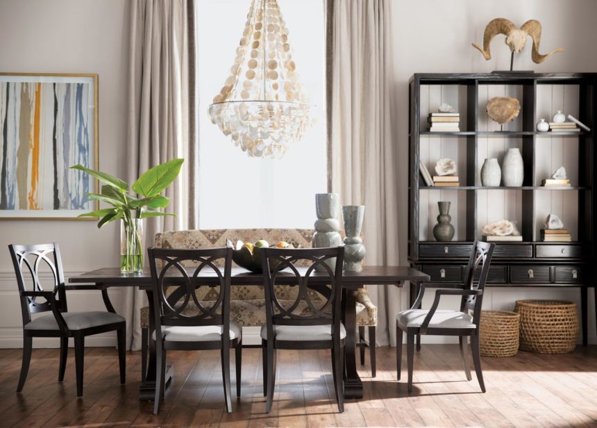
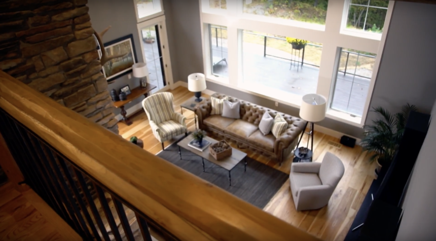
The Perfect Fit of Metal and Wood Furniture Create a Truly Eclectic Style

When homeowners Pat and Dan Stankey tapped Betty Swenson from our Ann Arbor, Michigan, Design Center for help in furnishing their home, they didn’t know what to expect. The home is unique, with lots of metal and wood, vaulted ceilings, and rustic touches. They were worried that she’d want to replace all their furniture with Ethan Allen. They were in for a very pleasant surprise. Inspired by the couple’s preferences and the architecture of the house, Betty helped Pat and Dan choose a combination of mostly casual pieces that gave their home the fresh, contemporary look they were after.


New House, New Look

Rick and Donna Devore were ready for what they call “a lifestyle change.” They’d been married for 38 years when they decided to downsize and move into a charming Victorian in the walkable city of Birmingham, Michigan. The couple wanted a new home that was casual and livable, comfortable, with coastal notes. Lucky for them, designer Michele Nestor of our Design Center in Birmingham was up to the challenge of furnishing the house from top to bottom. Michele delivered the cool look and fresh start they were after—and so much more. Take a look and see how this lifestyle change, changed their life.


Crafty Ways to Decorate With Ribbon

When it comes to seasonal décor, ribbon is one of the most versatile materials there is. Everyone knows ribbon can transform a gift—even one wrapped in plain brown paper—with a simple twist, knot, or bow. Ribbon can give a tired wreath a festive twirl in seconds. It can dress your dining chairs for dinner. And it can stand in for garland, then top a tree with sparkling finesse. We love ribbon of every stripe, whether wide, wired, plaid, pinked, grosgrain, or velvet.

We unspooled some holiday classics (a pair of tartans and razzle-dazzle reds) to jazz up a couple of our favorite everyday accents. With a snip here, and a snip there, we used ribbon to create holiday statement pieces—and you can, too. Let’s get rolling!

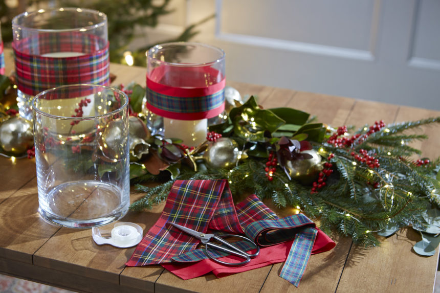
Wrap candleholders with lovely tartan ribbon to give your tabletop or mantel a quick holiday update. We used our simple glass hurricanes, available in three sizes. Cut lengths of ribbon two inches longer than the circumference of the hurricanes. Wrap ribbon around each hurricane, folding over the extra. Secure with double-sided tape. Layer narrow ribbon over wide for added cheer!

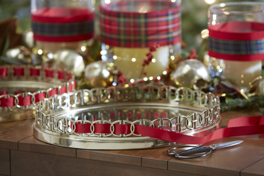
Our Oval Link tray is fab as is—perfect for displaying decorative objects, candles, flowers, or for serving up your favorite cocktail. We used narrow, red satin ribbon to add a pretty punch of color. Just weave your ribbon through the links, leaving about two inches to neatly fold over and secure with double-sided tape.


Behind the Design: How One Partnership Turned into a Friendship

When design consultant Gabriella met her client, Renee, to go over ideas for her master bedroom, the women had no idea that a “wow factor” project would bloom into a fabulous friendship. Renee is now married with a baby—and she’s still happy to call Gabriella a friend.  “As my life has grown and evolved, Gabriella has grown and evolved with me,” she says.

At Ethan Allen, we like to think of it as added value!


At Ethan Allen we’ve been on the move, to bring global design home to you! We call it Passport.

At Ethan Allen, we’ve been on the move, exploring new places and styles, new colors and finishes, new fabrics, and fresh, new pieces designed to bring the world home to you. We call it Passport, home furnishings and accents inspired by the rich tapestry of cultures from around the globe.

Passport is drawn from looks past and present, near and far—from India’s hand-knotted rugs to campaign-style dressers, from Ming Dynasty-inspired display cabinets and occasional tables that hint of pagodas, to woven rattan chairs designed in the rich tradition of British Colonial style.

Passport is exotic yet warm, collected, authentic, and livable. There’s something for everyone to love, whether you’re an armchair tourist (by the way, have we got an armchair for you!) or an intrepid traveler. Passport is your license to live adventurously, anywhere in the world.

We invite you to indulge your wanderlust in the comfort of your own home. Take a look—and come along for the ride!


Tips From the Design Star

Our latest Design Star, Peggy Fortuna, has been an award-winning design consultant in our Danbury, Connecticut, Design Center since 2012. Before that, the Baltimore native owned and operated her own design and color consulting business. Peggy and her husband have three grown daughters, one grandchild, and a chocolate lab with his own Instagram account. We caught up with Peggy recently and she shared her thoughts on design.

EA: What is your favorite Ethan Allen project?

PF: I had complete design freedom to decorate a client’s four-bedroom home in New Milford, Connecticut—including a large outdoor space. Every room, completely furnished with Ethan Allen furniture and accessories, is both beautiful and livable.

EA: What Ethan Allen item do you currently covet, and why?

PF: I love all the Dynasty and Ming pieces for all their finish options. I also love the sculptural shape and versatility of the Corbin ottoman. It can be used in both traditional and transitional spaces, and it looks great in all kinds of fabrics!

EA: What is your favorite design tip?
PF: I always say the rule is: There are no rules.

EA: Complete this sentence: Every room needs—

PF: Negative space. Color, light, volume, and pattern are important—but don’t forget the space that surrounds it all.

EA: Is there a color you can’t live without, and why?

PF: I love rooms that are all white, but I design using a varied palette. White is needed to balance the other colors in the room.

EA: If you could do any project, anywhere, on any budget, what would it be, and why?

PF: To me, nothing is more beautiful and serene than the beach—so, selfishly, I’d have to say I’d love to decorate a beach house for my family. It would be awesome. And while I am dreaming, let’s say it would be on Seven Mile Beach on Grand Cayman!


Dealing With Client Anxiety and Second Guessing? You’re Not Alone

When it comes to decorating, we sometimes second-guess ourselves to the point of never, ever making a change. From something as simple as introducing a color to something as complicated as replacing a family heirloom, our fears often keep us from taking action:

  • “What if I decide I don’t like it?”
  • “What if other people don’t like it?”
  • “What if I offend Aunt Jane?”
  • “What if it goes out of style?”
  • “What if it doesn’t work and I end up spending more money to make it right?”

We think it’s time to say “boo!” to your decorating fears and chase them away—once and for all.

You’re Not Alone

If you think you’re the only person spooked by decorating choices, we have good news: you’re not. “I had a client who had a real tough time parting with things,” recalls Joseph Panzer, a design consultant in our Chadds Ford, Pennsylvania, Design Center. “I understand; you get attached.”

Joseph urged his to repurpose some pieces; they explored ways to mix them in with new Ethan Allen furniture. “Sometimes, just reupholstering a piece can make a client see it a new light and add a nice uniqueness to a space.”

Julie Goss, a design consultant in our Vienna, Virginia, Design Center, had a client who needed a pair of chairs for her living room and a few things for her family room. They looked at many fabric samples together, but her client grew so anxious that became flushed, agitated, and broke out into a sweat.

If you’re feeling anxious about making decorating changes, we have some tips that can make it easier to take baby steps—beautiful baby steps—toward the project of your dreams:

  • Do your homework. Gather inspiration by clipping photos from magazines and tagging websites you like. If you see something that works over and over again, you’ll be more inclined to give it a try.
  • Start small. A whole house redo can be terrifying even if you have all the confidence in the world. Select one room, and then make it over, one component at a time.
  • Remember less is more. Keep things simple; choose a single piece that you love and build a design around it.
  • Lead with functionality. Start with something practical, like switching out a loveseat for a sectional now that their kids are older. If it’s a change you need to make (rather than just one you want to make), you’re more likely to take the plunge.
  • Resist the urge to follow trends. Just because everyone is doing something is usually reason enough not to. Choose looks that will never go out of style—you won’t regret it.

Eventually, Julie persuaded her client to place an order, but even when the furniture came in, it stayed in the service center for months. But when the client took a deep breath and finally accepted delivery, and the pieces were in place, she was delighted. Decorating fears are a lot like ghosts; when you turn around to face them, you see they’re not real.

Decorating doesn’t have to be frightful with the help of an Ethan Allen designer. Treat yourself to our complimentary design service, and we’ll show you our tricks for taking the fear out of decorating.

HAPPY HALLOWEEN FROM ETHAN ALLEN!


How to Mix Dining Chairs: Start With Doubles

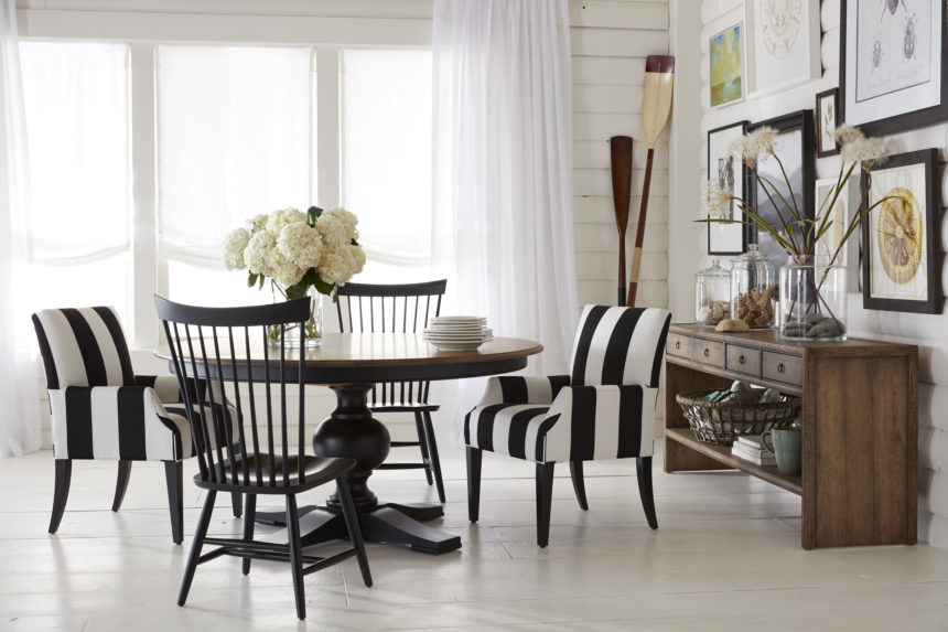
If you’re looking for a good recipe to shake up your dining room style, then start mixing things up with mismatched chairs. This eclectic style has become a here-to-stay trend we love—and why not? Mingling different chairs opens up countless ways to play with color, texture, and scale. When done right, it creates a fresh, unexpected look.

So how do you make it look so—well, put together? Here are a few tips from our designers to help you master the mismatch.

START WITH DOUBLES

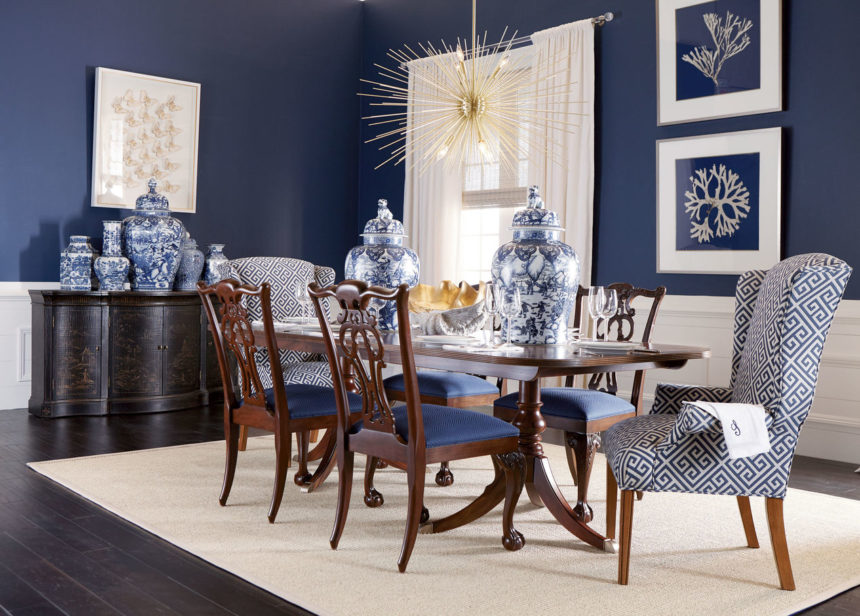
You don’t have to start over to get in on this look. Ease into it by introducing one set of chairs in a completely different design at the head and foot of the table. If your current style leans toward traditional, swap out your armchairs for a pair of modern ones, or add a duo of dramatic wing chairs to make a statement.

HOW IT’S DONE: Our Jayden host chairs bring a modern, dramatic  vibe to this elegant dining room with high backs, sinuous lines, and sleek tapered legs. Our designers tie the look together by dressing them in bold, blue-and-white Greek key fabric to  coordinate with the upholstered seats of the Chauncey side chairs.

SET A BENCHMARK

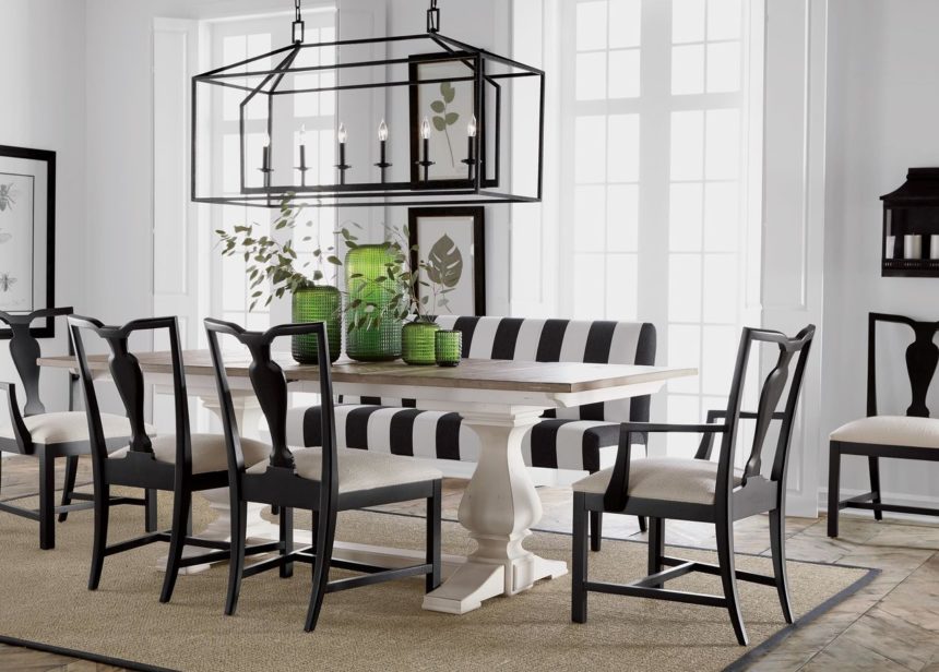
To create a relaxed feel, rethink your seating arrangement and replace a set of side chairs with a stunning upholstered bench. This look is not only fresh and fashionable—it’s also great for comfortably fitting in more friends and family on one or both sides of your table.

HOW IT’S DONE: The Clinton bench, upholstered in a striking black-and-white striped fabric, cozies up this dining room with a fashionable edge and invites gathering, lingering—and tons of compliments!

MIX, THEN MATCH

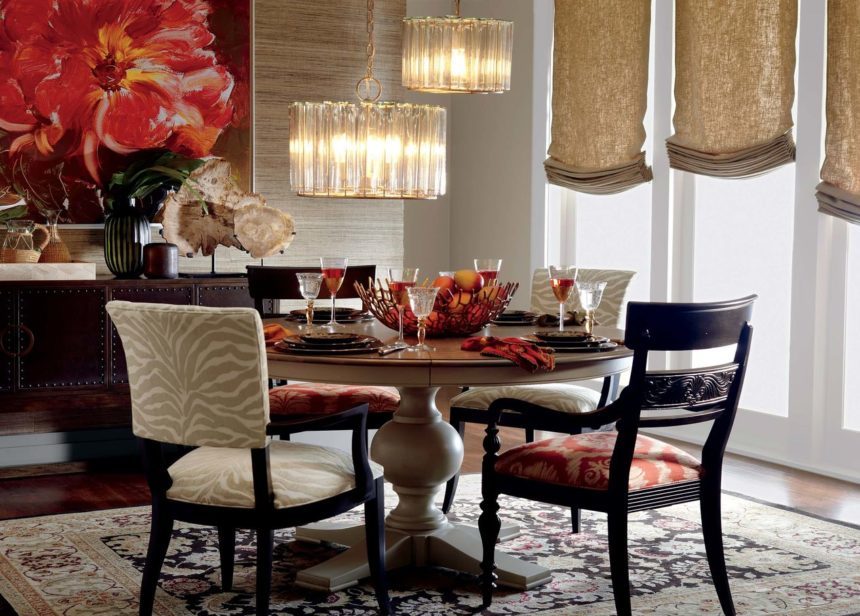
Maybe you’ve got a host of vintage chairs you’ve been collecting, or you have an eclectic taste for all sorts of styles. If you love a cool, collected look, then go ahead—mix it up! Just keep this pro tip in mind: Dress your chairs in a similar color or pattern to tie the look together.

HOW IT’S DONE: Our designers chose a pair of Drew armchairs and Mackenzie armchairs to create this eclectic dining room. While these styles are quite different, they pulled off the look with a couple of expert tricks: choosing chairs that share similar silhouettes, scales, and finishes, and dressing each pair in its own globally inspired pattern to create a collected yet cohesive look.

Hungry for more inspiration? Here’s a look at a few more mismatched dining looks we love!

Berkshire Armchair + Clinton Armchair

Berkshire ArmchairBlake Armchair 


Pattern in Interior Design: Q&A With Tad Donovan

Designers know that pattern is a powerful decorating tool; some would argue that it has even more currency than color. Tad Donovan is someone who knows the importance of pattern—and he uses it often when he designs spaces for Ethan Allen. Tad, who is based in Fort Lauderdale, is our latest Design Star.

We caught up with him recently and asked him to share his strategies for making the most of pattern in his projects.

EA: What does pattern bring to the design table?

TD: Pattern brings visual interest and an element of excitement to a room. It offers infinite possibilities for creating a space that really suits a client. It allows us to seamlessly integrate their personalities.

EA: How did you develop such a comfortable relationship with pattern?

TD: I give my parents credit; both were very talented. I was in my teens when they were building a new home, and I remember the binder my mother kept with all the samples she liked. I saw how she pulled different patterns together, making sure that each room made sense and related to the rest of the house. I think of pattern in the same way; it’s like pulling together a wardrobe—selecting ties, shirts, jackets, and accessories—with an eye toward everything working together.
EA: What are your rules for designing with pattern?

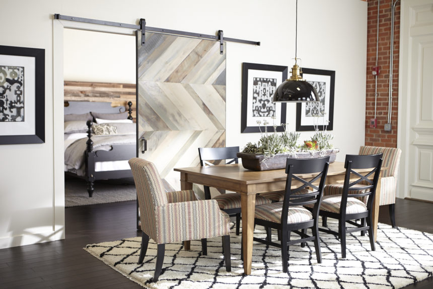
TD: Don’t be afraid of them!  If a client can point me in the direction of one fabric they like, I can help them conquer their fears. It not only gives us a starting point, but it also gives me a sense of who they are. From there, I can interject ideas to expand on their interests.

EA: How about mixing patterns?

TD: Yes, please!

EA: What are some of the common pattern mistakes people make?

Using too much of a similar pattern.


EA: What’s the difference between pattern and a print?

Patterns are everywhere—they appear in all kinds of materials, not just fabric. A print is technically a textile that has had dye applied to it—in the form of a pattern. Informally, I think of pattern as more geometric, or a series of repetitive lines/circles/colors. When I think of prints, I think more of a floral or toile.

EA: You say patterns are everywhere—where do you find them in the home?

They can be in architectural details such as dentil molding; tiles (a Moroccan motif, for example); flooring (think parquet wood floors); even in brick or stone walls.

EA: Do you live with patterns at home?

Let me think … that would be a yes!

PILLOW TALK

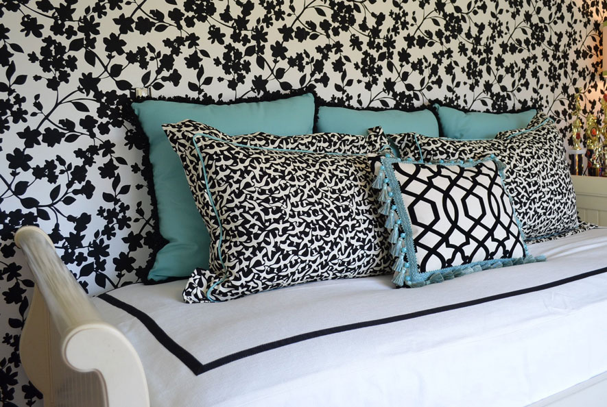
TD: My client wanted to update a teenage girl’s room using her existing EA furniture. The daughter wanted a palette of black, white, and “Tiffany blue.” I centered the trundle bed on the papered wall and framed the custom bedcovering with grosgrain ribbon on all four sides. The pillows pull everything together: We chose a small-scale print on two pillows for a positive/negative contrast with the walls. The smaller pillow features a black-and-white geometric pattern and a fun tassel trim. We went directly to the source for the larger pillows and trims—using a box from Tiffany to get the blue just right.

MASTER PLAN

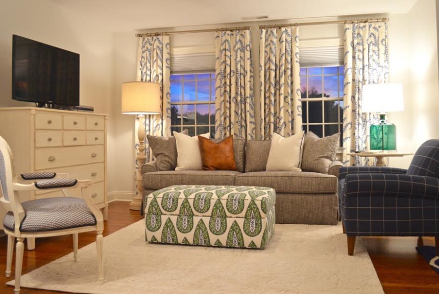
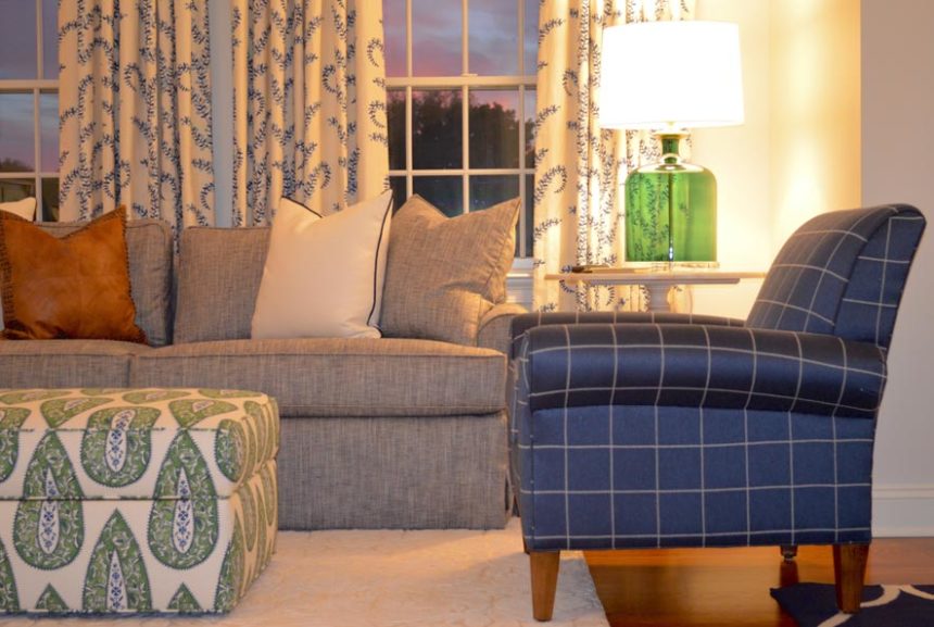
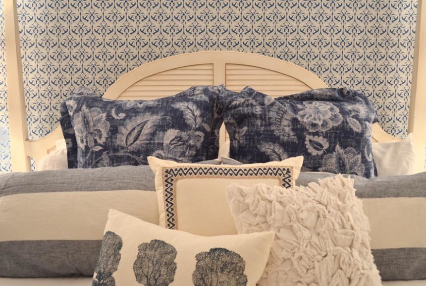
TD: Believe it or not, these are two views of the same room, a rather spacious master suite where my clients go to unwind. Their favorite color is blue and they already owned some pieces (which they still love) from our Swedish Home collection. We used wallpaper sparingly to separate the sleeping area from the sitting “room.”  It defined the space and gave importance to the patterns layered on the bed. We used green as an accent hue (note: the ottoman provides contrast and storage). The Adam chair in a bold windowpane fabric provides a powerful punch of color.

RED ALERT

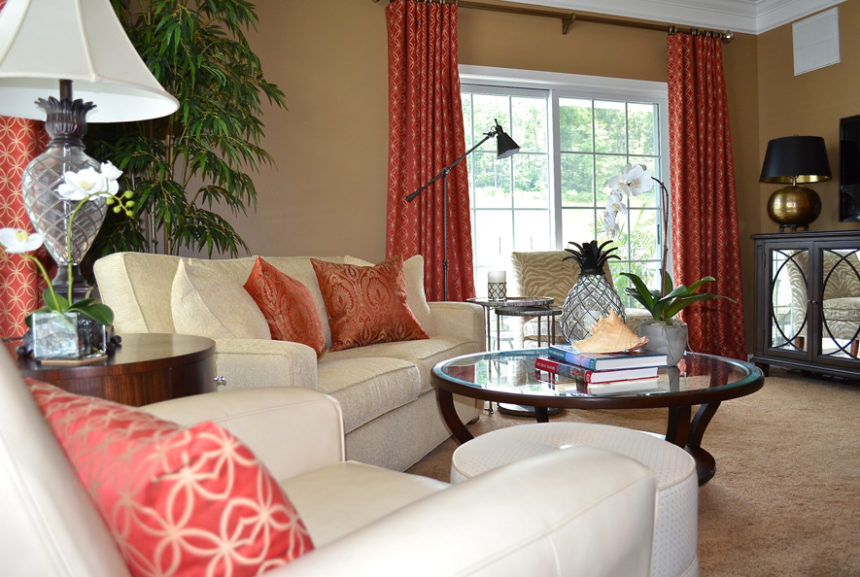
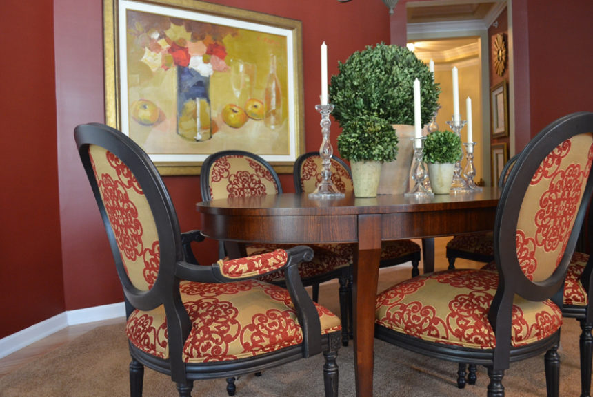
TD: This dining room is open to the living room at right. The very sophisticated space was inspired by the geometric pattern on the red sofa pillows. The client loved it so much, we used the same fabric for the window treatments. We picked up the rich red hue as an accent wall in the dining room, along with the fabric on the dramatic Cassatt chairs done in a distressed black finish.

BEAUTY AND THE BATH

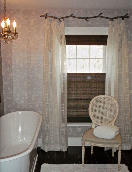
TD: Pattern plays a subtle but significant role in this children’s bathroom in an antique farmhouse. Geometric sheers hung from a metal “branch” rod complement the floral pattern in the wallpaper while adding a bit of softness.  The lined, natural woven shades provide texture and contrast, plus privacy.
WALL-TO-WALL WOW

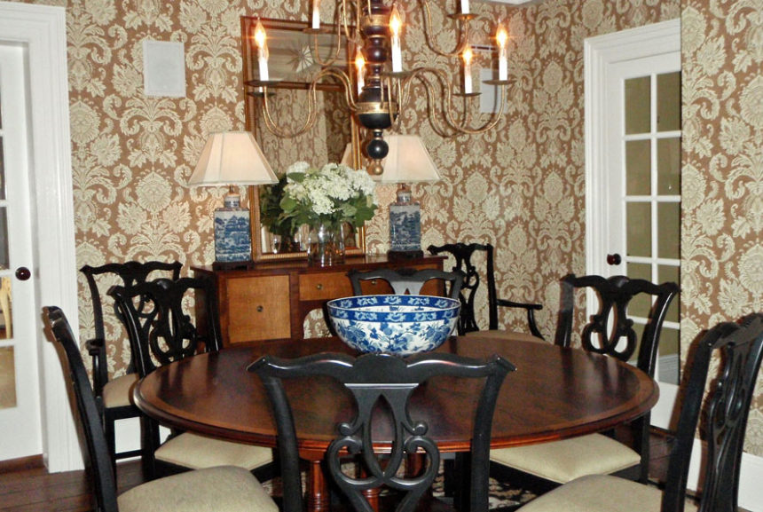
TD: This classic patterned wallpaper acts like artwork in a dining room full of doorways. It provides a lovely backdrop for our Hansen Indonesian mahogany dining table—the star of the room.  The blue and white porcelain lamps and bowl add a touch of color and, yes, another pleasing pattern.