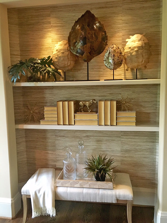
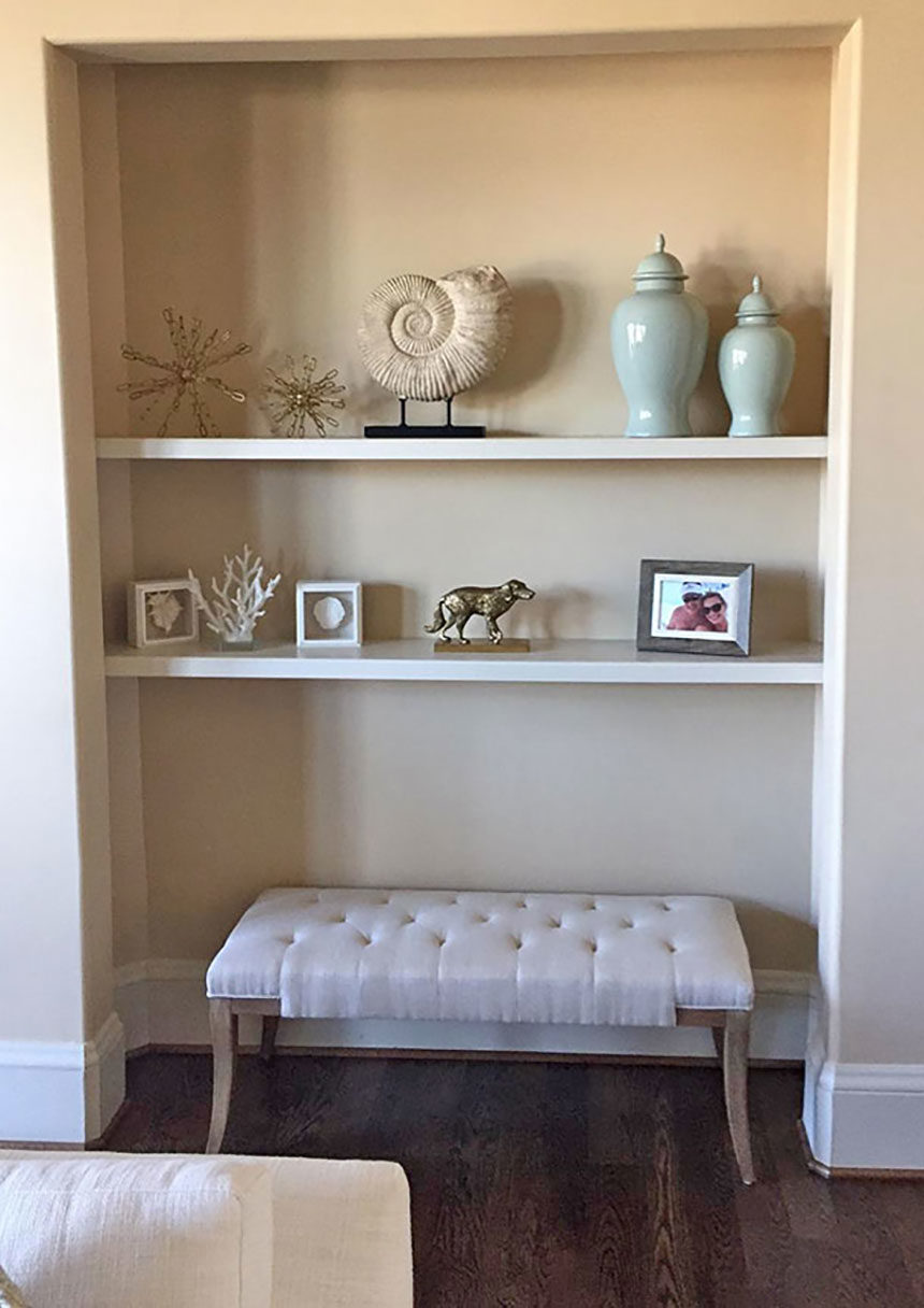
This bookshelf makeover was part of a larger project completed by Julie Goss of our Vienna, VA, Design Center. She transformed the space with a few simple moves.
BEFORE: Recessed shelving lends itself to a well-composed vignette. Unfortunately, it was styled more like a stiff repository than a compelling display space. A bunch of disparate pieces, similarly scaled, does not a pretty sightline make

AFTER: Hanging grass cloth on the walls of the alcove was transformative. It introduced texture and warmth and set the tone for a more organic look. Julie kept the client’s bench but gave it life by adding a tray, soft throw, decanters, and some greenery. For the shelves, she chose pieces that were better scaled to fit the space, including objet d’art and some sculptural books. Accent lighting brought everything into sharp focus. Done!

