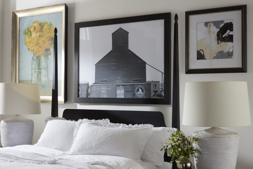
Pattern in Interior Design: Q&A With Tad Donovan

Designers know that pattern is a powerful decorating tool; some would argue that it has even more currency than color. Tad Donovan is someone who knows the importance of pattern—and he uses it often when he designs spaces for Ethan Allen. Tad, who is based in Fort Lauderdale, is our latest Design Star.

We caught up with him recently and asked him to share his strategies for making the most of pattern in his projects.

EA: What does pattern bring to the design table?

TD: Pattern brings visual interest and an element of excitement to a room. It offers infinite possibilities for creating a space that really suits a client. It allows us to seamlessly integrate their personalities.

EA: How did you develop such a comfortable relationship with pattern?

TD: I give my parents credit; both were very talented. I was in my teens when they were building a new home, and I remember the binder my mother kept with all the samples she liked. I saw how she pulled different patterns together, making sure that each room made sense and related to the rest of the house. I think of pattern in the same way; it’s like pulling together a wardrobe—selecting ties, shirts, jackets, and accessories—with an eye toward everything working together.

EA: What are your rules for designing with pattern?

TD: Don’t be afraid of them!  If a client can point me in the direction of one fabric they like, I can help them conquer their fears. It not only gives us a starting point, but it also gives me a sense of who they are. From there, I can interject ideas to expand on their interests.

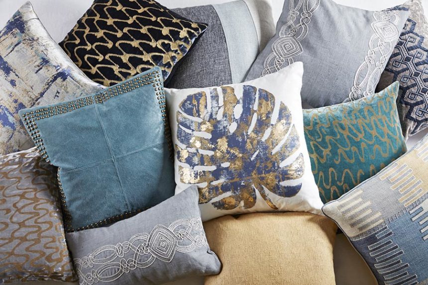
EA: How about mixing patterns?

TD: Yes, please!

EA: What are some of the common pattern mistakes people make?

Using too much of a similar pattern.


EA: What’s the difference between pattern and a print?

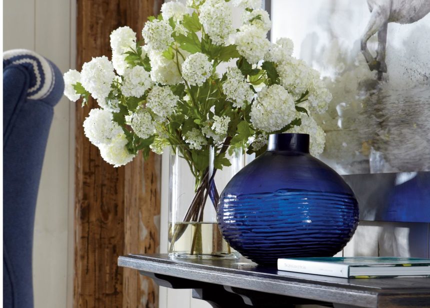
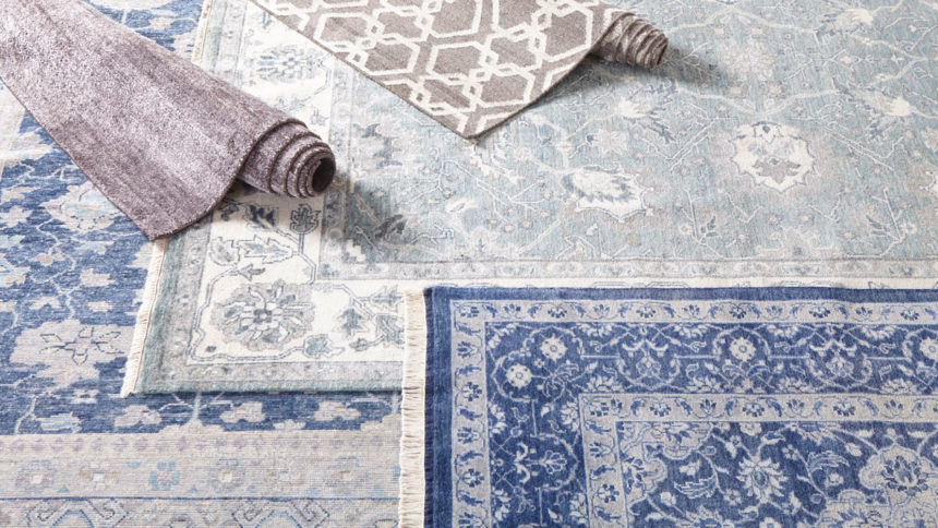
Patterns are everywhere—they appear in all kinds of materials, not just fabric. A print is technically a textile that has had dye applied to it—in the form of a pattern. Informally, I think of pattern as more geometric, or a series of repetitive lines/circles/colors. When I think of prints, I think more of a floral or toile.

EA: You say patterns are everywhere—where do you find them in the home?

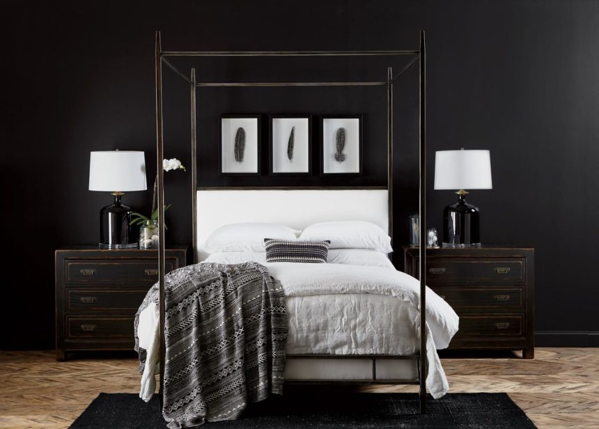
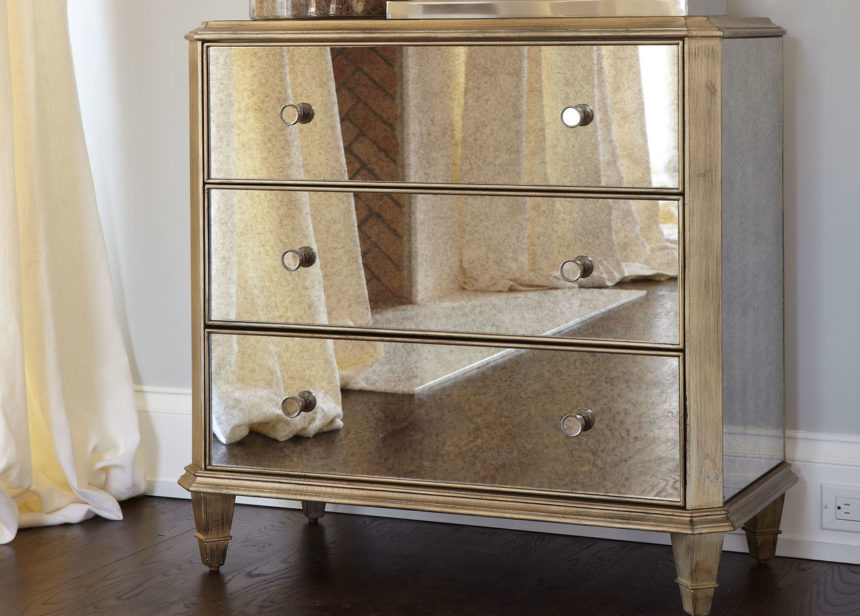
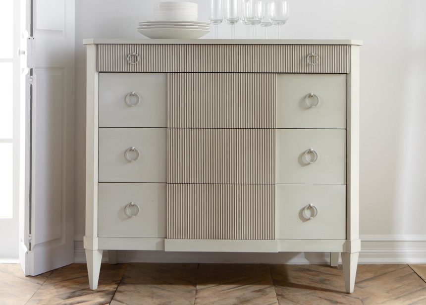
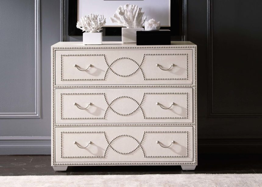
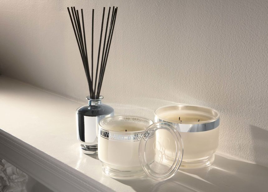
They can be in architectural details such as dentil molding; tiles (a Moroccan motif, for example); flooring (think parquet wood floors); even in brick or stone walls.

EA: Do you live with patterns at home?

Let me think … that would be a yes!
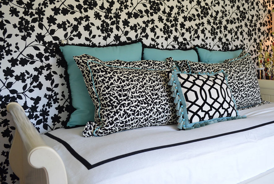
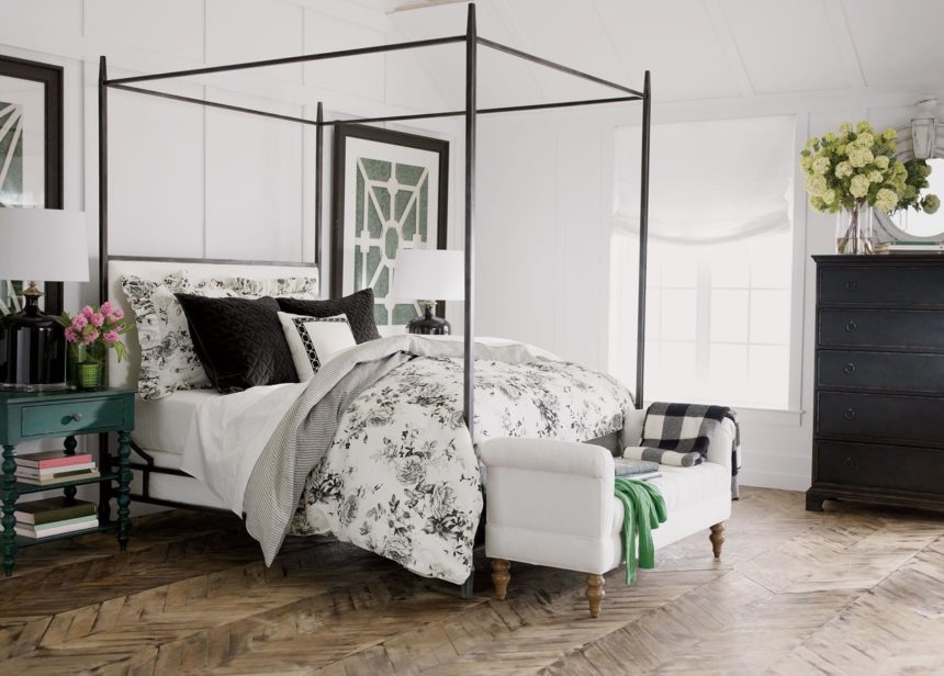
PILLOW TALK

TD: My client wanted to update a teenage girl’s room using her existing EA furniture. The daughter wanted a palette of black, white, and “Tiffany blue.” I centered the trundle bed on the papered wall and framed the custom bedcovering with grosgrain ribbon on all four sides. The pillows pull everything together: We chose a small-scale print on two pillows for a positive/negative contrast with the walls. The smaller pillow features a black-and-white geometric pattern and a fun tassel trim. We went directly to the source for the larger pillows and trims—using a box from Tiffany to get the blue just right.
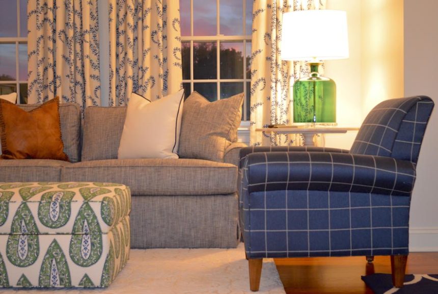
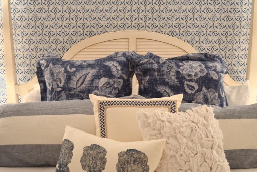
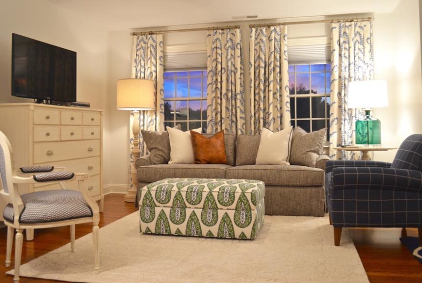
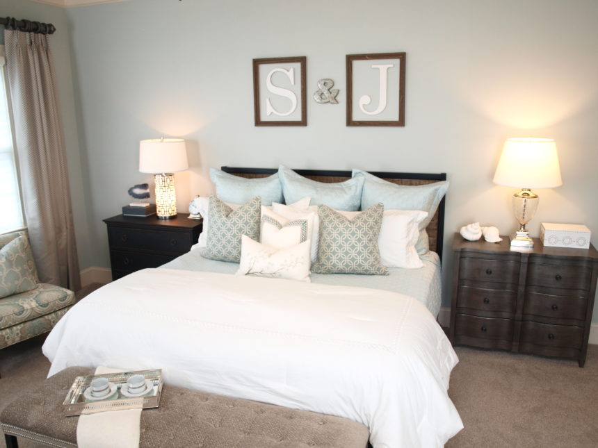
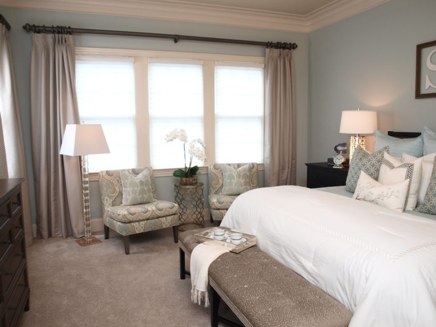
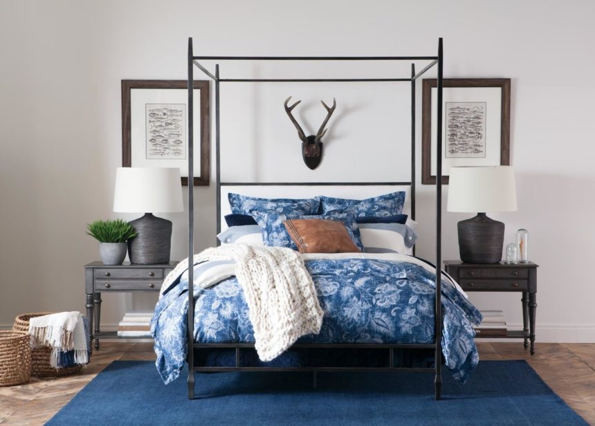
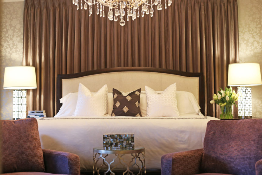
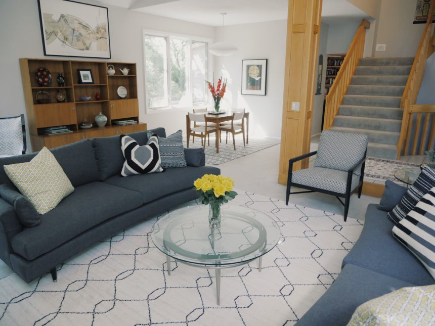
MASTER PLAN

TD: Believe it or not, these are two views of the same room, a rather spacious master suite where my clients go to unwind. Their favorite color is blue and they already owned some pieces (which they still love) from our Swedish Home collection. We used wallpaper sparingly to separate the sleeping area from the sitting “room.”  It defined the space and gave importance to the patterns layered on the bed. We used green as an accent hue (note: the ottoman provides contrast and storage). The Adam chair in a bold windowpane fabric provides a powerful punch of color.
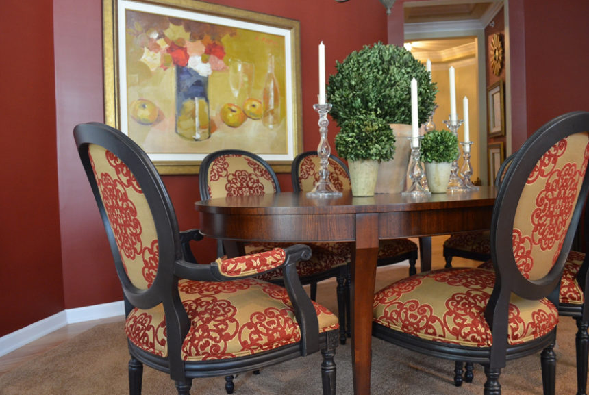
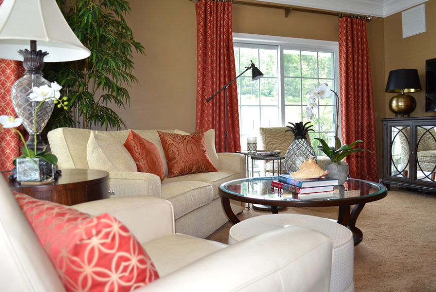
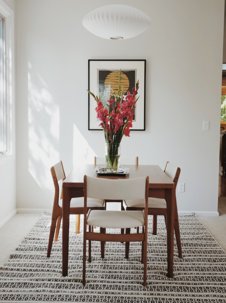
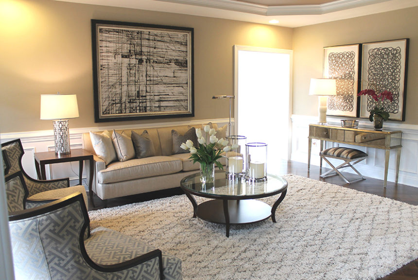
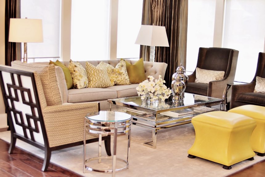
RED ALERT

TD: This dining room is open to the living room at right. The very sophisticated space was inspired by the geometric pattern on the red sofa pillows. The client loved it so much, we used the same fabric for the window treatments. We picked up the rich red hue as an accent wall in the dining room, along with the fabric on the dramatic Cassatt chairs done in a distressed black finish.
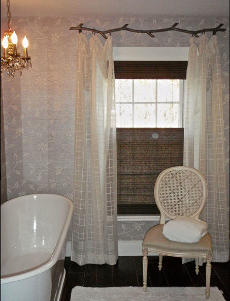
BEAUTY AND THE BATH

TD: Pattern plays a subtle but significant role in this children’s bathroom in an antique farmhouse. Geometric sheers hung from a metal “branch” rod complement the floral pattern in the wallpaper while adding a bit of softness.  The lined, natural woven shades provide texture and contrast, plus privacy.
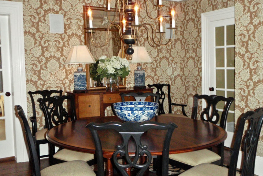
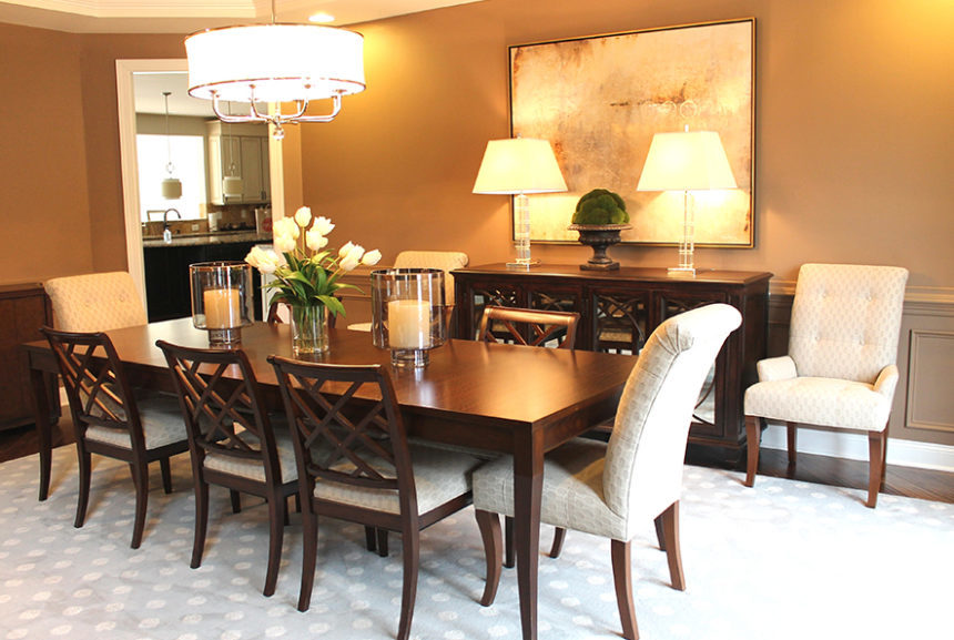
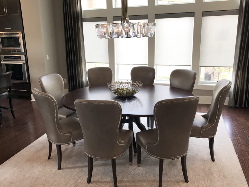
WALL-TO-WALL WOW

TD: This classic patterned wallpaper acts like artwork in a dining room full of doorways. It provides a lovely backdrop for our Hansen Indonesian mahogany dining table—the star of the room.  The blue and white porcelain lamps and bowl add a touch of color and, yes, another pleasing pattern.


Earning Client Trust Makes All the Difference

Finding a gifted and discerning interior designer who “gets” you can be one of the most satisfying aspects of decorating your home. It can give you the confidence you need to push your creative envelope. It can make the difference between a good experience and a great one. Just ask Jennifer Coleman, who lives with her husband, Sean, and their children outside of Raleigh, North Carolina.

A while back, Jennifer decided it was time to refresh her home—starting with a new sofa. “We’d put decorating on the back burner for a long time,” she says. “It was time to love our space.”

By the time Jennifer walked into our Design Center in Cary, North Carolina, she’d already fallen for the Mansfield sofa. “Jennifer had done her homework,” remembers design associate Daniel Sawyer. “She brought sketches and dimensions, and had her eye on certain pieces.”

“I knew the look I wanted,” says Jennifer. “I just had no idea how to piece it together.” Her first meeting with Daniel lasted more than three hours. “I embrace the ‘first date’ philosophy with a client,” he says. “I like to learn about them in a very genuine way. What colors they like—and hate. What they like about their space—and what needs improvement.”

Once Daniel visited the Colemans’ home, Jennifer started thinking beyond the Mansfield. Her list grew to include accent chairs, ottomans, a rug, lighting, and a (mandatory) leather recliner for her husband. When the conversation turned to accessories, Jennifer wanted to hold off. Daniel knew the difference those little pieces would make, so he showed up on installation day with his car loaded with artwork and accents. Jennifer was surprised—and pleased. “I’m good at the big picture, but not accessories,” she says. In the end, she kept everything but a single piece. With complete confidence in her designer by then, Jennifer asked Daniel to help decorate the master bedroom. “The room was a joy to create,” says Daniel. “Our full design plan included custom bedding, new Hunter Douglas shades, and custom window treatments. Jennifer and Sean now describe it as their sanctuary.”

And the decorating’s not over yet, laughs Jennifer: “Remember, we really didn’t plan to get more than a piece or two … but I think we’ll do the dining room next!”


Our Statement Making Furniture Speaks for Itself

Every piece of furniture we make has a personality of its own—from the Robyn bed’s country casual vibe to the Vivica chest’s go-glam-or-go-home attitude. There isn’t a chair, chest, ottoman, or etagère that doesn’t make a statement; we designed them that way! Recently we imagined what our furniture would say—how it might introduce itself, for example—if only it had the chance. We featured some table talk in our October magazine, but the conversation didn’t stop there. Meet some of our favorites:

ROBYN: I’m a sleigh bed infused with a cottage vibe—contemporary yet rustic, as cozy in a city loft as I am in a summer beach house.

KINGSTON: I’m tropically inspired, with a reeded headboard and footboard design; I’ll instantly transform your bedroom into an island getaway.

LINCOLN: I may look casual, but I have great fashion sense. My upholstered headboard can be dressed in your choice of dozens of fabrics so I can show off your unique style.

FAIRFAX: I’m proof that traditional doesn’t have to be old-fashioned. I’m neoclassical with a modern twist—and I steal the show in any space.

GRAYSON: I have a generous seat for roomy relaxation—and with my Chippendale-inspired design, I look fabulous anywhere, especially in the middle of a room.

VERSAILLES: I’m inspired by Louis XV and generously proportioned for comfort. My hand-carved details are subtle—but stunning.

VIVICA: I’m all about the glamour; my silver leaf wood frame is dressed head-to-toe in antiqued mirror panels. Va va voom!

ADELAIDE: I’m Gustavian (that’s part Swedish, part French); my breakfront effect and delicate ring pulls make me one-of-a kind.

BOWEN: I’m a petite beauty with a big personality, dressed in a faux snakeskin-embossed leather in white or silver, and detailed with antiqued silver nail head trim.


The Power of Home Fragrance

It’s one of the first things you notice when you enter a room. It evokes memories: a grandmother’s cooking, a mother’s embrace, a day at the beach. It’s powerful enough to stir emotions and yet often overlooked when designing a room.

Fragrance.

A pleasing fragrance can soothe or energize; it can even suggest a completely different atmosphere (e.g., a candle with the fragrance of a mountain forest burning on a kitchen table in Manhattan). Because everyone experiences scent differently, it’s a good idea to choose more complex scents so each person can detect their favorite note. The best fragrances achieve a perfect balance of top, middle, and bottom notes.

  • The top note is the first thing you detect when taking the lid off a candle or opening a jar of essential oils. Good top notes suggest freshness: citrus, herbs, a touch of ginger.
  • The middle note usually emerges about fifteen minutes after a candle is lit. The middle notes give a fragrance its personality, whether it’s a fruity, floral, or spicy note.
  • The base note is the scent remaining in the room long after the candle has been extinguished. Woodsy, musky aromas add elegance and depth and often work well in this layer.

When we design fragrances at Ethan Allen, we draw from five categories of scents and present them in varying sizes of candles, each with a minimum burn time of 40 hours. We also create diffusers, in which reeds are immersed in scented oil to soak up fragrance and disperse it throughout the room. Diffusers last until all the oil has evaporated and are easily refreshed by adding more oil.

  • Floral. Morning Blossom blends an initial top note of citrus with a heart of jasmine and violet over base notes of patchouli and vanilla.
  • Ozonic or spa. The freshness of coconut, the sweetness of honey, jasmine, and vanilla, and a hint of sandalwood make our Cashmere Petals fragrance unforgettable.
  • Citrus. With Sparkling Citrus, we blend strong top notes of tangerine and citrus zest with jasmine middle tones and a base of white woods.
  • Woodsy or smoky. In Hearthwood, a top note of orange blends with a heart of clove and heliotrope; the base note of warm spice lingers long after the candle has been blown out.
  • Fruit. To keep a fragrance like Enchanted Apple from being too overpowering, we add notes of lilac, peach nectar, tonka bean, and oak moss.

Whatever your reason for selecting a home fragrance—setting a mood, creating an atmosphere—don’t forget to include your favorite fragrance in your final room design. It’s an invisible touch that makes all the difference.


Blue Home Décor: Our Favorite Looks

Take a peek at True Blue, our October magazine (download it here), and we promise you won’t feel blue in the least. Our designers captured some pretty cool blue moments—from the Baldwin settee on the cover (love the Greek key nailhead trim) to our sumptuous Monikka bedding (p. 22—be still our hearts!). Blue is widely considered the world’s favorite color (go on, Google it), and we know that in home décor, blues of every stripe just never seem to go out of style. Join the navy? We’re in. Reach for the sky? We’re up for it. Take a powder? We love all the baby blues. In fairness to fall, we can appreciate its fiery reds and glorious golds, but give us any hue of blue—in any season—and we’re down.

Here are some of our favorite looks!


The couple walked into the West Des Moines Design Center on a whim. They weren’t at all sure they were in the right place. They told design associate Paige Mongar they had a statement room to furnish, with a very particular look in mind: modern, with midcentury and Scandinavian notes.

“They thought Ethan Allen was only associated with traditional and classic design,” says Paige, our latest Design Star, but they knew our quality was unparalleled, so they were curious to see our product line.”  Without hesitation, she reassured them that Ethan Allen offered the chic, minimalist styles they were after.

“They needed to furnish the vaulted living room of their 1988 contemporary,” she explains. “There’s a balcony above, and the living room is open to a well-defined dining area. They wanted to improve the flow and make the space more conducive to entertaining.”

The couple “favored a monochromatic palette with minimal pops of color,” says Paige. “They were looking for furniture that would reflect their love of Scandinavian and midcentury design. They wanted to highlight their artwork—and a beloved midcentury dining set and bookcase they’ve had since the 1960s.”

Paige confidently pointed them in the direction of modern, streamlined pieces, such as the delicately curved Apollo sofa, the Elgin chair, and Rowan buffet. She followed up with a house call and a detailed proposal—and the end result is this stylish and sophisticated space.


Facing Apollo sofas provide pleasing symmetry; their subtle curves invite conversation.


The scale of the room allows for generous seating—and good flow.

The Elgin chair is a midcentury-style icon; a variety of textures adds warmth to the room.

The Rowan buffet provides storage, a serving surface, and a base for showcasing art.

The vintage midcentury dining set is complemented by a Woven Symmetry Rug.

Corinne chairs create a lovely vignette—and an appealing corner reading nook.


Ethan Allen Design Star, Paige Mongar


Summer is officially over.  It’s time to close the pool, rake the leaves, plant the bulbs … but whatever you do, don’t call off the outdoor entertaining—not yet.

Even if you live in a region with four distinct seasons, there’s still time to get out and grill, chill, sip, and nosh, while hosting friends and family in style. Fall entertaining is all about creating a cozy vibe. Bring on the harvest hues and amp up the creature comforts. Swap the beach towels for toasty blankets and throws. Let there be light: Bring out the candles and lanterns, and build a fire. Think hot cocoa instead of cold brews.

And because you never know when a chill will chase the party indoors, remember to eat dessert first—especially s’mores, everyone’s fireside favorite. Our colleague Marta Eriquez was kind enough to share her recipe for indoor s’mores with a deliciously gooey twist. The best part: You can make them all year long (no fire or charred marshmallows required).

MARTA’S S’MORES BARK
Ingredients

  • 24 oz. dark chocolate, melted
  • 1 cup marshmallow fluff
  • 3 full sheets of graham crackers, crumbled

Instructions

  1. Line a 9″ x 12″ rimmed baking sheet with parchment paper or a silicone baking mat.
  2. Melt half the chocolate in the microwave and use a silicone spatula or the back of a wooden spoon to spread it on the baking sheet. Refrigerate for 20 minutes.
  3. Crumble the graham crackers and set aside.
  4. Heat the marshmallow fluff in the microwave. Quickly spread a marshmallow layer over the hardened chocolate.
  5. Press graham cracker crumbs into the marshmallow layer. Refrigerate for 20 minutes.
  6. Melt the rest of the chocolate and very gently spread it over the graham cracker layer. Refrigerate for an hour.
  7. Break into pieces and serve.

Bark can be stored in an airtight container in the refrigerator—if you have any left over!


Art, like beauty, is in the eye of the beholder. Art is personal. What moves one person may do nothing at all for someone else. Enter our custom art program, an opportunity for you to enjoy art—from landscapes, abstracts and pop art to portraits, geometrics, photographs and more—on your terms.

Shawn Lang spearheaded the development and launch of our custom art program while director of wall décor for Ethan Allen (he’s now a social media consultant for us). We asked him a few questions about how he conceptualized it—and what makes it unique.

How did you visualize the custom art program before you launched it?

Shawn: When we decided to update the existing custom art program, we knew we wanted to design a simple, user-friendly program for both our designers and clients. We wanted it to have a fresh look and offer a wide variety of artwork to capture all lifestyles, so we included traditional landscapes, contemporary abstracts, photography, and transitional pieces that can work in any room.

Did you work with artists who already have pieces in the Ethan Allen collection?

Shawn: We did include artists we’ve worked with in the past. At the same time, we also added new artists to the mix—we thought they would provide the new assortment with a fresh update. All in all, we added more than 180 new images to the collection.

From your perspective, what makes the new program special?

Shawn: I think the best thing about it is that we can refresh the assortment quickly. We can easily add new imagery as trends evolve, so the collection is always relevant.


How does it work?

Shawn: We designed the process to be easy for anyone to do in just a few quick steps:

  • First, launch the custom art creation tool.
  • Then browse our selection of works. You’ll find a wide array of styles and genres.
  • Choose to have your work printed on either paper or canvas.
  • Decide on the scale that works best for your room: small, medium, or large.
  • Preview your art in dozens of frames, in a wide range of styles to match your décor.
  • Add options like mats, pen lines, bevels, fillets, or liners to really make it your own.
  • Preview your artwork so you can see exactly what the finished piece will look like. You can even view it against different wall color samples to get an idea of how it will look in your room—before you buy.

What happens once it’s ordered?

Shawn: Once your custom art piece is created, it’s sent to our Passaic, New Jersey, workshop to be framed by hand. In the workshop, mats are cut by hand, and pen lines are drawn by hand. Our artisans have learned and honed their skills over many years, and I think the quality they produce really differentiates us from other custom art programs out there. No detail is too small for them.

If you have any questions about our custom art program, visit a Design Center, or chat with a designer online. At the end of the process, you’ll have a piece of art that’s truly your own.


No matter the style or scope of a project, Rose T. Bien-Aime says her goal is always to provide her clients with “a place of peace and comfort.” Rose, who is a consultant in our Rockville, MD, Design Center—and our latest Design Star—also believes we should infuse our homes with a little romance every chance we get.

“My goal is to make my clients feel sophisticated and romantic every day,” she says. “As a designer, I love to create spaces that are timeless—and sexy!”

Rose adds romance by layering rooms with classic pieces and curated touches of glam. She prefers pleasing palettes that lean toward neutral, with unexpected pops of color. She loves to marry clean lines and shapely silhouettes and thinks no space is finished until it shines—literally (she adores silver and gold finishes).

When Rose is designing a room, every element matters. “Window treatments, carpeting, lighting, mirrors, accents, and art—they all play significant roles in raising levels of sophistication and romance,” she says. “But it’s the perfect mix of materials, finishes, and furnishings in a room that come together to lift your mood and warm your heart. For me, that’s romantic.”

HONEYMOON SUITE
Rose’s client wanted a room that exuded the luxury of a five-star hotel, “an environment that made her feel like a queen at night and even more glamorous in the morning.” Rose did it with Hollywood-inspired metallic wallpaper, wall-to-wall silk drapery panels in charcoal gray, and an oversized crystal Whitney chandelier over the bed. Gideon chairs complement the upholstered Charlton Bed. The finishing touch: All that reflected light!

IN A MIDCENTURY MOOD
This sophisticated living room has all the hallmarks of a period piece. It’s designed around a pair of Corrine chairs, which Rose describes as “sexy from every angle.” The cool gray-and-cream palette is inherently elegant. The perfect complement to Corrine: the curves on the glass Cirque coffee table and the Gracie end tables. The Vivica console and the Xanadu bench add midcentury drama.

WINE AND DINE

Rose’s clients wanted a timeless dining space that works as well for large parties as it does for as candlelight dinners for two. The stunning Barrymore table sets an elegant tone with its graceful saber legs and exotic wood finish. The antiqued mirror glass and circular-cut mullions of the Brandt buffet provide instant ambience. Rose mixed Verlaine side chairs with Verlaine armchairs for a whimsical touch. Glass, crystal, and nickel provided sparkle!

GREAT EXPECTATIONS

Just how romantic is a double staircase foyer?  “It’s ‘Gone with the Wind’ all over again,” says the designer. The balustrade is very refined, while the gorgeous millwork speaks for itself. Rose played up the room’s symmetry with two Wellesley benches in a neutral patterned fabric. She added glitz with the placement of Starburst mirrors above the benches, officially setting a romantic tone for the rest of the home.

STYLE IN THE ROUND

What happens when a dining room doubles as the entryway to a home? For Rose, the answer is “a quiet storm of classic elegance, romance, and undeniable flair.” The modern, sexy lines of the Ashcroft dining table paired with the curvaceous Penelope chairs deliver just the combination she was after. Everything else—from the chandelier and area rug and to the simple Cora bowl—enhance the core design.

URBAN GLAM

This space is all about modern drama, with the tufted Shelton sofa setting a sophisticated mood. Rose chose it to gracefully anchor the Kyle wing chairs, as well as the uniquely styled Grayson chair in the foreground. The


Happy birthday to us! Ethan Allen is 85 years young!

To celebrate, we’re dusting off our old scrapbooks and sharing some great memories. When you’ve been around as long as we have, you see a lot of trends come and go … and it’s fair to say we’ve lived in more than a few “of-the-moment” rooms. We’ve discovered some fun pics from decades past, including this one featuring red shag carpeting and wallpaper in the same pattern as the sofa (the ’70s were something else)!

Did you grow up with Ethan Allen furniture? Did you sleep in one of our beds? Do you remember Thanksgiving dinner at one of our tables?  Why not join the party? If you have any photos you’d like to share, we’d love to see them!

And because we keep making memories every day, we’d also love to see how you live with Ethan Allen now. Let’s enjoy a blast from the past—and present—together. Share your memories—tag your photos with #EthanAllenThenAndNow—and we’ll do the same!