Summer: time for long, lazy days, gentle breezes and sunkissed afternoons. Time to take the good life outdoors.
A cat-like stretch on a chaise under a canopy of trees. Welcome splashes and the sunny sounds of kids playing in the pool. A midday meal gathered from the garden, juice from a just-picked tomato running down your chin. Time spent in the open air is one of life’s great pleasures. Creature comforts and good company make it even better.
This season, no matter your style, your budget or the size of your yard, porch or patio, we’ve got your outdoor experience covered. Need some patio inspiration or outdoor decorating ideas? Get the party started by choosing from seven distinctive collections, all with the quality construction and durability you expect from Ethan Allen. (The invite list is on you!)
VERO DUNES
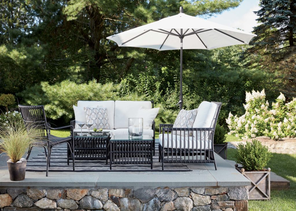
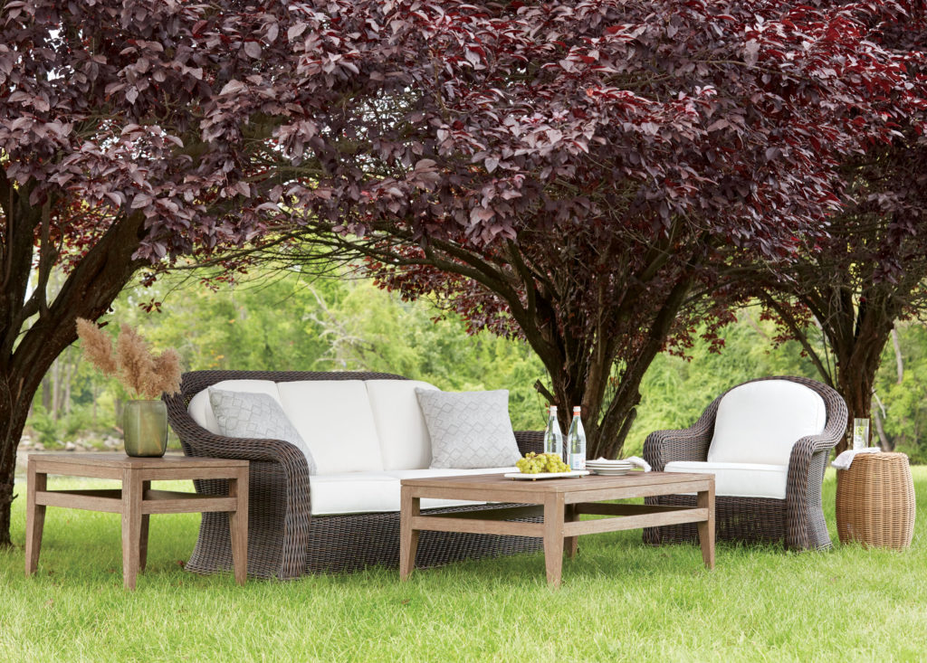
Vero Dunes delivers resort-worthy comfort and style, in all-weather wicker with a sleek onyx finish. Its resin-wrapped aluminum frame has the look of genuine wicker, but it’s lighter and rust-free for durability. Vero Dunes has a modern vibe, classic notes and exceptional versatility.
BRIDGEWATER COVE
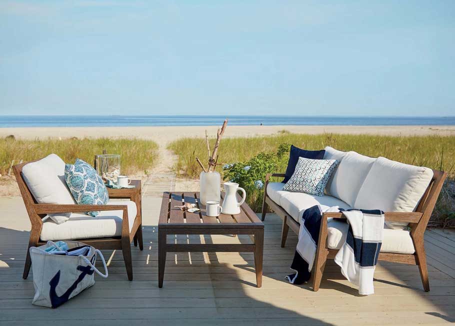
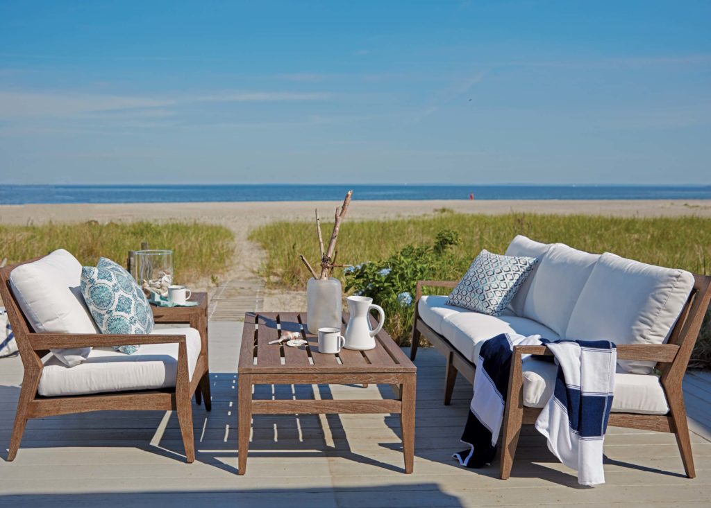
Design a more decked-out deck with Bridgewater Cove, a strikingly simple, relaxed and refined collection crafted of sustainable Plantation Teak. It has clean lines, tapered details and unmistakably modern notes. Its durable cushions are as comfortable as any you’ll find indoors.
BISCAYNE
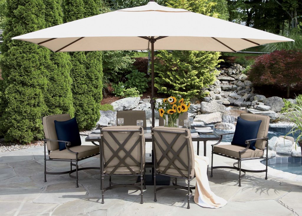
Picturing a prettier patio? Biscayne is a classic that invites you to unwind elegantly. Its timeless style (transitional, with arm scrolls, gracefully curved chair stretchers and a double-X back) is at home in any outdoor space. Need shade? The tempered glass top is available with an optional umbrella hole.
MILLBROOK
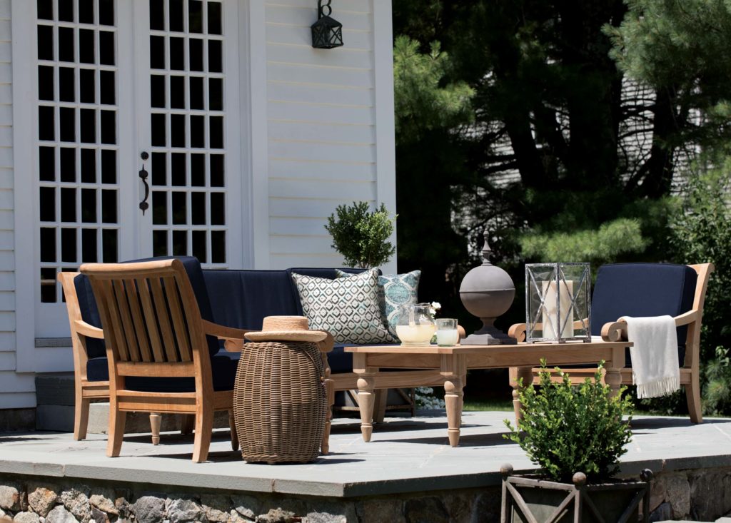
Proving style doesn’t stop at the French doors, Millbrook delivers refined good looks and timeless style to any outdoor space. It’s crafted of sustainable Plantation Teak, with a look that’s part West Indies lanai and part English garden; its generous scale and beautifully carved arms and legs lend it a formal feeling.
REDDING RIDGE
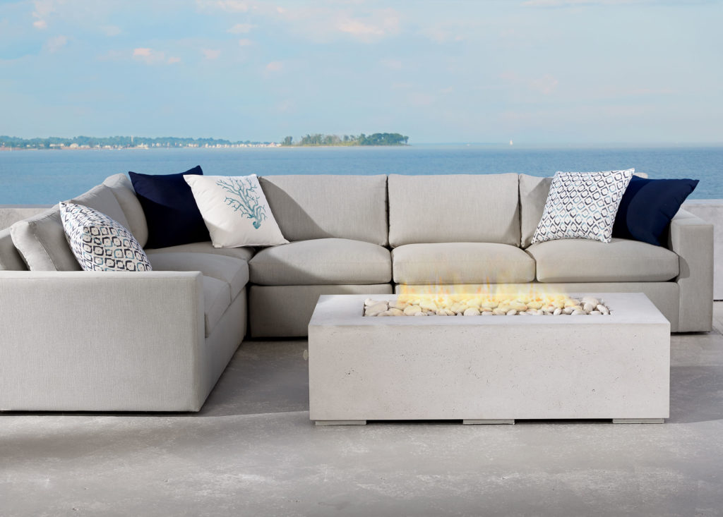
Lounging around never looked so good, Redding Ridge is a stylish, inviting, fully upholstered collection made to weather the elements. With clean lines, deep, comfortable seats and a strong, durable frame, this gorgeous collection blurs the lines between indoors and out. Our modern concrete fire table adds warmth and ambience at the flip of a switch.
NOD HILL
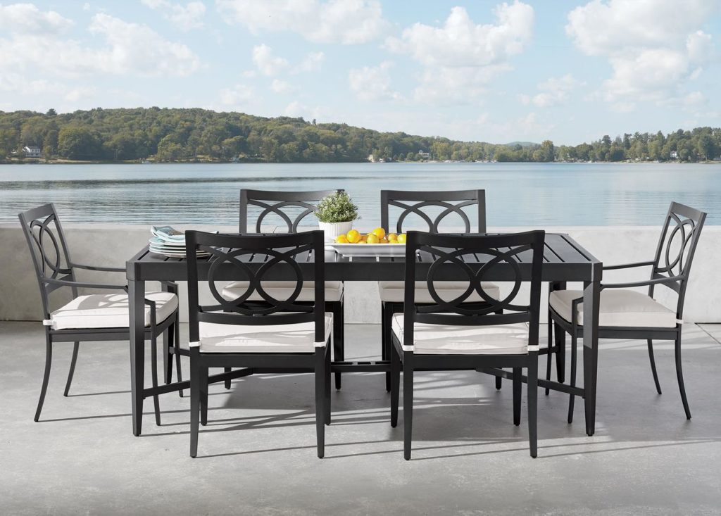
What better way to start the day than under the summer sky? Serve up breakfast or brunch on a dining table from the Nod Hill collection. With an interlocking circle design and gently curved arms, the coordinating chair is simple and stylish. Indoor/outdoor aluminum frames are powder-coated for good looks and generously scaled for comfort.
WILLOW BAY
A pretty spot of shade on the lawn is the perfect place for Willow Bay, a graceful, all-weather woven collection with a fresh, updated look. A cool, contemporary, tightly closed weave gives the collection the look of genuine wicker. The rust-proof aluminum frames are durable, so Willow Bay will last year after relaxing year.
~ ~ ~
Find your favorite? Good. Now mix things up! Many of our styles can sit seamlessly alongside others, so you don’t have to furnish your dining, lounging and conversation areas with just one collection. (Wood and all-weather wicker look great together, for example.) Use color, pattern, even greenery, to tie them together and create a cohesive look. Select from dozens of our fab performance fabrics, and add pillows, rugs and umbrellas, to create outdoor rooms you can really live in.
The iconic fashion designer Coco Chanel once said, “Simplicity is the keynote of all true elegance.” We couldn’t agree more, and you’ll see just how true her statement is in our new selection of relaxed modern styles.
With an eye on livability and a nod to midcentury modern and Hollywood glamour, our designers have created an exciting array of furnishings that dispel any notions about elegant design being fussy or formal. The styles have an overall modern sensibility with low profiles, and sleek lines, yet they are exquisite in their details. What’s more, they’re surprisingly versatile and comfortable. If you’re seeking out modern furniture ideas for your home, you’ll want to give these new styles a closer look.
UNIQUE FINISHES
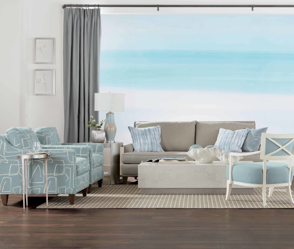
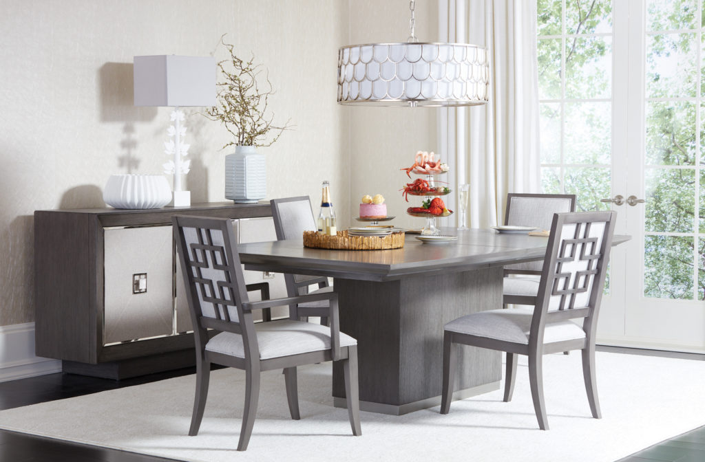
Minimalist looks, like the Braemore coffee table, get a casual feel from a unique wire-brushed stain in gray, alabaster or mink. Many pieces feature metal accents in satin nickel and champagne gold finishes, and modern forms, like the McLevin open cube table, are wrapped in fabric to become bold fashion statements.
MIXED MATERIALS
The looks are unfussy, but far from unfashionable. A unique mix of materials like marble, mother-of-pearl, clear acrylic, faux shagreen and recycled glass, distinguish many of the pieces, adding unexpected texture and dazzle to clean, modern settings. The streamlined Rambert oak buffet serves up many chic suprises with fabric-wrapped doors and stainless steel pull knobs with capiz shell inlays.
SERENE HUES
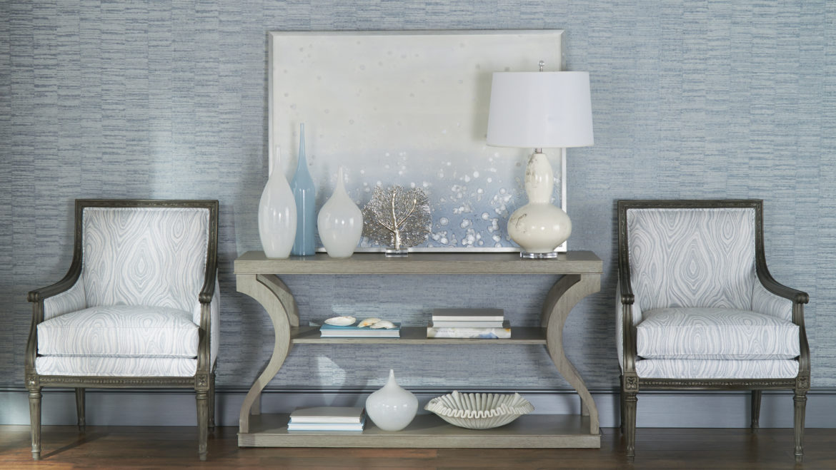
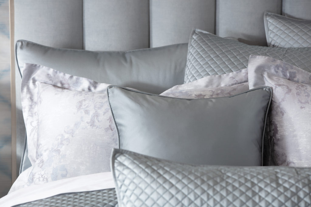
A tranquil palette of blue, gray, white and sand creates a relaxing, feel-at-home vibe. These sophisticated neutrals are always fresh and can go from coastal charm to city chic. The lustrous Salena quilted bedding in mist blue and Loren mother-of-pearl stool are just a couple of our favorites for bringing these hues into your home.
MODERN COMFORTS
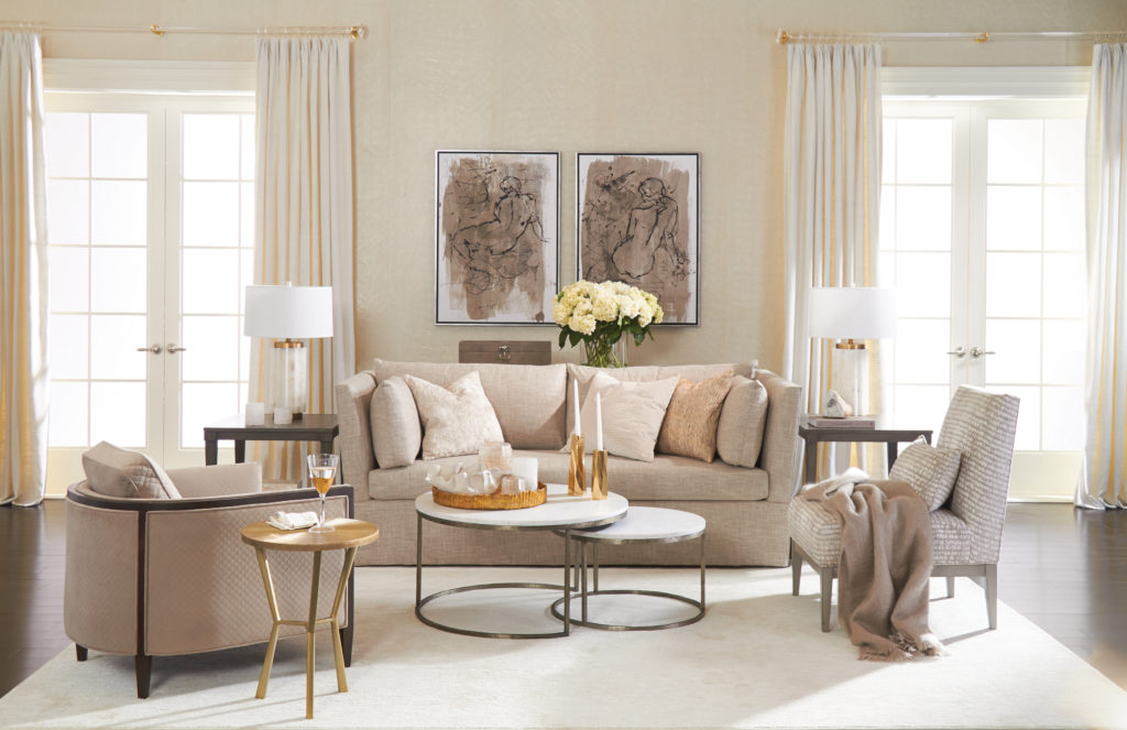
Hand-tailored sofas and chairs with tall backs, sleek profiles and subtle curves deliver luxurious everyday comfort with understated glamour. The Channing sofa brings back the Deco curved sofa in a small-scale design that suits small spaces, while the Averill shelter-arm sofa, with your pick of a tailored waterfall skirt or tapered legs, looks stunning dressed up or down.
GET ELEGANT DECORATING IDEAS FROM OUR DESIGNERS
Whether your taste leans modern or glamorous, eclectic or classic, our new relaxed modern designs can bring a sophisticated flair to your home. Head to your nearest Design Center to see them up close and personal, or to speak with a designer who can help you create a simply elegant look of your own. Their services are always complimentary.
The couple walked into the West Des Moines Design Center on a whim. They weren’t at all sure they were in the right place. They told design associate Paige Mongar they had a statement room to furnish, with a very particular look in mind: modern, with midcentury and Scandinavian notes.
“They thought Ethan Allen was only associated with traditional and classic design,” says Paige, our latest Design Star, “but they knew our quality was unparalleled, so they were curious to see our product line.” Without hesitation, she reassured them that Ethan Allen offered the chic, minimalist styles they were after.
“They needed to furnish the vaulted living room of their 1988 contemporary,” she explains. “There’s a balcony above, and the living room is open to a well-defined dining area. They wanted to improve the flow and make the space more conducive to entertaining.”
The couple “favored a monochromatic palette with minimal pops of color,” says Paige. “They were looking for furniture that would reflect their love of Scandinavian and midcentury design. They wanted to highlight their artwork—and a beloved midcentury dining set and bookcase they’ve had since the 1960s.”
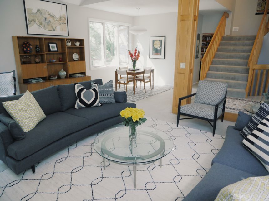
Paige confidently pointed them in the direction of modern, streamlined pieces, such as the delicately curved Apollo sofa, the Elgin chair, and Rowan buffet. She followed up with a house call and a detailed proposal—and the end result is this stylish and sophisticated space.
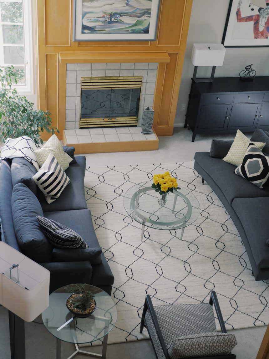
Facing Apollo sofas provide pleasing symmetry; their subtle curves invite conversation.
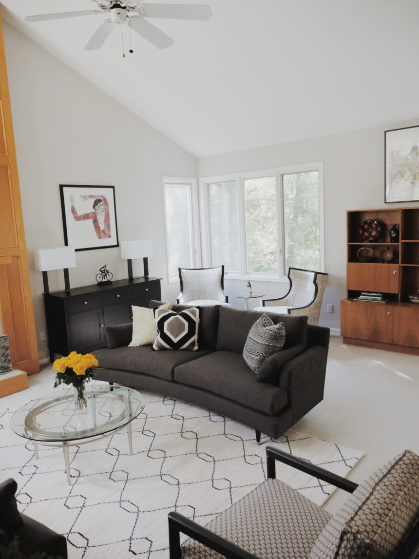
The scale of the room allows for generous seating—and good flow.
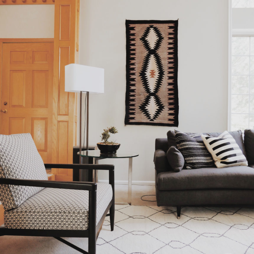
The Elgin chair is a midcentury-style icon; a variety of textures adds warmth to the room.
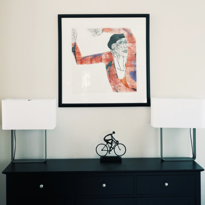
The Rowan buffet provides storage, a serving surface, and a base for showcasing art.
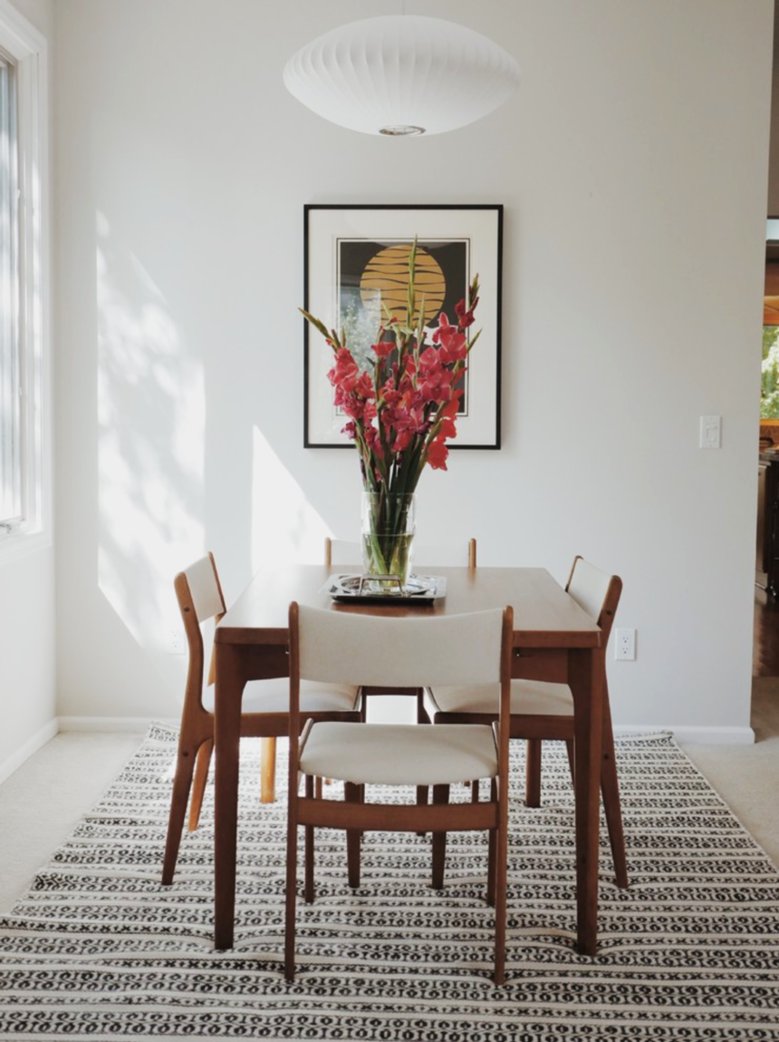
The vintage midcentury dining set is complemented by a Woven Symmetry Rug.
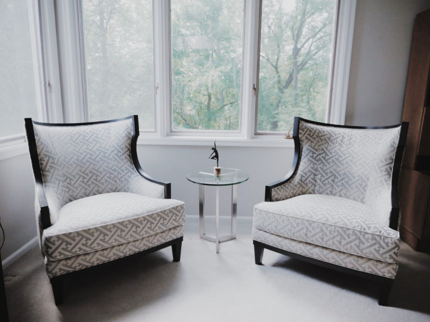
Corinne chairs create a lovely vignette—and an appealing corner reading nook.

Ethan Allen Design Star, Paige Mongar
No matter the style or scope of a project, Rose T. Bien-Aime says her goal is always to provide her clients with “a place of peace and comfort.” Rose, who is a consultant in our Rockville, MD, Design Center—and our latest Design Star—also believes we should infuse our homes with a little romance every chance we get.
“My goal is to make my clients feel sophisticated and romantic every day,” she says. “As a designer, I love to create spaces that are timeless—and sexy!”
Rose adds romance by layering rooms with classic pieces and curated touches of glam. She prefers pleasing palettes that lean toward neutral, with unexpected pops of color. She loves to marry clean lines and shapely silhouettes and thinks no space is finished until it shines—literally (she adores silver and gold finishes).
When Rose is designing a room, every element matters. “Window treatments, carpeting, lighting, mirrors, accents, and art—they all play significant roles in raising levels of sophistication and romance,” she says. “But it’s the perfect mix of materials, finishes, and furnishings in a room that come together to lift your mood and warm your heart. For me, that’s romantic.”
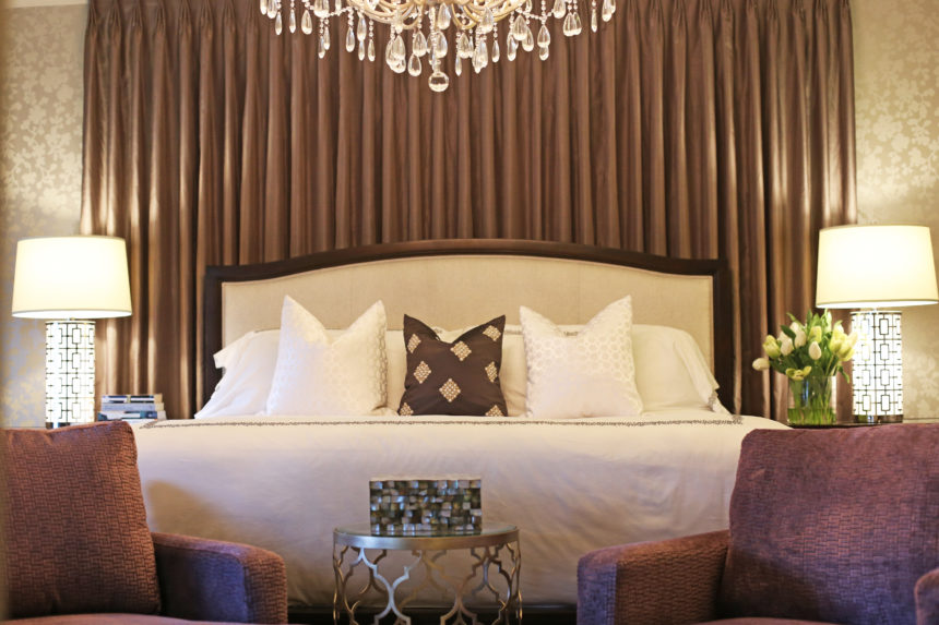
HONEYMOON SUITE
Rose’s client wanted a room that exuded the luxury of a five-star hotel, “an environment that made her feel like a queen at night and even more glamorous in the morning.” Rose did it with Hollywood-inspired metallic wallpaper, wall-to-wall silk drapery panels in charcoal gray, and an oversized crystal Whitney chandelier over the bed. Gideon chairs complement the upholstered Charlton Bed. The finishing touch: All that reflected light!
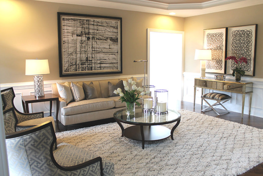
IN A MIDCENTURY MOOD
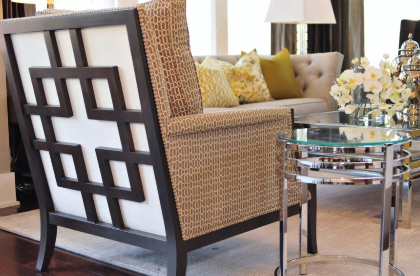
This sophisticated living room has all the hallmarks of a period piece. It’s designed around a pair of Corrine chairs, which Rose describes as “sexy from every angle.” The cool gray-and-cream palette is inherently elegant. The perfect complement to Corrine: the curves on the glass Cirque coffee table and the Gracie end tables. The Vivica console and the Xanadu bench add midcentury drama.
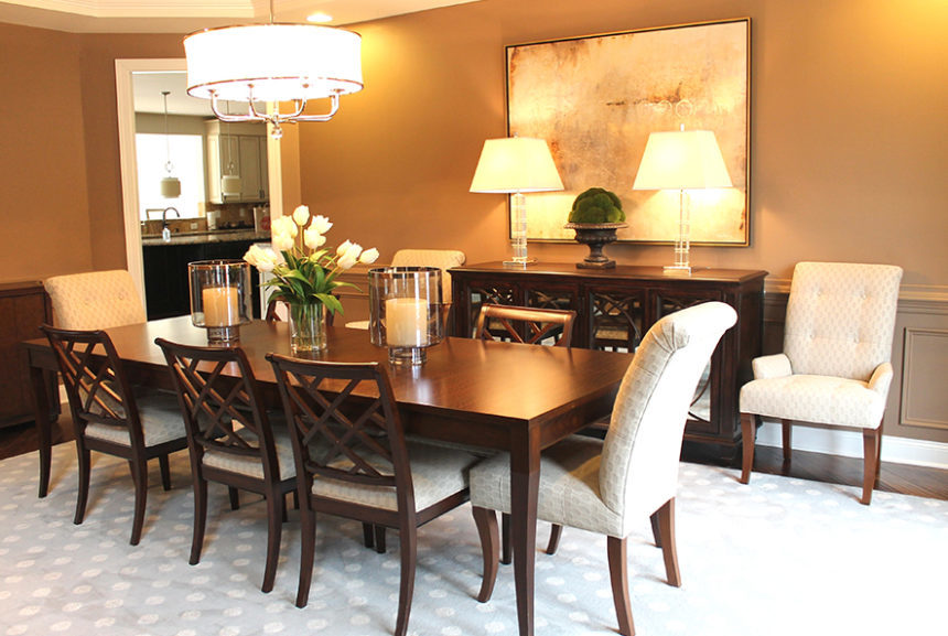
WINE AND DINE
Rose’s clients wanted a timeless dining space that works as well for large parties as it does for as candlelight dinners for two. The stunning Barrymore table sets an elegant tone with its graceful saber legs and exotic wood finish. The antiqued mirror glass and circular-cut mullions of the Brandt buffet provide instant ambience. Rose mixed Verlaine side chairs with Verlaine armchairs for a whimsical touch. Glass, crystal, and nickel provided sparkle!
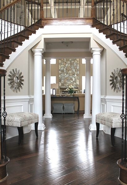
GREAT EXPECTATIONS
Just how romantic is a double staircase foyer? “It’s ‘Gone with the Wind’ all over again,” says the designer. The balustrade is very refined, while the gorgeous millwork speaks for itself. Rose played up the room’s symmetry with two Wellesley benches in a neutral patterned fabric. She added glitz with the placement of Starburst mirrors above the benches, officially setting a romantic tone for the rest of the home.
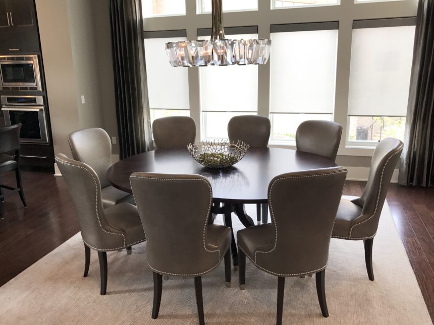
STYLE IN THE ROUND
What happens when a dining room doubles as the entryway to a home? For Rose, the answer is “a quiet storm of classic elegance, romance, and undeniable flair.” The modern, sexy lines of the Ashcroft dining table paired with the curvaceous Penelope chairs deliver just the combination she was after. Everything else—from the chandelier and area rug and to the simple Cora bowl—enhance the core design.
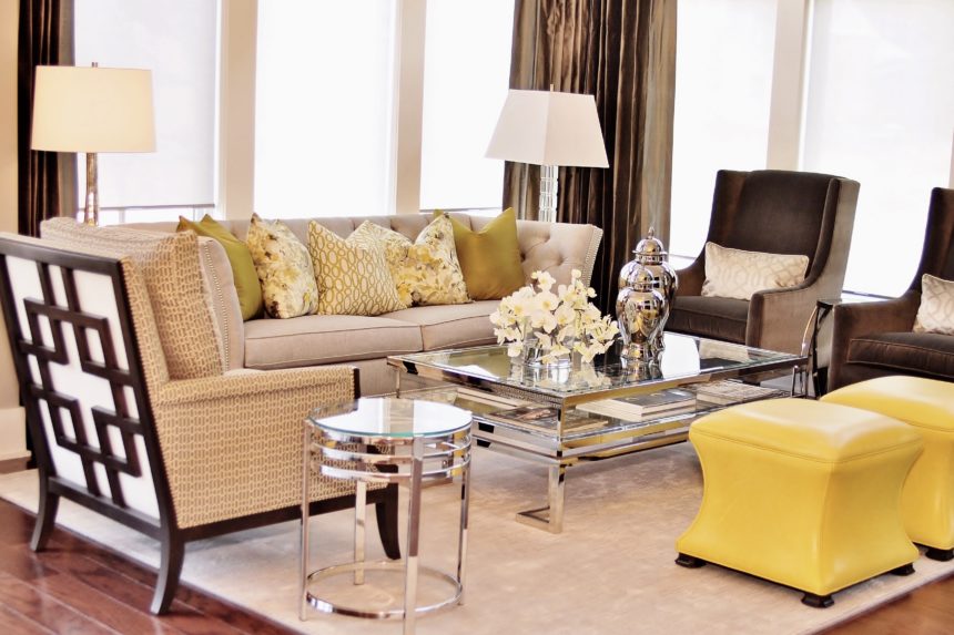
URBAN GLAM
This space is all about modern drama, with the tufted Shelton sofa setting a sophisticated mood. Rose chose it to gracefully anchor the Kyle wing chairs, as well as the uniquely styled Grayson chair in the foreground. The
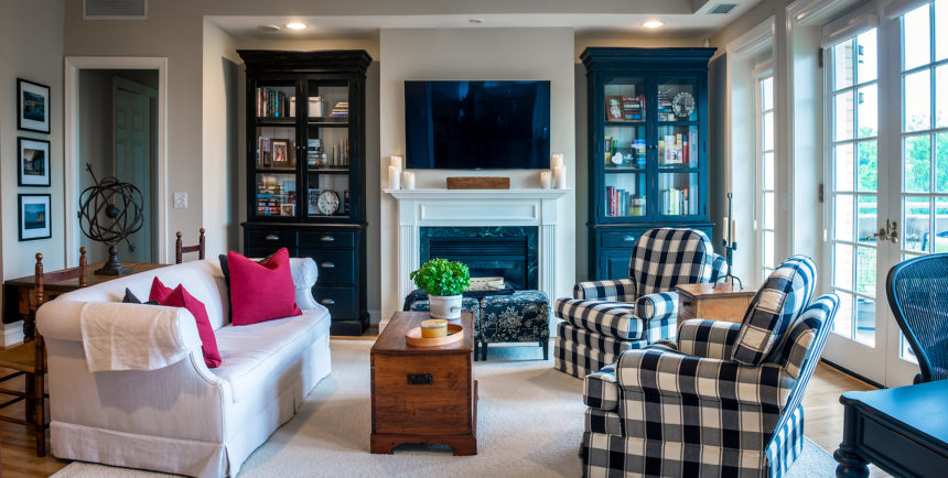
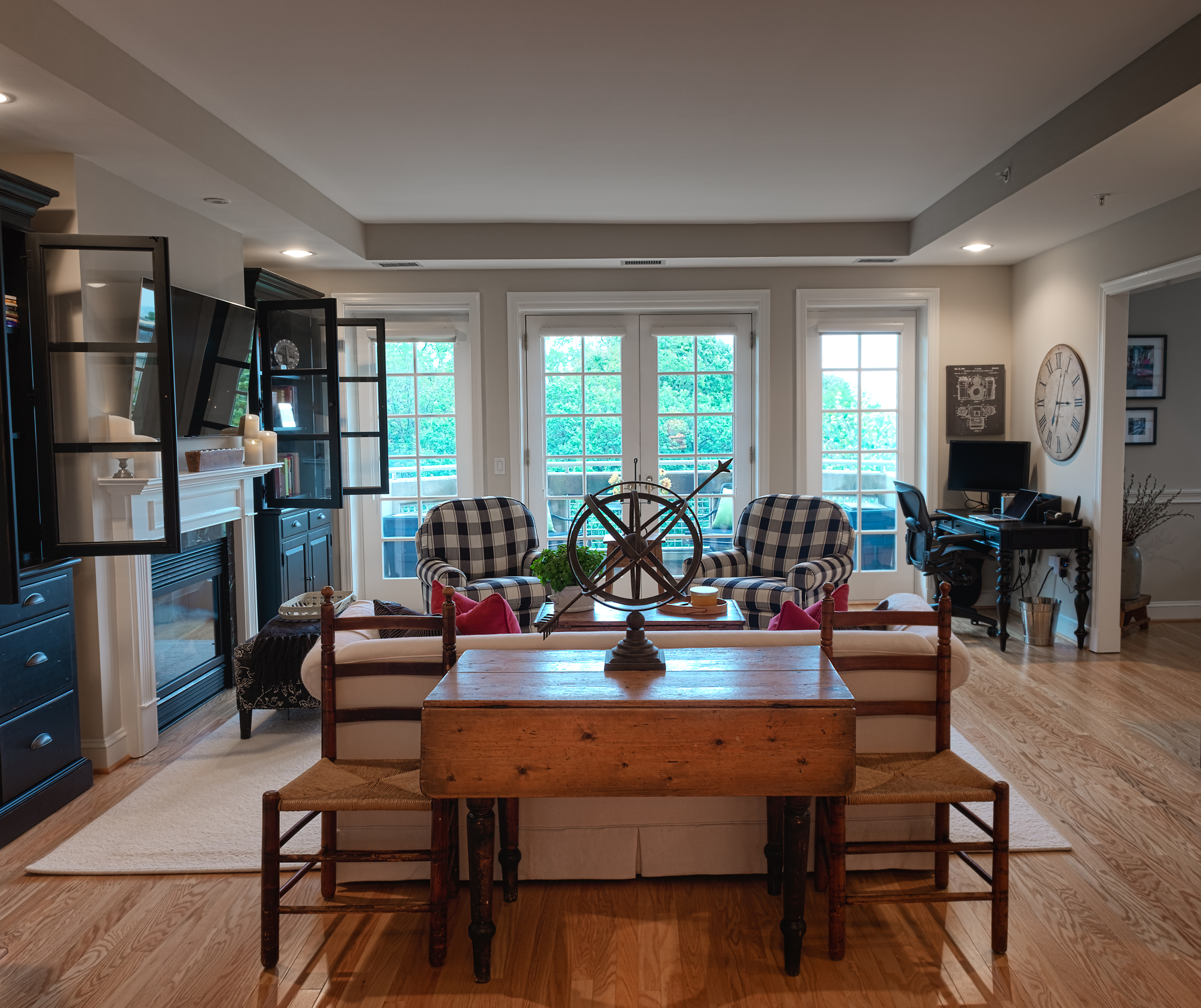
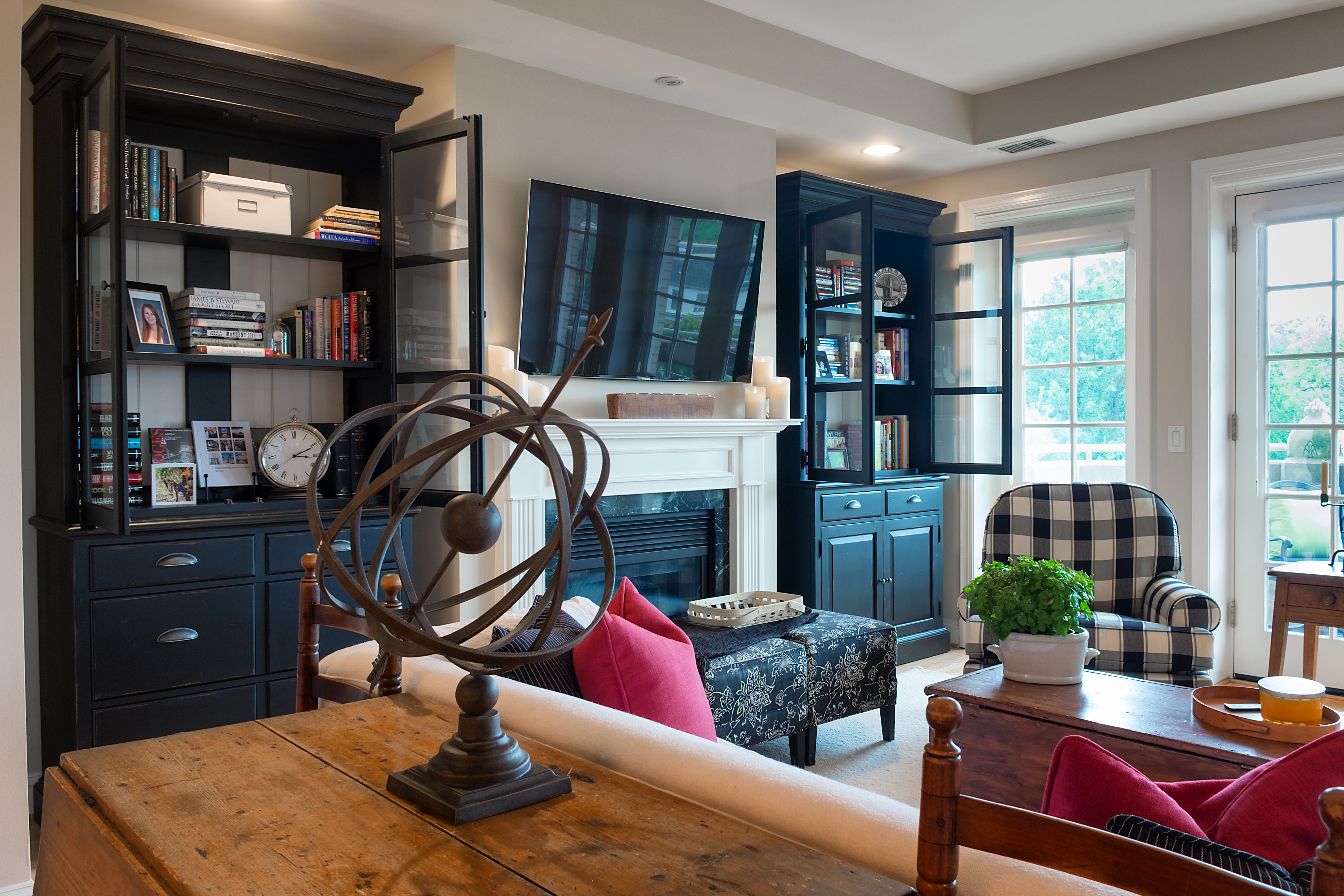
Farmhouse style has been a mainstay of interior design forever—or at least it seems that way! It’s easy to see why: It’s homey, relaxed, and authentic. Every region has its own take on it—from ranch (think Texas) and plantation (Georgia) to homestead (New England). There are style subsets, too, from traditional to Tuscan. With so many ways to crush on farmhouse style, it’s no surprise it’s branched out far beyond the countryside. Julie Goss, a designer in our Vienna, Virginia, Design Center, recently helped a downsizing couple furnish a new home in farmhouse style—in a penthouse in the heart of Washington, D.C.
We caught up with Julie, one of our Design Stars, recently and asked her to share her story.
EA: A farmhouse and a penthouse are as different as any two homes can be! How did you make the space into something it’s not?
JG: The architecture was on our side: wood floors, French doors, nice ceiling height. It was neutral enough to let us move it in the direction we wanted.
EA: What was the look your clients were going for?
JG: Traditional farmhouse with a black-and-white color palette. The wife is an avid photographer, so we needed to “hide” a home office in plain sight, which we did with two Sayville double-door cabinets that flank the fireplace, and the petite Turner desk in another corner. It’s the perfect blend of style and function, in a space where every inch mattered.
EA: What existing pieces did they want to incorporate?
JG: There was a long list: a sofa, trunk/coffee table, a drop leaf table, ladderback chairs, an art collection, and lots of antiques.
EA: What do antiques bring to the design table?
JG: I love working with antiques. They deliver an extra layer of character, texture and history. Things that are handmade bring soul and make a space special. Antiques can be integrated into any type of project. I especially love to juxtapose them with very modern or tribal pieces. Antiques wake it all up.
EA: How did you embrace farmhouse style with the new pieces?
JG: We chose styles that are relaxed and eclectic. Twin Devonshire swivel gliders in a bold check add style without overwhelming the space. The neutral rug gives the room a cozy, cohesive feel. Many of the accents feel vintage, so they blend right in. The weathered iron armillary, which was designed to impart a feeling of age, is a perfect example.
EA: The space is lovely; was there one secret to its success?
JG: The black and white color palette was the “special sauce” here. It’s timeless; it works with every style: traditional and modern, casual and formal. By keeping to a disciplined palette, we could make the space feel modern. Sometimes it’s daunting to bring in so much black, but it was needed to make the white pop. It turned out to be a very airy, open, and happy space. They love it!
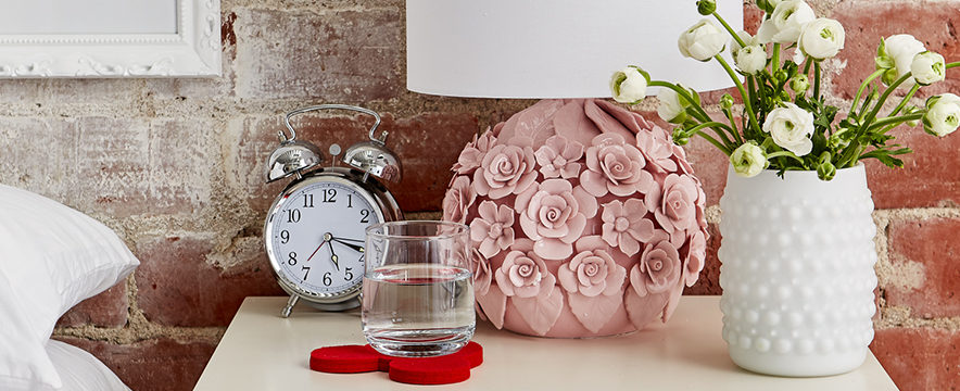
Pretty is as pretty does—and petal-soft pink is the prettiest of all! Yours from Ethan Allen | Disney. Sign up for your baby’s registry now!
#EthanAllen #EthanAllenDesign #EthanAllenxDisney

