

Take a (blue) note and discover ways to get a cool, coastal look—no matter where you live. Ethan Allen designer Tia Ortiz shares her secret: a beachy blue palette.
It’s a palette that gives a room movement—and repose. It’s inspired by surf, sand, and glistening blue-green fragments of sea glass that wash up to shore. We call it beachy blue. It’s a favorite of EA designer Tia Ortiz, of our Rockville, Maryland, Design Center. “I work with a lot of clients who lean toward modern, livable spaces,” she says. “So I recommend enduring styles and a sophisticated mix of patterns. And if they like cool, versatile colors, I almost always turn to a palette of sea and sky.”
People gravitate toward beachy blue because it’s both serene and uplifting. It’s the mainstay of coastal décor, of course, along with warm white—and the go-to palette for anyone who’s ever dreamed of living at the shore. It’s very approachable, ideal for a casual presentation. “It’s a cool color combination I absolutely love,” says Tia.
BACKGROUND CHECK
Beachy blue offers an ocean of decorating possibilities; it can swell (when used as a painted background) or be still (when used sparingly). We adore priming a canvas with it. No matter the furniture style, it creates a calming mood.
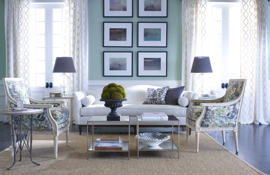
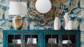
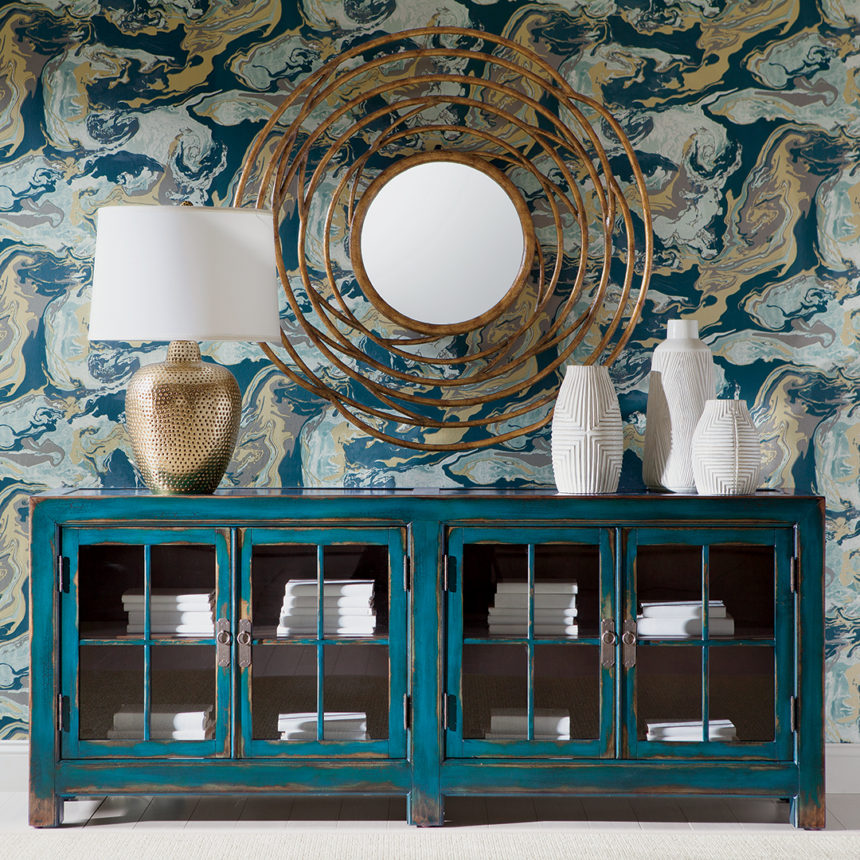
Our evocative Glacier prints stand out against a wall that leans toward green-blue.
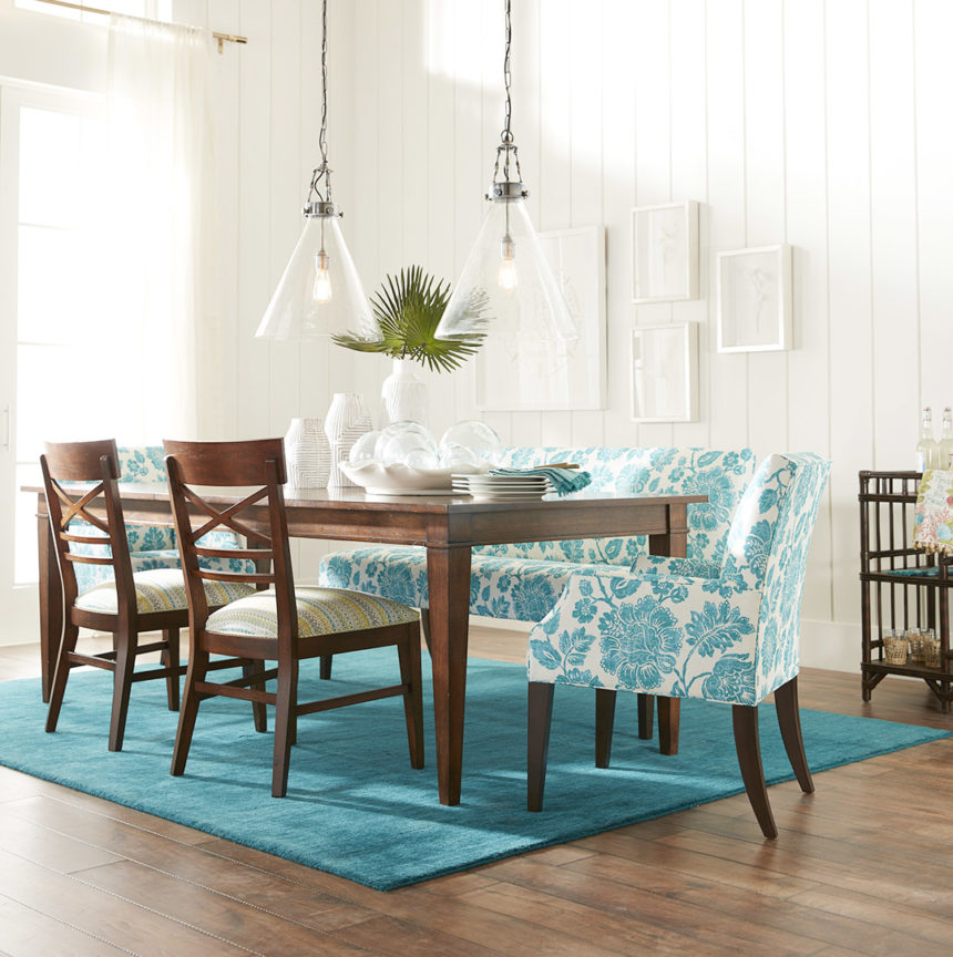
This transitional space owes its casual good looks to a cool aqua and soft white palette.
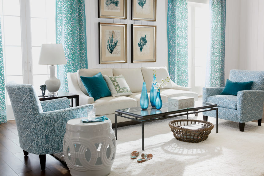
White pieces pop against subtle blues, proving negative space can have a positive impact.
FABRIC SOFTENER
Go coastal with blue hues in a sophisticated mix of patterns—whatever makes you feel most at home, advises Tia. Beachy blues can tone down bold patterns and accentuate subtle ones. They’re the common thread that makes so many fabric collections click.
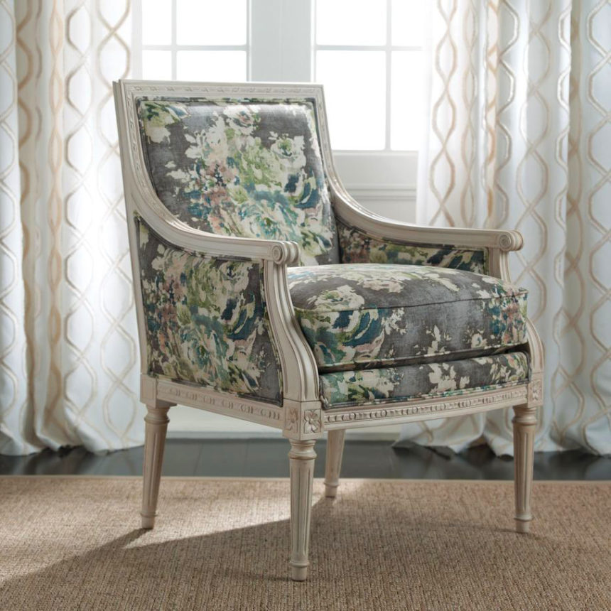
An antique white finish on a Giselle chair is the perfect foil for a watercolor-inspired floral.
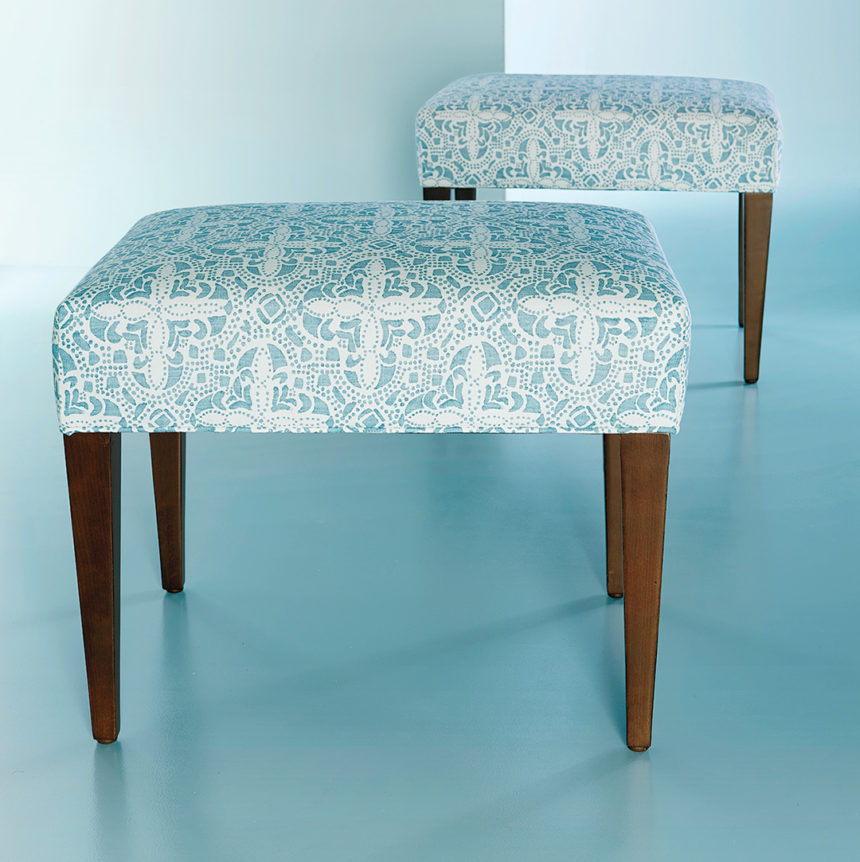
Beachy blues rise to the occasion when playing with lively, large-scale patterns.
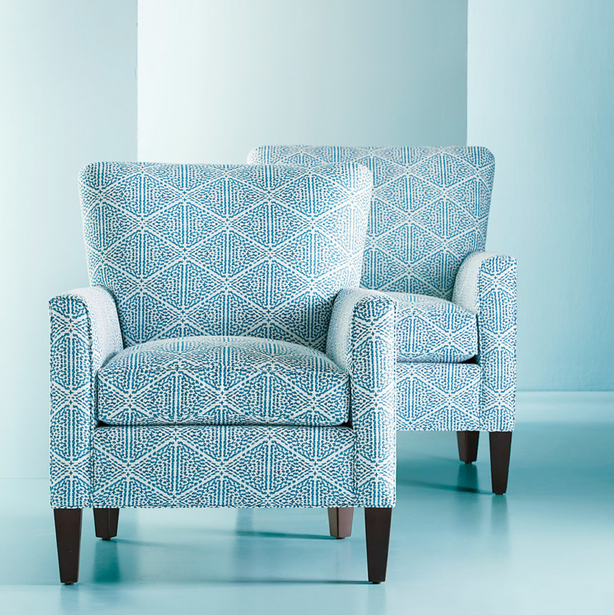
Graphic, small-scale patterns create a singular sensation—especially when you use pieces in pairs.
COMPLEMENTARY COLORS
You don’t need a serious commitment to live with beachy blue. A pop here and there is all it takes to pull together a casual space with ease. When used sparingly, it serves to complement, not consume, a space.
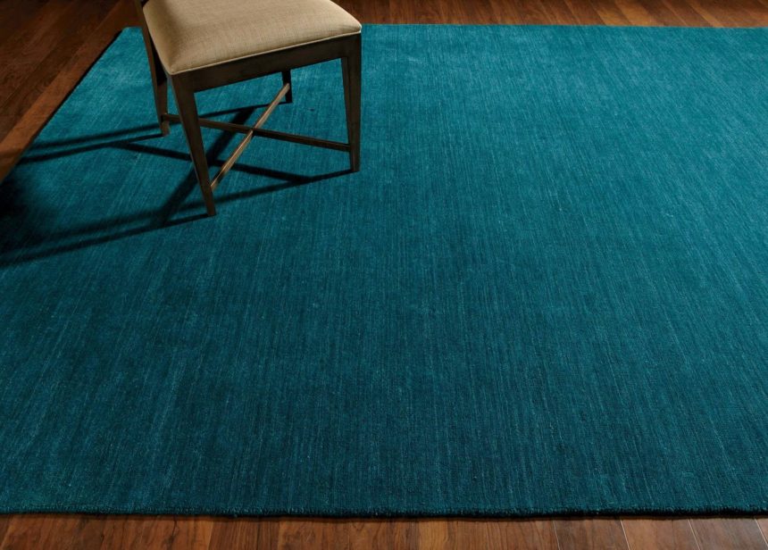
A hand-loomed rug in rich, tonal turquoise goes over to the dark side, in a good way.
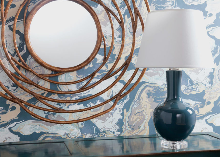
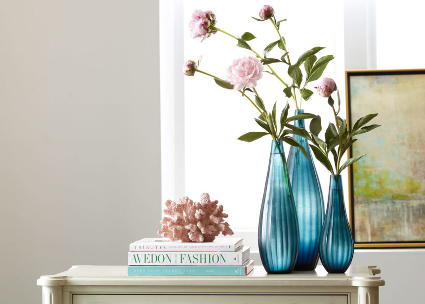
Here, there, and wherever you like, beachy blue accents make a splash.
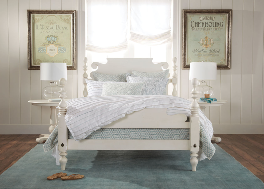
One of the things we like best about a beachy blue palette is how ambience altering it can be—even when it’s barely there. Start with a whitewashed Quincy bed to set a romantic mood, and complete the serene scene with a hand-loomed wool rug, a bedding ensemble that stars the lovely Foulard Block Print Quilt in sea glass, and artwork that evokes a sense of the French countryside.
Like this summery palette as much as we do? Explore our inspiration rooms for even more fresh ideas at ethanallen.com. To see more beautiful rooms in every palette under the sun, subscribe to The Art of Making Home.
