6 Inspiring New Year Resolutions for Your Home

It’s nearly New Year’s Day, which means it’s resolution time! We asked some of our team members here to share their “home goals” for the new year. Some are big picture game-changers. Some are small steps that can make you feel good all day. We hope they inspire you to make some of your own!

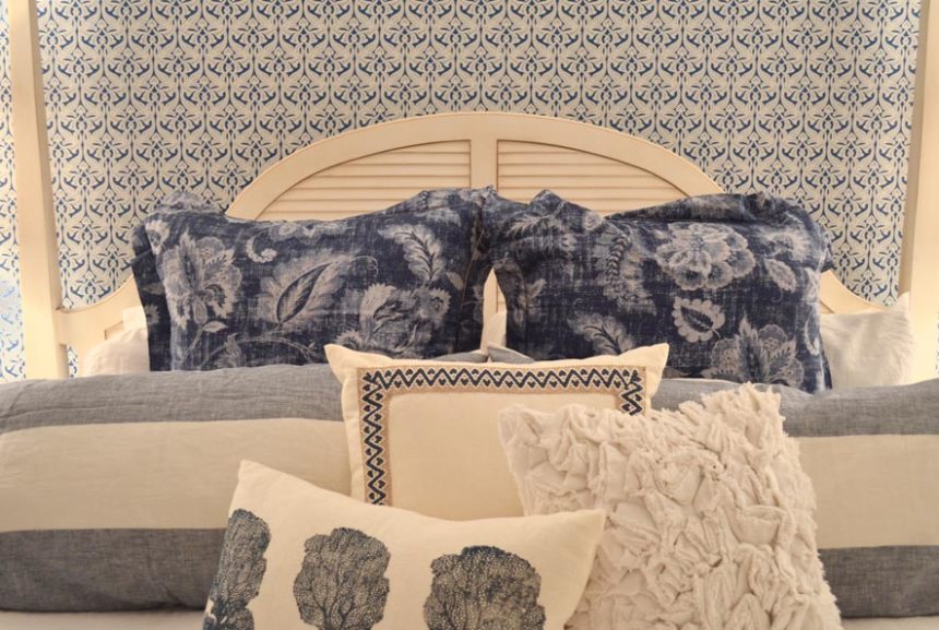
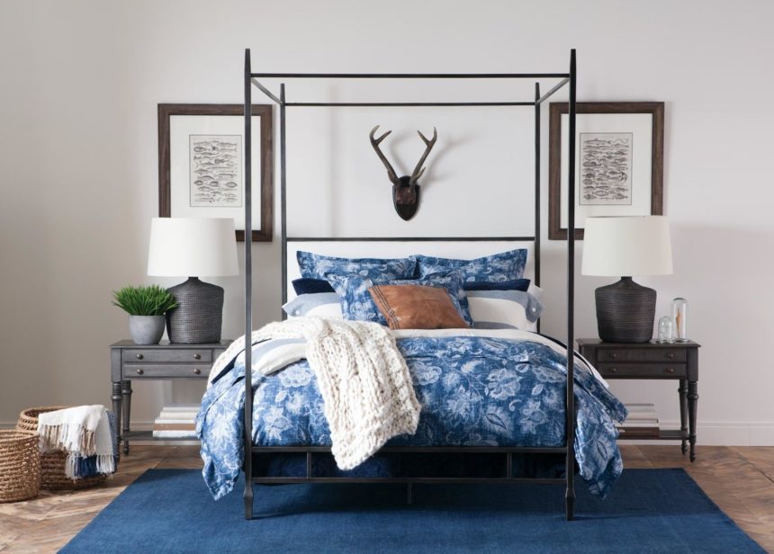
SHAWN LANG, Consultant/Lifestyle Blogger:  “My New Year Resolution this year is pretty simple but important: I vow to make my bed every morning. And not just throwing the blanket over with the sheets all crinkled up underneath. I’m actually going to make my bed just as I do when guests come over: Perfectly. The way I see it, it’s the first accomplishment of the day! Getting it done will give me the motivation to accomplish other projects throughout the day. And nothing beats coming home to a freshly made bed where you can relax with a good book.”

MISSY GRASSO, Senior Designer: “My place is a tiny apartment on a working farm. I love it. It keeps me in balance, which is really important if you work three jobs, like I do! When I moved here three years ago, I didn’t take the time to reorganize my life, and it’s about time I did. So, I resolve to get organized, especially with my finances, to get a laptop (my phone’s just not cutting it), and despite lack of space, to find a filing solution. I’m looking forward to feeling like things are under control and living happily in my tranquil haven!”

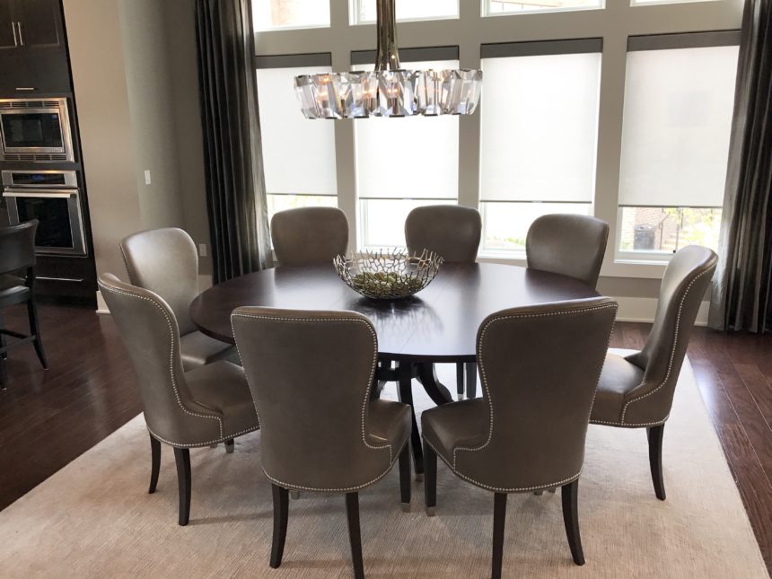
MARIA LAPIANA, Copywriter: “Like a lot of people, my New Year Resolution is to clear the clutter; specifically, the clutter on my dining room table. Most of the time it’s piled high with mail and miscellany. It’s also a way station for pretty much everything that’s on its way into or out of the house. The mess is controlled chaos, but it still drives me nuts. So in 2018, I’m going to give it a clean sweep. Or a sweep. At least a dusting… Well, I’ll do my best. After all, how hard can it be to move everything to the kitchen counter?”

LAURA CHAPMAN, Senior Director of Design: “I may finally alphabetize my spice rack, but it’s not certain. I like the thrill of the hunt when seasoning my food, and it makes my mom and mother-in-law crazy when they visit, so the chaos may be worth keeping!”

KAREN PEASE-MARINO, Senior Art Director: “We recently downsized, so my resolutions involve two spaces in our new home. The first: to make a collage of art, mirrors, and found objects on our blank dining room wall; I have all the pieces – now it’s time to get them up there. The second: to set up my studio. I’m planning to write a children’s book about extreme poverty in Africa, and my goal is to have it finished by June. I don’t need much – just a place for my computer, a table to work on my collages, and an “inspiration wall” for swipe, African fabric swatches, beads, quotes, and any other forms of inspiration that get my creative juices flowing.”

ILENE DORENBOSCH, Design Manager: “A good friend breeds golden retrievers, and as of Christmas, we have a new addition to our family! Our new little girl joins Cassie, our beloved  12½-year-old Golden – it’s been a long time since we’ve had a puppy in the house.  Our dog-driven New Year Resolutions are to give Cassie as much attention as the puppy, to make sure we don’t leave socks and anything that can be eaten within puppy reach, and to not argue about who will get up in the middle of the night to take the puppy out in the winter cold. We’re so excited for the sound of little paws running through the house again!”

We at The Daily Muse wish you a safe, happy, and prosperous new year.


The Perfect Fit of Metal and Wood Furniture Create a Truly Eclectic Style

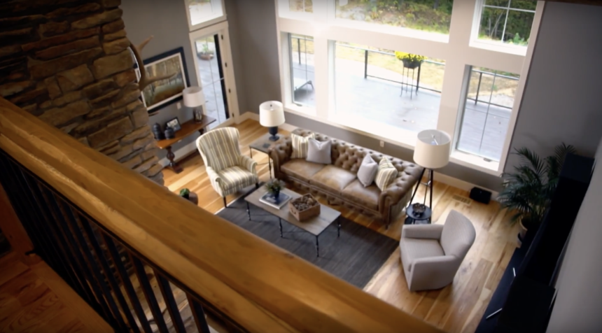
When homeowners Pat and Dan Stankey tapped Betty Swenson from our Ann Arbor, Michigan, Design Center for help in furnishing their home, they didn’t know what to expect. The home is unique, with lots of metal and wood, vaulted ceilings, and rustic touches. They were worried that she’d want to replace all their furniture with Ethan Allen. They were in for a very pleasant surprise. Inspired by the couple’s preferences and the architecture of the house, Betty helped Pat and Dan choose a combination of mostly casual pieces that gave their home the fresh, contemporary look they were after.


Tips for a Stress Free Holiday

This Thanksgiving, say goodbye to entertaining stress! These simple Thanksgiving tips can help you plan a day that everyone can love.

Make a Plan

Nothing is impossible once you break it down into simple steps! So: Get your menu set and your shopping done a few days before; jot down a schedule (e.g., what’s being cooked in what order, who’s arriving when, how you’ll pace the hors d’oeuvres, dinner, and dessert) and build in some socializing time for yourself; and make sure there’s enough seating for all your guests.


Back to the Future

Nothing beats a recipe that’s been passed down for generations. Send happy Thanksgiving memories into the future by preparing a family favorite or two – you could even have copies of the recipes for guests to take home.


Get an Early Start

Check those recipes to see what you can make in advance. Stocks for gravy, sides, and dough are all good candidates for pre-prep.


Ready…Set…Set the Table!

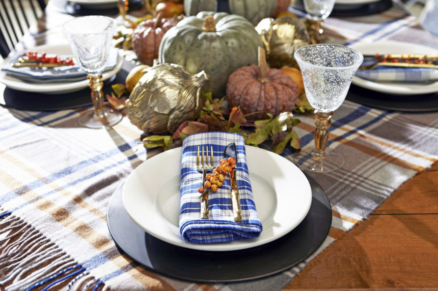
Tablescaping game on. Check out our Harvest tabletop here.


Card Your Guests

Hosting a crowd? Assign seats with place cards, mixing friends and family to create a more social experience.


The Warmest Welcome

Greet your guests with a signature cocktail or a steamy mug of hot mulled cider (with or without the rum!).


Open with a Wow

Feel like stretching those creative culinary muscles? Start with one over-the-top appetizer to get your party started.


Child’s Play

Set up games, an easy craft, or a space where the little ones can put together a simple yummy dessert, and they won’t have time to ask, “Is it ready yet?”


Pass the Sanity, Please

If there are lots of people or lots of dishes, simplify your hosting duties: Set up a buffet near the table and let guests serve themselves.


Behind the Design: How One Partnership Turned into a Friendship

When design consultant Gabriella met her client, Renee, to go over ideas for her master bedroom, the women had no idea that a “wow factor” project would bloom into a fabulous friendship. Renee is now married with a baby—and she’s still happy to call Gabriella a friend.  “As my life has grown and evolved, Gabriella has grown and evolved with me,” she says.

At Ethan Allen, we like to think of it as added value!


At Ethan Allen we’ve been on the move, to bring global design home to you! We call it Passport.

At Ethan Allen, we’ve been on the move, exploring new places and styles, new colors and finishes, new fabrics, and fresh, new pieces designed to bring the world home to you. We call it Passport, home furnishings and accents inspired by the rich tapestry of cultures from around the globe.

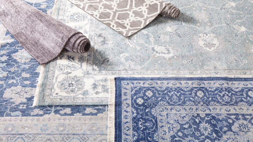
Passport is drawn from looks past and present, near and far—from India’s hand-knotted rugs to campaign-style dressers, from Ming Dynasty-inspired display cabinets and occasional tables that hint of pagodas, to woven rattan chairs designed in the rich tradition of British Colonial style.

Passport is exotic yet warm, collected, authentic, and livable. There’s something for everyone to love, whether you’re an armchair tourist (by the way, have we got an armchair for you!) or an intrepid traveler. Passport is your license to live adventurously, anywhere in the world.

We invite you to indulge your wanderlust in the comfort of your own home. Take a look—and come along for the ride!


Pattern in Interior Design: Q&A With Tad Donovan

Designers know that pattern is a powerful decorating tool; some would argue that it has even more currency than color. Tad Donovan is someone who knows the importance of pattern—and he uses it often when he designs spaces for Ethan Allen. Tad, who is based in Fort Lauderdale, is our latest Design Star.
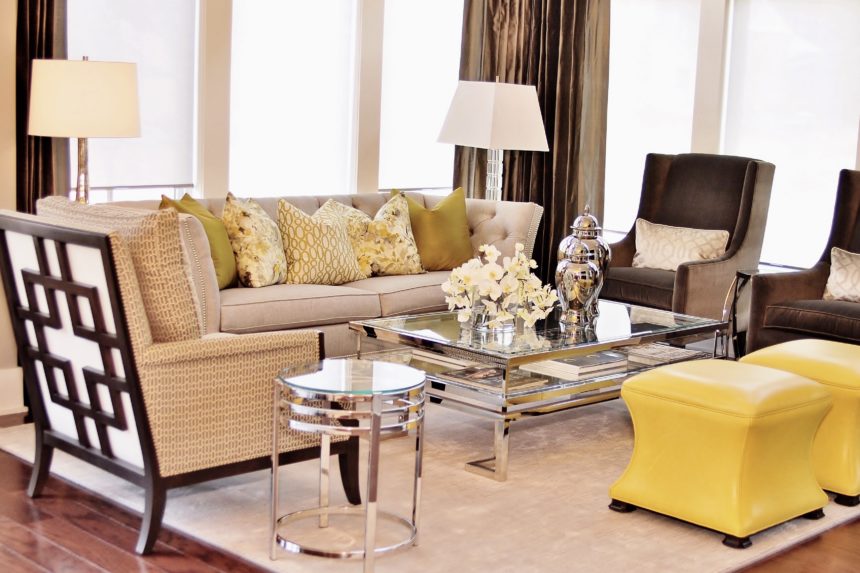
We caught up with him recently and asked him to share his strategies for making the most of pattern in his projects.

EA: What does pattern bring to the design table?

TD: Pattern brings visual interest and an element of excitement to a room. It offers infinite possibilities for creating a space that really suits a client. It allows us to seamlessly integrate their personalities.

EA: How did you develop such a comfortable relationship with pattern?

TD: I give my parents credit; both were very talented. I was in my teens when they were building a new home, and I remember the binder my mother kept with all the samples she liked. I saw how she pulled different patterns together, making sure that each room made sense and related to the rest of the house. I think of pattern in the same way; it’s like pulling together a wardrobe—selecting ties, shirts, jackets, and accessories—with an eye toward everything working together.
EA: What are your rules for designing with pattern?

TD: Don’t be afraid of them!  If a client can point me in the direction of one fabric they like, I can help them conquer their fears. It not only gives us a starting point, but it also gives me a sense of who they are. From there, I can interject ideas to expand on their interests.
EA: How about mixing patterns?

TD: Yes, please!

EA: What are some of the common pattern mistakes people make?

Using too much of a similar pattern.


EA: What’s the difference between pattern and a print?

Patterns are everywhere—they appear in all kinds of materials, not just fabric. A print is technically a textile that has had dye applied to it—in the form of a pattern. Informally, I think of pattern as more geometric, or a series of repetitive lines/circles/colors. When I think of prints, I think more of a floral or toile.

EA: You say patterns are everywhere—where do you find them in the home?

They can be in architectural details such as dentil molding; tiles (a Moroccan motif, for example); flooring (think parquet wood floors); even in brick or stone walls.

EA: Do you live with patterns at home?

Let me think … that would be a yes!

PILLOW TALK

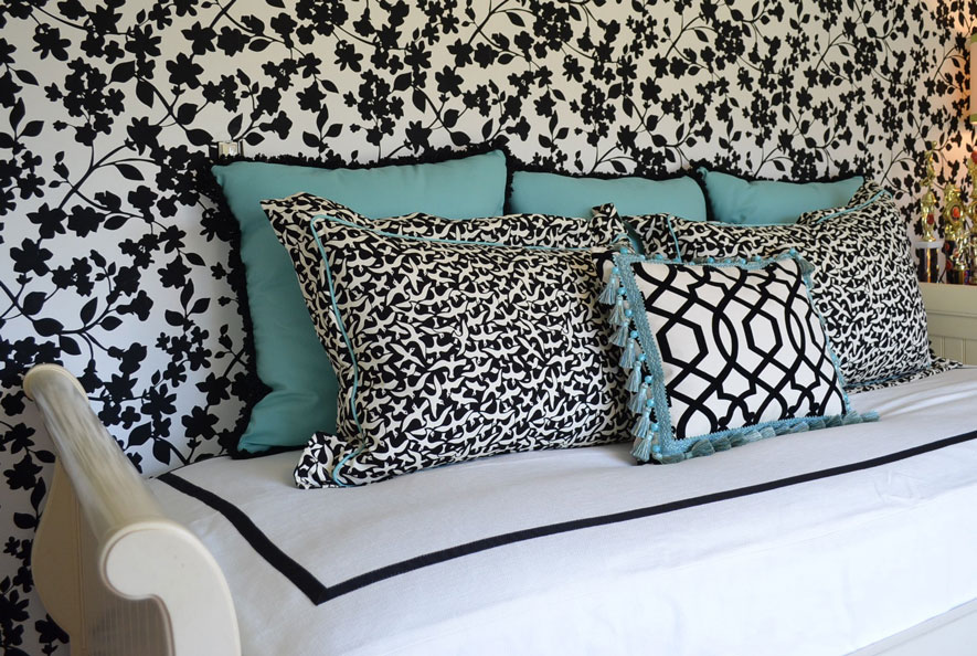
TD: My client wanted to update a teenage girl’s room using her existing EA furniture. The daughter wanted a palette of black, white, and “Tiffany blue.” I centered the trundle bed on the papered wall and framed the custom bedcovering with grosgrain ribbon on all four sides. The pillows pull everything together: We chose a small-scale print on two pillows for a positive/negative contrast with the walls. The smaller pillow features a black-and-white geometric pattern and a fun tassel trim. We went directly to the source for the larger pillows and trims—using a box from Tiffany to get the blue just right.

MASTER PLAN

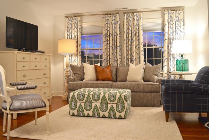
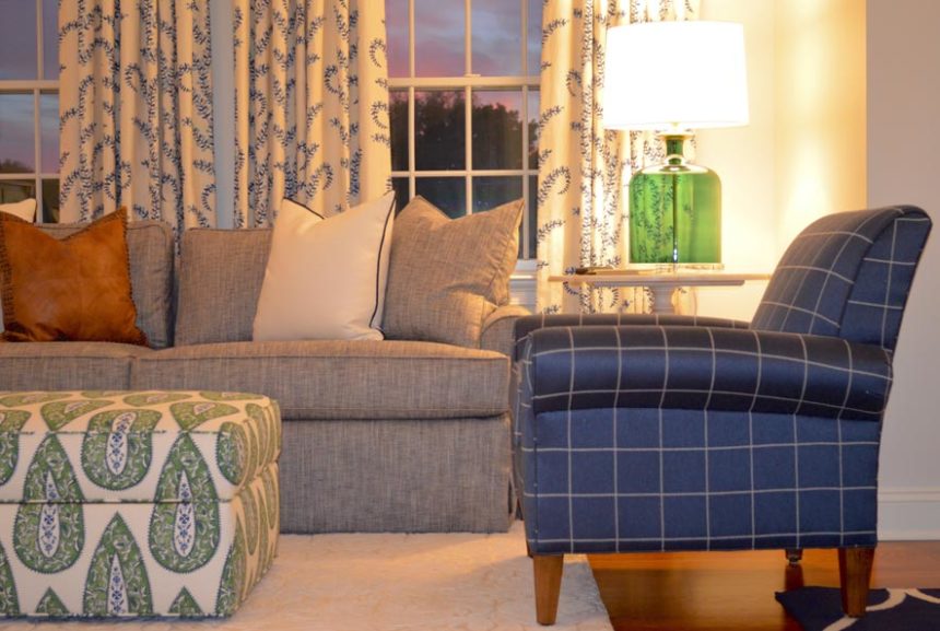
TD: Believe it or not, these are two views of the same room, a rather spacious master suite where my clients go to unwind. Their favorite color is blue and they already owned some pieces (which they still love) from our Swedish Home collection. We used wallpaper sparingly to separate the sleeping area from the sitting “room.”  It defined the space and gave importance to the patterns layered on the bed. We used green as an accent hue (note: the ottoman provides contrast and storage). The Adam chair in a bold windowpane fabric provides a powerful punch of color.

RED ALERT

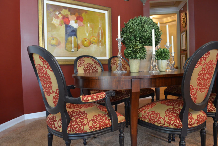
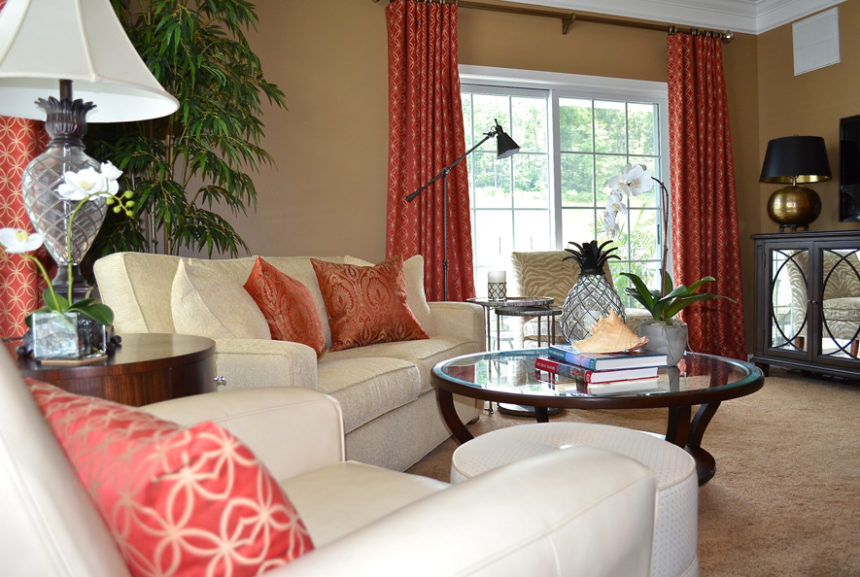
TD: This dining room is open to the living room at right. The very sophisticated space was inspired by the geometric pattern on the red sofa pillows. The client loved it so much, we used the same fabric for the window treatments. We picked up the rich red hue as an accent wall in the dining room, along with the fabric on the dramatic Cassatt chairs done in a distressed black finish.

BEAUTY AND THE BATH

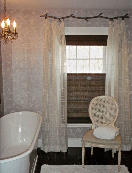
TD: Pattern plays a subtle but significant role in this children’s bathroom in an antique farmhouse. Geometric sheers hung from a metal “branch” rod complement the floral pattern in the wallpaper while adding a bit of softness.  The lined, natural woven shades provide texture and contrast, plus privacy.

WALL-TO-WALL WOW

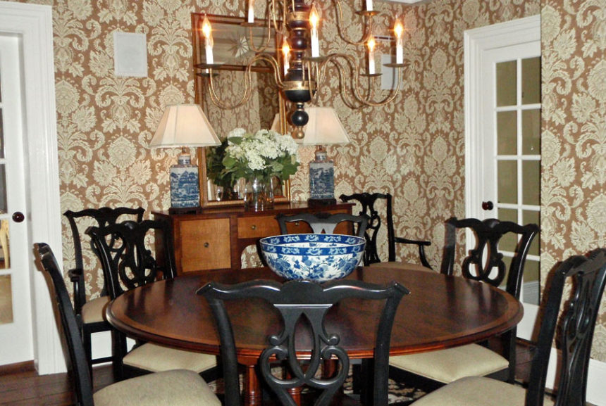
TD: This classic patterned wallpaper acts like artwork in a dining room full of doorways. It provides a lovely backdrop for our Hansen Indonesian mahogany dining table—the star of the room.  The blue and white porcelain lamps and bowl add a touch of color and, yes, another pleasing pattern.


The Power of Home Fragrance

It’s one of the first things you notice when you enter a room. It evokes memories: a grandmother’s cooking, a mother’s embrace, a day at the beach. It’s powerful enough to stir emotions and yet often overlooked when designing a room.

Fragrance.

A pleasing fragrance can soothe or energize; it can even suggest a completely different atmosphere (e.g., a candle with the fragrance of a mountain forest burning on a kitchen table in Manhattan). Because everyone experiences scent differently, it’s a good idea to choose more complex scents so each person can detect their favorite note. The best fragrances achieve a perfect balance of top, middle, and bottom notes.

  • The top note is the first thing you detect when taking the lid off a candle or opening a jar of essential oils. Good top notes suggest freshness: citrus, herbs, a touch of ginger.
  • The middle note usually emerges about fifteen minutes after a candle is lit. The middle notes give a fragrance its personality, whether it’s a fruity, floral, or spicy note.
  • The base note is the scent remaining in the room long after the candle has been extinguished. Woodsy, musky aromas add elegance and depth and often work well in this layer.

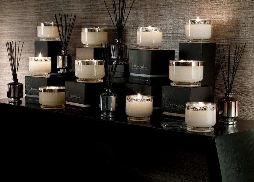
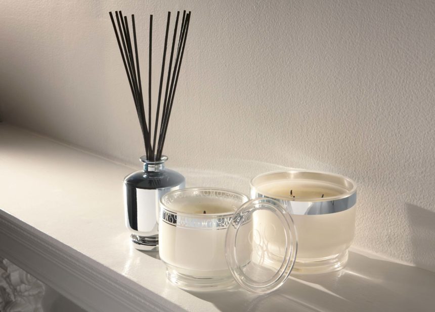
When we design fragrances at Ethan Allen, we draw from five categories of scents and present them in varying sizes of candles, each with a minimum burn time of 40 hours. We also create diffusers, in which reeds are immersed in scented oil to soak up fragrance and disperse it throughout the room. Diffusers last until all the oil has evaporated and are easily refreshed by adding more oil.

  • Floral. Morning Blossom blends an initial top note of citrus with a heart of jasmine and violet over base notes of patchouli and vanilla.
  • Ozonic or spa. The freshness of coconut, the sweetness of honey, jasmine, and vanilla, and a hint of sandalwood make our Cashmere Petals fragrance unforgettable.
  • Citrus. With Sparkling Citrus, we blend strong top notes of tangerine and citrus zest with jasmine middle tones and a base of white woods.
  • Woodsy or smoky. In Hearthwood, a top note of orange blends with a heart of clove and heliotrope; the base note of warm spice lingers long after the candle has been blown out.
  • Fruit. To keep a fragrance like Enchanted Apple from being too overpowering, we add notes of lilac, peach nectar, tonka bean, and oak moss.

Whatever your reason for selecting a home fragrance—setting a mood, creating an atmosphere—don’t forget to include your favorite fragrance in your final room design. It’s an invisible touch that makes all the difference.


Blue Home Décor: Our Favorite Looks

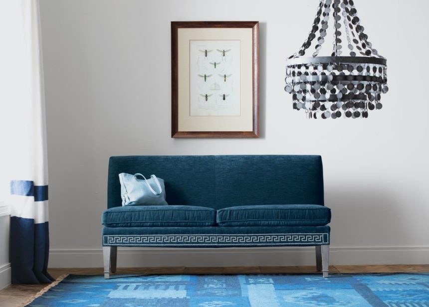
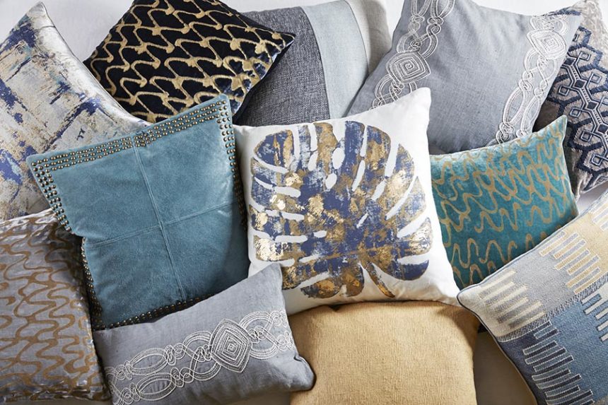
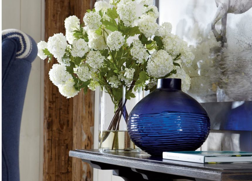
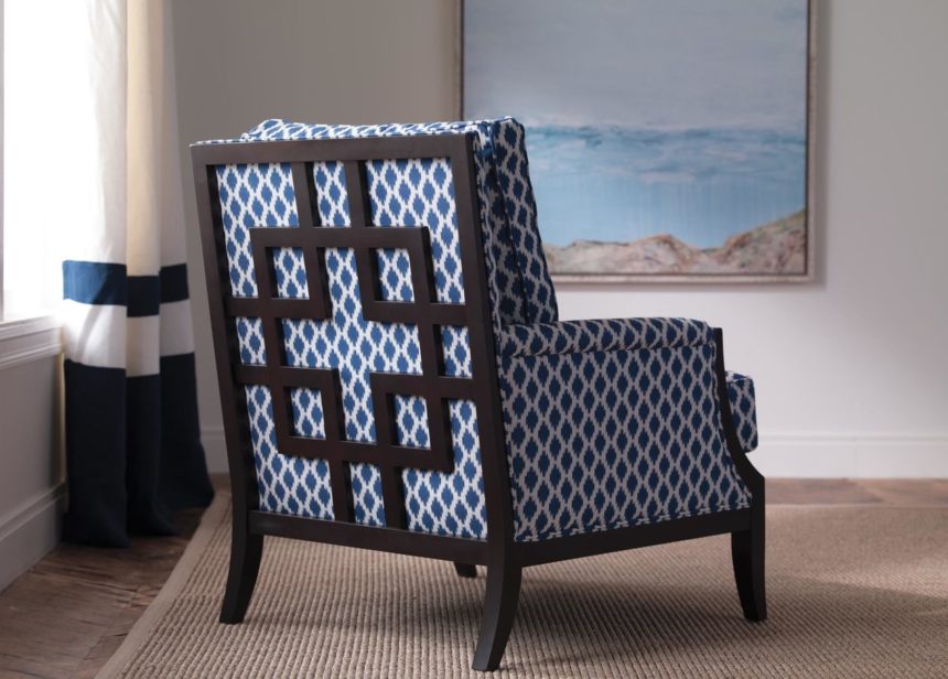
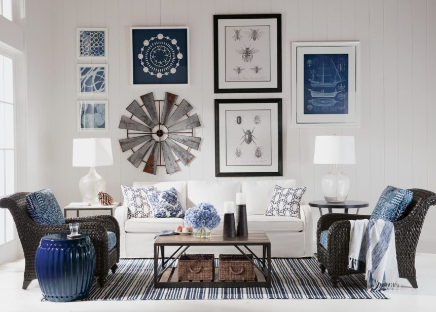
Take a peek at True Blue, our October magazine (download it here), and we promise you won’t feel blue in the least. Our designers captured some pretty cool blue moments—from the Baldwin settee on the cover (love the Greek key nailhead trim) to our sumptuous Monikka bedding (p. 22—be still our hearts!). Blue is widely considered the world’s favorite color (go on, Google it), and we know that in home décor, blues of every stripe just never seem to go out of style. Join the navy? We’re in. Reach for the sky? We’re up for it. Take a powder? We love all the baby blues. In fairness to fall, we can appreciate its fiery reds and glorious golds, but give us any hue of blue—in any season—and we’re down.

Here are some of our favorite looks!


No matter the style or scope of a project, Rose T. Bien-Aime says her goal is always to provide her clients with “a place of peace and comfort.” Rose, who is a consultant in our Rockville, MD, Design Center—and our latest Design Star—also believes we should infuse our homes with a little romance every chance we get.

“My goal is to make my clients feel sophisticated and romantic every day,” she says. “As a designer, I love to create spaces that are timeless—and sexy!”

Rose adds romance by layering rooms with classic pieces and curated touches of glam. She prefers pleasing palettes that lean toward neutral, with unexpected pops of color. She loves to marry clean lines and shapely silhouettes and thinks no space is finished until it shines—literally (she adores silver and gold finishes).

When Rose is designing a room, every element matters. “Window treatments, carpeting, lighting, mirrors, accents, and art—they all play significant roles in raising levels of sophistication and romance,” she says. “But it’s the perfect mix of materials, finishes, and furnishings in a room that come together to lift your mood and warm your heart. For me, that’s romantic.”

HONEYMOON SUITE
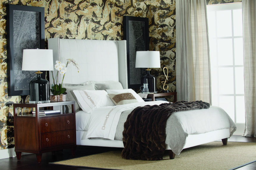
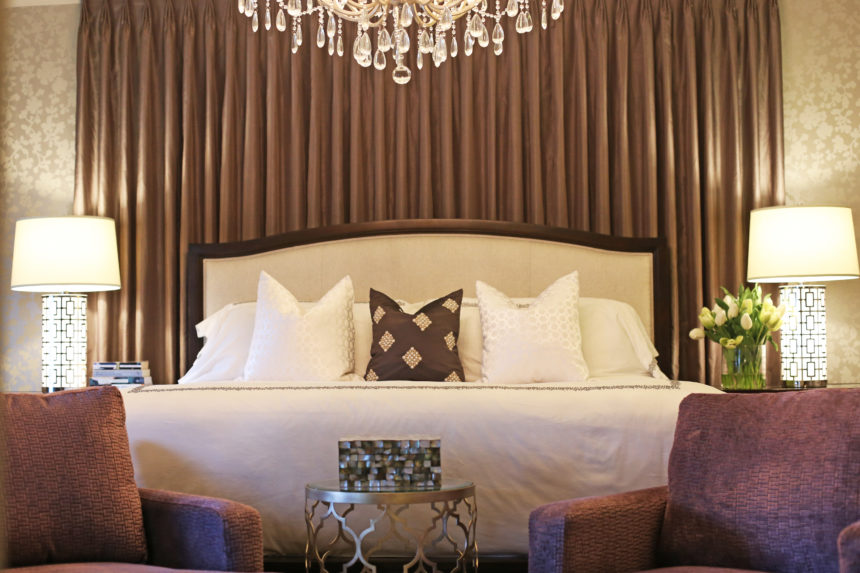
Rose’s client wanted a room that exuded the luxury of a five-star hotel, “an environment that made her feel like a queen at night and even more glamorous in the morning.” Rose did it with Hollywood-inspired metallic wallpaper, wall-to-wall silk drapery panels in charcoal gray, and an oversized crystal Whitney chandelier over the bed. Gideon chairs complement the upholstered Charlton Bed. The finishing touch: All that reflected light!

IN A MIDCENTURY MOOD
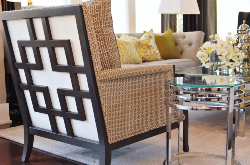
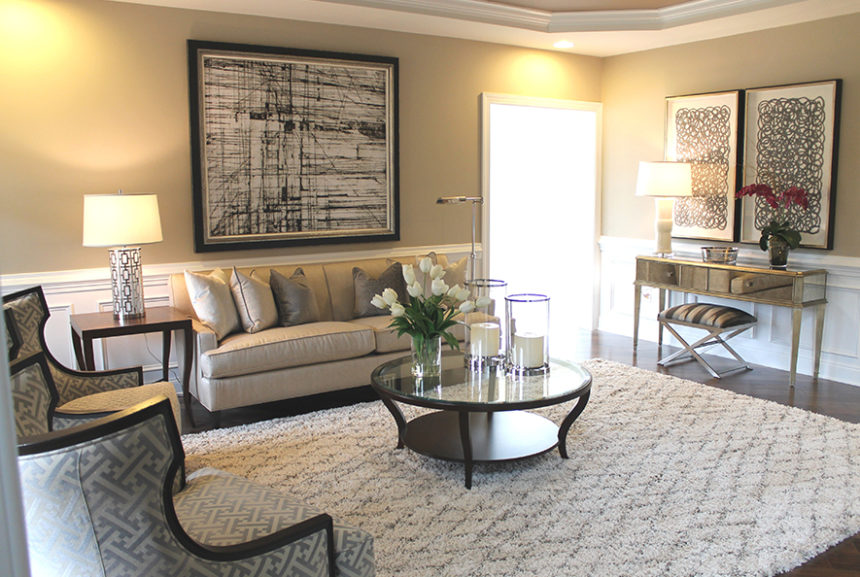
This sophisticated living room has all the hallmarks of a period piece. It’s designed around a pair of Corrine chairs, which Rose describes as “sexy from every angle.” The cool gray-and-cream palette is inherently elegant. The perfect complement to Corrine: the curves on the glass Cirque coffee table and the Gracie end tables. The Vivica console and the Xanadu bench add midcentury drama.

WINE AND DINE

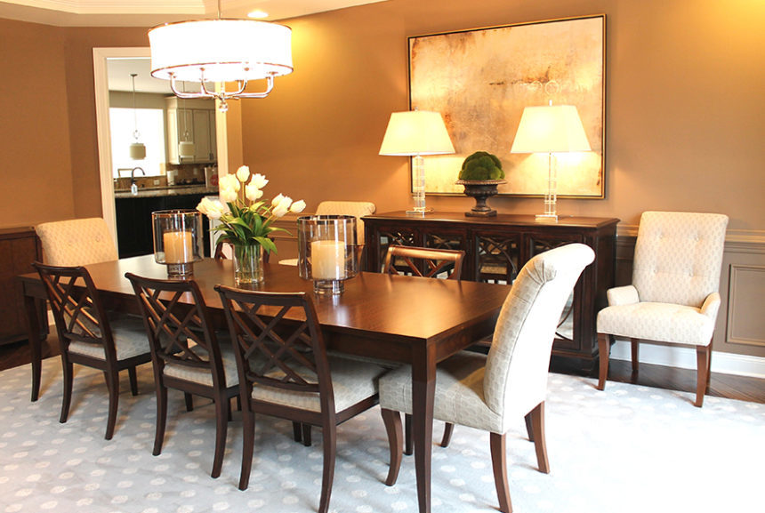
Rose’s clients wanted a timeless dining space that works as well for large parties as it does for as candlelight dinners for two. The stunning Barrymore table sets an elegant tone with its graceful saber legs and exotic wood finish. The antiqued mirror glass and circular-cut mullions of the Brandt buffet provide instant ambience. Rose mixed Verlaine side chairs with Verlaine armchairs for a whimsical touch. Glass, crystal, and nickel provided sparkle!

GREAT EXPECTATIONS

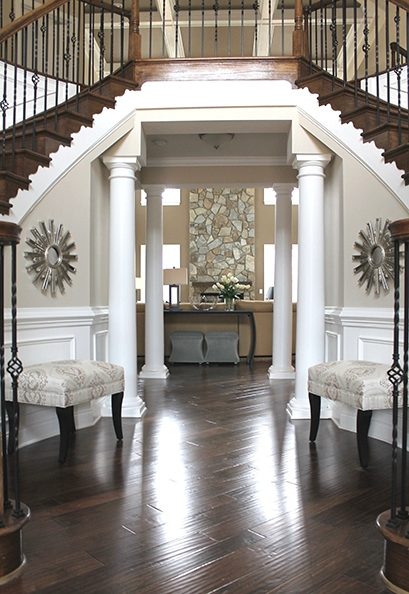
Just how romantic is a double staircase foyer?  “It’s ‘Gone with the Wind’ all over again,” says the designer. The balustrade is very refined, while the gorgeous millwork speaks for itself. Rose played up the room’s symmetry with two Wellesley benches in a neutral patterned fabric. She added glitz with the placement of Starburst mirrors above the benches, officially setting a romantic tone for the rest of the home.

STYLE IN THE ROUND

What happens when a dining room doubles as the entryway to a home? For Rose, the answer is “a quiet storm of classic elegance, romance, and undeniable flair.” The modern, sexy lines of the Ashcroft dining table paired with the curvaceous Penelope chairs deliver just the combination she was after. Everything else—from the chandelier and area rug and to the simple Cora bowl—enhance the core design.

URBAN GLAM

This space is all about modern drama, with the tufted Shelton sofa setting a sophisticated mood. Rose chose it to gracefully anchor the Kyle wing chairs, as well as the uniquely styled Grayson chair in the foreground. The


Happy birthday to us! Ethan Allen is 85 years young!

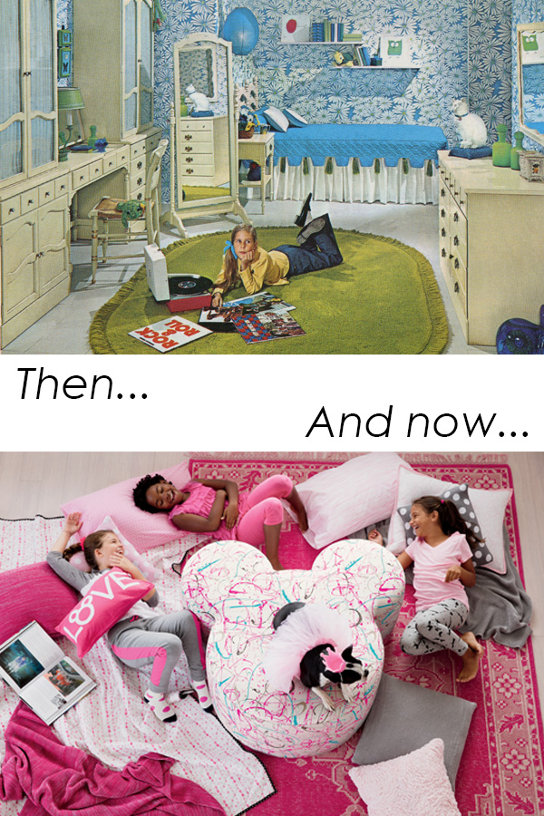
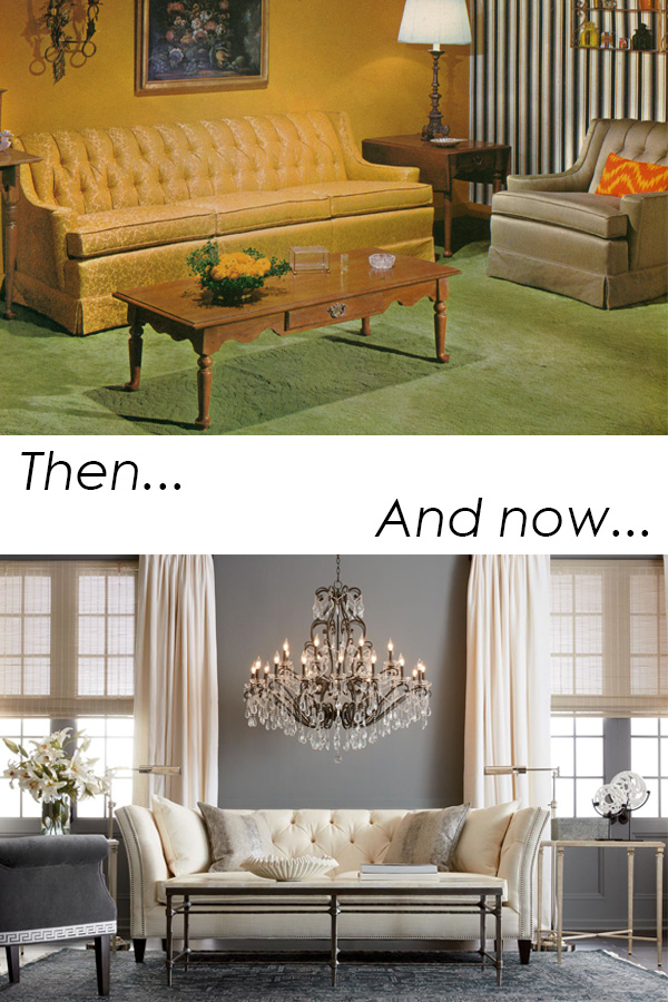
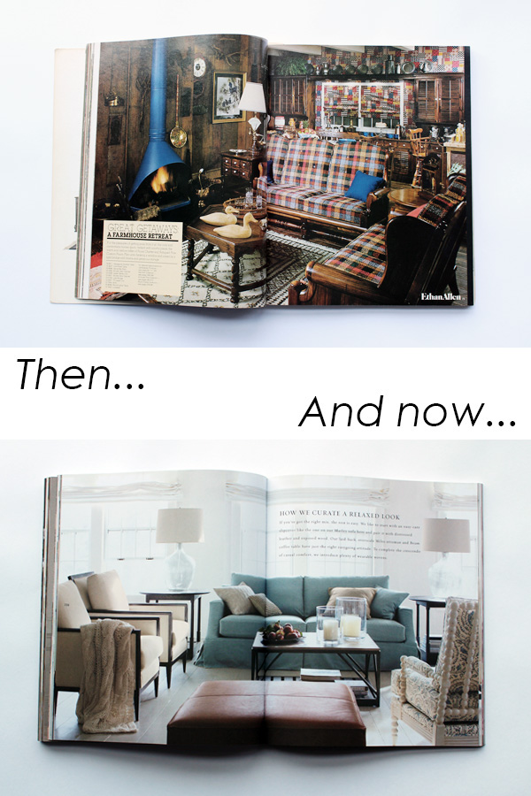
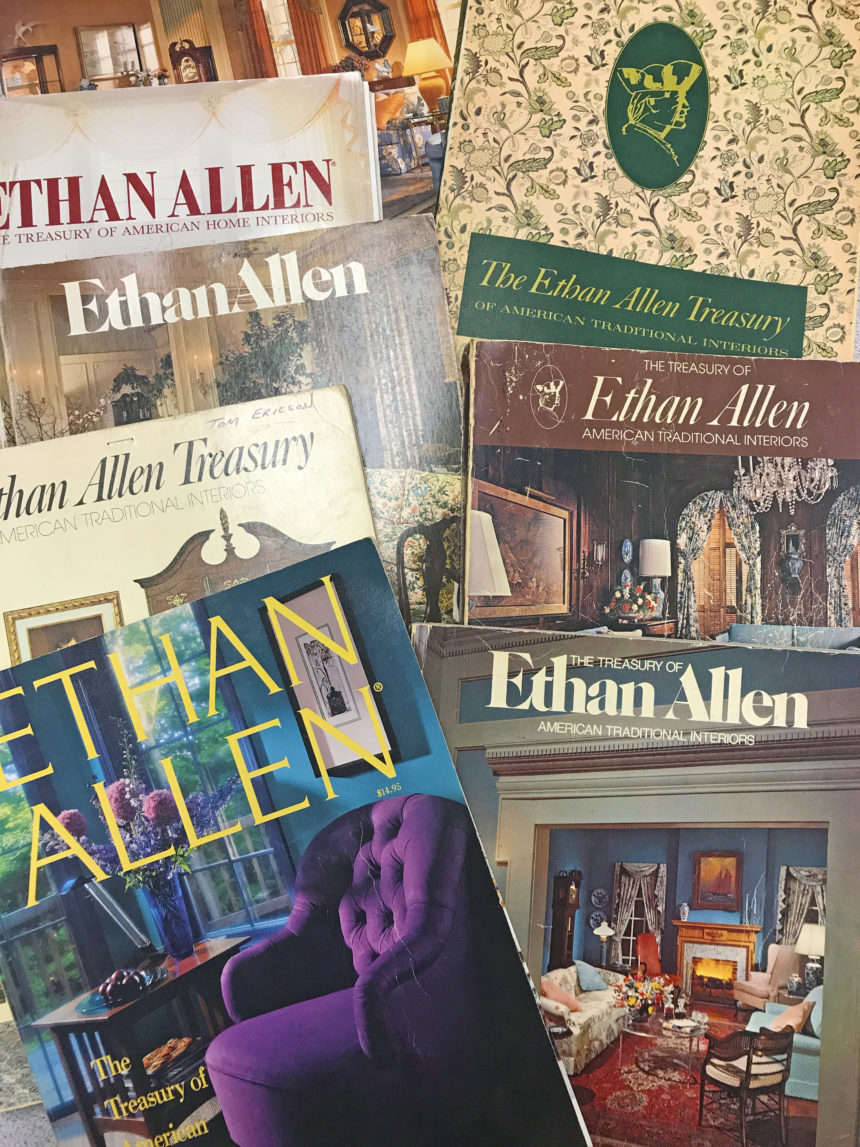
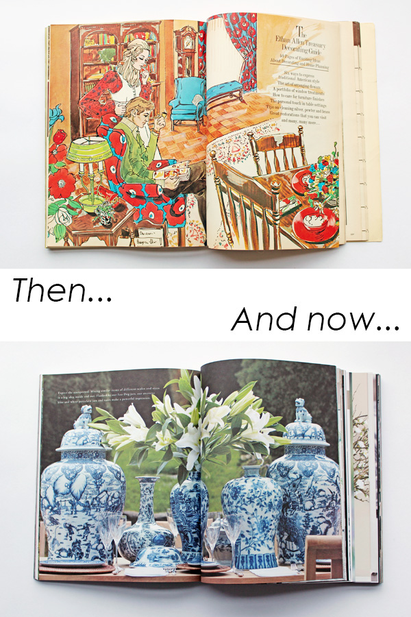
To celebrate, we’re dusting off our old scrapbooks and sharing some great memories. When you’ve been around as long as we have, you see a lot of trends come and go … and it’s fair to say we’ve lived in more than a few “of-the-moment” rooms. We’ve discovered some fun pics from decades past, including this one featuring red shag carpeting and wallpaper in the same pattern as the sofa (the ’70s were something else)!

Did you grow up with Ethan Allen furniture? Did you sleep in one of our beds? Do you remember Thanksgiving dinner at one of our tables?  Why not join the party? If you have any photos you’d like to share, we’d love to see them!

And because we keep making memories every day, we’d also love to see how you live with Ethan Allen now. Let’s enjoy a blast from the past—and present—together. Share your memories—tag your photos with #EthanAllenThenAndNow—and we’ll do the same!