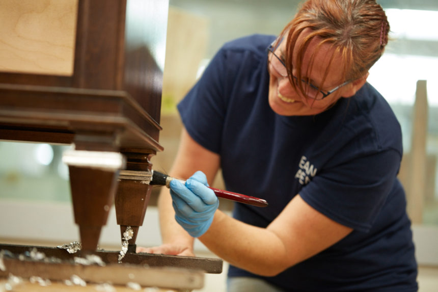
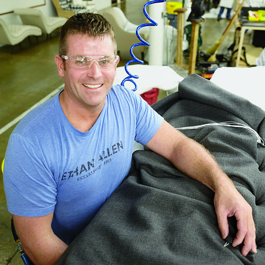
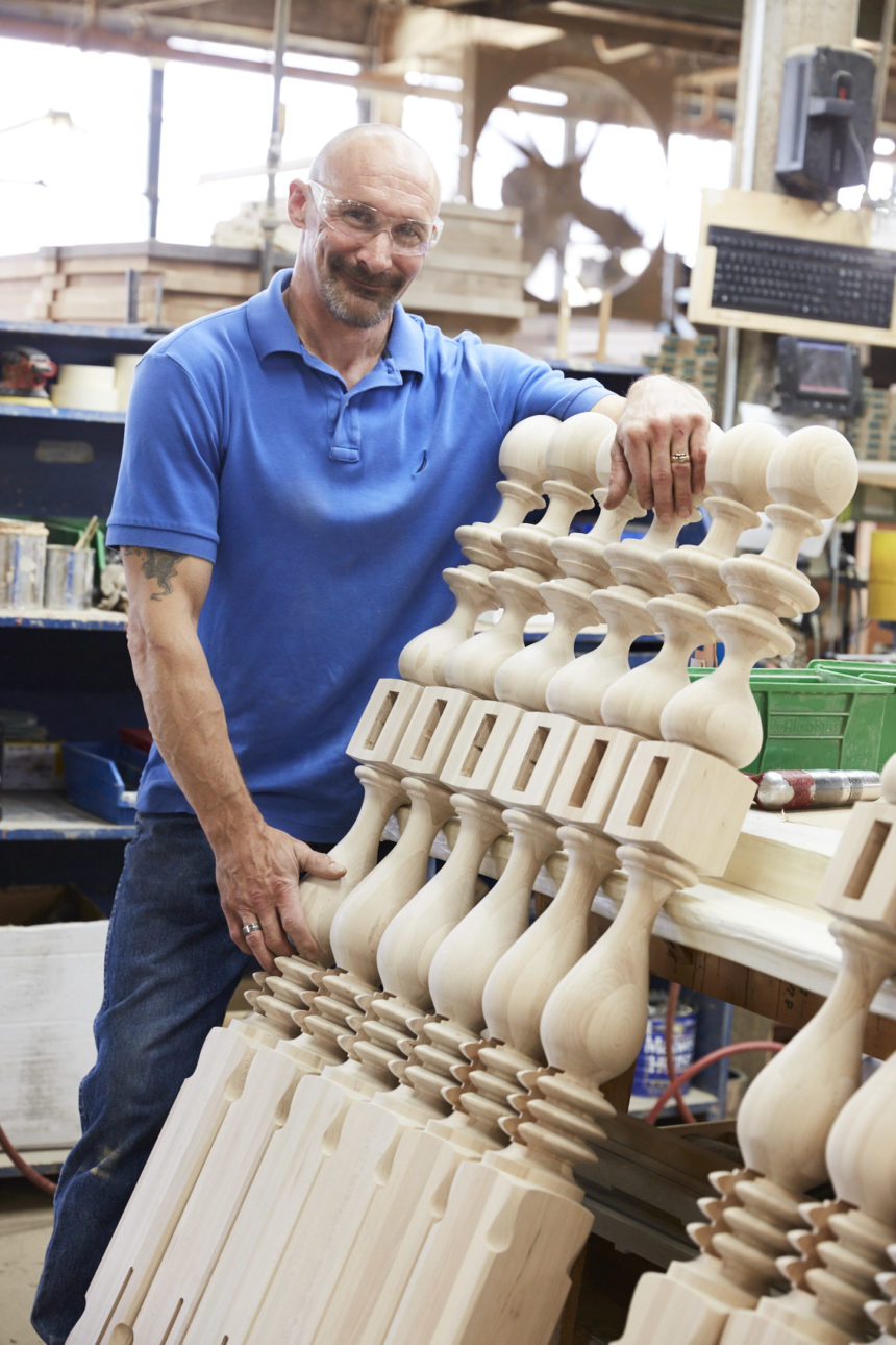
It’s our anniversary!  This fall we’re celebrating 85 years of craftsmanship, innovation, style, service, and quality. We picked Labor Day to kick off the party—a day that honors the great tradition of the American worker. Appropriately, we’re celebrating 85 years of jobs well done. We’re so incredibly proud of our workers—from the craftspeople who make our wood pieces to the designers who help our customers create beautiful rooms.

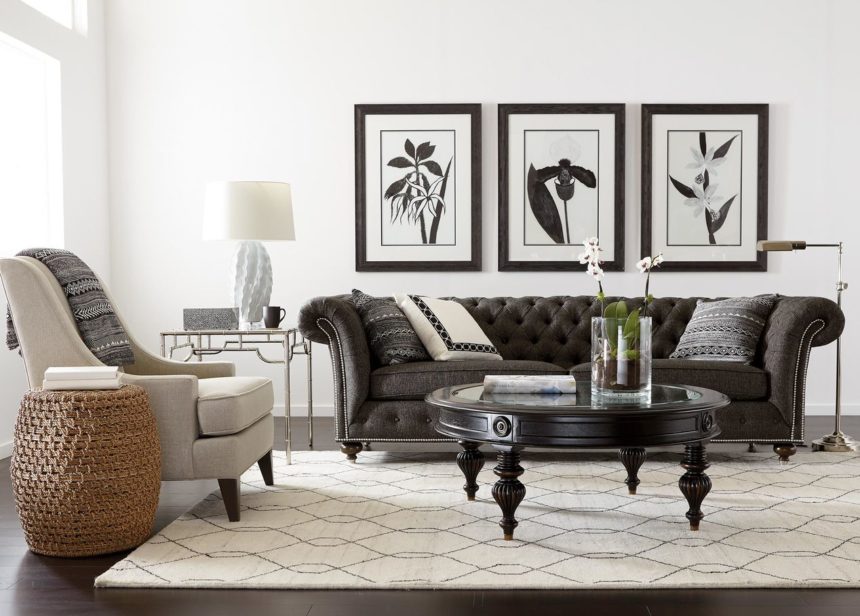
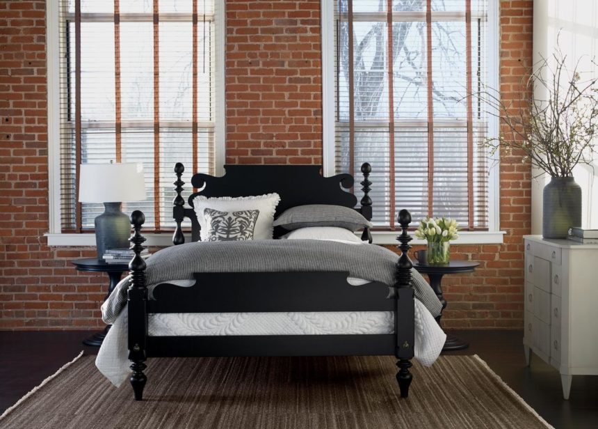
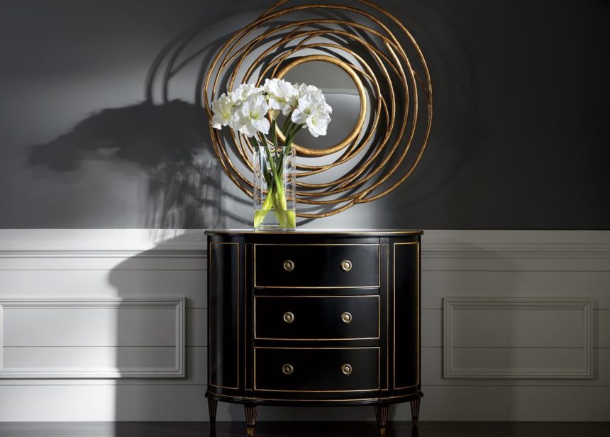
Throughout September we’ll be celebrating our history (look for highlights of our timeline), our favorite anniversary palette (beautiful black and gold), and the creativity of our artisans. We’ll be sharing entertaining “then and now” stories and going behind the scenes inside our photo studio and manufacturing plants.

Don’t worry. We’ll still be sharing our Design Stars’ stories and serving up fresh decorating ideas, but we’ve got some serious celebrating to do this September.

We may be 85, but we can party with the best of them—come along for the ride!

—The Ethan Allen Design Team


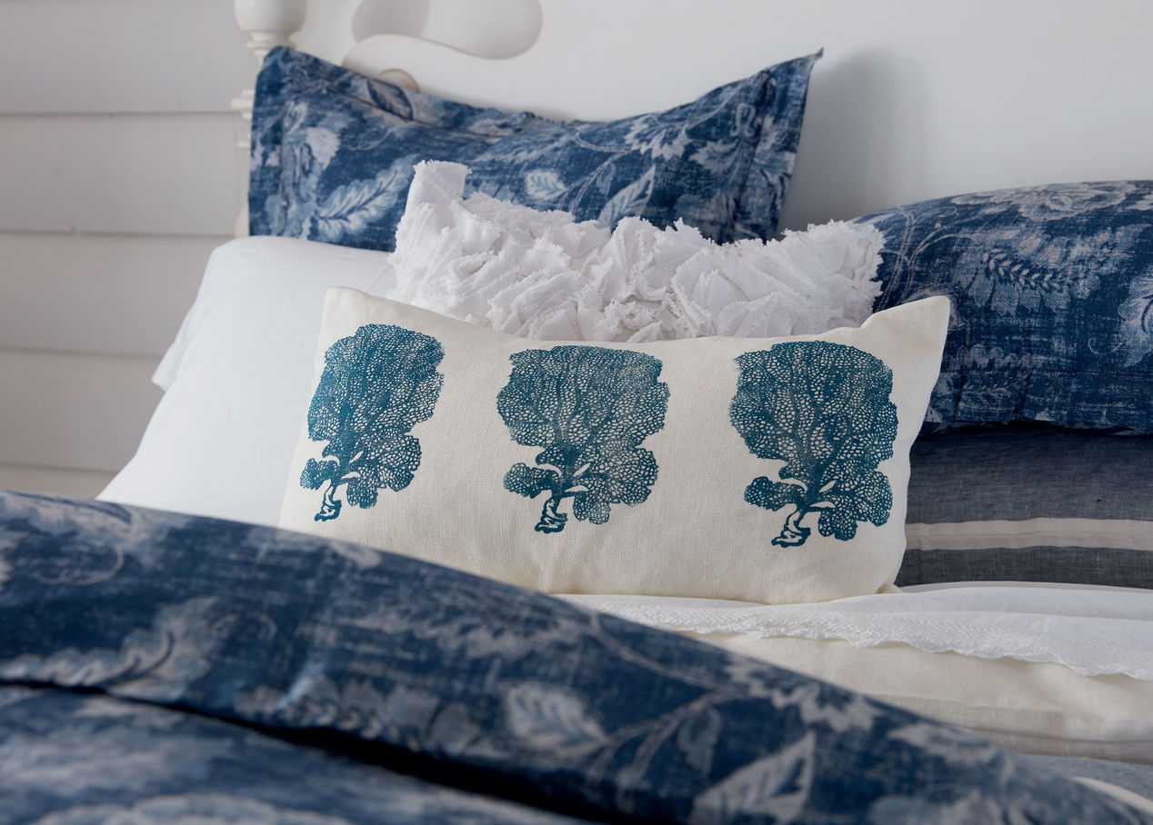
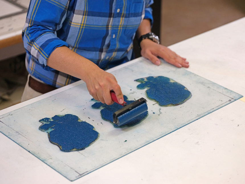
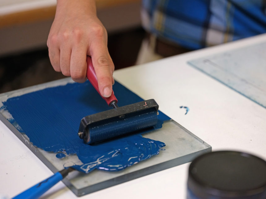
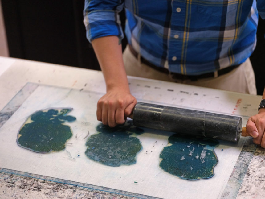
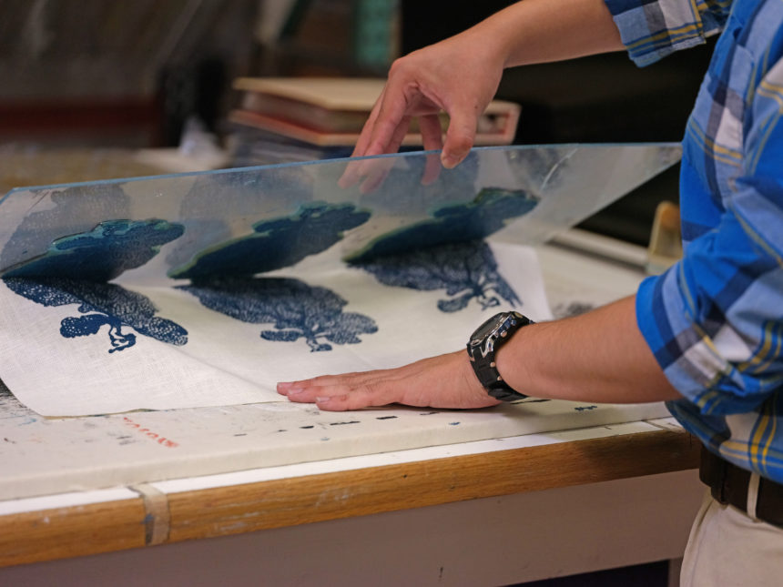
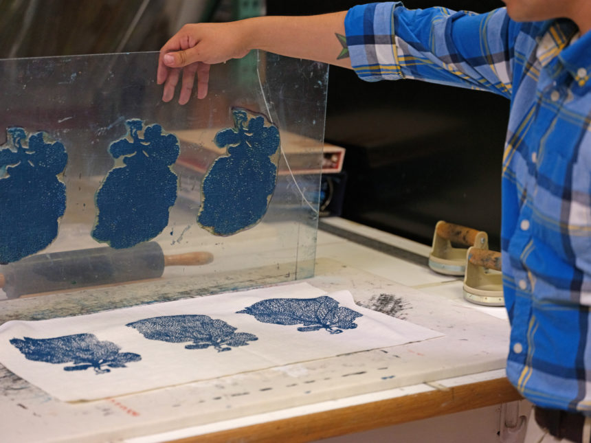
The ancient art of block printing has been around for 2,000 years. As a traditional method of textile design, it’s held up surprisingly well. Block printing is essentially the transfer of an image or design (in this case, coral) to a surface (a soft, white linen-and-cotton blend fabric) from a carved material (rubber, although wood is widely used) covered in ink (ours is water-based and nontoxic).

PRINTING OUR PILLOW, STEP BY STEP
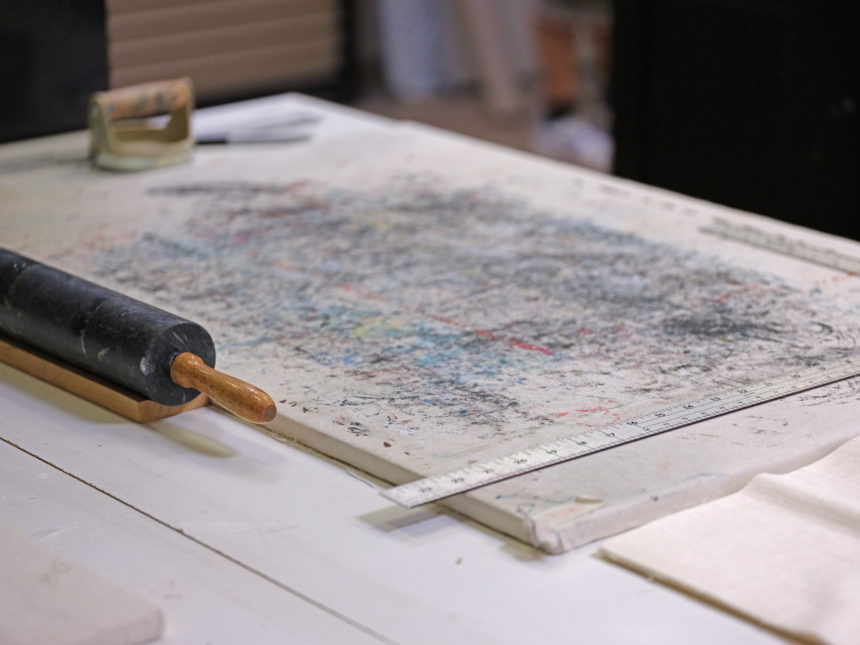
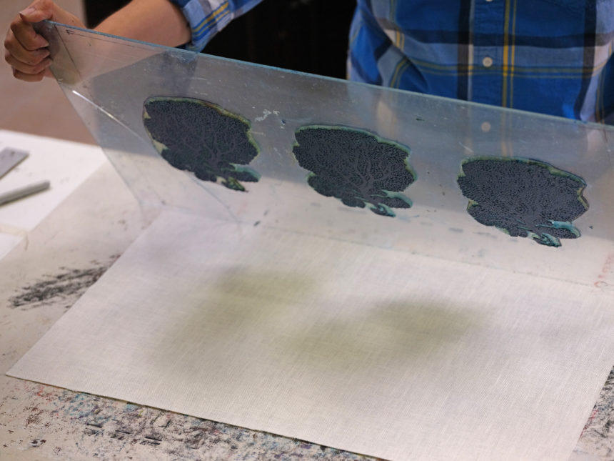
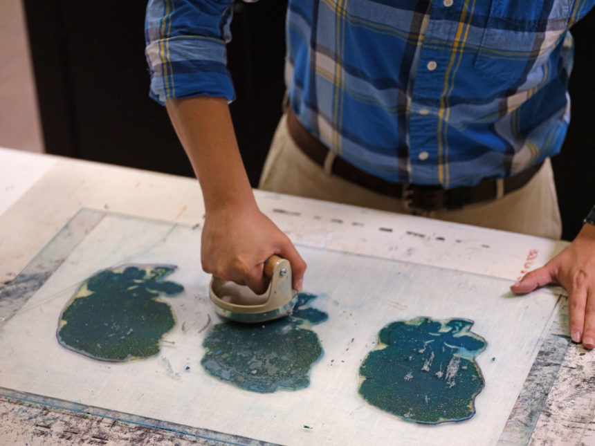
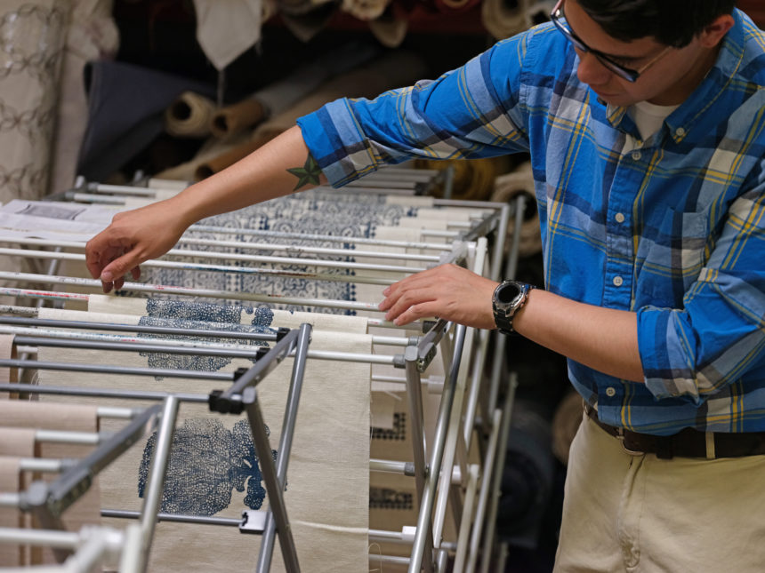
An artist starts by carving the coral design into a piece of rubber to create a stamp that can be used again and again. The stamp is then glued to a piece of plexiglass, and ink is rolled out onto the raised stamp, ensuring the pigment is applied evenly. The pillow face fabric is placed on a padded surface, and the plexiglass is then turned over and positioned onto the fabric, inked side down. Pressure is evenly applied to the back of the plexiglass. While the fabric is held down, the plexiglass is then cleanly lifted away. The fabric is hung to dry before being sewn into the finished pillow.

Our Fan Coral Pillow is a contemporary example of the time-honored technique that’s widely associated with India, China, and Japan. The beauty and fine details of the natural sea fan coral are printed by hand onto cloth to produce an original, strikingly modern design—done the old-fashioned way. Our gorgeous block-printed pillows are made close to home, in a workshop in downtown Chicago. Each print is inked by hand, so variations will occur—only adding to the natural beauty of the piece.


There’s a science to symmetry, and a host of reasons why we humans like it so much.  It’s a design principle that has guided artists and architects for millennia. Symmetry is what happens when the elements on both sides of an axis are the same. It’s restful. It creates balance. And balance creates harmony. Too much symmetry can feel forced or fussy, but when it’s done well, it’s both visually agreeable and subliminally soothing.

Alicia Zupan knows this instinctively, which is why she does symmetry better than most. And that’s one of the reasons Alicia, a member of the Ethan Allen design team in Oklahoma City since 2012, is our latest Design Star.

For many designers like Alicia, symmetry is a go-to tool that never disappoints. “Symmetry is found in nature through reflection, repetition, and rotation,” explains Alicia.  “and I use all three in many of my projects.” But while symmetry creates balance, it’s not the only path to harmony. “I also use asymmetrical pieces to create balance,” she says, “but they must be chosen well. It’s important they are of same scale or visual weight to create a feeling of equilibrium.”

This is how Alicia does it:

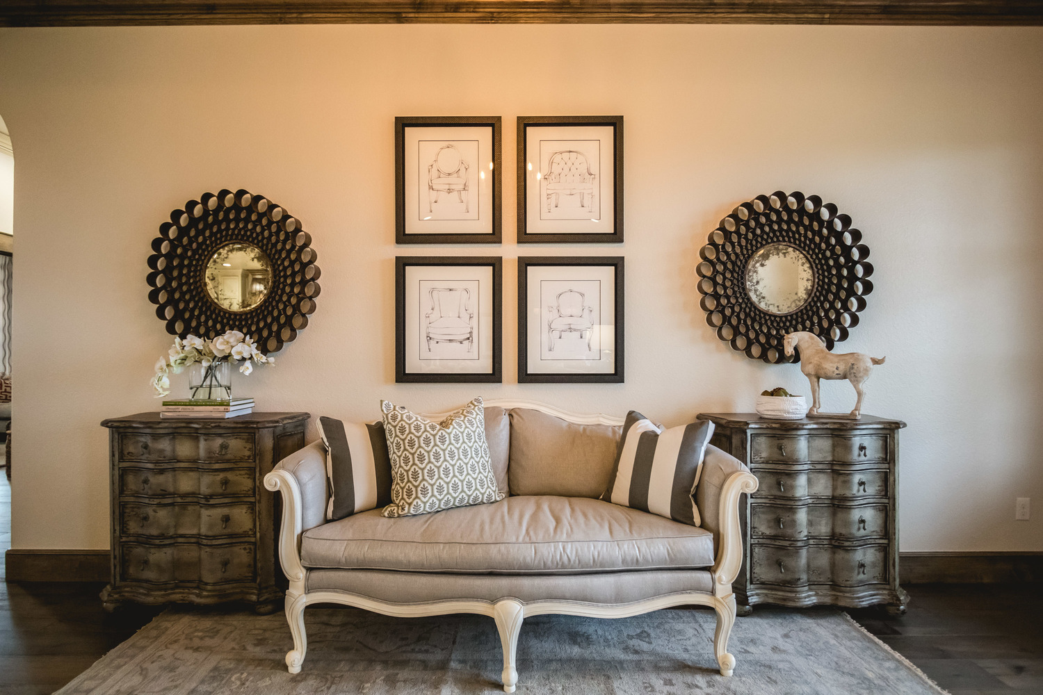
AZ: “This entry wall was large, open to the living and dining rooms, so it needed a statement that said, ‘Welcome, come have a seat!’ To create that, I used mirroring Lucca chests and aged bronze industrial mirrors on either side of the Evette settee, the focal point of the space. The repetitive use of artwork above the settee is called translational symmetry. To add interest and break up the uniformity, I added asymmetry in the form of tabletop accents and a patterned pillow.”

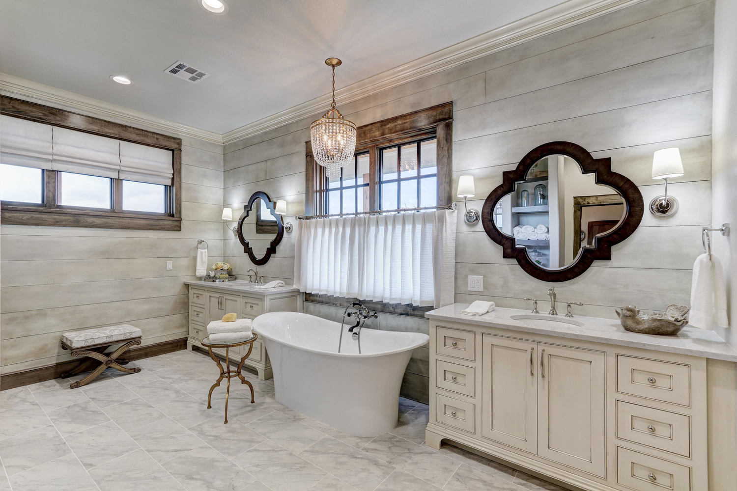
AZ: “This is one of my favorite bathrooms. There’s lots of symmetry here. We wanted the freestanding bathtub to be the focal point of the room. The two Quatrefoil mirrors over the matching vanities established support and structure for the focal point. Custom sheers and the Alexa chandelier created an element of romance; a small bench and Belle table deliver function and interest.”

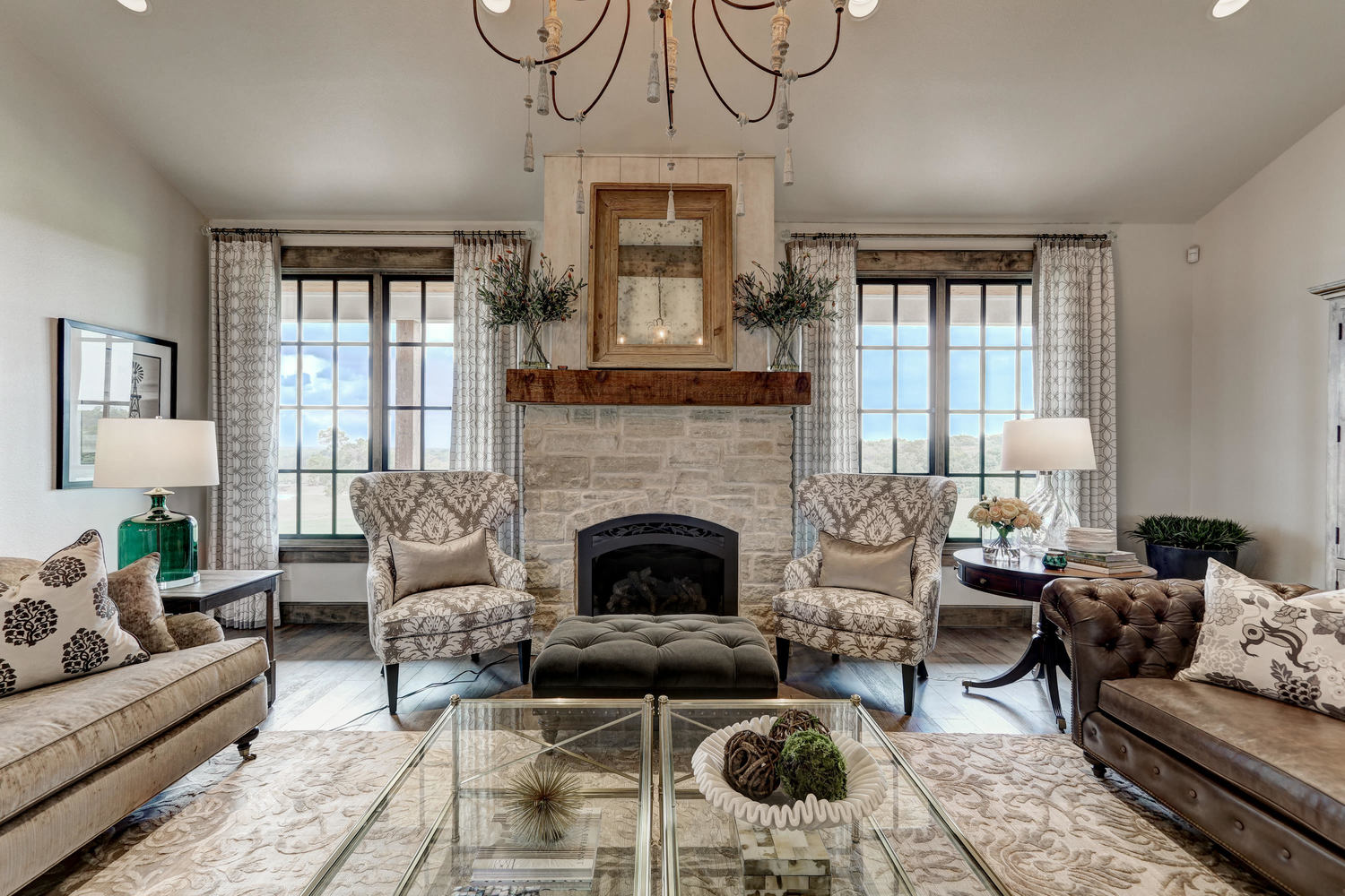
AZ: “Two matching Rand chairs flanking the fireplace and twin Jocelyn coffee tables create powerful symmetry in this room. The Mansfield and Oxford sofas are similar in scale, so they add balance. The use of different fabrics and accents brings in asymmetrical notes.”

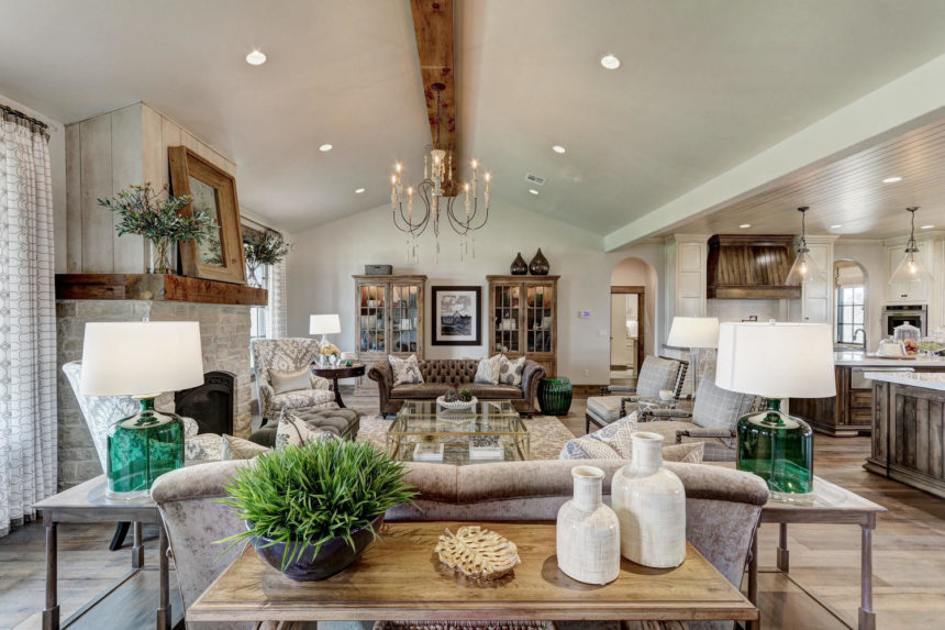
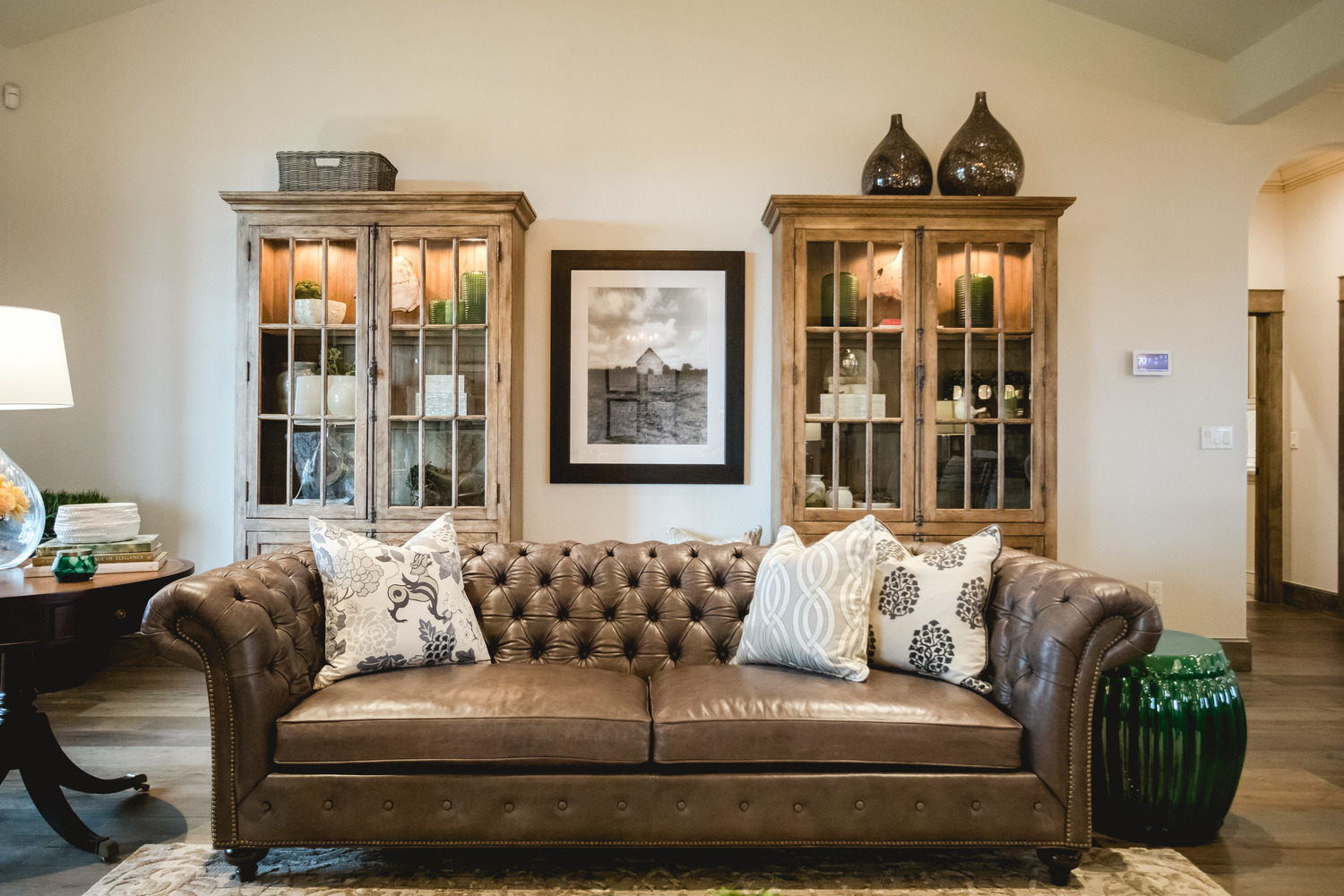
AZ: “The statement-making cabinets behind the Mansfield sofa anchor this space with pure symmetry. I balanced out the visual weight of the Bradford Rent table and clear glass lamp with the Emerald drum table on the other side of the sofa. The simple basket and Aubergine Plum vases are very different, but nevertheless add equilibrium.”

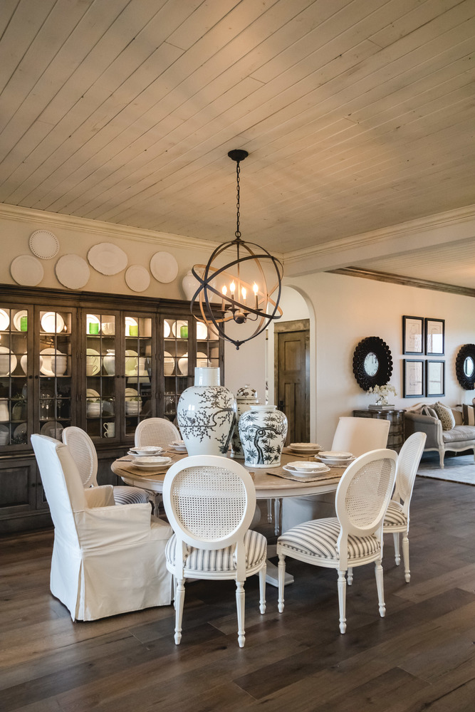
AZ: “Here I used ‘radial symmetry’ in the way I positioned the Chrystiane and Dayton chairs around the Cooper table, which is the central axis in the room, along with the Navesink chandelier overhead.”

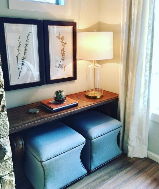
AZ: “I love using pairs to create symmetry in a vignette. Here I hung a pair of pressed botanicals over the Wayfarer console and tucked a pair of Corbin ottomans underneath.”

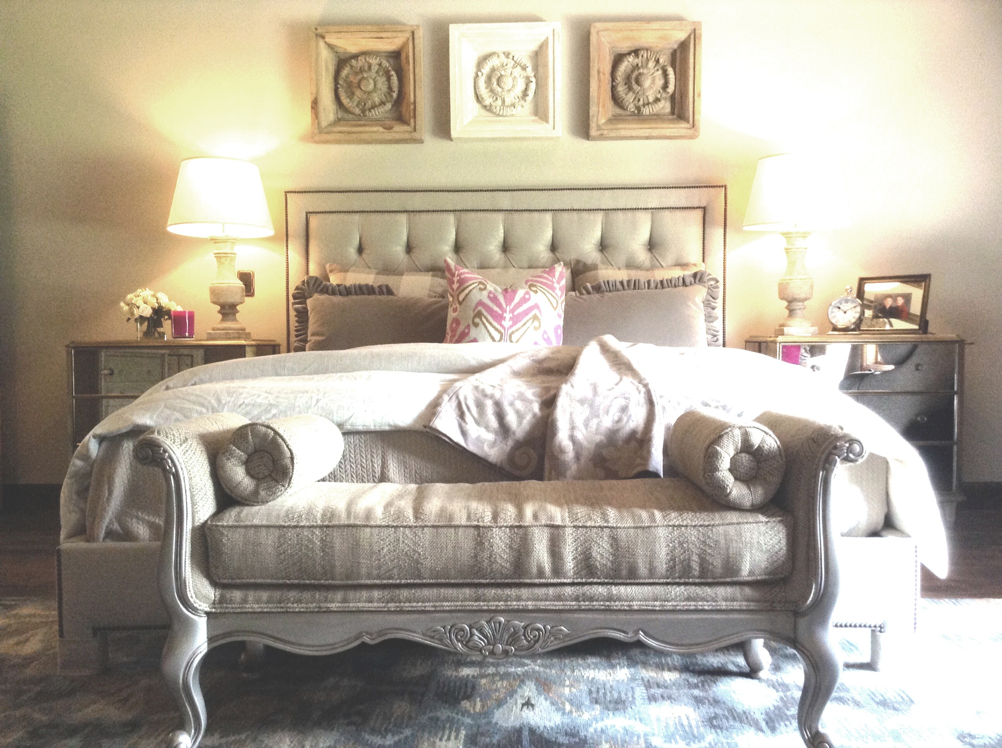
AZ: “Two Vivica chests and matching lamps on each side of the Jensen bed create balance and serenity. The graceful Belfiore bench softens the lines of the headboard and repeats the rosette motif of the artwork above the bed.”