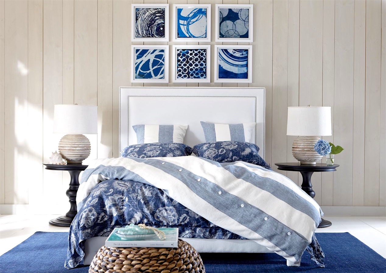
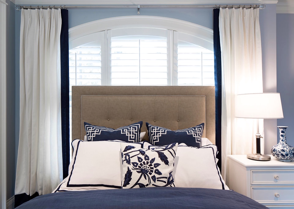
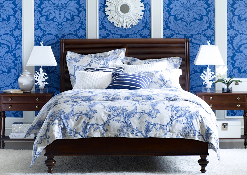
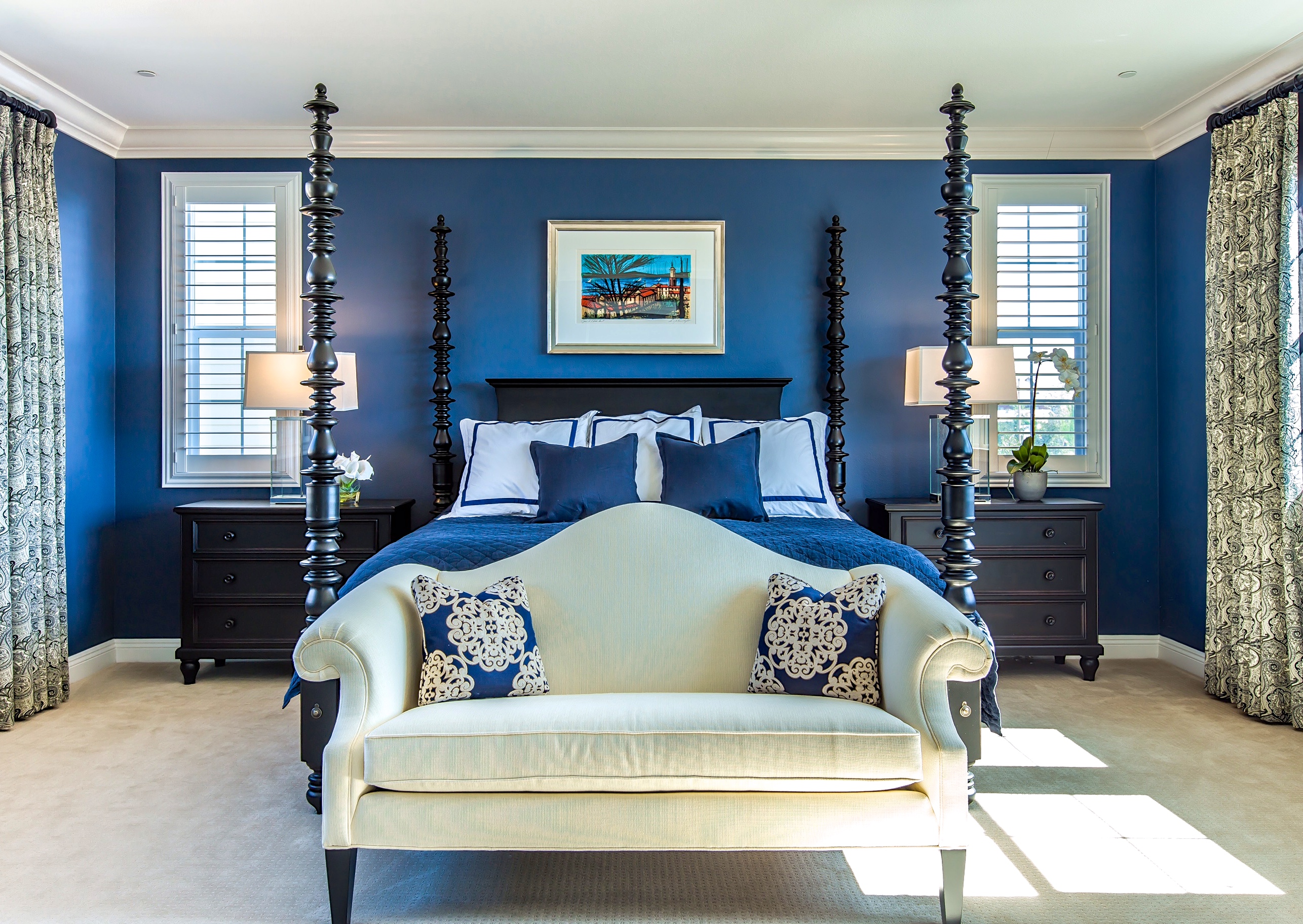
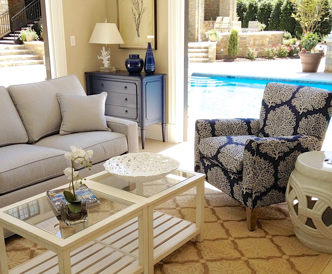
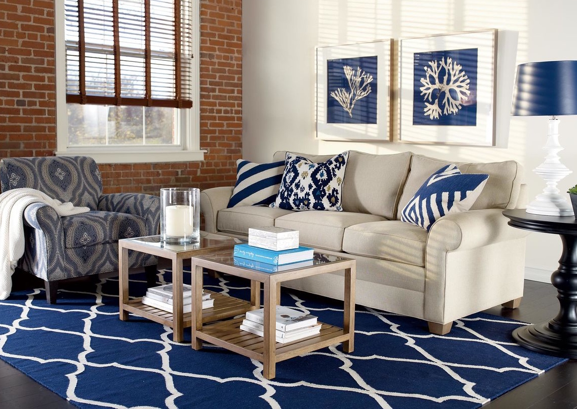
Design Star Janet Morganti knows a thing or two about using the color blue in the home. Ok…she knows a lot more than that! The award-winning designer has been with Ethan Allen for twenty years creating interiors in the U.S. and abroad. Her design philosophy is, and always has been, to make clients happier and more comfortable in their homes—and that’s exactly what she did in two notable projects, where she used the classic blue and white color combo to create two very different desired looks.

“Blue can be very cool, but very calming,” says Janet. While she points out that pairing it with white can really make it pop, her projects demonstrate that the color combo isn’t just a nautical style. With the right mix of tones, textures, and styles, blue and white can be anything from dress-down to dressy. Take a look at how she used blue and white and pick up some pointers for yourself!

FARMHOUSE FORMALITY

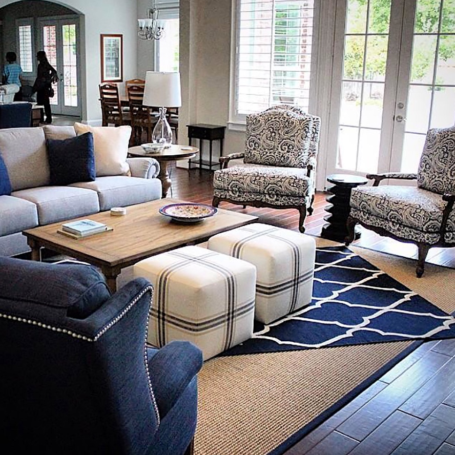
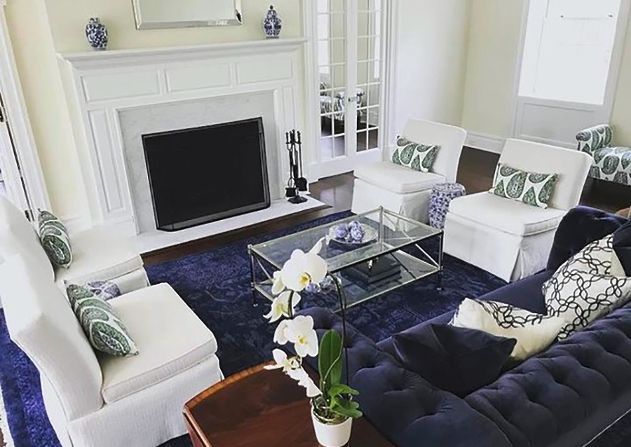
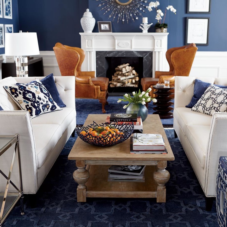
Janet took an unexpected formal twist in an older farmhouse-style home, choosing an inky blue and white palette to create a bright and cheery elegant look in the living room. Its well-appointed style is a mix of old and new—combining the client’s existing Ethan Allen pieces with new furniture and accessories in updated traditional styles.
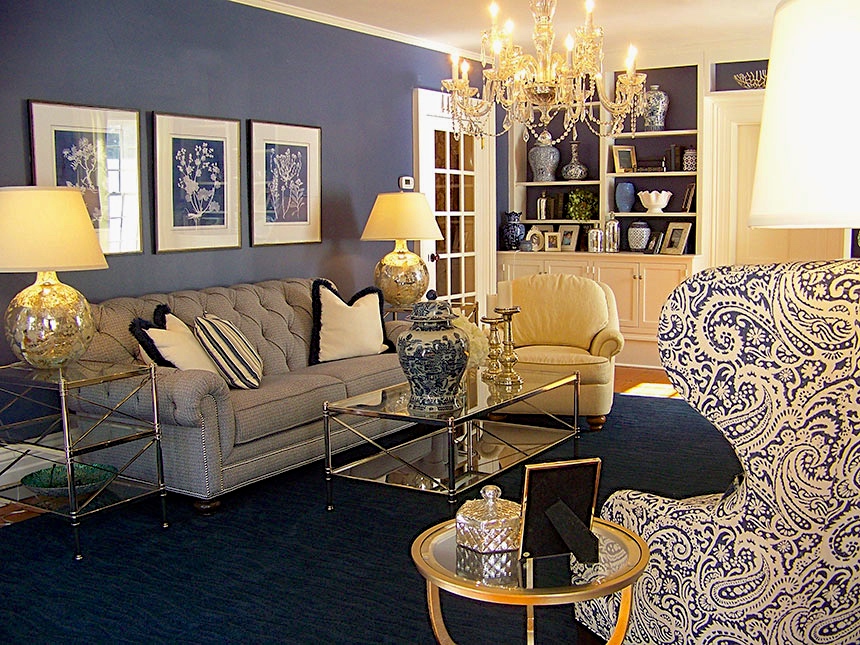
Janet enhanced the glamorous quality of the blue with a tufted Chadwick sofa. She dressed the rest of the room up with metallic and glass Jocelyn coffee and end tables, along with dazzling accents. The deep blue wall color and lustrous Loomed Wool rug in navy create a rich backdrop for the room’s elegant furnishings.
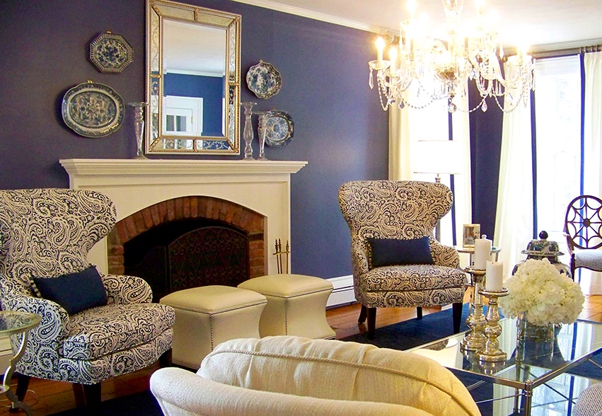
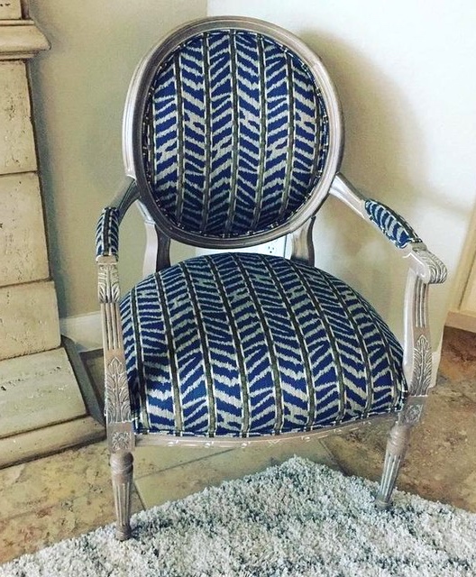
A pair of Rand wing chairs upholstered in a blue and white paisley print fabric inspired the room’s overall style. Also a pair of white leather Corbin ottomans by the fireplace, as well as the spider back Cristal Chair by the windows, provide everyday functionality with a fashionable flair.

BEACHY KEEN COMFORT

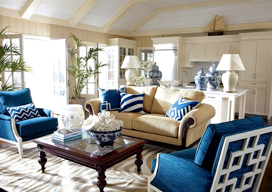
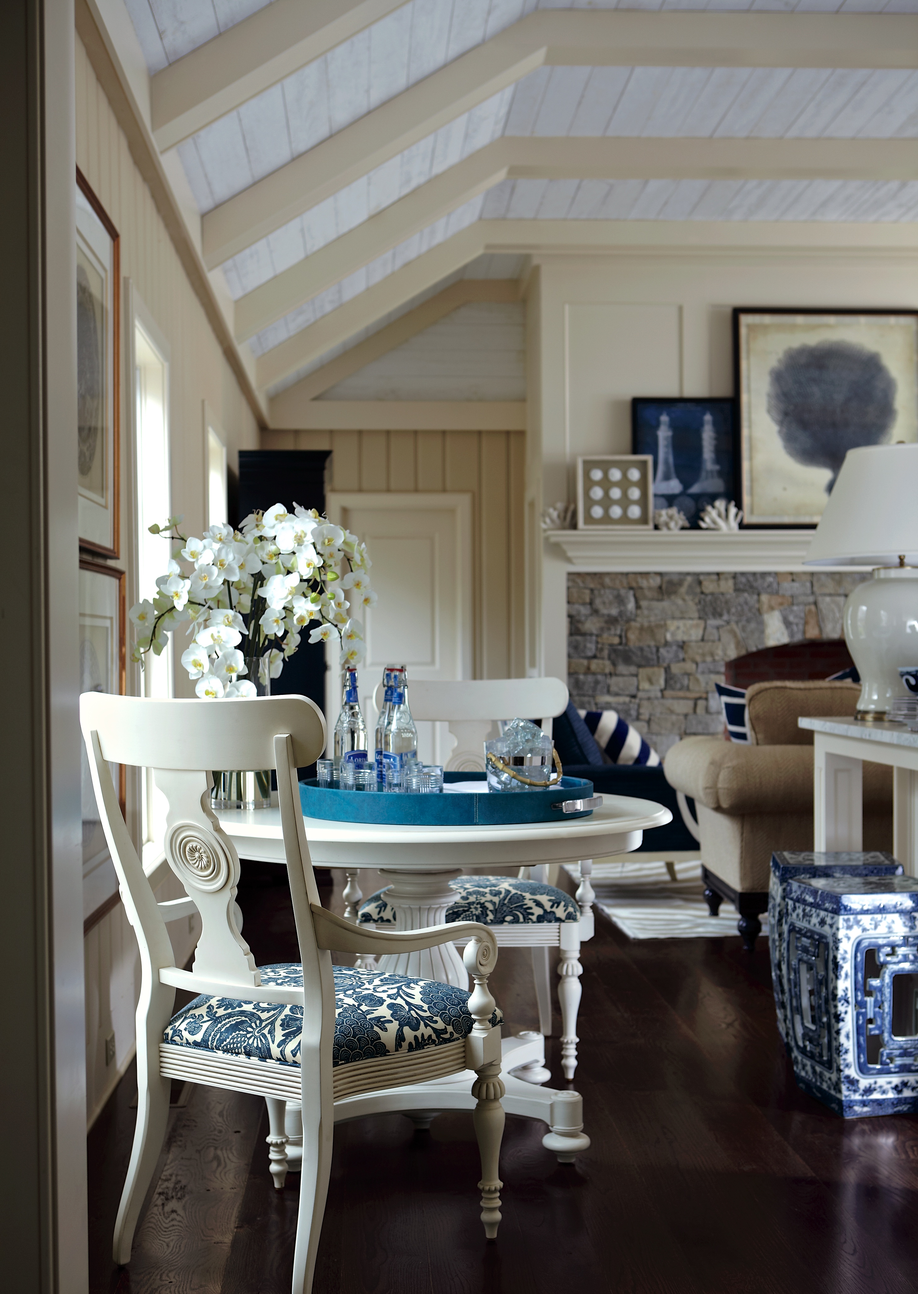
For a client with eight grandchildren and aging parents, a beach house family room needed to be comfortable (and resilient) for everyone from the age of eight to eighty. Janet turned to the crisp and classic navy blue and white color palette to create a coastal comfort zone for beach days to rainy days.
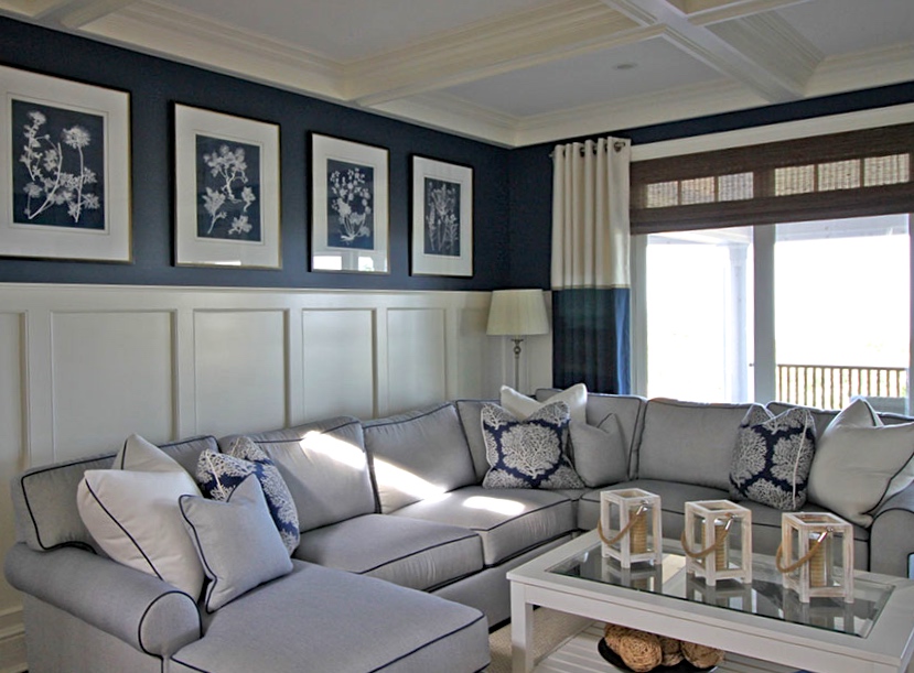
Janet strikes a perfect balance between comfort and style—and it’s all in the details. The Retreat sectional with chaise is upholstered in a soft, easy-care outdoor fabric with contrast welting, and accented with fashionable outdoor pillows. The artwork and custom drapery on the windows weave the blue and white story throughout the space with clean, crisp symmetry.
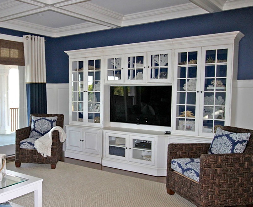
High performance meets high style: the indoor/outdoor rug handles all the high traffic beautifully while the Villa media center—finished in a striking white with contrasting navy blue interior—provides ample storage for kids’ games and electronics and displays chic coral accents.

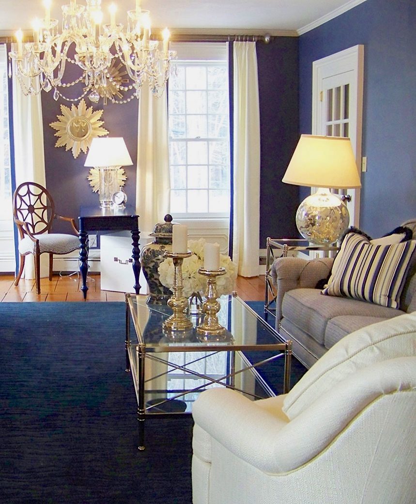
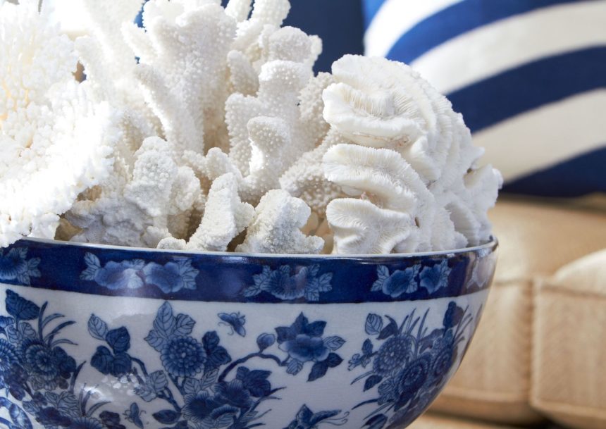
Blue and white. It’s a beloved combination with a rich history and global appeal. Think Chinese porcelain, delftware from Holland, French toile, Laura Ashley anything—and crisp, coastal interiors everywhere. You can’t help but appreciate blue and white for its versatility. We love blue and white for its “anything goes” charm, so throughout July the Daily Muse will be celebrating this primo palette, featuring Ethan Allen designs as well as rooms our readers have shared with us. Stop by often to discover new ways to use blue and white in your home.


Ethan Allen Style Team

Ethan Allen Interior Designer: Brittany Whitney

Ethan Allen Style Team

Ethan Allen Interior Designer: Natalie LeMier

Ethan Allen Style Team

Ethan Allen Interior Designer: Lorraine Wong

Ethan Allen Style Team

Ethan Allen Interior Designer: Annette Nielsen

Ethan Allen Style Team

Ethan Allen Interior Designer: Jessica D’Arpino

Ethan Allen Style Team

Ethan Allen Interior Designer: Kellily Johnson

Ethan Allen Style Team


Kathy Vigoda has been designing chic spaces for satisfied Ethan Allen clients for six years—but she’s been perfecting her styling skills for more than thirty! Kathy, who works out of our Design Center in Hartsdale, New York, is our latest Design Star! No matter the scale or budget, her projects have a distinctly finished, magazine-worthy look. “I love it any time I can complete a room with all the bells and whistles,” she says. Kathy recently shared with us five design principles that guide her every step of the way toward the “big reveal.”

  1. Think Scale
    Size matters in interior design. Too often people choose things like rugs, lamps, and artwork that are simply too small for a room.
  2. Create Symmetry
    Creating balance in a room can be a bit intuitive. You may not always be able to articulate why it feels right, but if you create symmetry, you won’t go wrong.
  3. Add Texture and Color
    Mix materials whenever possible, and add touches of color that echo a larger element in a room, such as pillows in the same color as the drapes.
  4. Provide Contrast
    This often refers to color, but you can create contrast with texture or shape, too. For example, a room with lots of edges can be softened by a round rug.
  5. Edit. Edit. Edit.
    Kathy’s rule of thumb: before you walk out of a room for the last time, turn around and study it—and then take one piece out!


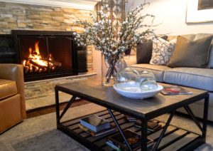
The stone fireplace inspires a mix of natural textures, including leather upholstery, the Beam Metal Base Coffee Table (with knotty oak top), a faux flower arrangement, and globes made of 100% recycled glass.


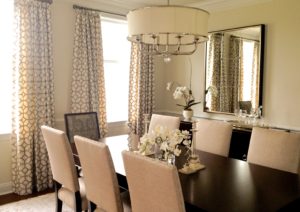
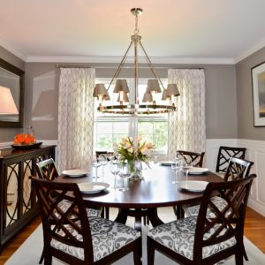
Monochromatic does not mean boring! In this brand-new dining room, Kathy introduces several light elements, including upholstered chairs and our Zoe Eight-Light Nickel Chandelier for contrast against the dark table.


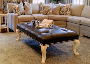
Form meets function in this living room arrangement featuring our Landon bench, a “coffee table” scaled to fill the space created by a sectional. An unconventional pairing of dark leather and white legs creates contrast, too.


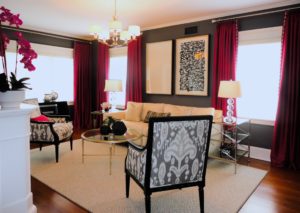
The furniture placement in this room is all about symmetry: the windows flanking the sofa, the end tables, and the Giselle chairs. Color comes to the fore with deep pink drapes, which Kathy also picked up in the floral arrangement and accent pillow.

This is a classic example of how shape can provide contrast. The room is all angles (the wainscoting, rug, buffet, single wide window), but the all-important Ashcroft dining table provides balance (and drama).

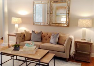
Simple symmetry owns the day in this living room: the three-part Evan coffee table, the end tables with lamps, even the pair of mirrors. Kathy says the client wanted one very large mirror, but she suggested two, and they loved the idea.


To see more of Kathy’s design work, click here.