Have a room that needs a jolt of all-over style? Laying down a flat-weave rug may be the quickest, easiest design move you can make. Designers love flat-weave rugs because they can slide into any space (they’re woven on a loom but aren’t knotted, so they have no pile), they’re easy to keep looking fresh (most are reversible), and they shine in any casual setting.

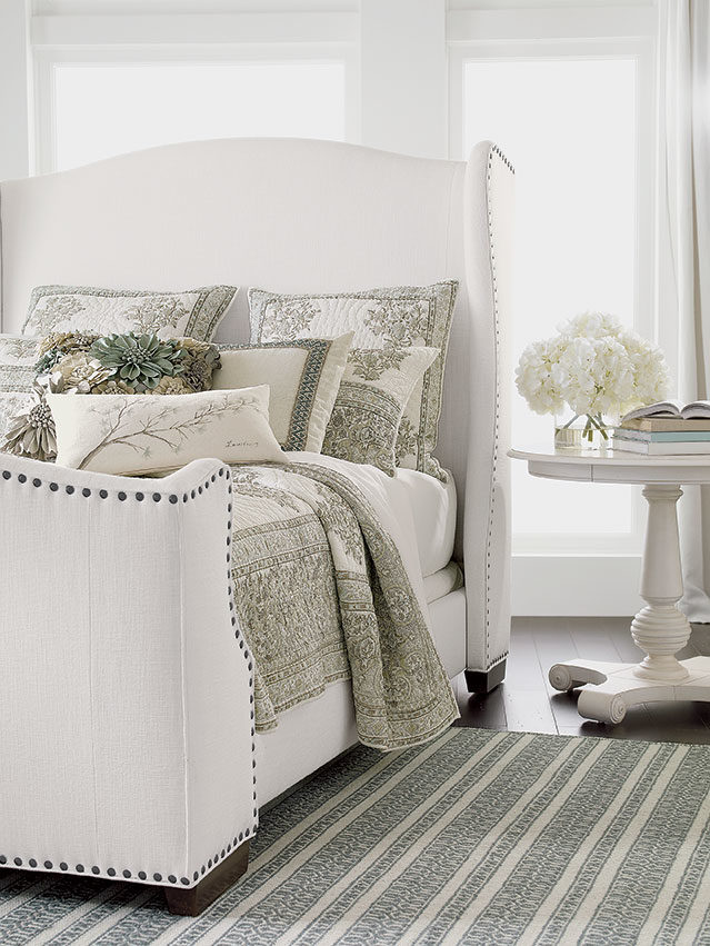
We call this beauty Woven Symmetry; it’s a contemporary Moroccan kilim-style rug that does more than add pattern to a plain floor. It’s woven of 100% Indian wool, uncommonly soft underfoot, and oh so durable. Shown here in Cream/Seafoam, it’s a good fit for this romantic bedroom because it’s sweet, subtle, and in sync with the floral bedding ensemble (our 100% cotton Mineral Hand-blocked quilt in white, mineral, and taupe).

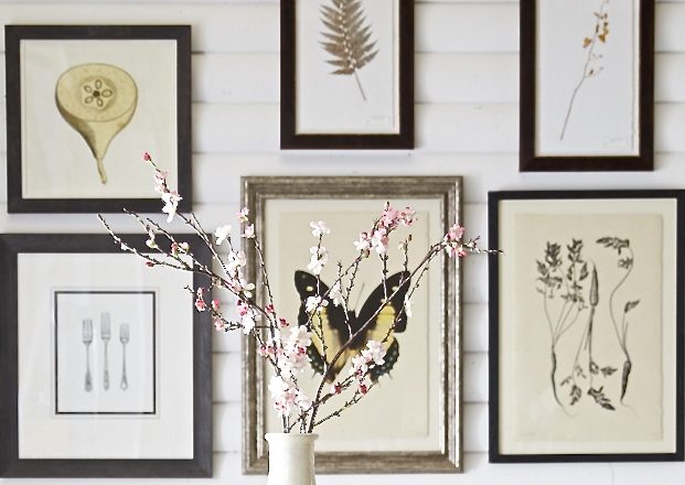
Take your space from spare to spectacular by adding a gallery wall of art. It’s one of the easiest ways to make a personal statement at home, so feel free to mix photography with paintings and prints. The trick is to hang artwork with a collected look: images that tell a color story and/or have a common theme.

BARE BONES
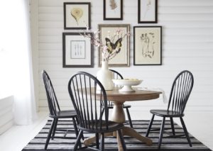
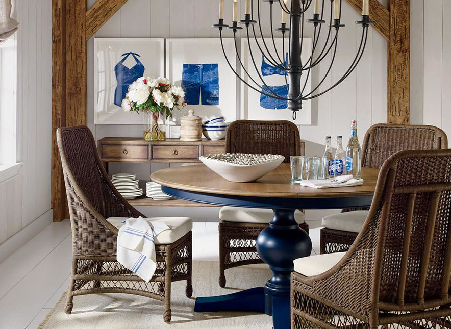
This sweet dining ensemble is a study in proportion and pure form; our Adam pedestal table and Gilbert side chairs are a perfect fit for the small space. They make a lovely vignette, and yet it feels like the room could use just a little love.

GOTTA HAVE ART
Gallery wall to the rescue! Simply framed prints add balance and help to underscore the contrast between black and white in the space. We chose prints with a similar feel, most them nature-inspired line drawings, with varied sizes to lend visual interest. To give your collection a professional look, check out our video: How to Hang a Gallery Wall.


Kathy Vigoda has been designing chic spaces for satisfied Ethan Allen clients for six years—but she’s been perfecting her styling skills for more than thirty! Kathy, who works out of our Design Center in Hartsdale, New York, is our latest Design Star! No matter the scale or budget, her projects have a distinctly finished, magazine-worthy look. “I love it any time I can complete a room with all the bells and whistles,” she says. Kathy recently shared with us five design principles that guide her every step of the way toward the “big reveal.”

  1. Think Scale
    Size matters in interior design. Too often people choose things like rugs, lamps, and artwork that are simply too small for a room.
  2. Create Symmetry
    Creating balance in a room can be a bit intuitive. You may not always be able to articulate why it feels right, but if you create symmetry, you won’t go wrong.
  3. Add Texture and Color
    Mix materials whenever possible, and add touches of color that echo a larger element in a room, such as pillows in the same color as the drapes.
  4. Provide Contrast
    This often refers to color, but you can create contrast with texture or shape, too. For example, a room with lots of edges can be softened by a round rug.
  5. Edit. Edit. Edit.
    Kathy’s rule of thumb: before you walk out of a room for the last time, turn around and study it—and then take one piece out!


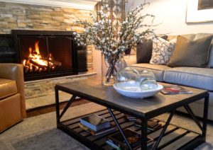
The stone fireplace inspires a mix of natural textures, including leather upholstery, the Beam Metal Base Coffee Table (with knotty oak top), a faux flower arrangement, and globes made of 100% recycled glass.


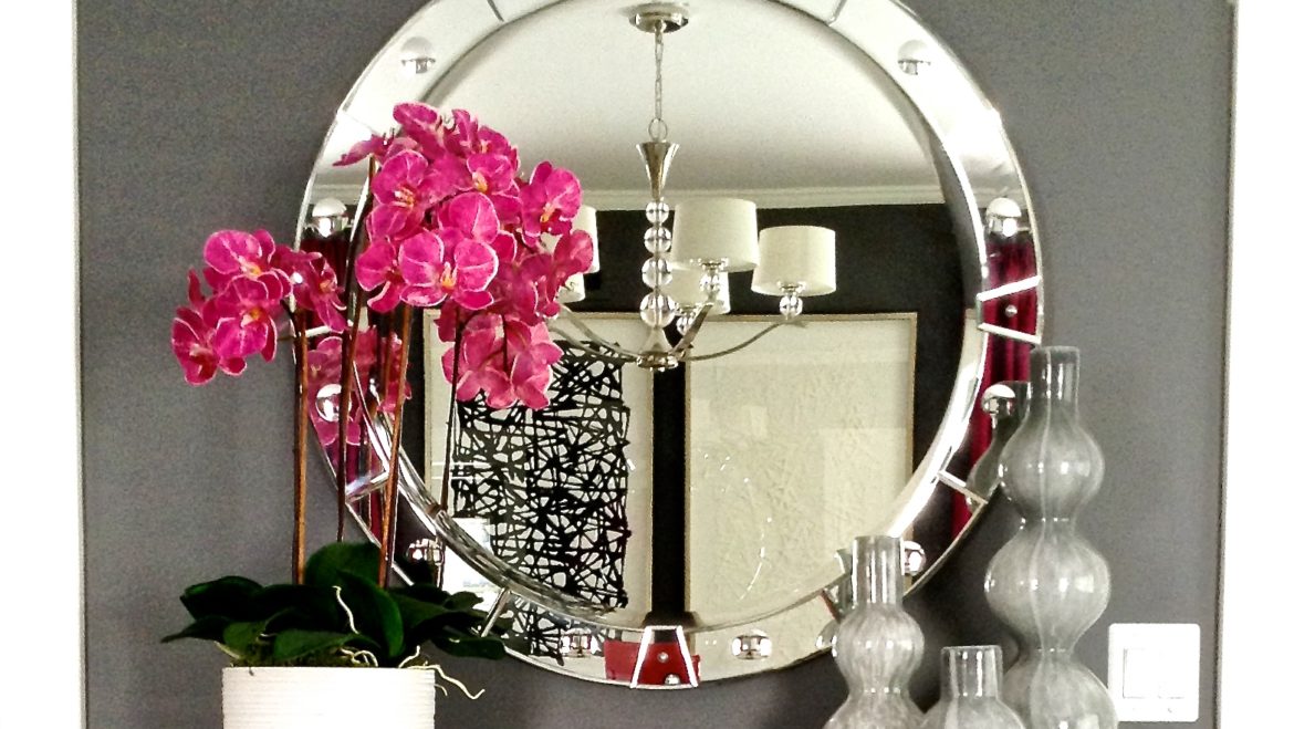
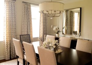
Monochromatic does not mean boring! In this brand-new dining room, Kathy introduces several light elements, including upholstered chairs and our Zoe Eight-Light Nickel Chandelier for contrast against the dark table.


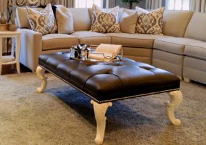
Form meets function in this living room arrangement featuring our Landon bench, a “coffee table” scaled to fill the space created by a sectional. An unconventional pairing of dark leather and white legs creates contrast, too.


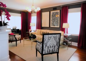
The furniture placement in this room is all about symmetry: the windows flanking the sofa, the end tables, and the Giselle chairs. Color comes to the fore with deep pink drapes, which Kathy also picked up in the floral arrangement and accent pillow.

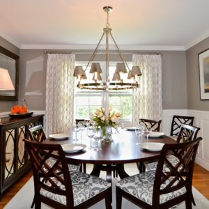
This is a classic example of how shape can provide contrast. The room is all angles (the wainscoting, rug, buffet, single wide window), but the all-important Ashcroft dining table provides balance (and drama).

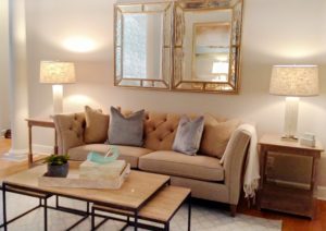
Simple symmetry owns the day in this living room: the three-part Evan coffee table, the end tables with lamps, even the pair of mirrors. Kathy says the client wanted one very large mirror, but she suggested two, and they loved the idea.


To see more of Kathy’s design work, click here.