It’s Cinco de Mayo AND Kentucky Derby day? There has never been a day in the history of mankind that has demanded a party more clearly than this one. And there has never been a piece of furniture more ready for a party than our Lora bar.

Check out this video of five ways to style our Lora bar

We’ve decided to focus on the Kentucky Derby and the classic cocktail that goes with it: the mint julep. Let’s dive into this great tradition, and, as a bonus, we’ll also give you some pro tips on serving with Lora.

The Kentucky Derby

The Kentucky Derby, which debuted in 1875, takes place at Churchill Downs in Louisville. It’s preceded by a flurry of local activities, including a spectacular air show and fireworks display called Thunder over Louisville. A general admission ticket to the Derby doesn’t guarantee anyone a place to sit, and seats are premium price, so fans start flocking into the Downs early to grab space on the central lawn.

And the hats—what would the Kentucky Derby be without these iconic fashion statements?

It’s also not Derby day without a cold, refreshing mint julep in hand. With an assist from our Lora bar, this cocktail is sure to earn a Triple Crown at your Kentucky Derby party.

Mint Julep Recipe

Although it precedes the Civil War, and reports differ over whether it was originally made with cognac or bourbon, the mint julep became the official drink of the Kentucky Derby in the 1930s. Over 120,000 mint juleps are served at Churchill Downs on Derby weekend, including 10,000 bottles of ready-to-serve cocktail, 60,000 pounds of crushed ice, and 4,000 sprigs of freshly harvested mint.

Mint juleps are traditionally served in silver cups (in fact, the Derby makes sterling silver cups for the big day), and the cups develop a lovely signature frost on the outside as you stir the cocktail. If you don’t have silver cups, don’t worry—we won’t tell. Just make sure to use good bourbon.

Oh, and start this the night before your party; you’ll need to make the simple syrup in advance.

Ingredients

2 cups sugar

2 cups water

Fresh mint

Crushed ice

Bourbon

Silver julep cups

  1. Prep the syrup. In a saucepan over medium heat, mix the sugar and water and bring to a boil. Heat until the sugar is completely dissolved and the liquid is simmering and clear. Cool the syrup it and place it in a covered container along with six to eight sprigs of fresh mint. Refrigerate overnight.


  1. Prep your workspace. On the day of your party, place your simple syrup in a bowl along with a tablespoon on the top shelf of your Lora bar. Arrange your bottle of bourbon, a bucket of crushed ice with a small scoop, and a plate of mint sprigs near the simple syrup bowl, leaving yourself a little room to make each cocktail. You can keep a shot glass handy to measure your bourbon; a shot glass holds one ounce of liquid. Place your silver cups on the Lora bar’s second level, along with some spare bourbon in case you run out.


  1. Make the juleps. Grab a silver cup and use the scoop to fill it with crushed ice. Add one tablespoon of simple syrup, plus two ounces of bourbon (two shots if you’re measuring with the glass). Stir the cocktail rapidly to chill the drink and frost the cup. Garnish with a sprig of mint.

HOME IS WHERE THE PET IS

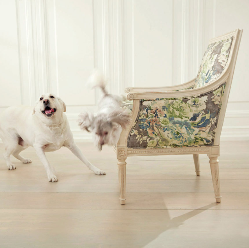
Today kicks off National Pet Month and we’re excited to have a reason to share our appreciation for pets. We’re passionate about helping people create homes they love—and that means more than just sharing the latest in home design trends, like the 2018 Pantone color of the year, and real interior design projects from our own designers.

When it comes to the art of making home, pets play an important part.  They make cozy throws even cozier, have personalities as colorful as works of art,  and they bring more beauty into our lives than any piece of furniture ever could.

PET PICTURES ARE WORTH A THOUSAND WORDS

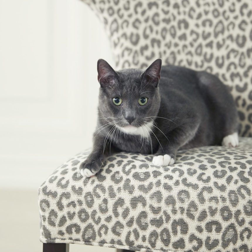
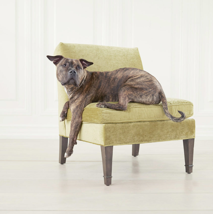
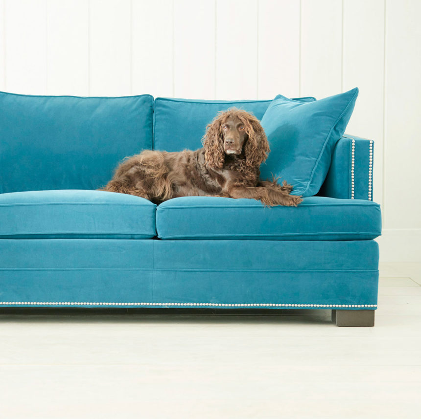
What better way to celebrate National Pet Month than with cute pet pictures! We invited some of our in-house pet owners and their beloved animal companions into the photo studio for pet portraits. We’ll be sharing them throughout the month, as well as some very special pet illustrations by Paul Shaw, manager of our Metairie, Louisiana, Design Center, whose beautiful artwork was recently featured in our State of the Art post.

And we’d like you to get in on the fun too! Tag photos of your pets with #EthanAllenPets on Instagram and tell us what you love most about your pet so we can find them and share the love!

So, let’s start celebrating with a look at a few ways pets bring joy and comfort into our homes:

They make us smile…

“The minute I come home, at least three cats come to welcome me! It always makes me smile to see their little faces!” Gwen Wilkinson, Associate Merchant and her clowder

 “When you look at her, she just casually rolls over on to her back, expecting a belly rub.” Kyle Rodgers, Video Editor and Barbara the dog

…and sing!

“Quentin and I love to sing in the morning! We make up our own lyrics, but we both squeak and howl to get us in the right mood for the day.”  Paul Shaw, Design Center Manager, Metairie, Louisiana, and Quentin the dog

They make us laugh…

“He is obsessed with his Lamb Chop (dog toy) collection. There’s a large basket of them near the front door from which he selects certain ones each day. At one point, we discovered that he had lined them up in front of the window so they could look outside.”  Greg McMahan, Senior Art Director and Clarence the dog

…and amaze us!

“Tater can hear a bag of chips a mile away. It’s become a challenge—we try to open the bag without it making a sound, but Tater comes running from the other end of the house every time. He can even hear cheese. I don’t know how he does it.” Donna Boccuzzi, Production Project Manager and her dog

They warm our hearts… 

“I love how they look up at me with such sweet eyes, even when treats are not involved.” Miller Opie, Social Media Creative Director and her dogs, Amelia and Django

 “I have special ‘Chico and me’ time after I get into my comfies in the evening. I put a pillow on the bed and he curls up on that while I curl my arms around him.” Karen Marino, Senior Art Director and Chico the cat

 …and ease our minds..

“I was given the opportunity to adopt Tucker when we both were going through a rough spot in our lives. I cannot wait to go home at the end of every day and see my buddy.  All the stress melts away when I see him and life is good.” Andrea Fenton, Product Manager and Tucker the dog

Be sure to stay tuned! We’re sniffing out a few more fun stories to share, including pet-friendly home design ideas, and a playful feature on Oliver (@oliver_in_charge), the famous Instagram pup who stole the heart of our Design Star, Nikki Brouillette.


Photographs and artwork make a home feel loved and lived in. The people in the photos or the images on the canvas are important to you. The frames reflect your style. Where you hang them says, “This matters.”

But some of us live in a different world – a world of good intentions and bare walls. “Someday,” we say. “Someday, I’ll put these up.”

And why? FOMU, friends. Fear of messing up! Well, banish those doubts. If you’re a reluctant member of the bare-wall tribe, hope is here. You can do this. No more measuring, extra holes, crooked art, or – let’s be honest – straight-up guessing where to swing the hammer.

Ethan Allen artwork is fitted with no-wire hanging hardware and comes with everything you need to hang your new masterpiece just a few easy steps – secure, level, and with no measuring required.

When you order artwork from Ethan Allen, the artisans in our Passaic, NJ, workshop frame it by hand and attach brackets to each frame. Your kit includes pointed plastic nubs that slip into those brackets to mark the wall exactly where you need to drill. It also contains wall anchors, wood screws, security washers, bumpers, a level and tape, and detailed instructions.

  1. To hang each piece slip a plastic nub into each bracket, then slide it to the side where the screw will be.
  2. Remove the backing from the bumpers and apply them to the frame back on the lower back corners. This will protect your wall from the frame and vice-versa.
  3. Remove the backing from one side of the tape and fix it to level included. Remove the other backing and gently secure the level to the center of the frame.
  4. Hold your artwork up to the wall where you’d like to hang it. When it’s properly positioned and level, push the frame firmly against the wall. The plastic nubs in the brackets will leave small indentations in the wall where the screws should go.
  5. Put the frame down and remove the nubs.
  6. Put a nail into the hole in the nail home in the nub. Push the nail through the nub piece and line up the tip of the nail to the indentation on the wall. Hammer the piece into place. Do the other side. Once you get the nubs in place, just slide the brackets (on the back of your artwork) over the nubs, and boom! Your artwork is locked in tight.

Now that you know how easy hanging Ethan Allen art can be, why not plot a gallery wall? Find all the pro tips and tricks you’ll need (plus a helpful video!) – and banish FOMU forever.


Meet Margaret Francis, our Director of Wall Décor and Outdoor Living.

Making art is a little bit like breathing for Margaret Francis. She’s simply got to do both.

Art has been an essential part of her life since she can remember; learning to use her mother’s vintage sewing machine at age six is one of her fondest memories. Because she’s responsible for curating Ethan Allen’s art offerings and developing our Home & Garden program, art invigorates her every day.

Margaret is coming up on her one-year anniversary at EA, having moved here last summer from Chicago with her husband, Tedd, an architect who grew up in the Midwest, and their children: Kate, 4, and James, 3. They live in a townhouse that she describes as “eclectic with midcentury notes.” It’s not far from where Margaret grew up. She’s a creative and clever maker who enjoys sewing, quilting, framing art, and felting—as busy as she is. Ask her to tell you the coolest thing she’s ever made and she’ll say it’s her two kids.

Margaret took a roundabout route from Boston University, where she earned degrees in psychology and women’s studies, to product development and merchandising, but she concedes she learned something every step of the way. (At one point she considered becoming a marine biologist but says taking chemistry was the game changer.)

After graduating, she did a little of everything—from working as a house mother for students at the St. Thomas Choir School in New York City to handling client services for a financial software company. Frustrated, she finally saw a career counselor, took a battery of tests, and was told unequivocally that she should study industrial design.

Margaret earned a master’s degree—in industrial design—from Pratt Institute three years later, and she took off on the career path that eventually led her to Ethan Allen. She worked in retail for more than ten years, where she especially enjoyed collaborating on home and garden merchandise and seasonal categories.

Because she has both a good eye and an understanding of the art marketplace, her position at EA is a perfect fit. Our art program is multifaceted—from custom framed and exclusive prints to sculptural and dimensional work—with so many opportunities for Margaret to put her stamp on it. She’s very skilled at choosing mats, frames, and details, so there’s no doubt that she’ll showcase each work in the best possible way.

And because she appreciates form and function, developing outdoor living ideas taps into her affinity for problem solving.

Keen to bring fresh ideas to the Home & Garden category, Margaret hit the ground running.  She researched the market extensively and attended trade shows, looking for ways to “move the Ethan Allen needle” toward a more transitional and modern look, without overlooking our clients with more traditional tastes.

Some of Margaret’s additions include color-coordinated fabrics from Sunbrella for long-lasting beauty; mix-and-match pillows; umbrellas in two shapes; and rugs that look and feel fab underfoot. Two new furniture groups (coming later this summer) will showcase the trend toward bridging indoor and outdoor spaces; look for weathered teak and elegant resin wicker, both with timeless indoor appeal.

Along with versatility, quality, and durability, Margaret (ever the industrial designer) was determined that our new outdoor furniture would feel as good as it looks. One of her first directives: “Make me a more comfortable cushion!”

Don’t miss Instagram takeover day with Margaret Francis on Friday April 27th. Margaret will be posting pix all day long!


Meet Ethan Allen Design Star Kate Marchesini

Background

Kate Marchesini got a job in advertising right out of college—as an art director on Madison Avenue, no less. She worked her way up to VP, but after more than a few demanding years, she veered off the ad path into the world of interior design, where she’s stayed ever since. Over the years, Kate has worked as a freelancer, an Ethan Allen designer, and a stay-at-home mom. In 1998, she started her own design firm with her husband, and in 2011, she returned to the EA family as a designer in our Somerville, New Jersey, Design Center.

Home life

Kate lives with her husband, Charles, outside of Frenchtown, New Jersey, near the Delaware River in an older home they restored themselves. Fun fact: The couple’s first design project was also one of their own homes, a 1765 Dutch farmhouse on the National Register of Historic Places. Their award-winning restoration was based on plans they found at the Library of Congress.

The couple has always been passionate about architecture and design, so Kate says they spend their free time visiting historic structures and “shopping for anything that feeds our passion.” She also enjoys drawing, painting, and gardening.

EA: You’re an artist. What part does art play both in and out of work?

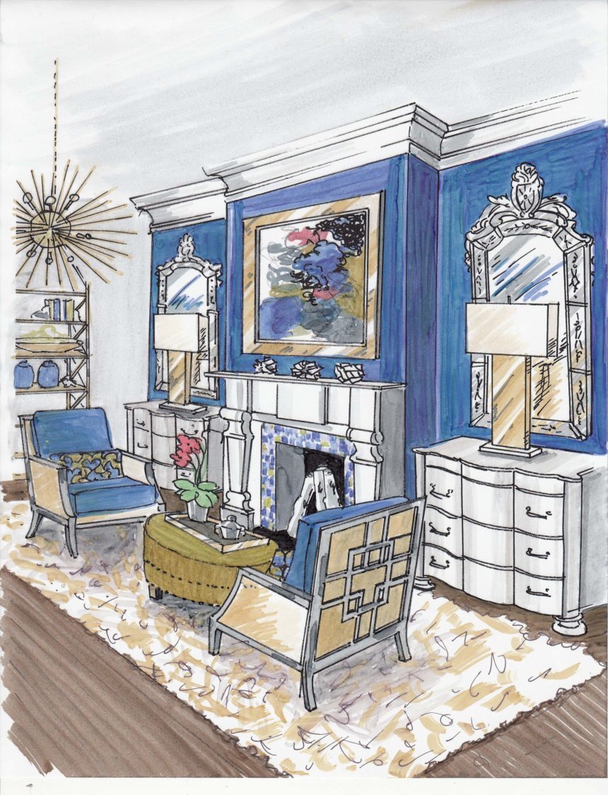
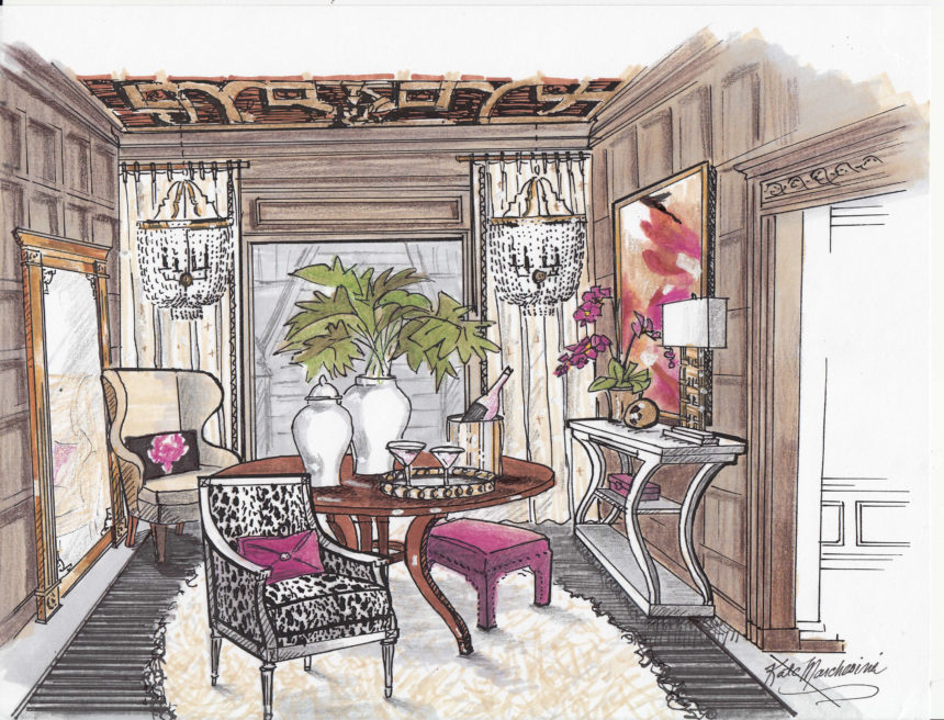
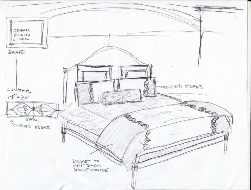
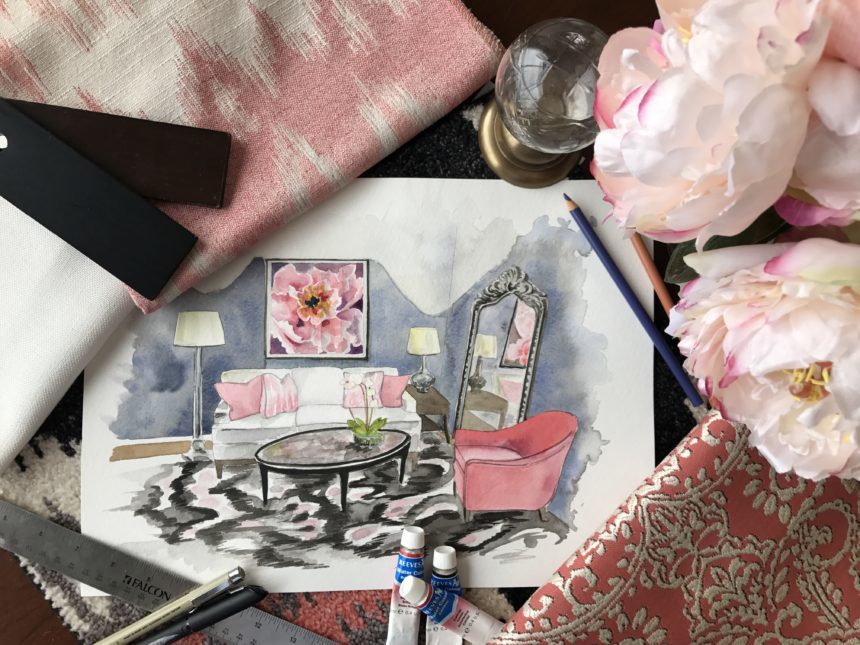
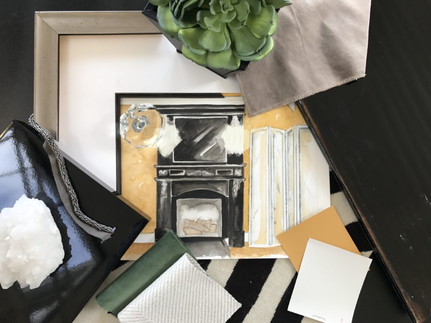
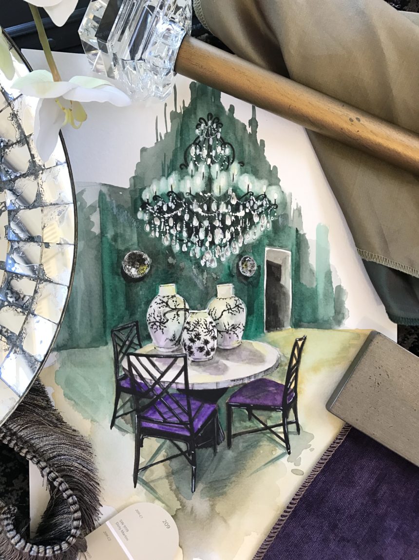
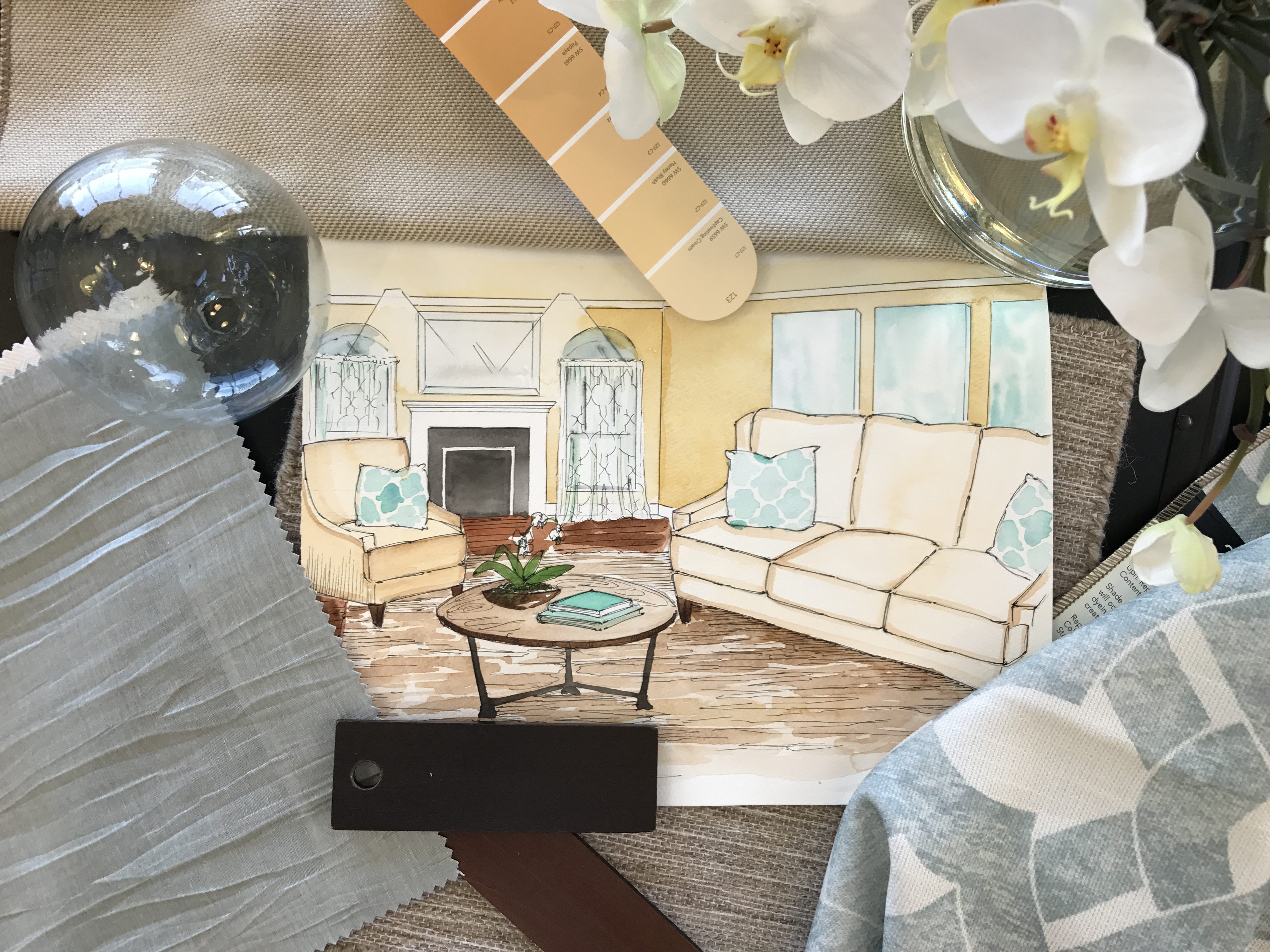
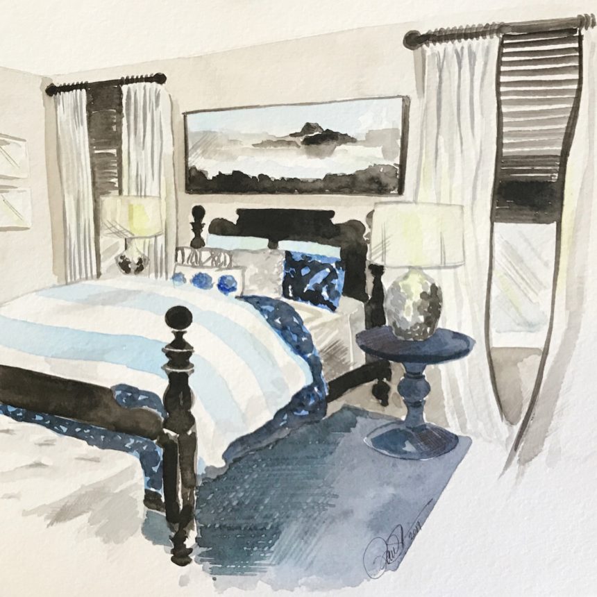
KM: On the job I use my art to illustrate how a room will look. Sometimes the old cliché of a picture being worth a thousand words absolutely applies. A drawing can help distinguish details and colors, fabrics, and the scale of pieces you can’t understand from a floor plan. Even a computer-generated image doesn’t do what a drawing can do.

Outside of work, I use my art all the time to help explain things—whether it’s to show a contractor how a piece of molding joins another, or how I want the fabric to drape on a dress.

EA: What is your favorite Ethan Allen project?

KM: I’ve done a lot of fun projects, but there’s one that stands out. It was in an older home that had built-in bookcases and wonderful woodwork—and purple walls that the clients wanted to keep! There was also black and white geometric wallpaper inside the bookcases, which made quite a statement. They liked the unexpected color, but wanted to put their own spin on it.

We achieved this by choosing classic pieces: our Shelton sofa in a solid taupe fabric, and the Zachary mirrored coffee table. We replaced the wallpaper with a pearlized pattern to soften the look of the bookcases and we put lots of contemporary glass and crystal inside. The result was better than they imagined. We became friends and have since worked on other projects together. You know you’ve done a good job when a client comes back for more!

EA: Which Ethan Allen item do you covet?

KM: My favorite piece is our shapely Donatella console table. I can put that anywhere for an instant “wow” factor.

EA: What is your favorite design tip?

KM: Think of your sofa as background music. Always choose a versatile, neutral fabric that you can live with, and use accents to change up the mood or tempo of the room. You can create a fresh, new look by simply switching out your pillows!

EA: Complete this sentence: Every room needs …

KM: A single focal point—something that draws your eye in, and is more important than everything else in the room.

EA: What is the color you can’t live without, and why?

KM: Black is my go-to color whenever I need a little drama. Hang a white mirror on a black wall, or choose black pillows when you can’t (or don’t want to) match the color in a rug. I like to put black picture frames around old artwork for an instant lift.

EA: If you could do any project, anywhere, on any budget, what would it be?

KM: I would love to design an Italian villa on a canal in Venice. It would be my dream to work with ancient pigmented walls, patinaed with age—even while infusing the space with a fresh dose of contemporary design. Visiting the city wouldn’t be so bad either.

EA: Is there anything else you’d like our readers to know about you?

KM: I design because I love to create with the end result in mind. I can picture a finished room down to the last candlestick. It’s very rewarding for me to see pieces being added as excitement builds and a project comes to life.

Find more of Kate Marchesini’s work on Houzz. To see more beautiful rooms by designers like Kate, subscribe to The Art of Making Home.


Decorating with Abstract Artwork

Which of these is a painting of a train station?

The correct answer is that both are—at least, according to the artists.

Continuing our World Art Day 2018 celebration, let’s pull back the curtain on abstract art and how you can use it in your space. Whether you love it, dislike it, feel intimidated by it, or find it intriguing, abstract art provokes an emotional response.

World Art Day Theme: Abstract Art

According to Wassily Kandinsky, one of history’s first and most prominent abstract artists, abstract paintings are about using color to provoke an emotion. They have no physical subject; instead, form and hue are the focus. Instead of re-creating an object from the physical world, they bring the artist’s interior world outside.

The train station paintings illustrate Kandinsky’s point perfectly. The piece on the right, States of Mind II: the Farewells by Umberto Boccioni, is an abstract artwork painting designed to show what’s in the minds and hearts of people at a train station. Instead of showing people’s facial expressions to explain what they’re feeling, like the painting on the left does, Boccioni uses shape and color to show the feelings people experience in a train station.

For the departure of someone they don’t see often enough, sadness.

For the loss of someone who’s saying goodbye forever, grief.

For the beginning of a first journey to a new place, anticipation.

And for sending off a relative who has overstayed their welcome, relief!

Abstract painting can be gestural or figurative, geometric or fluid. What it is not is a rendition of something from the physical world. Monet’s impressionism, Dali’s surrealism, and Picasso’s cubism are predecessors of abstract, but they’re not part of the abstract movement.

Because they don’t have a clear subject, abstract paintings can be a little hard to label. They can be Jackson Pollack’s spattered action paintings or Mark Rothko’s color-field paintings. But good news: The same qualities that make abstract artwork hard to talk about also it make perfect for decorating.

Secrets from the Pros

When you purchase furniture, we recommend making a long-term investment in something that will last, with timeless fabrics and finishes that can translate in any décor. Then, you can use artwork to change the vibe of a room whenever you feel like it—no redecorating needed.

Here are some more of our favorite tips:

  • You might think abstract artwork in a traditional space would add unwanted energy or even chaos. We find that it actually relaxes the feel of the room by providing a colorful focal point. In a more monochromatic palette, it gives your eye somewhere to rest, so don’t be afraid to use it.
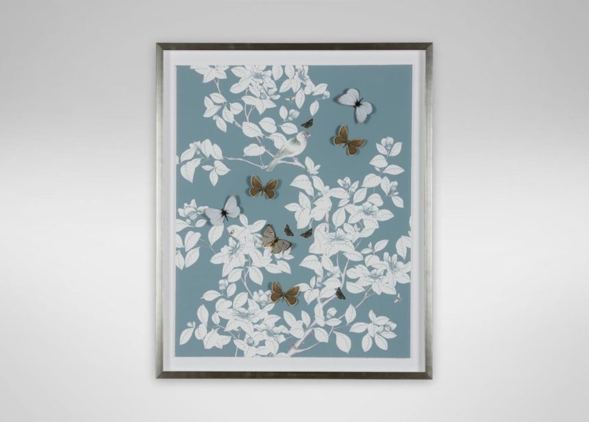
  • Don’t worry about making your artwork match your furniture. Your art choices should speak to We recommend choosing artwork that highlights the undertones in your room’s palette, but always let your heart guide you.
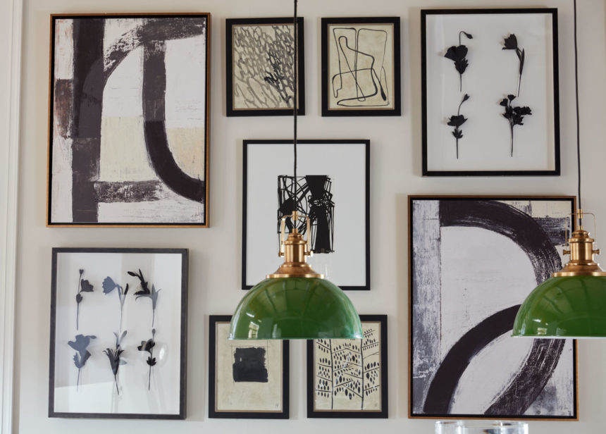
  • Instead of going with one large abstract art piece as a focal point, you can also create striking gallery walls by mixing and matching abstracts. Here are two examples that we love:

For the Transitional Space

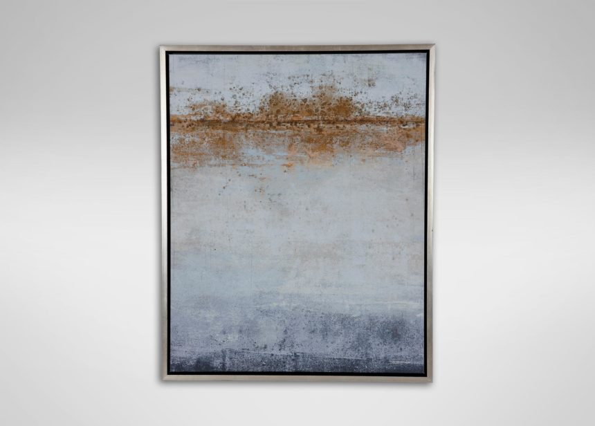
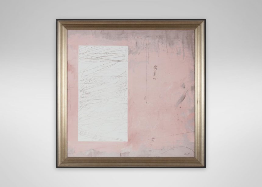
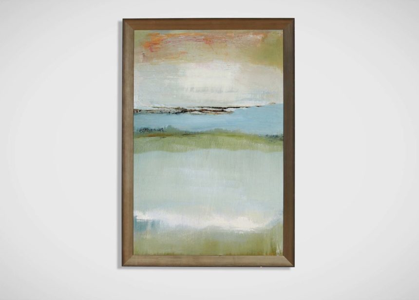
For transitional spaces, we recommend abstracts with a tonal palette. Paintings like these are comfortable in any design, and they tend to be soothing and restful to the eye.

Here are three of our favorites:

For the Modern Space

In modern spaces, we love bold, contemporary abstracts. These beauties don’t shy away from color; they’re large in scale and big on drama. Here are some examples:

For the Traditional Space

Think abstract can’t be traditional? Think again! See how we’ve showcased abstracts in these three traditional and updated classic spaces:

Learn More

  • Have you ever wondered where Ethan Allen finds the paintings we keep in our collection? Get the secrets from our first World Art Day 2018
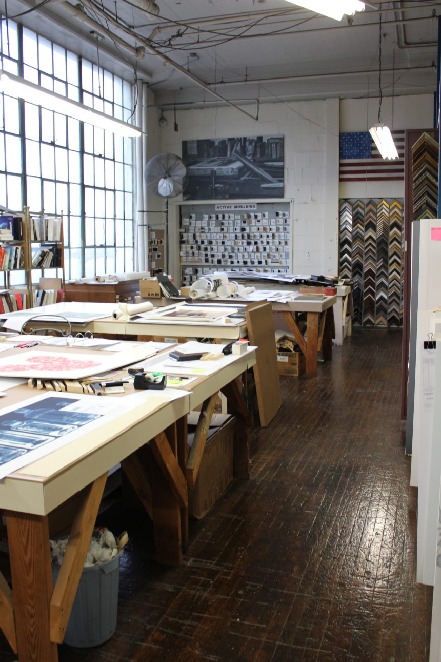
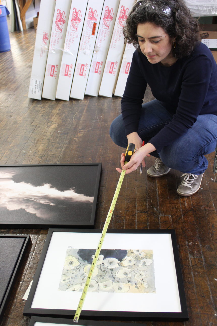
  • You can also find out about the hands-on process of framing and presenting artwork. Go behind the scenes at our wall décor workshop in Passaic, New Jersey.
  • To get a notification whenever we publish a new post, subscribe to The Art of Making Home.

Happy World Art Day!


World Art Day is a day to appreciate the richness that the visual arts add to your life.

It’s also a day to appreciate the artists in your life: the kid who covers your refrigerator with hand-drawn comics; the friend who can’t resist scavenging fallen branches or discarded fabric remnants to make an art piece; the person who’s always sketching or painting in the park; or your partner who’s always covered in ink, clay, or paint spatters from evenings and weekends spent in their studio. Art is ultimately about seeing the world through their eyes, whether you’re browsing in a museum or hanging a painting on your wall.

For World Art Day, we’d like to give you a peek at the 2018 artwork trends and 2018 wall décor trends we’re watching at Ethan Allen. We’d also like to give you the inside scoop on how we choose works to add to our collection and how we connect with great artists.

2018 Artwork Trends

As we wrap up the second decade of the twenty-first century, we’re inhabiting a world of rapid technological change. As the world becomes more digital, we see the art world trending toward the corporeal: the organic things we can touch and feel.

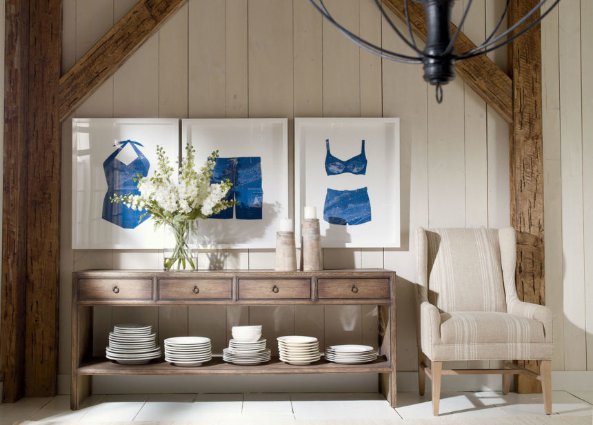
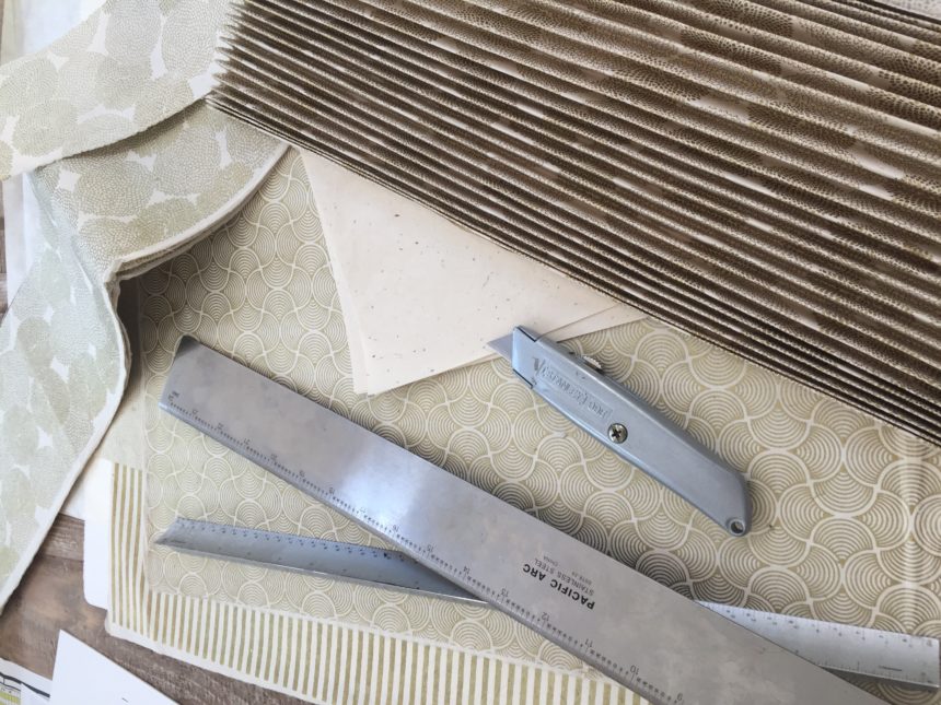
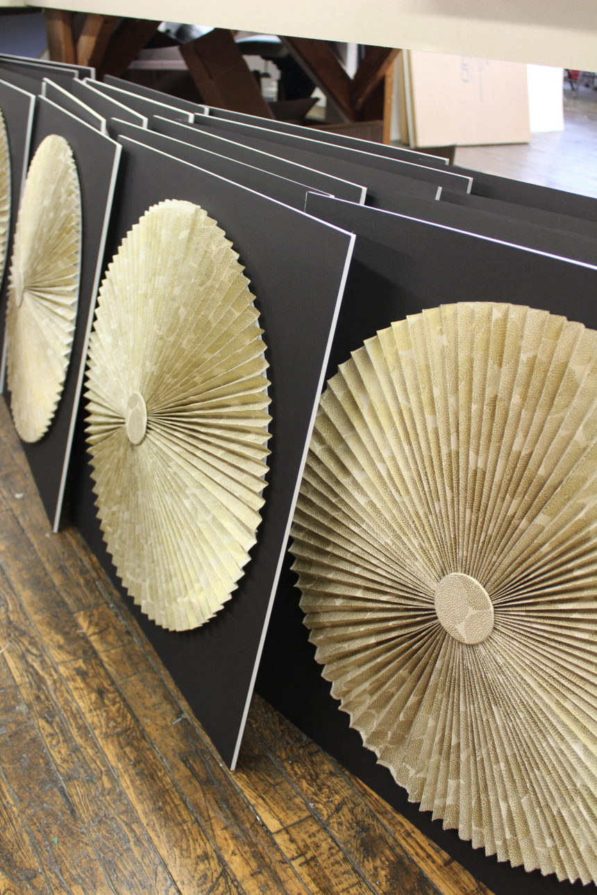
At Ethan Allen, that means working with artists like Dawn Wolfe, who creates gorgeous papercraft artwork. She works with beautiful paper she discovers all over the world, such as handmade gold foil paper from Nepal. She meticulously folds things like vintage-inspired maps into beautiful shapes, from fans to dresses to swimsuits and more. She also adds paper art as a sculptural element to her prints, giving the work a 3D boost.

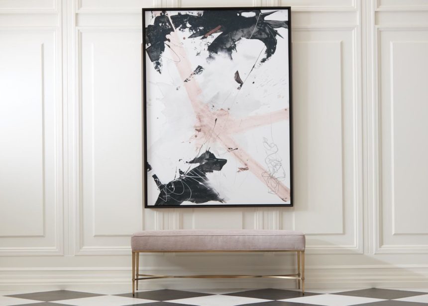
Another one of our favorite 2018 artwork trends is a renewed exploration of abstraction and distortion. We have an in-depth post coming on decorating with abstract art (stay tuned!) but for now, take a look at this piece we’ve recently added to our collection, Black and Blush by artist Milton Coppo.

In this work, bold black leaps forward while blush, surrounded by negative space, retreats into the background. You can see it as a symbolic work for a boisterous age, where big personalities around the edges tend to dominate the social conversation.

Or you can just like the colors and the bold brushstrokes—art appreciation doesn’t have to be deep.

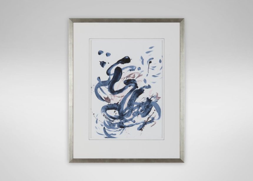
One of our favorite 2018 wall décor trends involves materials and framing—these details become an extension of the work. We love this work by artist PC Ngo; it’s an abstract that we print on watercolor paper, trim with a fine, hand-drawn blue pen line, and mount in a champagne frame, adding both metallic color contrast and shine.

How Ethan Allen Artwork Comes to Life

When we’re looking for new works and new artists, we look to the art world. We visit shows. We hang out in artists’ studios. We also commission artwork that fits current home décor trends.

Our process often starts with a style book that we create. It’s a collection of images, text, and other things that inspire us. According to Ethan Allen director of wall décor and outdoor living, Margaret Francis, artists who like the style book and who are interested in working with us then generate unique, proprietary designs. We select the works we like and then add them to our collection, using mediums from giclée prints on specially chosen papers to frameless canvases.

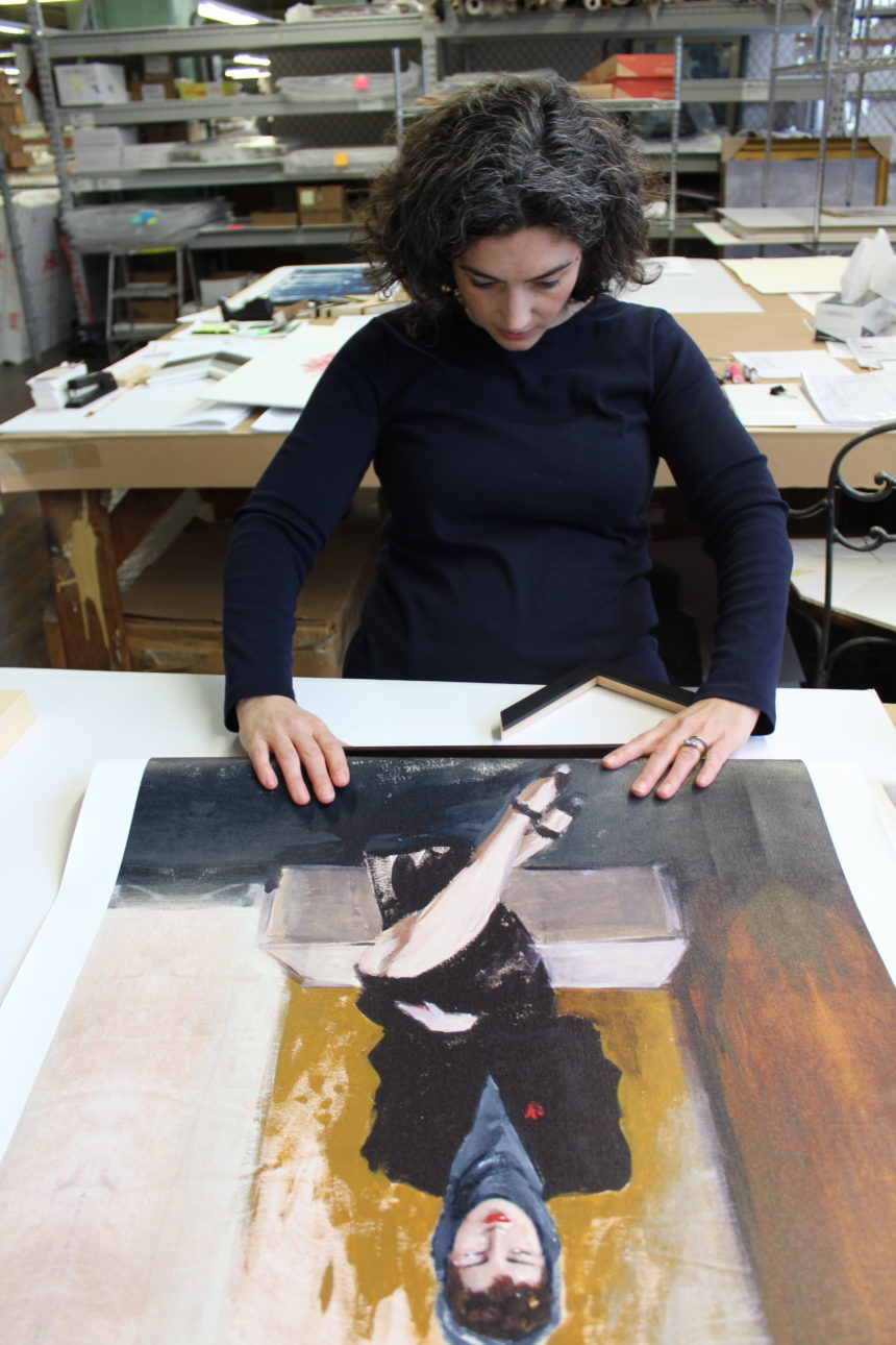
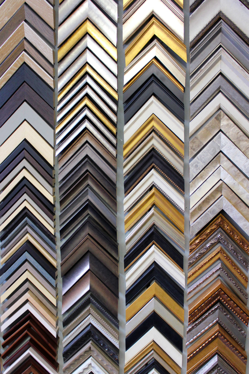
When artwork does need framing, it’s done by hand by artisans in our Passaic, New Jersey, workshop. They choose or custom-build a frame that complements and supports the artwork’s look. Then, they might add mats and add hand embellishments, like fillets, pen lines, and more before sending it along to you.

Happy World Art Day!

Today, we encourage you to take a moment to salute the sculpture you pass in the park every day (you know, the one you walk by but barely notice). Spend an hour or even a day at a museum, immersing yourself in a world filled with masterpieces made by hand.

Buy a sketch book and some colored pencils. Doodle something wonderful in your notebook during a meeting. And explore the art of making home with us by subscribing to the blog.


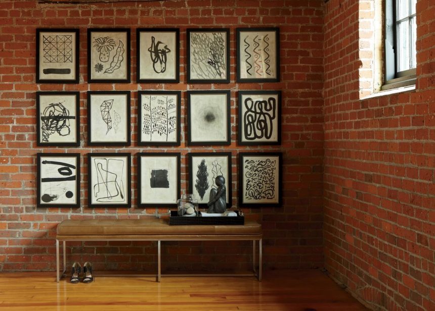
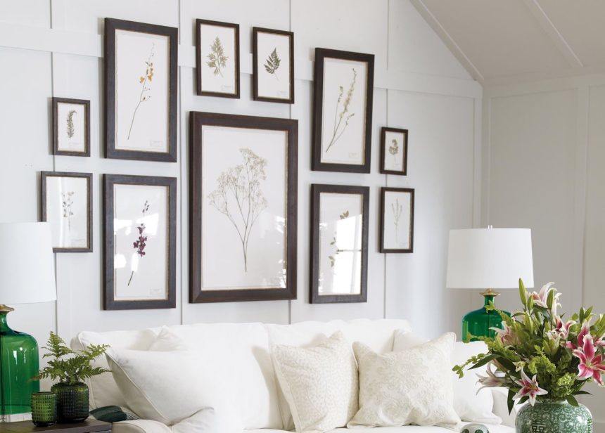
They’re featured in all your favorite interior design magazines and blogs (like ours!), but each one is unique. The gallery wall is a home design trend that’s here to stay—and it’s easy to see why. It adds an eye-catching element to your home, can help set the theme for a room, and is a fun way to express your personality.

If the idea of putting one together seems too daunting or complicated, or you just don’t know where to start—read on! These simple tips and tricks will help you pull off a perfect gallery wall of your own—with ease.

Choose the Wall

Gallery wall arrangements have the most impact on prominent walls painted in neutral colors. This lets the artwork really shine. Colored walls can work, too: Just be sure to create contrast with frames or white mats to prevent a bolder hue from visually swallowing up the artwork.

Think Thematically

Although there are no hard and fast rules when it comes to the content, gallery walls that share a color or a theme—such as abstract or botanicals—generally look more put together. Designer tip! If all of your artwork features the same subject, use unique frames to create a more interesting gallery wall design.

Add a Surprise

Consider incorporating a mirror, chalkboard, wall clock or family photo. When selecting this element, think about the room it’s going in. A gallery with a chalkboard is right at home in an entryway or kitchen where you can keep a can’t-miss shopping or to-do list.

Decide on a Style

If you love a clean modern look, group an even number of same-sized images together to create a symmetrical gallery wall design. For an eclectic gallery wall, mix rectangle, square and even round wall décor. Groups of three, five, or nine pieces work especially well.

Now that you’ve established the overall vibe of your gallery wall, you’re ready to start installing your art – but don’t start swinging the hammer just yet. These simple steps will help you create a flawless gallery wall with a just a few supplies and some imagination.


1. Gather the following: kraft paper, pencil, scissors, tape, a hammer, nails or picture hangers and framed artwork with saw tooth hooks or a picture wire—something you won’t need to worry about if you have Ethan Allen artwork, which features a wireless hanging system.


2. Spread the kraft paper on the floor. Trace your framed pieces onto it and cut them out.


3. Arrange the cut-outs on your wall starting at eye level and tape them in place. Play with the arrangement as much as you’d like! For an avant-garde look, try an arrangement with no spacing between artwork at all.


4. On each framed piece, measure the distance between the saw tooth hook(s) or picture wire when it’s held taut and the top of the frame.


5. Measure the same distance from the top of the corresponding cut-out and insert a nail through the kraft paper at that point.
 

6. If you’re using Ethan Allen artwork, you can skip steps 4 and 5! Just place and press the art piece firmly against the corresponding cut-out to create dimple marks, then insert the provided self-hanging hardware at those points.


7. Remove the cut-outs from your wall, hang your artwork, and voila—the perfect art gallery wall!

Ready to get started? Mix art you own and love with new ones or create an entirely new look. We’ve got hundreds of pieces of framed and custom-framed artwork to choose from!


Meet Ethan Allen Design Star Paul Shaw

To say that Design Star Paul Shaw is colorful is an understatement. Paul is, first and foremost, an artist. He sketches and paints and finds inspiration everywhere—from the foothills of Appalachia, where he grew up; to France, Italy, and Ecuador, where he had the good fortune to study art. We’re fortunate to call him one of our own; Paul has been with Ethan Allen for six years.  He currently manages our Metairie Design Center in greater New Orleans, where we caught up with him for our latest interior designer interview.
Paul has come a long way since “roaming Appalachia” as a child, “anchoring tents amid the pines and seasonally taking up residence in old farmhouses.” On the bright side, he says: “My childhood instilled in me a deep reverence for nature and our interdependence. It also fostered an imagination that took me all the way to the Sorbonne, where I studied for seven months.”

Having called New Orleans home (off and on) for many years, Paul describes the city’s allure with affection: “She’s a charmer, offering up Creole cuisine, violet sunsets, and music that floats across the Mississippi,” he says. He says he feels comfortable there “because the culture is robust and provides artists like me an amp to plug into.”

Along with degrees in art history and French, Paul has ten years’ experience in the design industry, including stints in visual merchandising and floral design. He really feels as though he’s found his calling. “Whether by art or design, I believe beauty is inherent in everything and my vocation exists to reveal it,” he says. “We work every day to build the life of our dreams and sometimes we are surprised to discover we are living it!”

Paul loves to wax lyrical about his life, his work, and the importance of art in the home—and we’re happy to quote him on it!

What’s the one thing you’d like our readers to know about you?

Design should be felt as much as it is seen. My aim is to create spaces that tangibly impact the way you feel. If you want to feel vibrant, we will create energy with color and movement. Conversely, tonal solids and subtle textures inspire calm.

What is your favorite design tip?

Scale is queen! The right proportion will make or break a design. I often demonstrate this with a quick sketch. It provides a instant lesson on maximizing space, creating pleasing proportions, and investing both time and money wisely.

What Ethan Allen piece is your favorite?

The Nikita console. She has universal appeal. Dark, lacquered, and dramatic, she is always ready to anchor a large canvas or add a graceful, architectural curve to a focal wall. She and I are definitely in a long-term relationship.

Complete this sentence: Every room needs …

Art. It is completely subjective and personal. It’s a reflection of our lives and a unique way to express our point of view. When I talk to clients about art, I do so respectfully. As an artist myself, I strive to impart the many ways in which art can impact a space—from creating balance to enhancing mood.

If you could do any project, anywhere, on any budget, what would it be?

I would focus my attention on rooftops! Living in an urban environment, I am always finding ways to bring the outside in. I would love to be involved in a city project to build rooftop gardens and outdoor living spaces. Pergolas, trailing vines, Moroccan poufs, and yes, chandeliers!

Tell us about your favorite Ethan Allen project.

I have a favorite scenario in which a client says to me: “Show us what you would do.” When I get the opportunity to answer that call, I pour my heart and soul into it. I strive for design that will endure and energetically suit the people who live with it. So far, no disappointments.


Find more of Paul Shaw’s work on Instagram @paul.shaw_ea, and on Houzz, https://www.houzz.com/pro/paulshawart/paul-shaw-ethan-allen-nola. To see more beautiful rooms by designers like Paul, subscribe to The Art of Making Home.


Take a (blue) note and discover ways to get a cool, coastal look—no matter where you live. Ethan Allen designer Tia Ortiz shares her secret: a beachy blue palette.

It’s a palette that gives a room movement—and repose. It’s inspired by surf, sand, and glistening blue-green fragments of sea glass that wash up to shore. We call it beachy blue.  It’s a favorite of EA designer Tia Ortiz, of our Rockville, Maryland, Design Center. “I work with a lot of clients who lean toward modern, livable spaces,” she says. “So I recommend enduring styles and a sophisticated mix of patterns. And if they like cool, versatile colors, I almost always turn to a palette of sea and sky.”

People gravitate toward beachy blue because it’s both serene and uplifting. It’s the mainstay of coastal décor, of course, along with warm white—and the go-to palette for anyone who’s ever dreamed of living at the shore. It’s very approachable, ideal for a casual presentation. “It’s a cool color combination I absolutely love,” says Tia.

BACKGROUND CHECK

Beachy blue offers an ocean of decorating possibilities; it can swell (when used as a painted background) or be still (when used sparingly).  We adore priming a canvas with it. No matter the furniture style, it creates a calming mood.

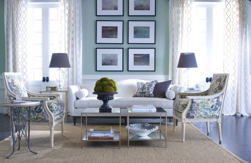
Our evocative Glacier prints stand out against a wall that leans toward green-blue.

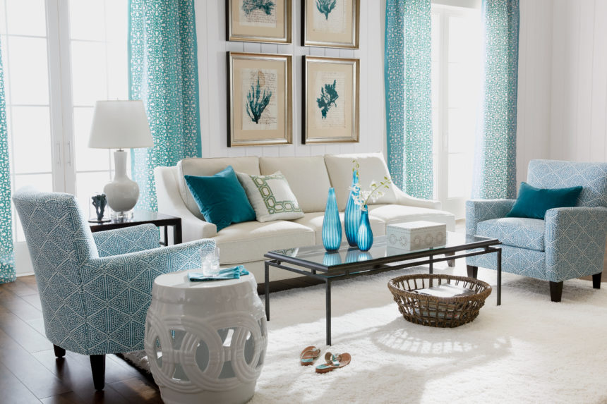
This transitional space owes its casual good looks to a cool aqua and soft white palette.

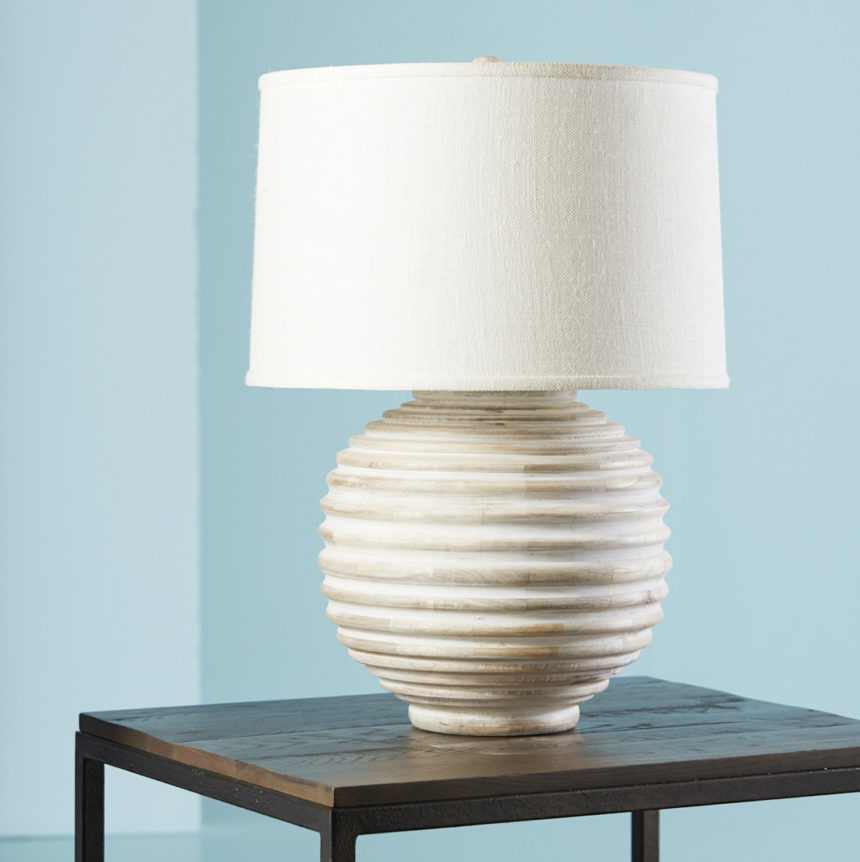
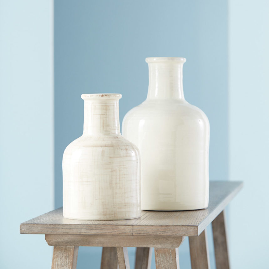
White pieces pop against subtle blues, proving negative space can have a positive impact.

FABRIC SOFTENER

Go coastal with blue hues in a sophisticated mix of patterns—whatever makes you feel most at home, advises Tia. Beachy blues can tone down bold patterns and accentuate subtle ones. They’re the common thread that makes so many fabric collections click.

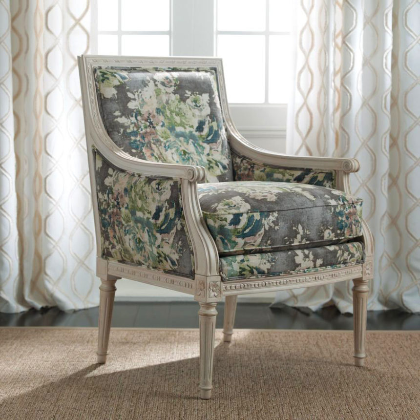
An antique white finish on a Giselle chair is the perfect foil for a watercolor-inspired floral.

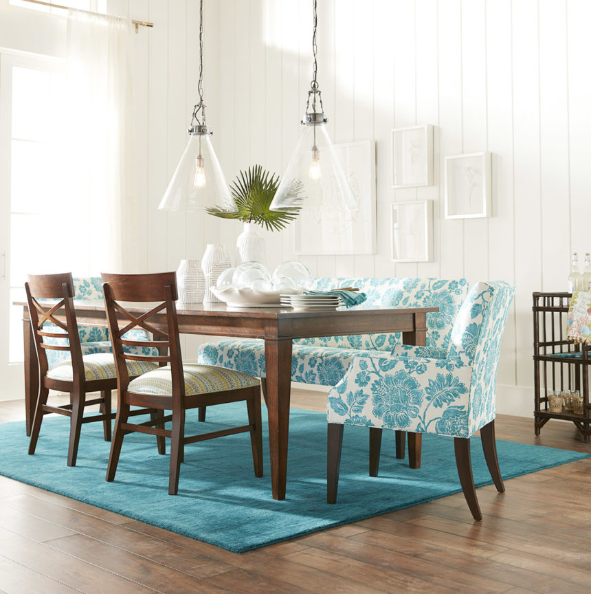
Beachy blues rise to the occasion when playing with lively, large-scale patterns.

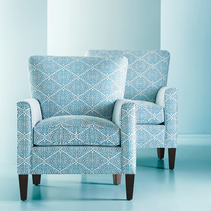
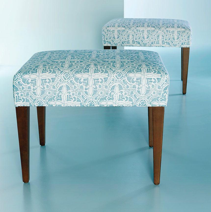
Graphic, small-scale patterns create a singular sensation—especially when you use pieces in pairs.

COMPLEMENTARY COLORS

You don’t need a serious commitment to live with beachy blue. A pop here and there is all it takes to pull together a casual space with ease. When used sparingly, it serves to complement, not consume, a space.

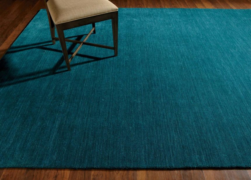
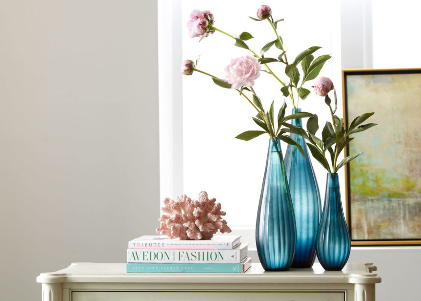
A hand-loomed rug in rich, tonal turquoise goes over to the dark side, in a good way.

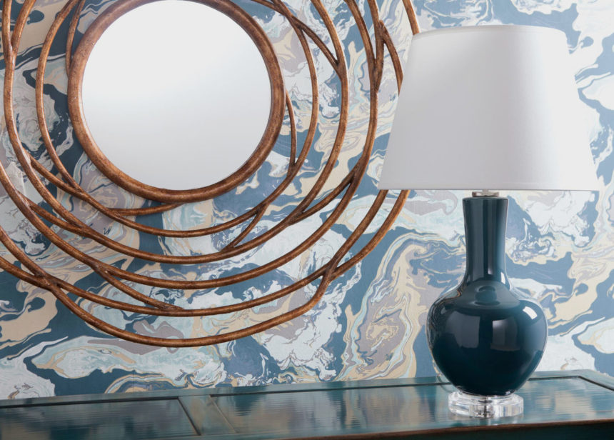
Here, there, and wherever you like, beachy blue accents make a splash.

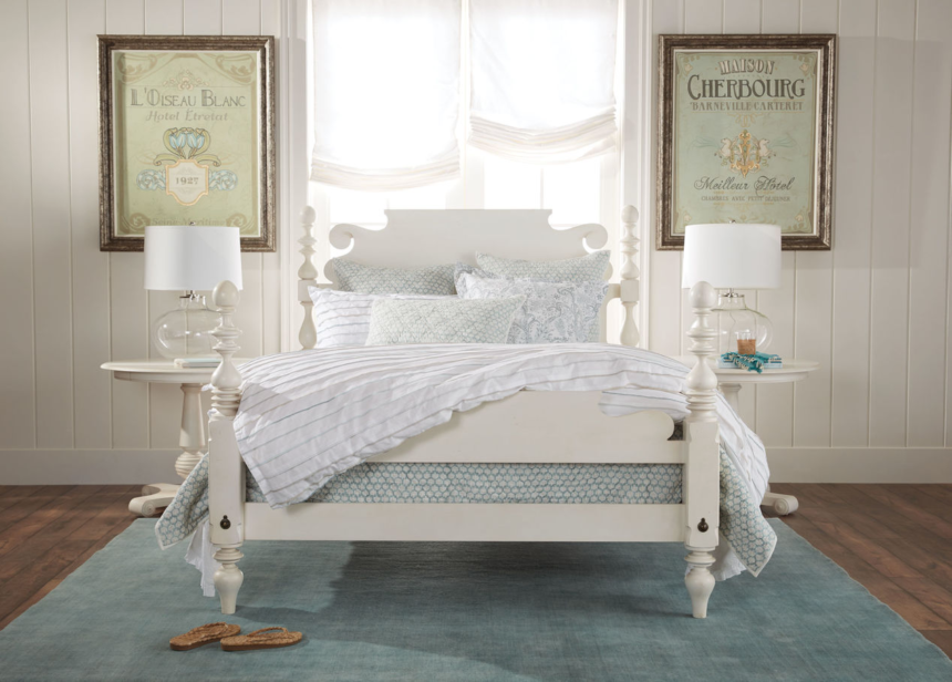
One of the things we like best about a beachy blue palette is how ambience altering it can be—even when it’s barely there. Start with a whitewashed Quincy bed to set a romantic mood, and complete the serene scene with a hand-loomed wool rug, a bedding ensemble that stars the lovely Foulard Block Print Quilt in sea glass, and artwork that evokes a sense of the French countryside.

Like this summery palette as much as we do? Explore our inspiration rooms for even more fresh ideas at ethanallen.com. To see more beautiful rooms in every palette under the sun, subscribe to The Art of Making Home.