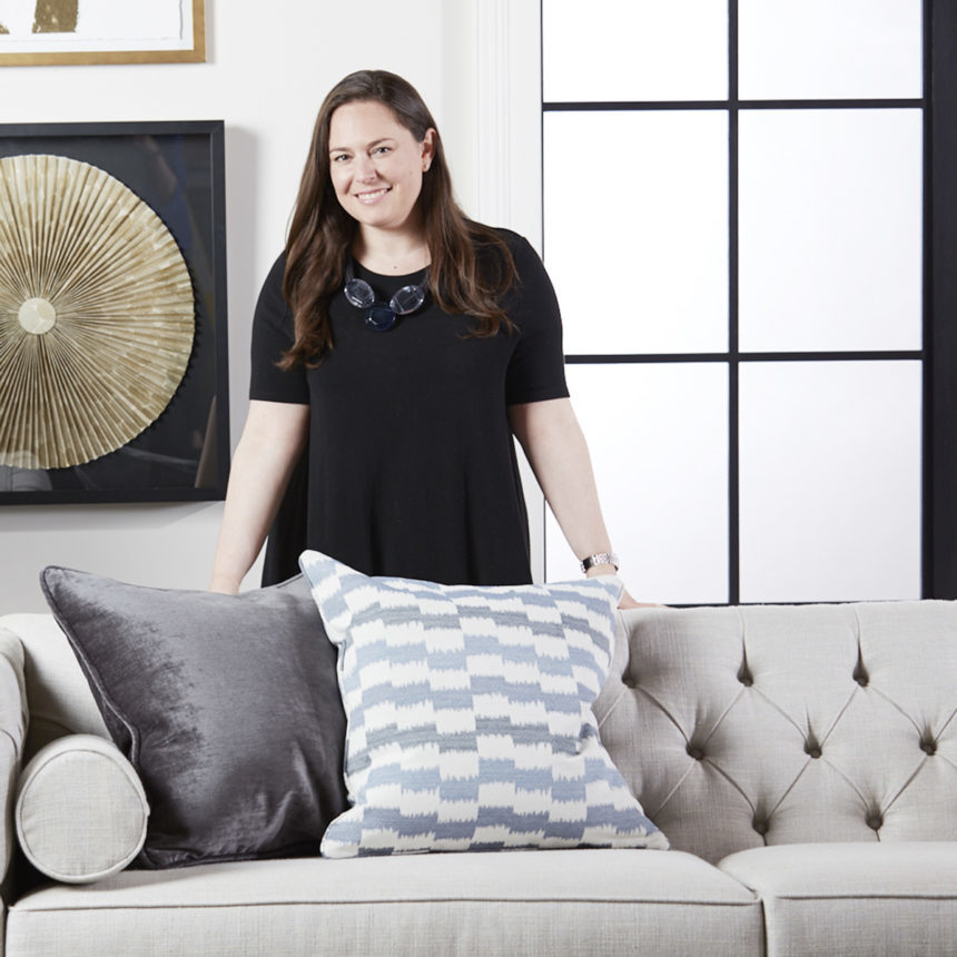
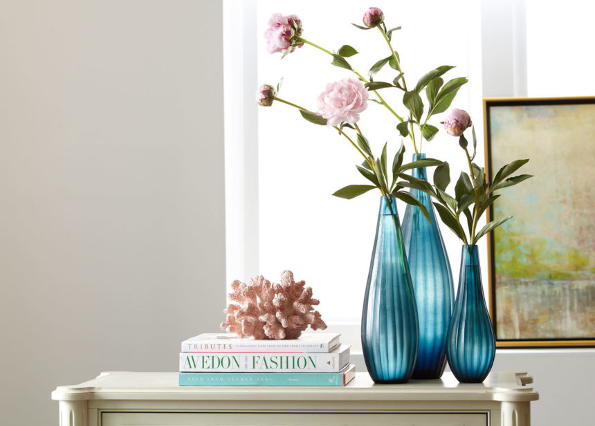
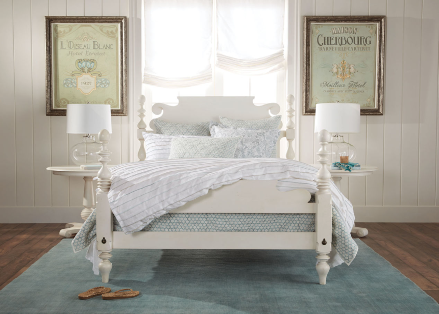
Ethan Allen’s own Florence Grazi takes you behind the design to reveal the latest fabric trends!

One of Ethan Allen’s biggest passions is personalization: making it possible for you to customize our styles in ways that help you express who you are. Our collection of 1,000+ textile fabric and leathers is one of the ways we make that happen, and the mind behind our fabric collection is our director of fabric and leather, Florence Grazi.

We start by briefly introducing you to Florence and giving you a sense of her arc as both an artist and a trend spotter. Then, we’ll dive right into what’s hot in the world of fabric right now and share some images of Florence’s favorite fabrics.

Meet Florence

Florence knew she wanted to be a textile designer when she was fifteen years old. Like so many of us, she was inspired by a great teacher; in her case, the teacher was Joan Busing, a printmaker with whom Florence studied art.

Joan often invited former students to return and share their work with her current students. One such guest, a student at Syracuse University, introduced Florence to designing fabric patterns with gouache, a paint that blends some of the behaviors of watercolor with the opacity of acrylic.

“I was totally enamored,” Florence remembers. “I thought, ‘This is what I want to do. I want to do something where I can just play with this stuff all the time.'” On a college evaluation visit to Syracuse, she met a senior student in the surface pattern studio who had interviews lined up at both Ralph Lauren and Hallmark. Seeing the chance not only to perfect her art but also to build a rewarding career, Florence earned a BFA from Syracuse and started putting her knowledge to work.

She began her career with Stacy Garcia, who had just launched a design house in New York City (Florence also interned with Garcia during her degree program and considers her an important mentor). At that point, Garcia was running her startup from a basement, with a focus on design for the hospitality industry. She has since branched out into residential categories, moved into office space, and become a sought-after speaker and designer. For Garcia, Florence developed patterns for both upholstery and soft goods fabrics (think bedding and pillows), along with patterns for wallpaper and carpet.  She then moved on to Kravet, where she developed signature looks for midrange and licensed fabric collections—most notably, the Candice Olson collection.

Ethan Allen has been a place where Florence’s passions come together: designing fabrics, spotting trends, and developing finished products that people will love. She credits her predecessor, Anne Lekow (now Ethan Allen’s senior director of upholstery merchandising), as a mentor who helped her combine both her product development experience and her trend-spotting know-how with an appreciation for how every fabric will look once it’s applied to a frame.

In fact, Florence says the most rewarding part of her job is seeing the gorgeous fabrics she works so hard to develop come together with a frame to create the perfect piece—that point at which the two-dimensional becomes three-dimensional. “The coolest thing I ever saw was the conveyor belt of furniture,” she says with a laugh, recalling a visit to one of Ethan Allen’s North American plants. “I thought, ‘This is the moment. This is the moment I’ve been waiting for.’ All the different furniture coming down the belt. All different patterns, all different frames. Fashion is something I look to for inspiration. This is my fashion show. That’s my runway.”

Throughout her career, Florence has had a passion for knowing what’s next in the world of textiles. Without further ado, we bring you Florence’s take on the latest fabric trends.

Pattern in Textile and Design: It’s Back!

We all know the usual advice for decorating a room: Start with neutral investment pieces and add colorful or patterned accessories to personalize the design. If Florence had her way, she’d turn that advice on its head—today.

“I think that people turn to neutral because they’re comfortable with it, and it’s an investment, and you can live with it for a long time,” she says. “I would love to start with a pattern and with color. And I’m starting to see that with some of the higher-end designers who have blogs and also in high-end publications.”

Florence has noticed a trend toward more large-scale botanical patterns, including tropical prints and florals. “There’s really an emphasis on bring the outdoors in,” says Florence, “but what’s next for florals? I don’t know that it’s necessarily super traditional or formal. It’s like a new construction. Florals that are big bouquets—they’re showing them now at triple the scale. Old-school bouquets shown on a black ground at twice the size. It’s all about changing something to make it for today rather than repeating history.”

In fact, people seem to want a fresh take on something already made: “A really traditional damask from the eighteenth century can be new again with a change in construction or a change in color.” Florence points to a metallic damask that Ethan Allen recently released, a metallic print on a linen ground. “It’s high and low. I love the juxtaposition, the mix of something shiny with something dry.” Even solids, she says, are incorporating that mix of matte and sheen to add a sense of dimension.

Florence also loves to see ancient techniques like block printing, which originated in ninth-century China during the Tang Dynasty, take on new life in today’s fabric patterns. One of the fabrics she developed for Ethan Allen’s Passport look, Mandron Pool, is a great example. See how this performance fabric is made.
Color Is Everything

Florence’s love for pattern goes back to the days she spent in her high school teacher’s studio. “It’s my core,” she says. “It’s my heartbeat.” She’s equally passionate about color, and that passion is essential because textile fabrics are often the first place Ethan Allen’s merchandising team starts when creating a new look.

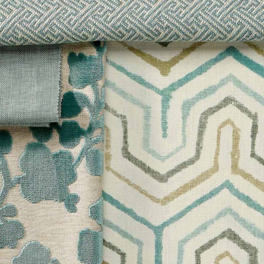
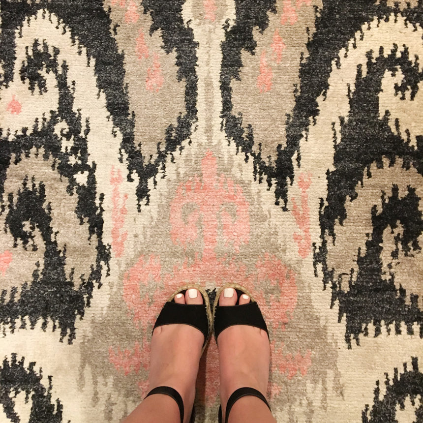
For Uptown, which released in Spring 2018, Florence found inspiration at a textile fair she attended in Italy. What she saw helped her develop the signature Uptown palette, which consists of deep jewel tones and light gemstone hues. Amethyst and eucalyptus, a color Florence describes as “slate-y teal,” are the core colors.

To pair beautifully with Florence’s Uptown palette, Ethan Allen created an all-new finish called champagne brass. The team also chose cooler brown tones for many of its wood finishes, which look gorgeous with the fabric palette and the new finish—all built around Florence’s initial concepts.

“This is the thing about color and design, period,” Florence says. “It stems from somewhere in history; it regenerates itself. People say, ‘We’ve been there; we’ve done this.’ Not this way. It’s all about figuring out the angle.”

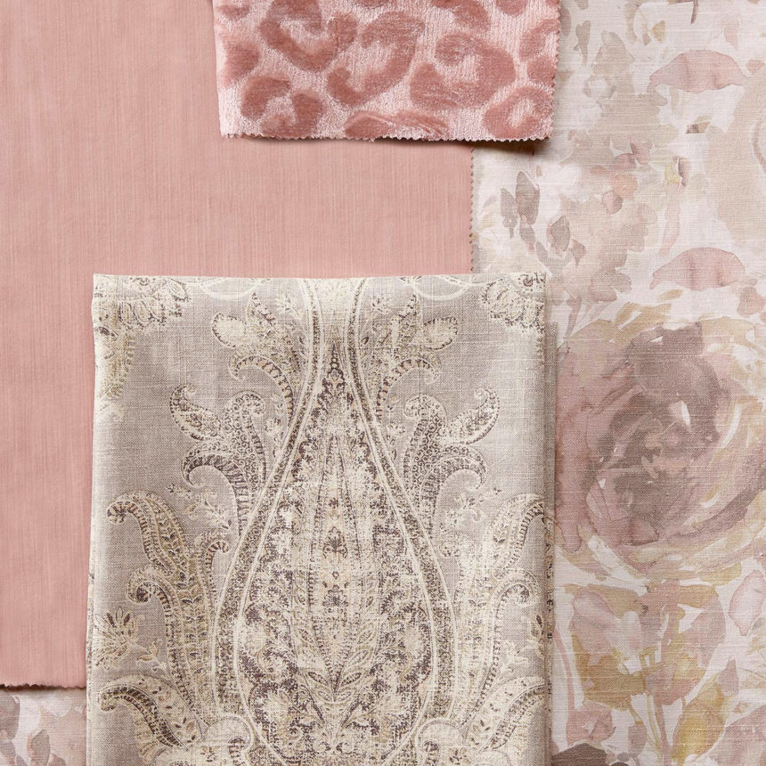
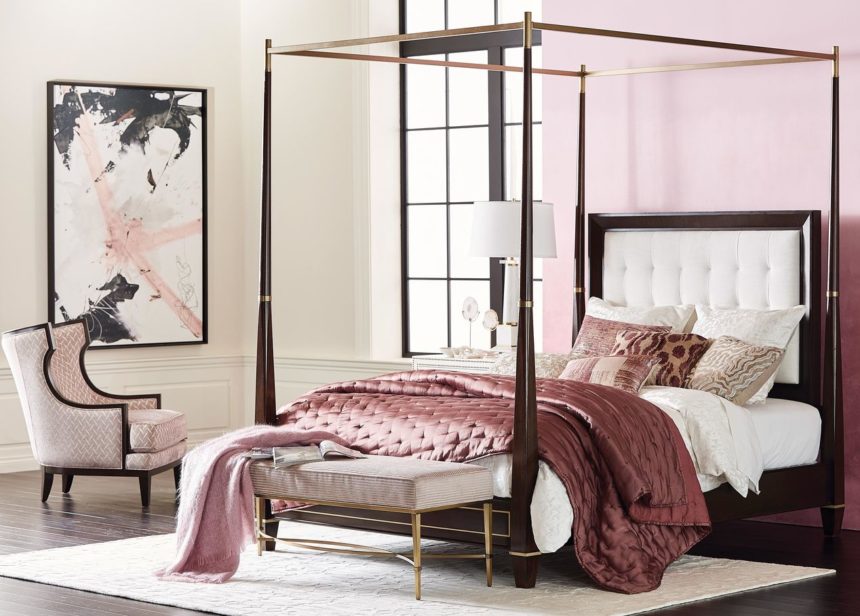
When it comes to color, Florence sees pastels as the on trend, particularly grayed-out hues that pair beautifully with finishes like lacquer, crystal, brushed metal, or Lucite. “I think what’s happening is there are light grayed pastels, like blush, mint, and lavender—I think these are becoming the new forms of neutrals. Also light, soft grays rather than charcoal.” In other words, blush is so much more than millennial pink; it’s en vogue because it pairs so beautifully with stylish finishes, wall colors, fabrics, and decorative elements. Other on-trend colors that pair beautifully with gray include—

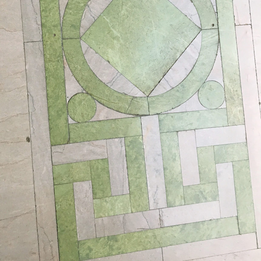
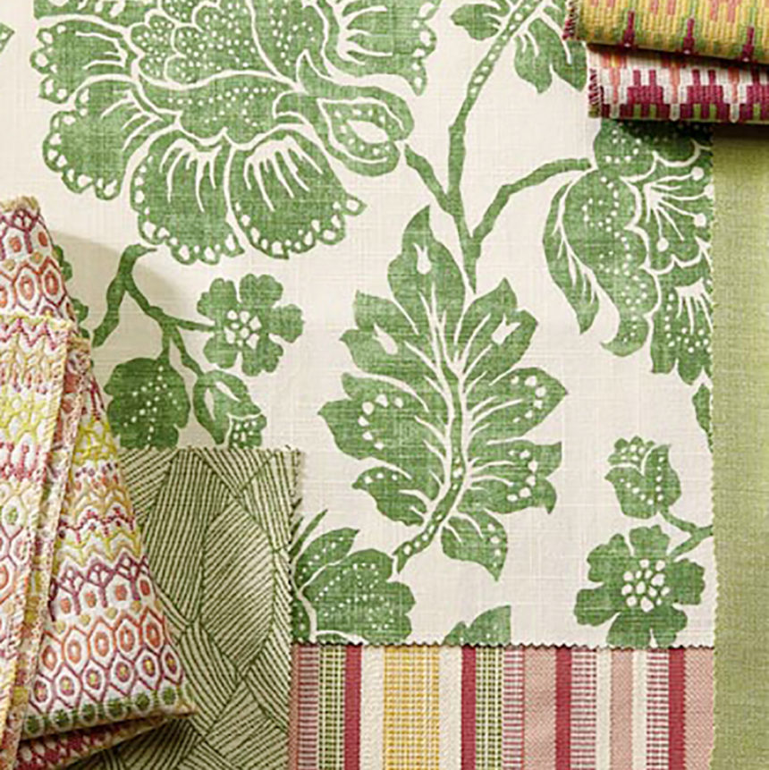
  • Greens are available in a wide range of shades—eucalyptus, sage, olive, moss, grass—and they have the added benefit of bringing the outdoors in. One example is Ethan Allen’s Lallana Emerald fabric, a bold tropical print in a range of greens, with a hand-sketched look that makes it modern and fresh.
  • Apricots that are less coral and more soft and fresh; think a light peach.
  • Limoncello, which Florence describes as a yellow with a hint of Dijon mustard.
  • White in shades of pearl and graceful cream; with today’s high-performance fabrics, you can upholster in white without worrying that stains and spills will shorten the life of your fabric.

Again, it goes back to interpreting familiar things in new ways. “I love anything that has a little bit of history. It makes something feel grounded. Color is an opportunity to set a mood, where depending on what you’re going for, you can make something more serene or more exciting.”
Texture Trends

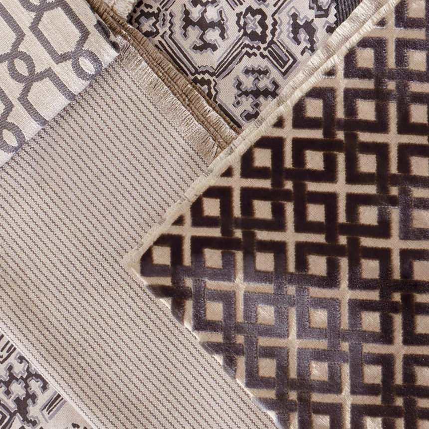
Not everyone is up for upholstering their sofa in a bold pattern, and that’s okay! Trendy textured fabrics have become a great way to add visual movement to larger furnishings; Florence calls them “plains with character.”

Tone-on-tone patterns, like herringbone, perform the function of a solid while adding dimension. “The way you can keep things interesting is by adding texture,” she says. “People are using texture on their large-scale pieces. That becomes a bit of a statement, but it’s soft, and it’s easy to live with.”

Velvets have been on trend for a while, and they’re gorgeous on large-scale pieces. (We featured our Oxford sofa in lush green velvet on the cover of our February 2018 magazine, and we even have high-performance velvets, like our Ramona Velvet in Ballet Pink.) Another on-trend textured choice for a sofa or sectional is bouclé, which Florence says can look incredibly chic when it’s paired with beautiful accent pillows and textiles.

And surprise!—tailored chenille is also in vogue, and Florence isn’t talking about your grandmother’s chenille. Today’s on-trend chenilles get their look less from pile and more from fill and warp direction.

Putting It All Together

Florence spots trends in Manhattan, where she lives, and also draws inspiration from New York’s thriving world of fashion. She talks to her huge network of suppliers to see what they’re developing, and she shows them what she’s creating to get a feel for how new designs could perform on the market.

Staying on trend is important, but what ultimately matters to Florence is quality. “I’m a value shopper. I want to make sure I’m getting the best things for my buck,” she concludes. “Since you’re paying what you’re paying for a piece of furniture, I want to make sure every fabric I put out there for anyone to live with has all the design touches that our clients deserve.”

If you enjoyed meeting Florence and getting the lowdown on fabric trends, here’s what to do next:

  • Follow Florence on Instagram @friendsoflorence, and keep an eye out for her takeover of Ethan Allen’s Instagram account on May 18.
  • Share ways you’ve personalized Ethan Allen furnishings with creative fabric choices, tagging them #EthanAllenDesign—we like to see them and share our favorites!
  • Get the latest design tips and trends by subscribing to The Art of Making Home.


HAPPY MOTHERS (OF INVENTION) DAY

They say a woman’s place is in the home, but we think it’s in the lab, too. This Mother’s Day, instead of offering up a breakfast-in-bed menu or list of last-minute gift ideas, we’re giving a shout-out to women whose inventions have made our homes safer, smarter, healthier, more comfortable—better.

These are women who saw necessity as opportunity, women who imagined things that never were and made them happen. They were teachers, engineers, factory workers, scientists, housewives. And while they were not all mothers in the literal sense, we’re honoring them anyway—they’re all mothers of invention.

DISHWASHER

Josephine Cochrane (1839–1913)

Josephine Cochrane and her dish-washing machine, c. 1886

So maybe it wasn’t altruism that inspired this invention, but we still have socialite Josephine Cochrane to thank for saving us all from dishpan hands. In the mid-1880s, the well-to-do hostess from Shelbyville, Illinois, was known for her frequent, lavish dinner parties. Needless to say, there was always a lot of cleanup to do, but Josephine didn’t give much thought to the tedious task that fell to her kitchen staff—until she discovered they were chipping her fine china.

Fed up, she took matters into her own hands and designed the first mechanical dishwashing machine that actually worked. She was awarded a patent in 1886 and founded a company (eventually known as KitchenAid) that would manufacture her machine, but it would be decades before the dishwasher became a commercially successful household appliance.

SOLAR HEATING SYSTEM
Maria Telkes (1900–1995)

Scientist Maria Telkes was known as “The Sun Queen.”

Maria Telkes got the sun in her eyes at an early age. Even in high school, the Hungary native found solar energy intriguing. At 25, after earning a Ph.D. in physical chemistry, Maria emigrated to the U.S., where she worked as a biophysicist and later as a research engineer in the field of energy conversion. In 1940, she joined the solar research team at the Massachusetts Institute of Technology, where she and architect Eleanor Raymond designed and built the Dover Sun House, the first completely solar-heated home. A prolific inventor who was awarded twenty patents over the course of her life, Maria also designed the first simple, easily operated solar oven for use in developing countries.

FOLDING CABINET BED
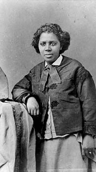
Sarah E. Goode (c. 1855–1905)

Former slave-turned-entrepreneur Sarah E. Goode.

There was no getting up on the wrong side of the bed for many who lived in the working-class neighborhoods of Chicago after the Civil War. Apartments were small and cramped, so beds were often jammed into corners, taking up the lion’s share of floor space. Sarah E. Goode would have none of it. Born into slavery around 1855, Goode and her husband Archibald, a carpenter, moved to Chicago after the war, where they opened a furniture store.

Because so many of their customers lived in tight quarters, Goode invented what she called a “folding cabinet bed,” which, when not in use, folded up and served as a rolltop desk. It inspired the later, popular Murphy bed, but Goode made history for another reason:  She was the first African-American woman to be granted a U.S. patent.

DISPOSABLE COFFEE FILTER
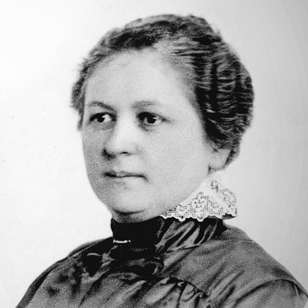
Melitta Bentz (1873–1950)

Melitta Bentz, inventor of the first paper coffee filter.

If this inventor’s name sounds familiar, it’s because the name she made for herself over a century ago is still well represented in the coffee aisle of your local supermarket. Melitta Bentz went from clever housewife to inventor, entrepreneur, and household name in 1908 when she registered a humble invention she called a “Filter Top Device Lined with Filter Paper” with the patent office in Dresden, Germany.

Melitta had grown tired of coffee that was overly bitter and full of grounds—plus she hated cleaning the sticky mess at the bottom of her pot. One day she punched holes in the bottom of the pot, and lined the inside with a sheet of blotter paper ripped from a school notebook. She filled the pot with grounds, set it over a coffee cup, poured boiling water over it—and the first disposable coffee filter was born. The Melitta company still manufactures paper filters today—along with ground coffee, single-serve coffee, coffee makers, pour-over manual coffee brewers, and accessories.

HOME SECURITY SYSTEM
Marie Van Brittan Brown (1922–1999)

Home security system inventor Marie Van Brittan Brown.

This invention’s got nothing on today’s smart houses, but hey, we all have to start somewhere. In this case, “somewhere” is Marie Van Brittan Brown’s hometown of Jamaica, Queens, where she lived with her husband, Albert Brown, an electronics technician.

A nurse who worked odd shifts, Marie often worried about her safety in their high-crime neighborhood, so she designed a security system, showing camera images of the front door, that could be operated from her bedroom. She and Albert created a prototype that worked, and were granted a patent for the invention in 1966. Home security system technology has come a long way since then, but it was Marie’s invention that inspired it.

FOOT PEDAL TRASHCAN
Lillian Gilbreth (1878–1972)


Lillian Gilbreth: She invented the kitchen triangle, too.


Lillian Gilbreth made trash disposal a lot less icky when she invented a can with a lid that opened with the touch of a foot. But that doesn’t begin to tell the story of a woman who dedicated her life to problem solving both inside (she came up with the idea of shelves inside refrigerator doors—who knew?) and outside the home. Dubbed the “mother of modern management,” the inventor of the foot pedal trashcan was an author, industrial engineer, and mother of twelve, who with her engineer husband, Frank, tested efficiency ideas in their New Jersey home. Two of their children later wrote a best seller about growing up in the Gilbreth household; Hollywood turned it into a movie: Cheaper by the Dozen (1950).

CHOCOLATE CHIP COOKIES
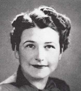
Ruth Wakefield (1903–1977)

Ruth Wakefield, the mother of the chocolate chip cookie.

One of our favorite home improvements of all time is the delicious aroma of chocolate chip cookies baking in the oven. Thank you, Ruth Wakefield!

Ruth was a dietician who, with her husband, Kenneth, ran a roadside inn in Massachusetts in the 1930s. Ruth was known for her cooking, especially her homemade desserts, so travelers looked forward to stopping at the Toll House Inn (see where we’re going with this?).

Legend has it that one day, Ruth was baking a batch of cookies when she discovered she was out of baker’s chocolate. She substituted broken pieces of Nestle’s semisweet chocolate, but they didn’t melt as expected. The result was the accidental invention of what Ruth called Toll House Crunch Cookies. They were an immediate hit, and according to most surveys taken over the years, the chocolate chip remains the most popular cookie in America.


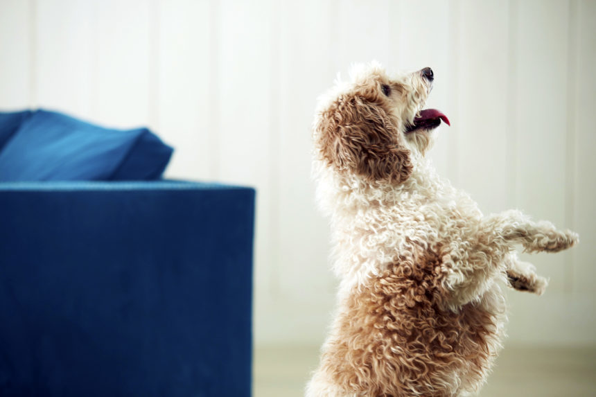
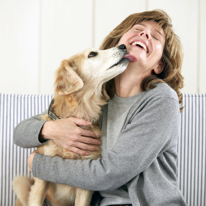
Our four-legged friends spend a lot of time on our rugs. And occasionally—for reasons pet owners are all too familiar with!— the rug gets the worse end of the deal. That’s why pet-friendly rugs are essential household items for the savvy pet owner. To be considered pet friendly, a rug has to meet three nonnegotiable criteria:

  1. Durable
  2. Stain resistant
  3. Easy to clean

We have some rug recommendations that are sure to stand up to almost anything Fido and Fluffy can throw at them, from muddy paws to sharpening claws. These are also great rugs for high-traffic areas.

Pet-Friendly Rugs for Simple, Sturdy Elegance

If your pet prefers to snooze on a colorful rug with a subtle pattern, both our Willow Grove and Splendor Lake rugs are great options.

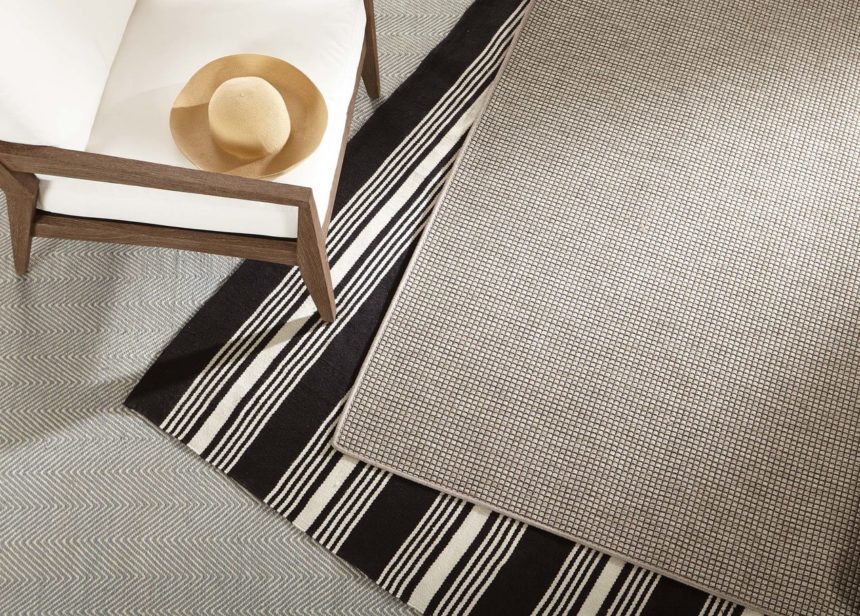
The Willow Grove rug is a handwoven rug with a herringbone pattern. It’s made from 100% UV stabilized polyethylene terephthalate—also known as PET, what a coincidence!—which is a durable polyester fiber created from recycled plastics.

Another option, made from similar materials, is our Splendor Lake rug. This one has a subtle trellis pattern, and, like Willow Grove, is woven by hand.

Both of these are indoor-outdoor rugs that are fade resistant with UV protection. PET is a quick-drying material that doesn’t absorb liquids, so it’s not prone to mold or mildew. These rugs are available in six colors and in three sizes to fit your space: 2’3″ x 3′, 5′ x 8′, and 8′ x 10′. Even better: They’re reversible for long-lasting value.

Rugs that Make a Bolder Statement

Sometimes, a space needs some bold pattern to spice it up. These striped pet-friendly rugs will wake up your space so your pet can cavort in style.

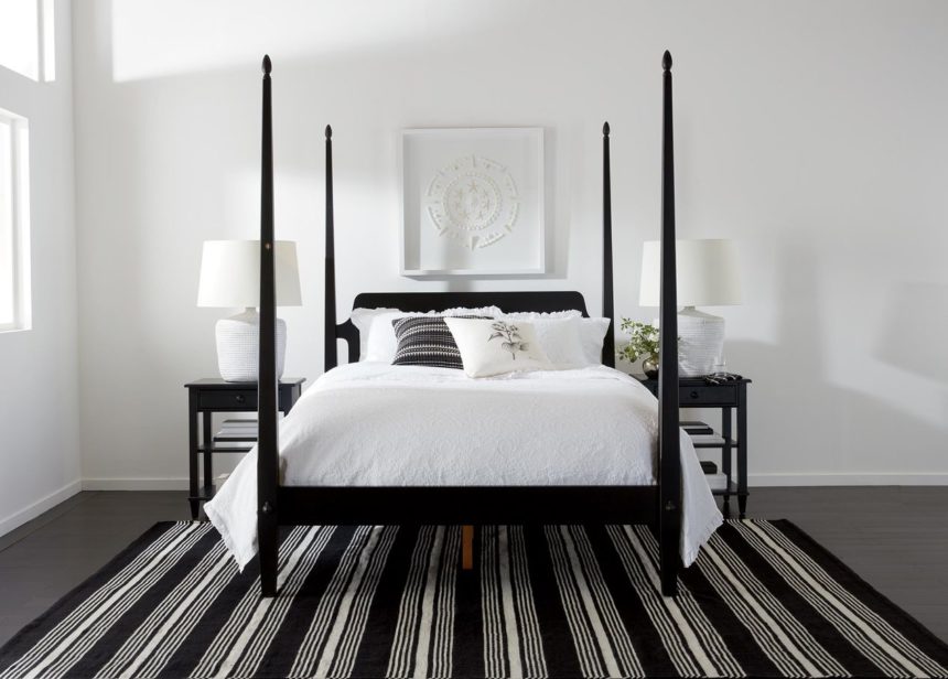
Our La Grange rug is perfect for a relaxed space and versatile; you can easily picture it in a cottage or in an urban loft. It has a flat weave that’s handwoven from the same high-performance fibers as Willow Grove and Splendor Lake. Like those two rugs, it’s also reversible, and it’s an indoor-outdoor option.

La Grange is available in black, navy, or camel with a contrasting ivory stripe. It’s also available in three sizes: 2’3″ x 3′, 5′ x 8′, and 8′ x 10′.

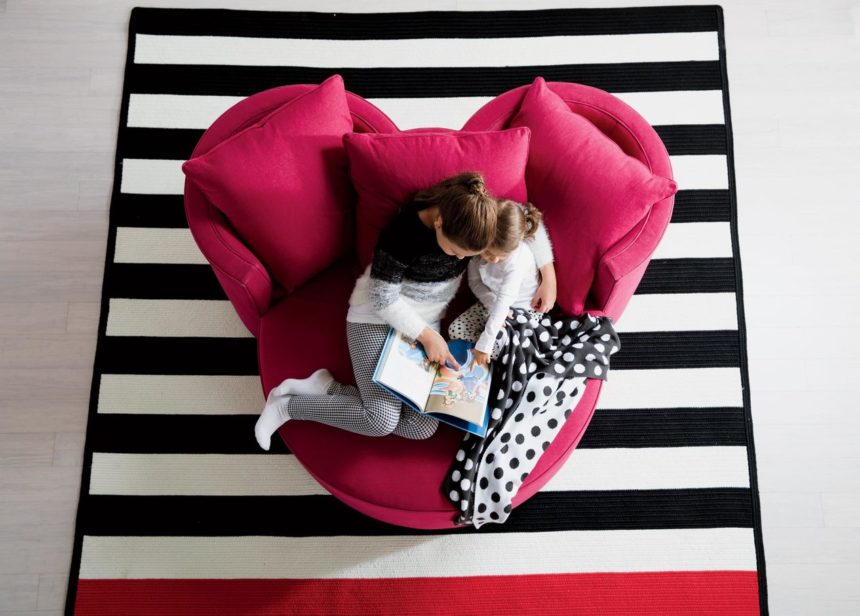
Let’s turn to a different kind of striped statement: a traditional rag rug look with a slightly whimsical pattern. This rug is crafted from 100% polypropylene in a traditional braided pattern, and it’s sewn around the sides to ensure it doesn’t unravel.

You’ll never guess where we got the idea for this pattern: Mickey Mouse. That’s right—this Mickey Mouse stripe rug is actually from our Ethan Allen | Disney collection, and it’s inspired by classic color combos from early Disney cartoons. It’s traditional with a twist, and when people ask you about it, you’ll have an interesting story to share! Like our other rugs, it meets the pet-friendly criteria and can be used indoors and out.

The reversible Mickey Mouse stripe rug is available in three color combos and in three sizes: 5′ x 7′, 6′ x 9′, and 8′ x 10′.

Rugs for Kids’ Rooms

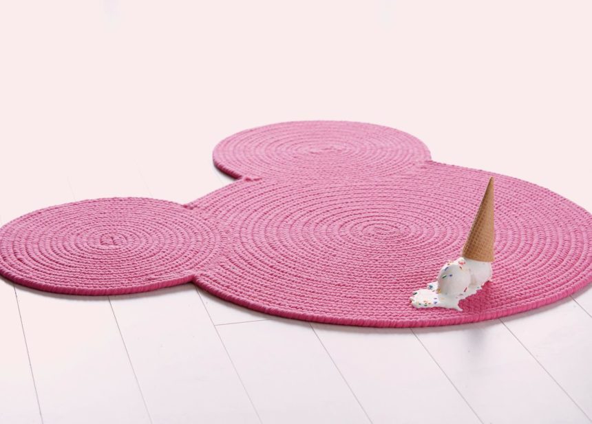
Mickey Mouse isn’t only for grown-ups. We have another Disney-inspired option for your favorite kiddo (or the kid in you): our braided Mickey Mouse rug.

Like the Mickey Mouse stripe rug we showed you earlier, this one is reversible, braided, and made from 100% polypropylene, a material that stands up to all kinds of messes, whether they’re made by little humans or furry companions.

We love the concentric braid pattern and the bold color options (there are four). We also love the idea that you can place this rug anywhere. You can stand on it in front of your baby’s crib and sing lullabies, or you can stand on it in front of your kitchen sink, doing dishes while your cat or dog watches (they want to help you, but they don’t have opposable thumbs).

One More Thing

We have a gorgeous new line of Home & Garden fabrics coming out, including indoor-outdoor rugs that meet all the pet-friendly criteria. Take a peek at them in our latest H&G lookbook if you need even more pet-friendly rugs to choose from!

Here’s to all the fun we have with our pets—and how nice it is when the cleanup is easy!


It’s Cinco de Mayo AND Kentucky Derby day? There has never been a day in the history of mankind that has demanded a party more clearly than this one. And there has never been a piece of furniture more ready for a party than our Lora bar.

Check out this video of five ways to style our Lora bar

We’ve decided to focus on the Kentucky Derby and the classic cocktail that goes with it: the mint julep. Let’s dive into this great tradition, and, as a bonus, we’ll also give you some pro tips on serving with Lora.

The Kentucky Derby

The Kentucky Derby, which debuted in 1875, takes place at Churchill Downs in Louisville. It’s preceded by a flurry of local activities, including a spectacular air show and fireworks display called Thunder over Louisville. A general admission ticket to the Derby doesn’t guarantee anyone a place to sit, and seats are premium price, so fans start flocking into the Downs early to grab space on the central lawn.

And the hats—what would the Kentucky Derby be without these iconic fashion statements?

It’s also not Derby day without a cold, refreshing mint julep in hand. With an assist from our Lora bar, this cocktail is sure to earn a Triple Crown at your Kentucky Derby party.

Mint Julep Recipe

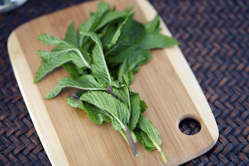
Although it precedes the Civil War, and reports differ over whether it was originally made with cognac or bourbon, the mint julep became the official drink of the Kentucky Derby in the 1930s. Over 120,000 mint juleps are served at Churchill Downs on Derby weekend, including 10,000 bottles of ready-to-serve cocktail, 60,000 pounds of crushed ice, and 4,000 sprigs of freshly harvested mint.

Mint juleps are traditionally served in silver cups (in fact, the Derby makes sterling silver cups for the big day), and the cups develop a lovely signature frost on the outside as you stir the cocktail. If you don’t have silver cups, don’t worry—we won’t tell. Just make sure to use good bourbon.

Oh, and start this the night before your party; you’ll need to make the simple syrup in advance.

Ingredients

2 cups sugar

2 cups water

Fresh mint

Crushed ice

Bourbon

Silver julep cups

  1. Prep the syrup. In a saucepan over medium heat, mix the sugar and water and bring to a boil. Heat until the sugar is completely dissolved and the liquid is simmering and clear. Cool the syrup it and place it in a covered container along with six to eight sprigs of fresh mint. Refrigerate overnight.


  1. Prep your workspace. On the day of your party, place your simple syrup in a bowl along with a tablespoon on the top shelf of your Lora bar. Arrange your bottle of bourbon, a bucket of crushed ice with a small scoop, and a plate of mint sprigs near the simple syrup bowl, leaving yourself a little room to make each cocktail. You can keep a shot glass handy to measure your bourbon; a shot glass holds one ounce of liquid. Place your silver cups on the Lora bar’s second level, along with some spare bourbon in case you run out.


  1. Make the juleps. Grab a silver cup and use the scoop to fill it with crushed ice. Add one tablespoon of simple syrup, plus two ounces of bourbon (two shots if you’re measuring with the glass). Stir the cocktail rapidly to chill the drink and frost the cup. Garnish with a sprig of mint.


HOME IS WHERE THE PET IS

Today kicks off National Pet Month and we’re excited to have a reason to share our appreciation for pets. We’re passionate about helping people create homes they love—and that means more than just sharing the latest in home design trends, like the 2018 Pantone color of the year, and real interior design projects from our own designers.

When it comes to the art of making home, pets play an important part.  They make cozy throws even cozier, have personalities as colorful as works of art,  and they bring more beauty into our lives than any piece of furniture ever could.

PET PICTURES ARE WORTH A THOUSAND WORDS

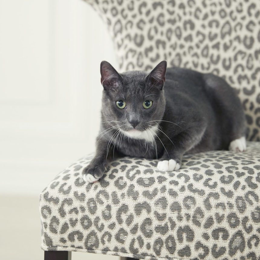
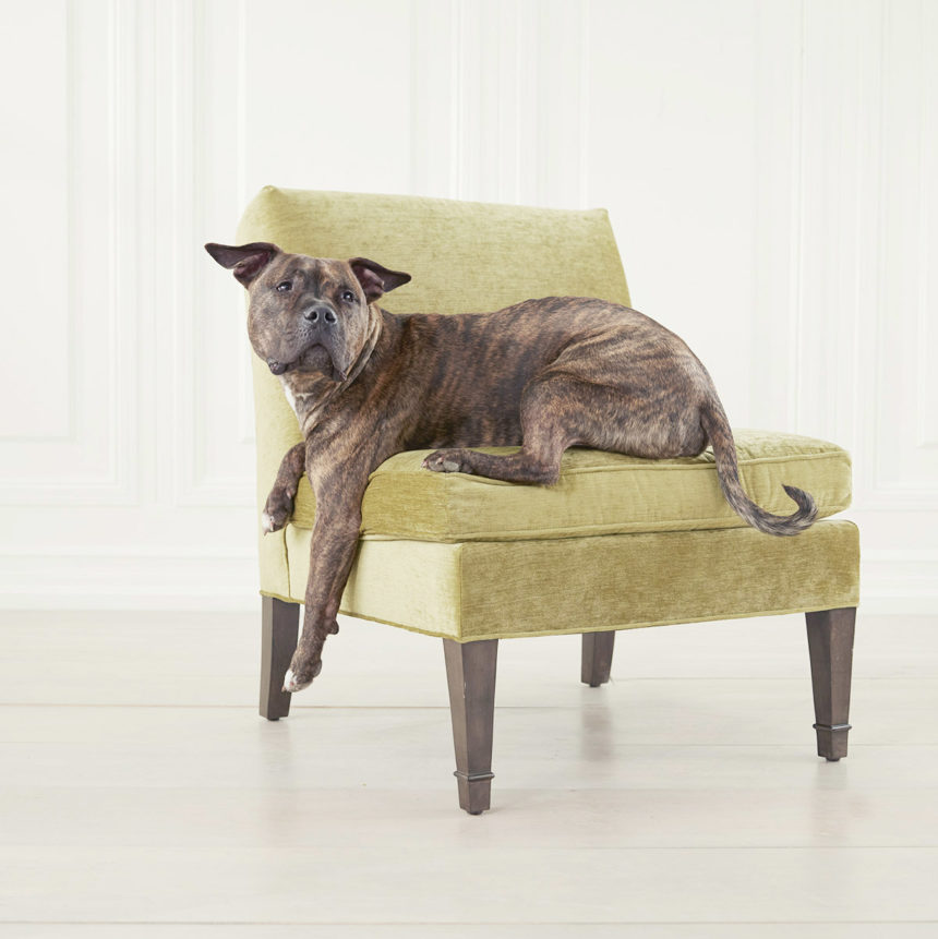
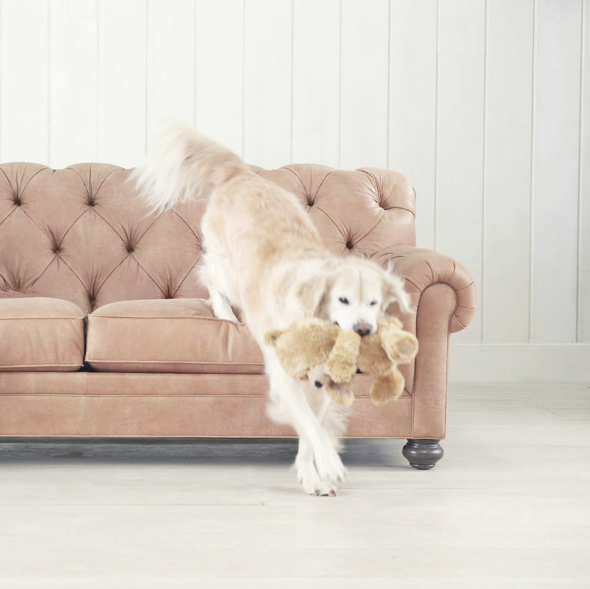
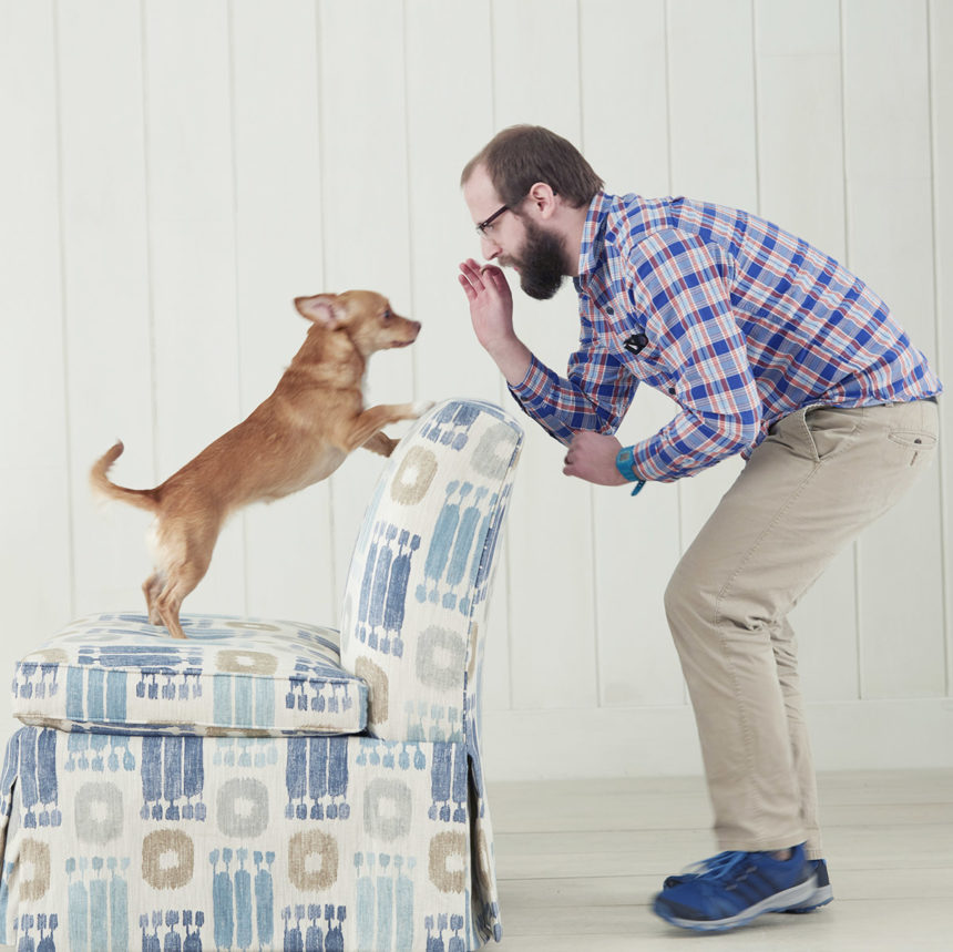
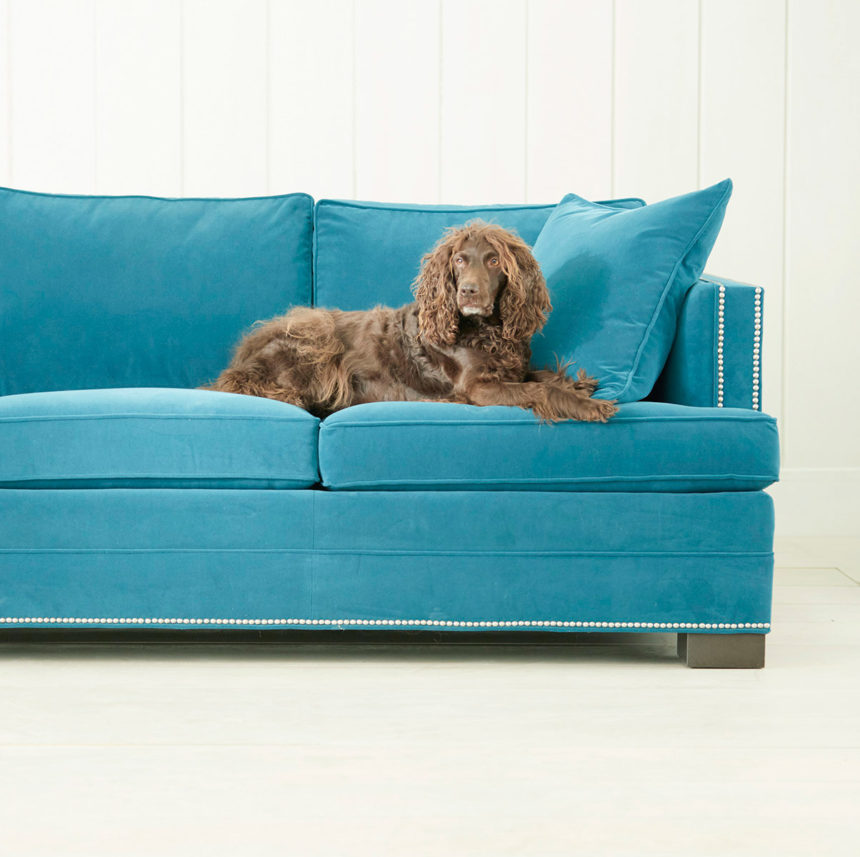
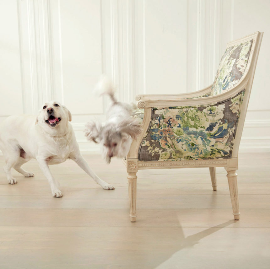
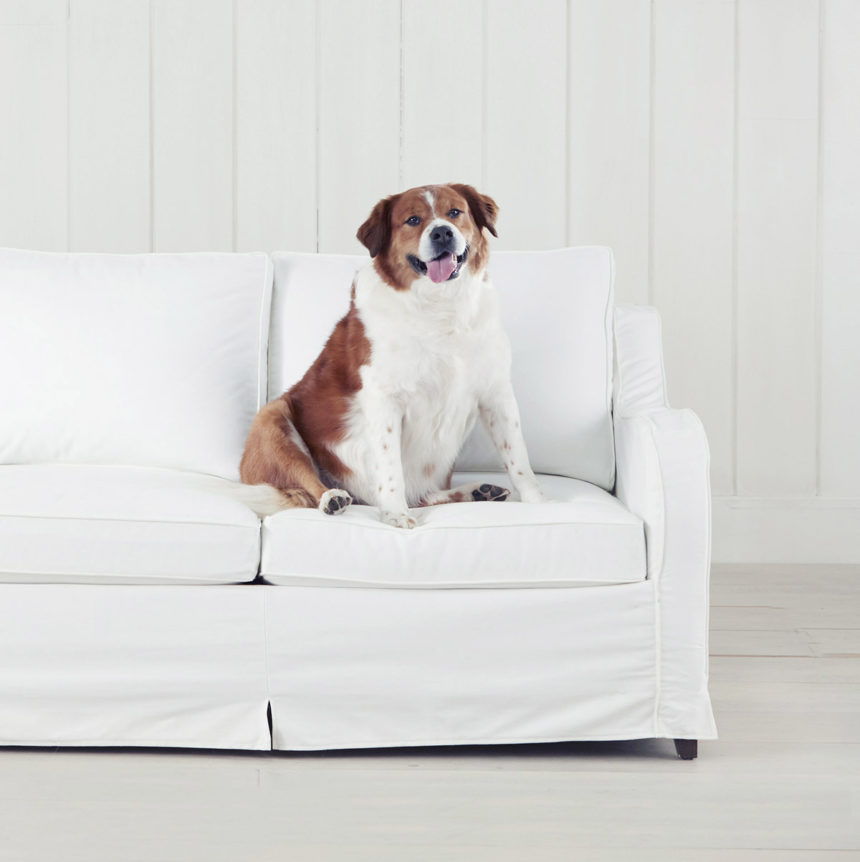
What better way to celebrate National Pet Month than with cute pet pictures! We invited some of our in-house pet owners and their beloved animal companions into the photo studio for pet portraits. We’ll be sharing them throughout the month, as well as some very special pet illustrations by Paul Shaw, manager of our Metairie, Louisiana, Design Center, whose beautiful artwork was recently featured in our State of the Art post.

And we’d like you to get in on the fun too! Tag photos of your pets with #EthanAllenPets on Instagram and tell us what you love most about your pet so we can find them and share the love!

So, let’s start celebrating with a look at a few ways pets bring joy and comfort into our homes:

They make us smile…

“The minute I come home, at least three cats come to welcome me! It always makes me smile to see their little faces!” Gwen Wilkinson, Associate Merchant and her clowder

 “When you look at her, she just casually rolls over on to her back, expecting a belly rub.” Kyle Rodgers, Video Editor and Barbara the dog

…and sing!

“Quentin and I love to sing in the morning! We make up our own lyrics, but we both squeak and howl to get us in the right mood for the day.”  Paul Shaw, Design Center Manager, Metairie, Louisiana, and Quentin the dog

They make us laugh…

“He is obsessed with his Lamb Chop (dog toy) collection. There’s a large basket of them near the front door from which he selects certain ones each day. At one point, we discovered that he had lined them up in front of the window so they could look outside.”  Greg McMahan, Senior Art Director and Clarence the dog

…and amaze us!

“Tater can hear a bag of chips a mile away. It’s become a challenge—we try to open the bag without it making a sound, but Tater comes running from the other end of the house every time. He can even hear cheese. I don’t know how he does it.” Donna Boccuzzi, Production Project Manager and her dog

They warm our hearts… 

“I love how they look up at me with such sweet eyes, even when treats are not involved.” Miller Opie, Social Media Creative Director and her dogs, Amelia and Django

 “I have special ‘Chico and me’ time after I get into my comfies in the evening. I put a pillow on the bed and he curls up on that while I curl my arms around him.” Karen Marino, Senior Art Director and Chico the cat

 …and ease our minds..

“I was given the opportunity to adopt Tucker when we both were going through a rough spot in our lives. I cannot wait to go home at the end of every day and see my buddy.  All the stress melts away when I see him and life is good.” Andrea Fenton, Product Manager and Tucker the dog

Be sure to stay tuned! We’re sniffing out a few more fun stories to share, including pet-friendly home design ideas, and a playful feature on Oliver (@oliver_in_charge), the famous Instagram pup who stole the heart of our Design Star, Nikki Brouillette.


Photographs and artwork make a home feel loved and lived in. The people in the photos or the images on the canvas are important to you. The frames reflect your style. Where you hang them says, “This matters.”

But some of us live in a different world – a world of good intentions and bare walls. “Someday,” we say. “Someday, I’ll put these up.”

And why? FOMU, friends. Fear of messing up! Well, banish those doubts. If you’re a reluctant member of the bare-wall tribe, hope is here. You can do this. No more measuring, extra holes, crooked art, or – let’s be honest – straight-up guessing where to swing the hammer.

Ethan Allen artwork is fitted with no-wire hanging hardware and comes with everything you need to hang your new masterpiece just a few easy steps – secure, level, and with no measuring required.

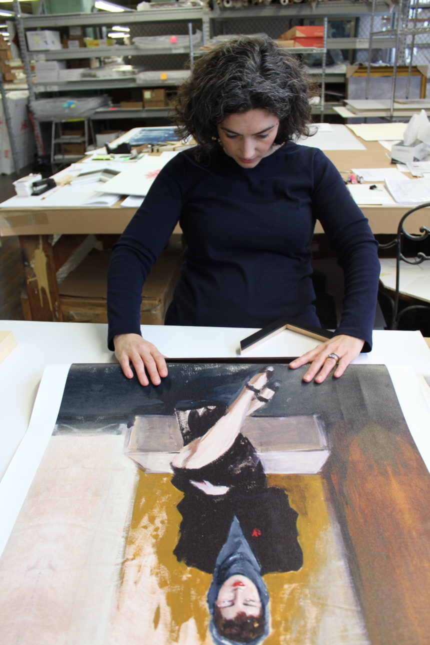
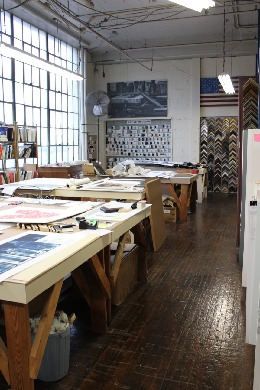
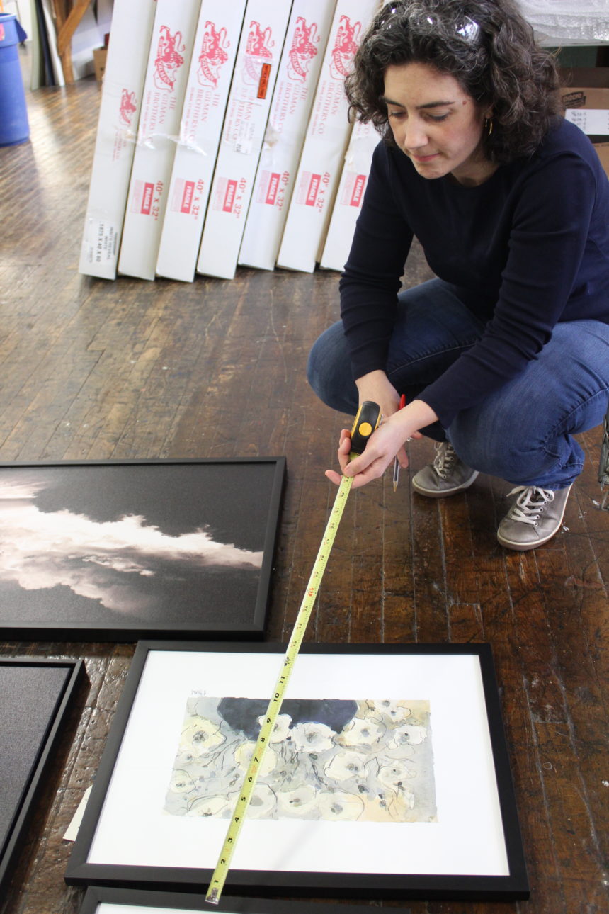
When you order artwork from Ethan Allen, the artisans in our Passaic, NJ, workshop frame it by hand and attach brackets to each frame. Your kit includes pointed plastic nubs that slip into those brackets to mark the wall exactly where you need to drill. It also contains wall anchors, wood screws, security washers, bumpers, a level and tape, and detailed instructions.

  1. To hang each piece slip a plastic nub into each bracket, then slide it to the side where the screw will be.
  2. Remove the backing from the bumpers and apply them to the frame back on the lower back corners. This will protect your wall from the frame and vice-versa.
  3. Remove the backing from one side of the tape and fix it to level included. Remove the other backing and gently secure the level to the center of the frame.
  4. Hold your artwork up to the wall where you’d like to hang it. When it’s properly positioned and level, push the frame firmly against the wall. The plastic nubs in the brackets will leave small indentations in the wall where the screws should go.
  5. Put the frame down and remove the nubs.
  6. Put a nail into the hole in the nail home in the nub. Push the nail through the nub piece and line up the tip of the nail to the indentation on the wall. Hammer the piece into place. Do the other side. Once you get the nubs in place, just slide the brackets (on the back of your artwork) over the nubs, and boom! Your artwork is locked in tight.

Now that you know how easy hanging Ethan Allen art can be, why not plot a gallery wall? Find all the pro tips and tricks you’ll need (plus a helpful video!) – and banish FOMU forever.


Meet Margaret Francis, our Director of Wall Décor and Outdoor Living.

Making art is a little bit like breathing for Margaret Francis. She’s simply got to do both.

Art has been an essential part of her life since she can remember; learning to use her mother’s vintage sewing machine at age six is one of her fondest memories. Because she’s responsible for curating Ethan Allen’s art offerings and developing our Home & Garden program, art invigorates her every day.

Margaret is coming up on her one-year anniversary at EA, having moved here last summer from Chicago with her husband, Tedd, an architect who grew up in the Midwest, and their children: Kate, 4, and James, 3. They live in a townhouse that she describes as “eclectic with midcentury notes.” It’s not far from where Margaret grew up. She’s a creative and clever maker who enjoys sewing, quilting, framing art, and felting—as busy as she is. Ask her to tell you the coolest thing she’s ever made and she’ll say it’s her two kids.

Margaret took a roundabout route from Boston University, where she earned degrees in psychology and women’s studies, to product development and merchandising, but she concedes she learned something every step of the way. (At one point she considered becoming a marine biologist but says taking chemistry was the game changer.)

After graduating, she did a little of everything—from working as a house mother for students at the St. Thomas Choir School in New York City to handling client services for a financial software company. Frustrated, she finally saw a career counselor, took a battery of tests, and was told unequivocally that she should study industrial design.

Margaret earned a master’s degree—in industrial design—from Pratt Institute three years later, and she took off on the career path that eventually led her to Ethan Allen. She worked in retail for more than ten years, where she especially enjoyed collaborating on home and garden merchandise and seasonal categories.

Because she has both a good eye and an understanding of the art marketplace, her position at EA is a perfect fit. Our art program is multifaceted—from custom framed and exclusive prints to sculptural and dimensional work—with so many opportunities for Margaret to put her stamp on it. She’s very skilled at choosing mats, frames, and details, so there’s no doubt that she’ll showcase each work in the best possible way.

And because she appreciates form and function, developing outdoor living ideas taps into her affinity for problem solving.

Keen to bring fresh ideas to the Home & Garden category, Margaret hit the ground running.  She researched the market extensively and attended trade shows, looking for ways to “move the Ethan Allen needle” toward a more transitional and modern look, without overlooking our clients with more traditional tastes.

Some of Margaret’s additions include color-coordinated fabrics from Sunbrella for long-lasting beauty; mix-and-match pillows; umbrellas in two shapes; and rugs that look and feel fab underfoot. Two new furniture groups (coming later this summer) will showcase the trend toward bridging indoor and outdoor spaces; look for weathered teak and elegant resin wicker, both with timeless indoor appeal.

Along with versatility, quality, and durability, Margaret (ever the industrial designer) was determined that our new outdoor furniture would feel as good as it looks. One of her first directives: “Make me a more comfortable cushion!”

Don’t miss Instagram takeover day with Margaret Francis on Friday April 27th. Margaret will be posting pix all day long!


Decorating with Abstract Artwork

Which of these is a painting of a train station?

The correct answer is that both are—at least, according to the artists.

Continuing our World Art Day 2018 celebration, let’s pull back the curtain on abstract art and how you can use it in your space. Whether you love it, dislike it, feel intimidated by it, or find it intriguing, abstract art provokes an emotional response.

World Art Day Theme: Abstract Art

According to Wassily Kandinsky, one of history’s first and most prominent abstract artists, abstract paintings are about using color to provoke an emotion. They have no physical subject; instead, form and hue are the focus. Instead of re-creating an object from the physical world, they bring the artist’s interior world outside.

The train station paintings illustrate Kandinsky’s point perfectly. The piece on the right, States of Mind II: the Farewells by Umberto Boccioni, is an abstract artwork painting designed to show what’s in the minds and hearts of people at a train station. Instead of showing people’s facial expressions to explain what they’re feeling, like the painting on the left does, Boccioni uses shape and color to show the feelings people experience in a train station.

For the departure of someone they don’t see often enough, sadness.

For the loss of someone who’s saying goodbye forever, grief.

For the beginning of a first journey to a new place, anticipation.

And for sending off a relative who has overstayed their welcome, relief!

Abstract painting can be gestural or figurative, geometric or fluid. What it is not is a rendition of something from the physical world. Monet’s impressionism, Dali’s surrealism, and Picasso’s cubism are predecessors of abstract, but they’re not part of the abstract movement.

Because they don’t have a clear subject, abstract paintings can be a little hard to label. They can be Jackson Pollack’s spattered action paintings or Mark Rothko’s color-field paintings. But good news: The same qualities that make abstract artwork hard to talk about also it make perfect for decorating.

Secrets from the Pros

When you purchase furniture, we recommend making a long-term investment in something that will last, with timeless fabrics and finishes that can translate in any décor. Then, you can use artwork to change the vibe of a room whenever you feel like it—no redecorating needed.

Here are some more of our favorite tips:

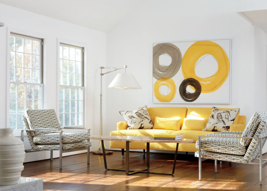
  • You might think abstract artwork in a traditional space would add unwanted energy or even chaos. We find that it actually relaxes the feel of the room by providing a colorful focal point. In a more monochromatic palette, it gives your eye somewhere to rest, so don’t be afraid to use it.
  • Don’t worry about making your artwork match your furniture. Your art choices should speak to We recommend choosing artwork that highlights the undertones in your room’s palette, but always let your heart guide you.
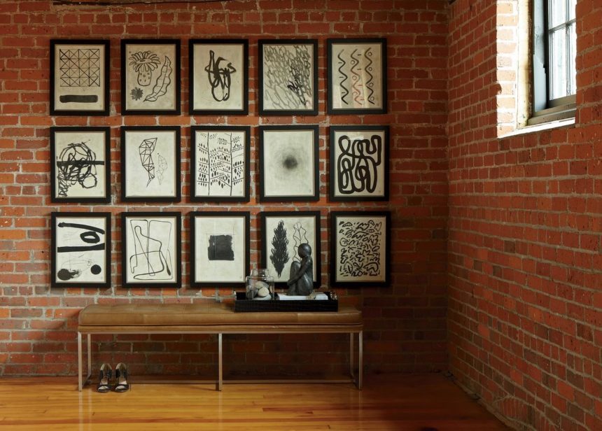
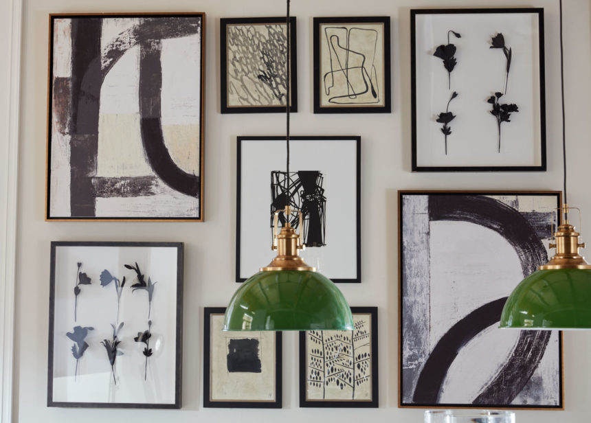
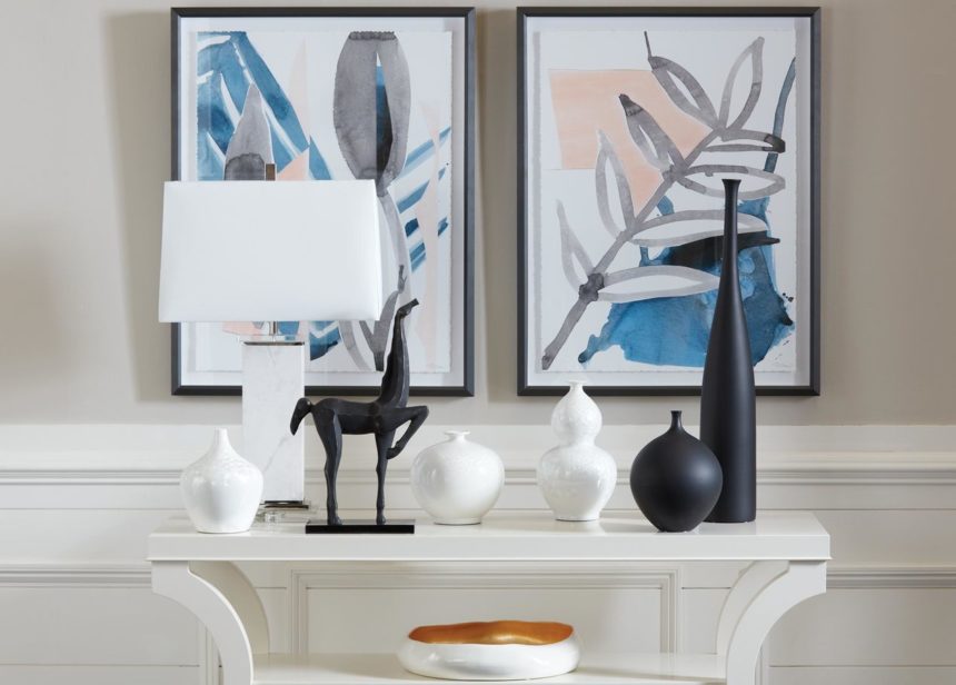
  • Instead of going with one large abstract art piece as a focal point, you can also create striking gallery walls by mixing and matching abstracts. Here are two examples that we love:

For the Transitional Space

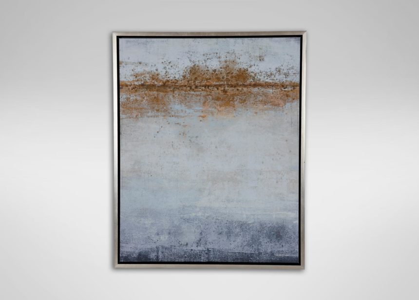
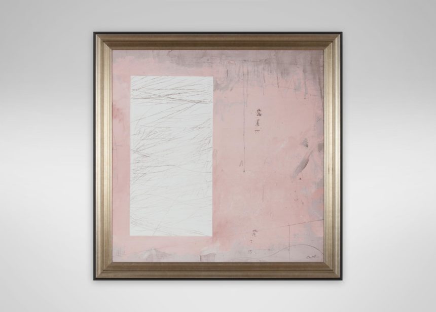
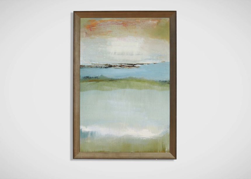
For transitional spaces, we recommend abstracts with a tonal palette. Paintings like these are comfortable in any design, and they tend to be soothing and restful to the eye.

Here are three of our favorites:

For the Modern Space

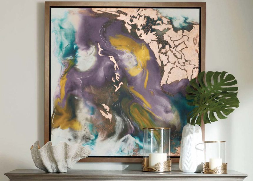
In modern spaces, we love bold, contemporary abstracts. These beauties don’t shy away from color; they’re large in scale and big on drama. Here are some examples:

For the Traditional Space

Think abstract can’t be traditional? Think again! See how we’ve showcased abstracts in these three traditional and updated classic spaces:

Learn More

  • Have you ever wondered where Ethan Allen finds the paintings we keep in our collection? Get the secrets from our first World Art Day 2018
  • You can also find out about the hands-on process of framing and presenting artwork. Go behind the scenes at our wall décor workshop in Passaic, New Jersey.
  • To get a notification whenever we publish a new post, subscribe to The Art of Making Home.
Happy World Art Day!


They’re featured in all your favorite interior design magazines and blogs (like ours!), but each one is unique. The gallery wall is a home design trend that’s here to stay—and it’s easy to see why. It adds an eye-catching element to your home, can help set the theme for a room, and is a fun way to express your personality.

If the idea of putting one together seems too daunting or complicated, or you just don’t know where to start—read on! These simple tips and tricks will help you pull off a perfect gallery wall of your own—with ease.

Choose the Wall

Gallery wall arrangements have the most impact on prominent walls painted in neutral colors. This lets the artwork really shine. Colored walls can work, too: Just be sure to create contrast with frames or white mats to prevent a bolder hue from visually swallowing up the artwork.

Think Thematically

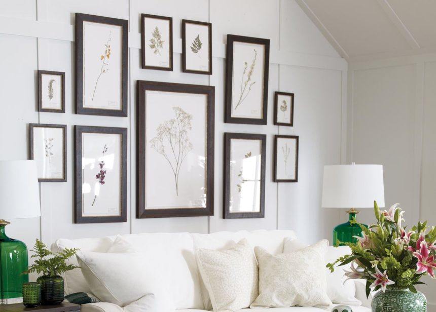
Although there are no hard and fast rules when it comes to the content, gallery walls that share a color or a theme—such as abstract or botanicals—generally look more put together. Designer tip! If all of your artwork features the same subject, use unique frames to create a more interesting gallery wall design.

Add a Surprise

Consider incorporating a mirror, chalkboard, wall clock or family photo. When selecting this element, think about the room it’s going in. A gallery with a chalkboard is right at home in an entryway or kitchen where you can keep a can’t-miss shopping or to-do list.

Decide on a Style

If you love a clean modern look, group an even number of same-sized images together to create a symmetrical gallery wall design. For an eclectic gallery wall, mix rectangle, square and even round wall décor. Groups of three, five, or nine pieces work especially well.

Now that you’ve established the overall vibe of your gallery wall, you’re ready to start installing your art – but don’t start swinging the hammer just yet. These simple steps will help you create a flawless gallery wall with a just a few supplies and some imagination.


1. Gather the following: kraft paper, pencil, scissors, tape, a hammer, nails or picture hangers and framed artwork with saw tooth hooks or a picture wire—something you won’t need to worry about if you have Ethan Allen artwork, which features a wireless hanging system.


2. Spread the kraft paper on the floor. Trace your framed pieces onto it and cut them out.


3. Arrange the cut-outs on your wall starting at eye level and tape them in place. Play with the arrangement as much as you’d like! For an avant-garde look, try an arrangement with no spacing between artwork at all.


4. On each framed piece, measure the distance between the saw tooth hook(s) or picture wire when it’s held taut and the top of the frame.
 

5. Measure the same distance from the top of the corresponding cut-out and insert a nail through the kraft paper at that point.


6. If you’re using Ethan Allen artwork, you can skip steps 4 and 5! Just place and press the art piece firmly against the corresponding cut-out to create dimple marks, then insert the provided self-hanging hardware at those points.


7. Remove the cut-outs from your wall, hang your artwork, and voila—the perfect art gallery wall!

Ready to get started? Mix art you own and love with new ones or create an entirely new look. We’ve got hundreds of pieces of framed and custom-framed artwork to choose from!


Take a (blue) note and discover ways to get a cool, coastal look—no matter where you live. Ethan Allen designer Tia Ortiz shares her secret: a beachy blue palette.
It’s a palette that gives a room movement—and repose. It’s inspired by surf, sand, and glistening blue-green fragments of sea glass that wash up to shore. We call it beachy blue.  It’s a favorite of EA designer Tia Ortiz, of our Rockville, Maryland, Design Center. “I work with a lot of clients who lean toward modern, livable spaces,” she says. “So I recommend enduring styles and a sophisticated mix of patterns. And if they like cool, versatile colors, I almost always turn to a palette of sea and sky.”

People gravitate toward beachy blue because it’s both serene and uplifting. It’s the mainstay of coastal décor, of course, along with warm white—and the go-to palette for anyone who’s ever dreamed of living at the shore. It’s very approachable, ideal for a casual presentation. “It’s a cool color combination I absolutely love,” says Tia.

BACKGROUND CHECK

Beachy blue offers an ocean of decorating possibilities; it can swell (when used as a painted background) or be still (when used sparingly).  We adore priming a canvas with it. No matter the furniture style, it creates a calming mood.

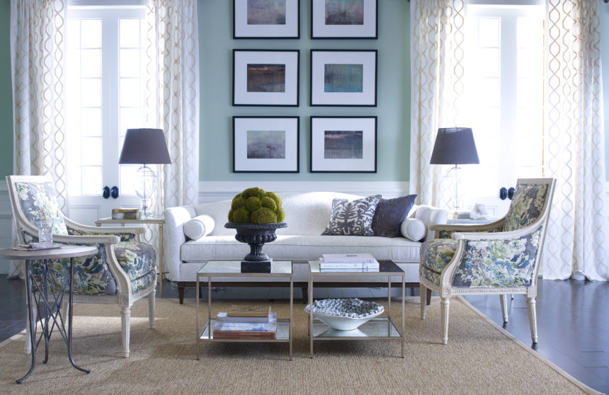
Our evocative Glacier prints stand out against a wall that leans toward green-blue.

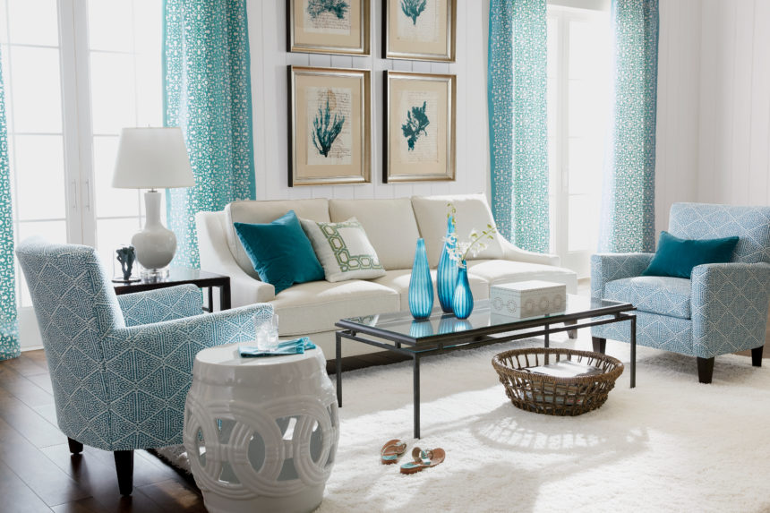
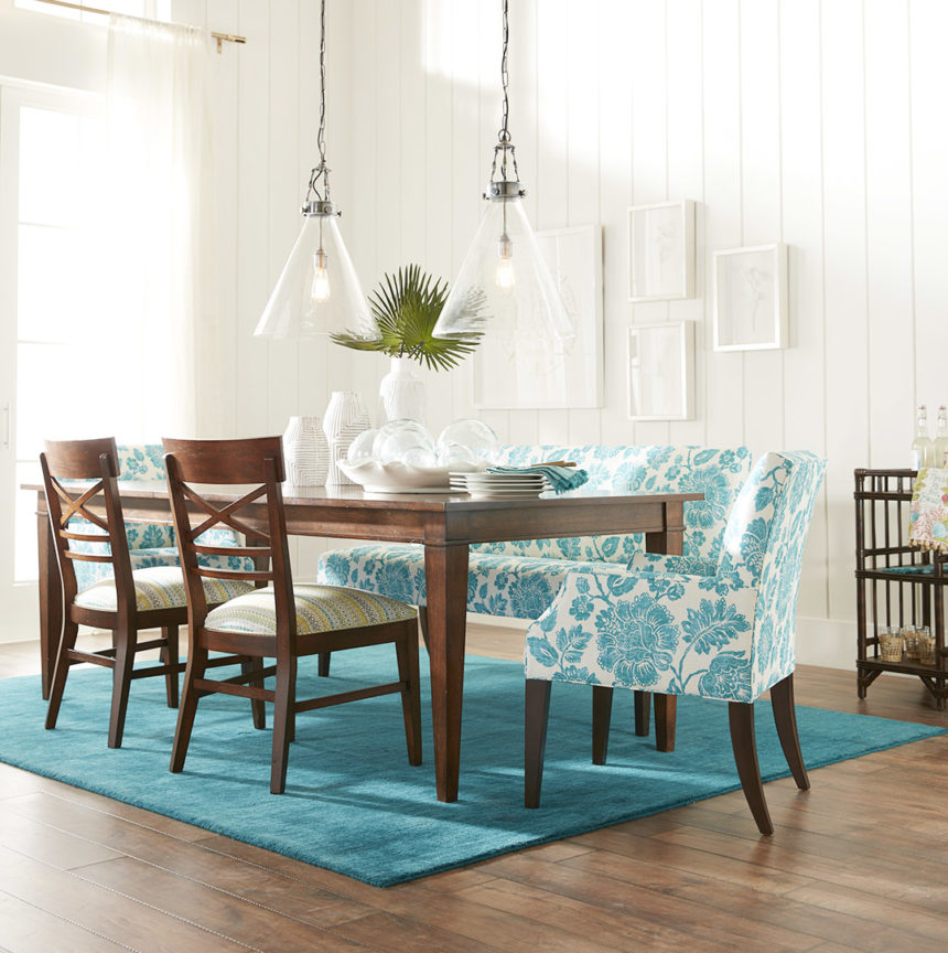
This transitional space owes its casual good looks to a cool aqua and soft white palette.

White pieces pop against subtle blues, proving negative space can have a positive impact.

FABRIC SOFTENER

Go coastal with blue hues in a sophisticated mix of patterns—whatever makes you feel most at home, advises Tia. Beachy blues can tone down bold patterns and accentuate subtle ones. They’re the common thread that makes so many fabric collections click.

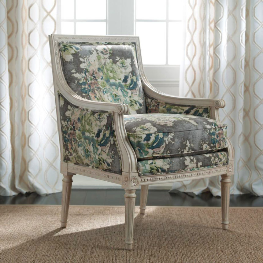
An antique white finish on a Giselle chair is the perfect foil for a watercolor-inspired floral.

Beachy blues rise to the occasion when playing with lively, large-scale patterns.

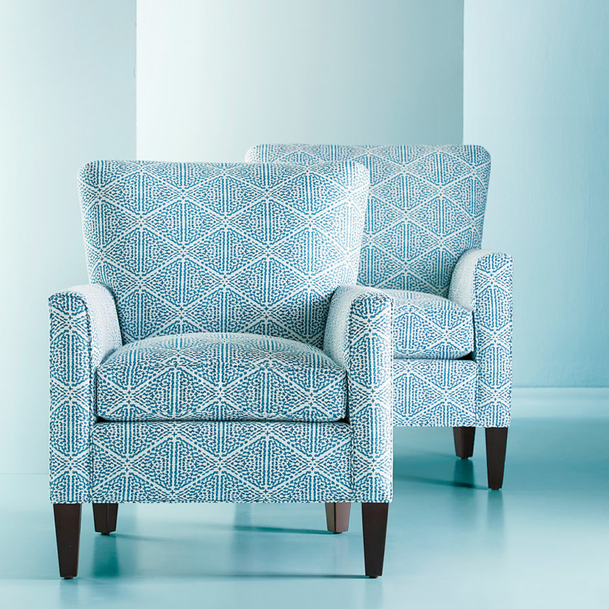
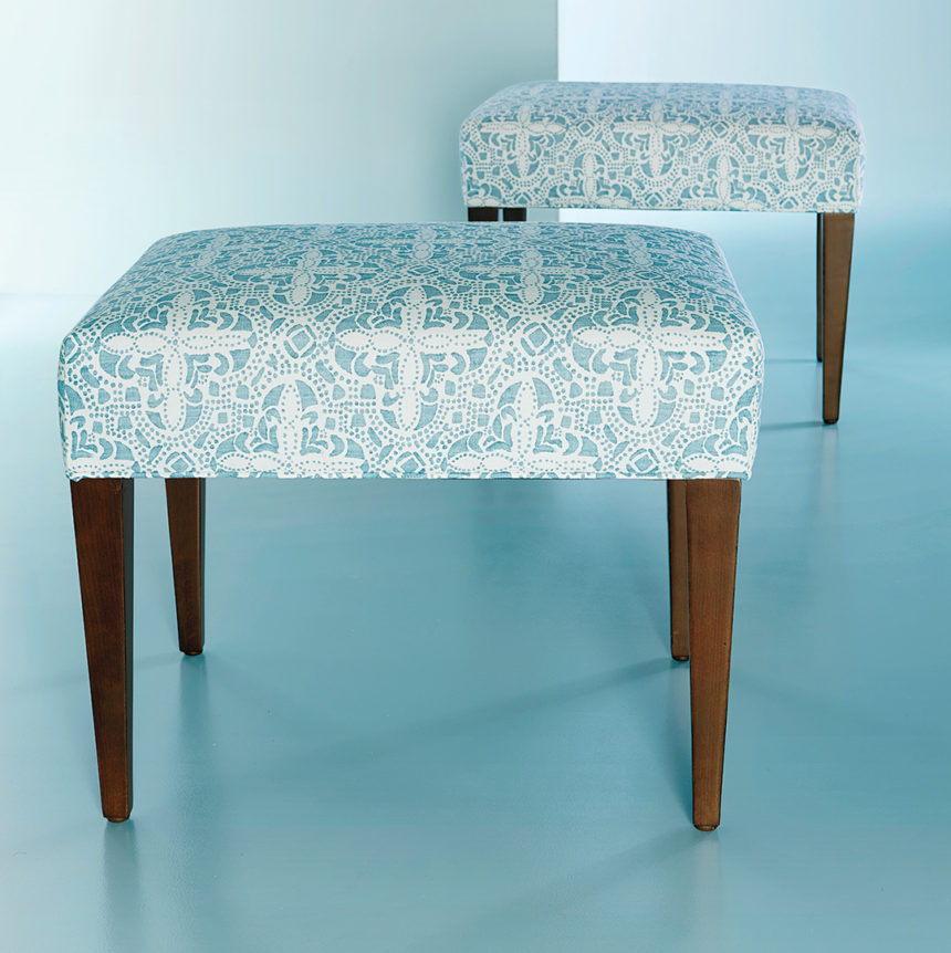
Graphic, small-scale patterns create a singular sensation—especially when you use pieces in pairs.

COMPLEMENTARY COLORS

You don’t need a serious commitment to live with beachy blue. A pop here and there is all it takes to pull together a casual space with ease. When used sparingly, it serves to complement, not consume, a space.

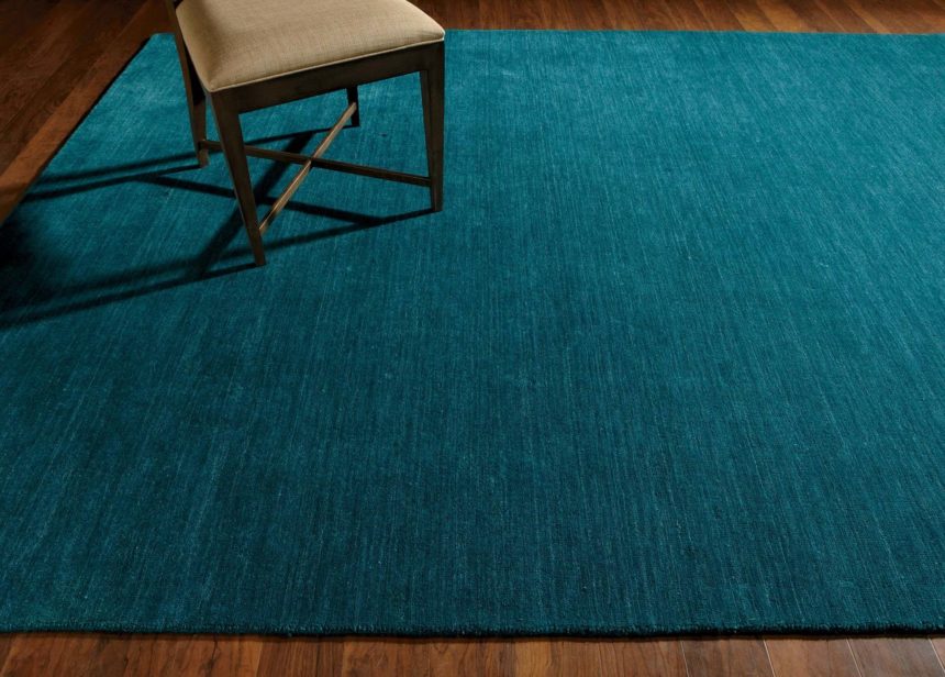
A hand-loomed rug in rich, tonal turquoise goes over to the dark side, in a good way.

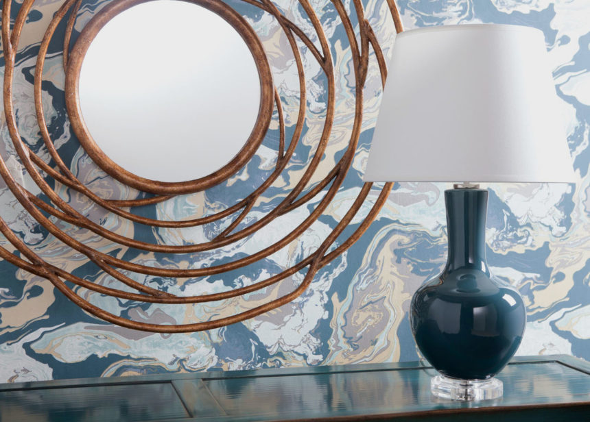
Here, there, and wherever you like, beachy blue accents make a splash.

One of the things we like best about a beachy blue palette is how ambience altering it can be—even when it’s barely there. Start with a whitewashed Quincy bed to set a romantic mood, and complete the serene scene with a hand-loomed wool rug, a bedding ensemble that stars the lovely Foulard Block Print Quilt in sea glass, and artwork that evokes a sense of the French countryside.

Like this summery palette as much as we do? Explore our inspiration rooms for even more fresh ideas at ethanallen.com. To see more beautiful rooms in every palette under the sun, subscribe to The Art of Making Home.