Tips for a Stress Free Holiday

This Thanksgiving, say goodbye to entertaining stress! These simple Thanksgiving tips can help you plan a day that everyone can love.

Make a Plan

Nothing is impossible once you break it down into simple steps! So: Get your menu set and your shopping done a few days before; jot down a schedule (e.g., what’s being cooked in what order, who’s arriving when, how you’ll pace the hors d’oeuvres, dinner, and dessert) and build in some socializing time for yourself; and make sure there’s enough seating for all your guests.


Back to the Future

Nothing beats a recipe that’s been passed down for generations. Send happy Thanksgiving memories into the future by preparing a family favorite or two – you could even have copies of the recipes for guests to take home.


Get an Early Start

Check those recipes to see what you can make in advance. Stocks for gravy, sides, and dough are all good candidates for pre-prep.


Ready…Set…Set the Table!

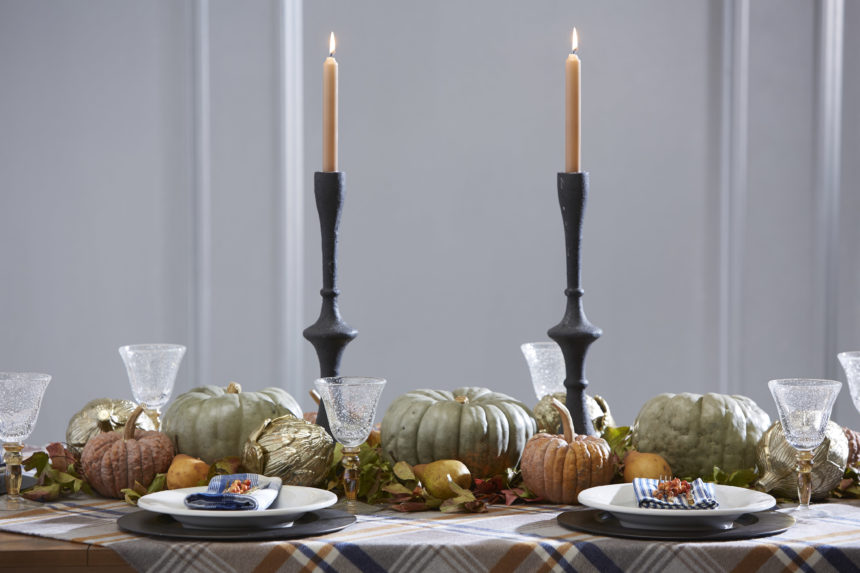
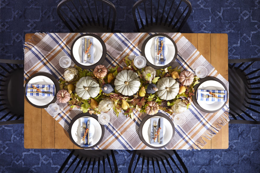
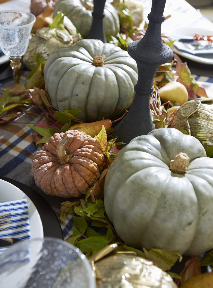
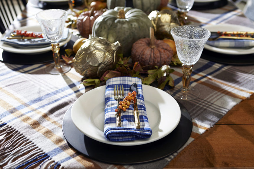
Tablescaping game on. Check out our Harvest tabletop here.


Card Your Guests

Hosting a crowd? Assign seats with place cards, mixing friends and family to create a more social experience.


The Warmest Welcome

Greet your guests with a signature cocktail or a steamy mug of hot mulled cider (with or without the rum!).


Open with a Wow

Feel like stretching those creative culinary muscles? Start with one over-the-top appetizer to get your party started.


Child’s Play

Set up games, an easy craft, or a space where the little ones can put together a simple yummy dessert, and they won’t have time to ask, “Is it ready yet?”


Pass the Sanity, Please

If there are lots of people or lots of dishes, simplify your hosting duties: Set up a buffet near the table and let guests serve themselves.

How to Set a Thanksgiving Tablescape

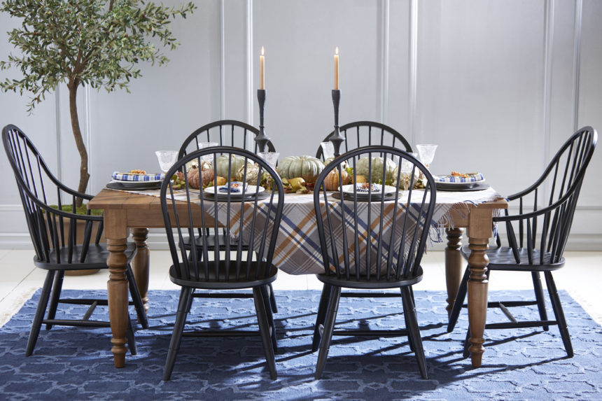
Setting a deliciously chic table for Thanksgiving is surprisingly easy—if you have a plan. We think the holiday lends itself to a harvest-inspired, rustic farmhouse look, so we chose a subtle seasonal palette: Think fall leaves (taupe, gold, burnt orange) and blue sky. We used natural materials as well as Ethan Allen decorative accents, to complete our tablescape.

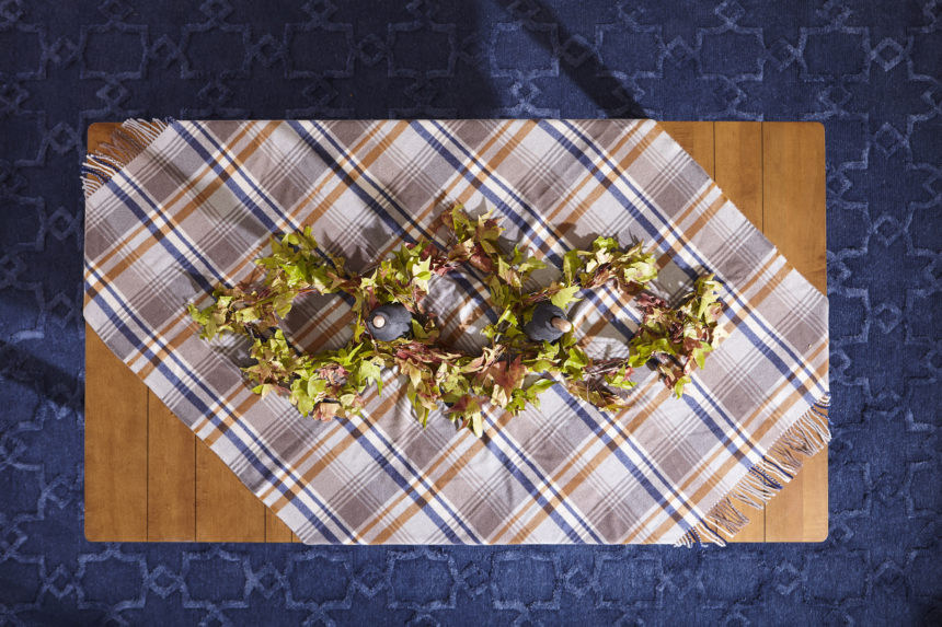
Step 1: Start with any table that will comfortably seat your guests—we used our classic, plank-top Miller table to set a “country” tone.

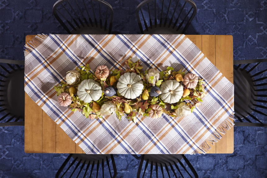
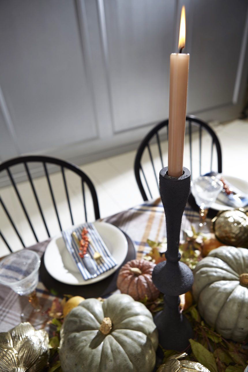
Step 2: Lay a foundation with a few basics—be creative! Instead of using a traditional tablecloth, we draped a plaid throw (a good friend routinely uses her favorite Tartan wool blanket) diagonally across the table to show off the beautiful wood. Brilliant idea, right? One caveat: be sure you don’t mind if your tablecloth stand-in gets a little messy. Next, create a “frame” for your centerpiece using natural fall foliage from your yard and add candlesticks for height (and later, ambience).

Step 3: Can you set a fall table without pumpkins and gourds? We think not! We placed them in and around our leafy branches, mixing colors, shapes, and sizes.

Step 4: Add volume and a little bling; a few of our faux Gold Artichokes did the trick.

Step 5: Fill in the “blanks” with some seasonal fruit; we scattered a few gorgeous pears. And remember: The more imperfect it looks, the better!

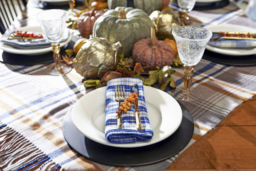
Step 6: Set the table with neutral white plates or use a combo of your favorite flea market finds. We added pops of color with a mix of cloth napkins, and gave each plate a final flourish with a sprig of bittersweet berries.

P.S. After the holiday, use your greenery to make small wreaths to hang around the house—because everyone knows that leftovers are the best part of Thanksgiving!


Dealing With Client Anxiety and Second Guessing? You’re Not Alone

When it comes to decorating, we sometimes second-guess ourselves to the point of never, ever making a change. From something as simple as introducing a color to something as complicated as replacing a family heirloom, our fears often keep us from taking action:

  • “What if I decide I don’t like it?”
  • “What if other people don’t like it?”
  • “What if I offend Aunt Jane?”
  • “What if it goes out of style?”
  • “What if it doesn’t work and I end up spending more money to make it right?”

We think it’s time to say “boo!” to your decorating fears and chase them away—once and for all.

You’re Not Alone

If you think you’re the only person spooked by decorating choices, we have good news: you’re not. “I had a client who had a real tough time parting with things,” recalls Joseph Panzer, a design consultant in our Chadds Ford, Pennsylvania, Design Center. “I understand; you get attached.”

Joseph urged his to repurpose some pieces; they explored ways to mix them in with new Ethan Allen furniture. “Sometimes, just reupholstering a piece can make a client see it a new light and add a nice uniqueness to a space.”

Julie Goss, a design consultant in our Vienna, Virginia, Design Center, had a client who needed a pair of chairs for her living room and a few things for her family room. They looked at many fabric samples together, but her client grew so anxious that became flushed, agitated, and broke out into a sweat.

If you’re feeling anxious about making decorating changes, we have some tips that can make it easier to take baby steps—beautiful baby steps—toward the project of your dreams:

  • Do your homework. Gather inspiration by clipping photos from magazines and tagging websites you like. If you see something that works over and over again, you’ll be more inclined to give it a try.
  • Start small. A whole house redo can be terrifying even if you have all the confidence in the world. Select one room, and then make it over, one component at a time.
  • Remember less is more. Keep things simple; choose a single piece that you love and build a design around it.
  • Lead with functionality. Start with something practical, like switching out a loveseat for a sectional now that their kids are older. If it’s a change you need to make (rather than just one you want to make), you’re more likely to take the plunge.
  • Resist the urge to follow trends. Just because everyone is doing something is usually reason enough not to. Choose looks that will never go out of style—you won’t regret it.

Eventually, Julie persuaded her client to place an order, but even when the furniture came in, it stayed in the service center for months. But when the client took a deep breath and finally accepted delivery, and the pieces were in place, she was delighted. Decorating fears are a lot like ghosts; when you turn around to face them, you see they’re not real.

Decorating doesn’t have to be frightful with the help of an Ethan Allen designer. Treat yourself to our complimentary design service, and we’ll show you our tricks for taking the fear out of decorating.

HAPPY HALLOWEEN FROM ETHAN ALLEN!


The Power of Home Fragrance

It’s one of the first things you notice when you enter a room. It evokes memories: a grandmother’s cooking, a mother’s embrace, a day at the beach. It’s powerful enough to stir emotions and yet often overlooked when designing a room.

Fragrance.

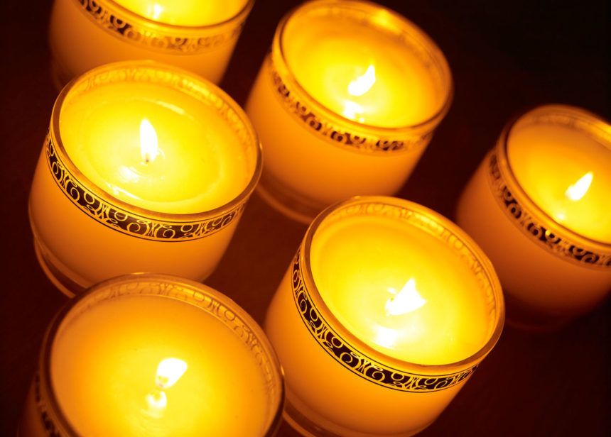
A pleasing fragrance can soothe or energize; it can even suggest a completely different atmosphere (e.g., a candle with the fragrance of a mountain forest burning on a kitchen table in Manhattan). Because everyone experiences scent differently, it’s a good idea to choose more complex scents so each person can detect their favorite note. The best fragrances achieve a perfect balance of top, middle, and bottom notes.

  • The top note is the first thing you detect when taking the lid off a candle or opening a jar of essential oils. Good top notes suggest freshness: citrus, herbs, a touch of ginger.
  • The middle note usually emerges about fifteen minutes after a candle is lit. The middle notes give a fragrance its personality, whether it’s a fruity, floral, or spicy note.
  • The base note is the scent remaining in the room long after the candle has been extinguished. Woodsy, musky aromas add elegance and depth and often work well in this layer.

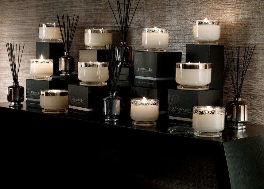
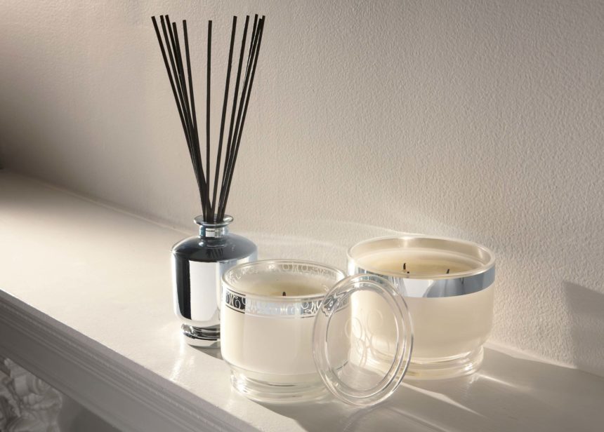
When we design fragrances at Ethan Allen, we draw from five categories of scents and present them in varying sizes of candles, each with a minimum burn time of 40 hours. We also create diffusers, in which reeds are immersed in scented oil to soak up fragrance and disperse it throughout the room. Diffusers last until all the oil has evaporated and are easily refreshed by adding more oil.

  • Floral. Morning Blossom blends an initial top note of citrus with a heart of jasmine and violet over base notes of patchouli and vanilla.
  • Ozonic or spa. The freshness of coconut, the sweetness of honey, jasmine, and vanilla, and a hint of sandalwood make our Cashmere Petals fragrance unforgettable.
  • Citrus. With Sparkling Citrus, we blend strong top notes of tangerine and citrus zest with jasmine middle tones and a base of white woods.
  • Woodsy or smoky. In Hearthwood, a top note of orange blends with a heart of clove and heliotrope; the base note of warm spice lingers long after the candle has been blown out.
  • Fruit. To keep a fragrance like Enchanted Apple from being too overpowering, we add notes of lilac, peach nectar, tonka bean, and oak moss.

Whatever your reason for selecting a home fragrance—setting a mood, creating an atmosphere—don’t forget to include your favorite fragrance in your final room design. It’s an invisible touch that makes all the difference.


Blue Home Décor: Our Favorite Looks

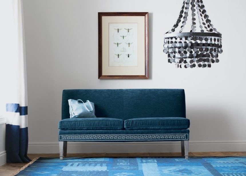
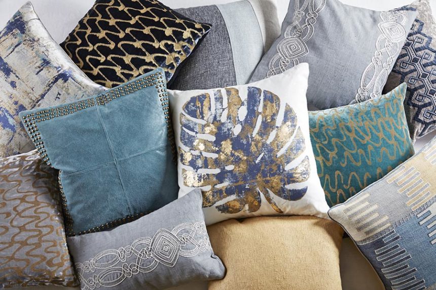
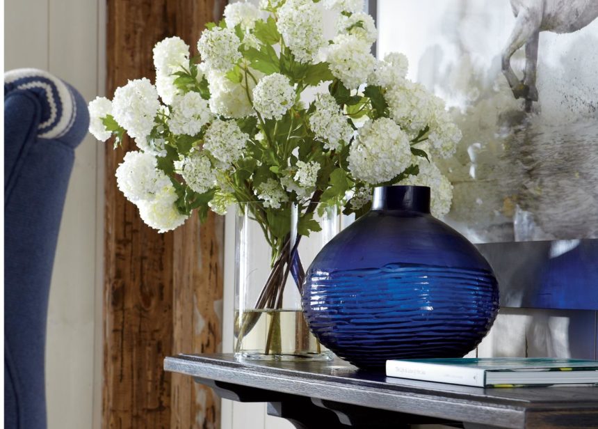
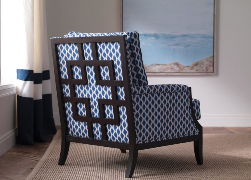
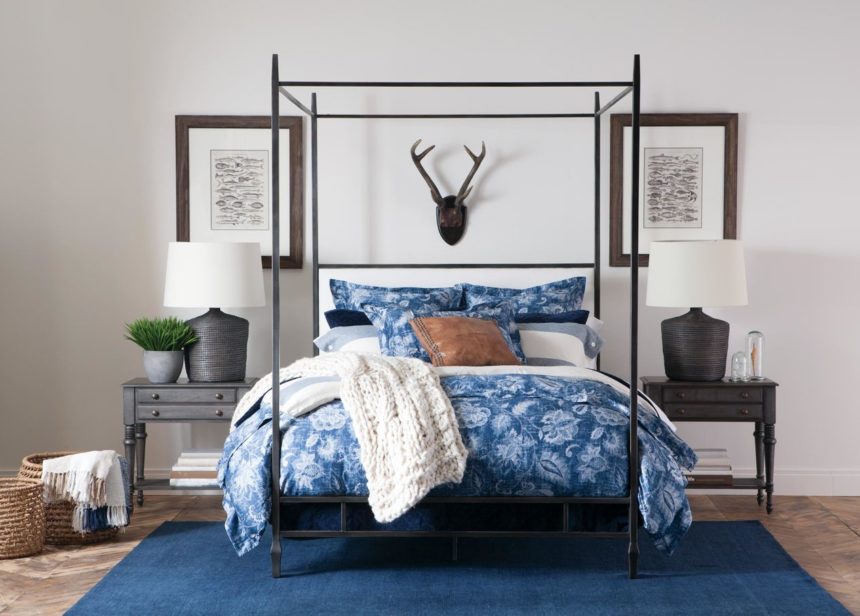
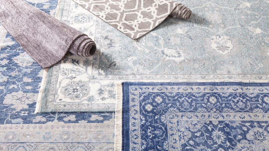
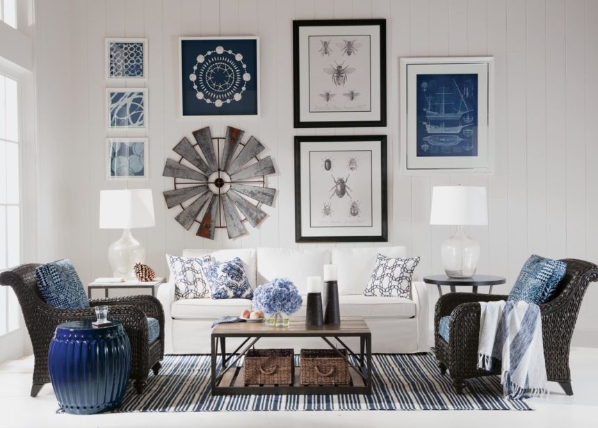
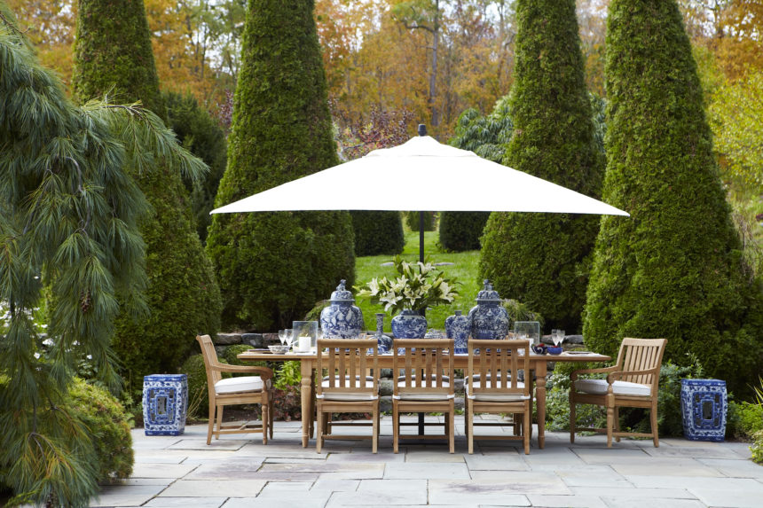
Take a peek at True Blue, our October magazine (download it here), and we promise you won’t feel blue in the least. Our designers captured some pretty cool blue moments—from the Baldwin settee on the cover (love the Greek key nailhead trim) to our sumptuous Monikka bedding (p. 22—be still our hearts!). Blue is widely considered the world’s favorite color (go on, Google it), and we know that in home décor, blues of every stripe just never seem to go out of style. Join the navy? We’re in. Reach for the sky? We’re up for it. Take a powder? We love all the baby blues. In fairness to fall, we can appreciate its fiery reds and glorious golds, but give us any hue of blue—in any season—and we’re down.

Here are some of our favorite looks!


Summer is officially over.  It’s time to close the pool, rake the leaves, plant the bulbs … but whatever you do, don’t call off the outdoor entertaining—not yet.

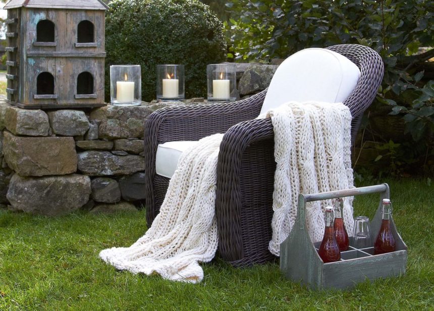
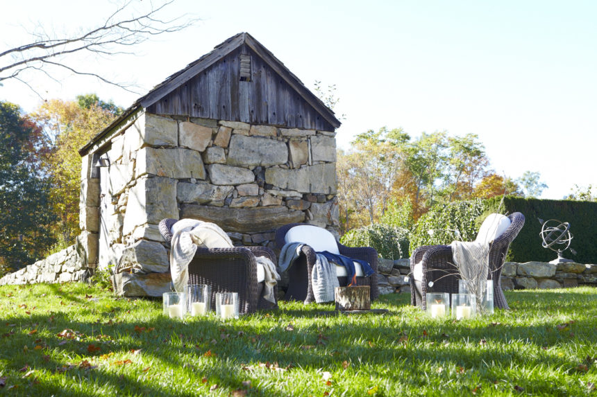
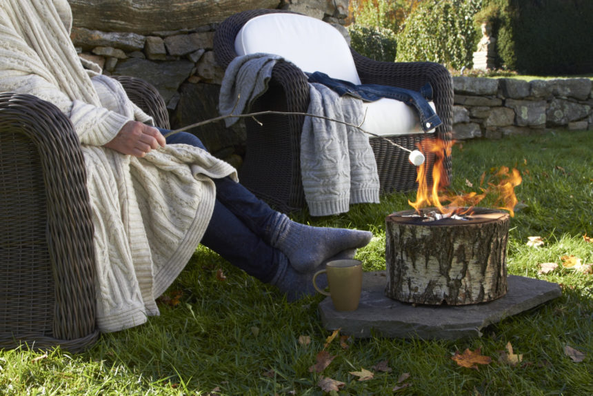
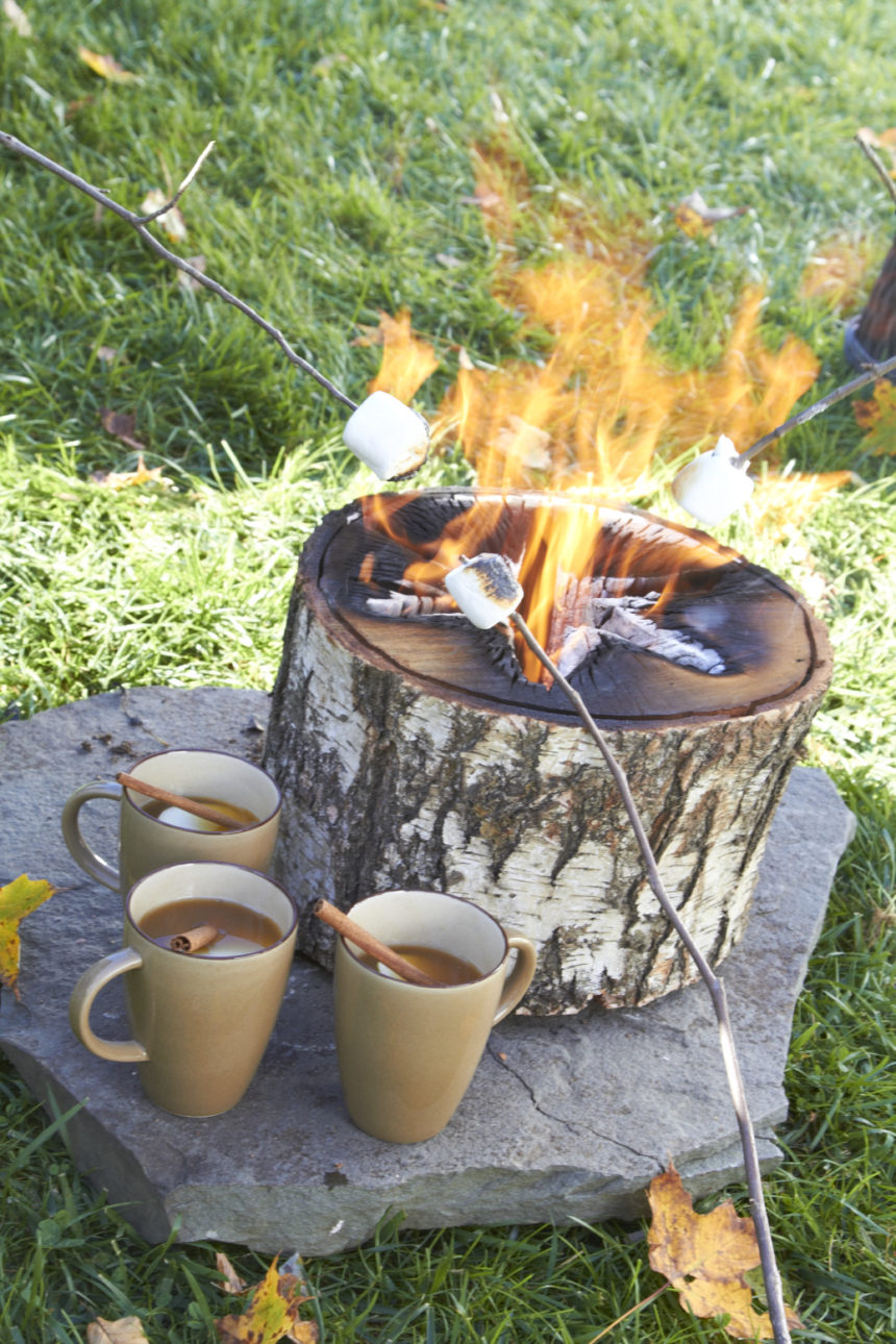
Even if you live in a region with four distinct seasons, there’s still time to get out and grill, chill, sip, and nosh, while hosting friends and family in style. Fall entertaining is all about creating a cozy vibe. Bring on the harvest hues and amp up the creature comforts. Swap the beach towels for toasty blankets and throws. Let there be light: Bring out the candles and lanterns, and build a fire. Think hot cocoa instead of cold brews.

And because you never know when a chill will chase the party indoors, remember to eat dessert first—especially s’mores, everyone’s fireside favorite. Our colleague Marta Eriquez was kind enough to share her recipe for indoor s’mores with a deliciously gooey twist. The best part: You can make them all year long (no fire or charred marshmallows required).

MARTA’S S’MORES BARK
Ingredients

  • 24 oz. dark chocolate, melted
  • 1 cup marshmallow fluff
  • 3 full sheets of graham crackers, crumbled

Instructions

  1. Line a 9″ x 12″ rimmed baking sheet with parchment paper or a silicone baking mat.
  2. Melt half the chocolate in the microwave and use a silicone spatula or the back of a wooden spoon to spread it on the baking sheet. Refrigerate for 20 minutes.
  3. Crumble the graham crackers and set aside.
  4. Heat the marshmallow fluff in the microwave. Quickly spread a marshmallow layer over the hardened chocolate.
  5. Press graham cracker crumbs into the marshmallow layer. Refrigerate for 20 minutes.
  6. Melt the rest of the chocolate and very gently spread it over the graham cracker layer. Refrigerate for an hour.
  7. Break into pieces and serve.

Bark can be stored in an airtight container in the refrigerator—if you have any left over!


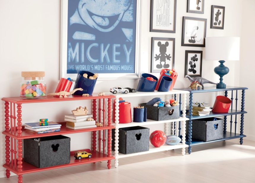
As carefree summer gives way to fall, the kids transition from all-day play to schoolwork squared. Suddenly you’re knee-deep in books, binders, backpacks, lunchboxes, pencils, and permission slips. One thing is sure: The house needs organizing (and quick). Looks like clearing clutter is your first assignment of the new school year. Luckily, our Ethan Allen | Disney collection has you covered! From cubbies and craft tables to desktop caddies, we offer dozens of ways to restore order to places where kids’ stuff tends to multiply—mudrooms and playrooms included.

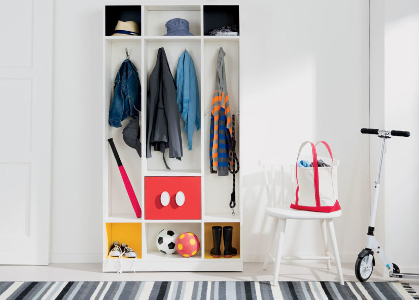
A NO-MESS MUDROOM. We call it a fun and functional storage solution of epic proportions—and we designed it just for you. In black and white with accents of bold yellow and bright red, our Mickey Mouse Colorblocked Cubbies do more than hold jackets, hats, backpacks, gym bags, and boots. This piece cheers up an entryway in a flash.

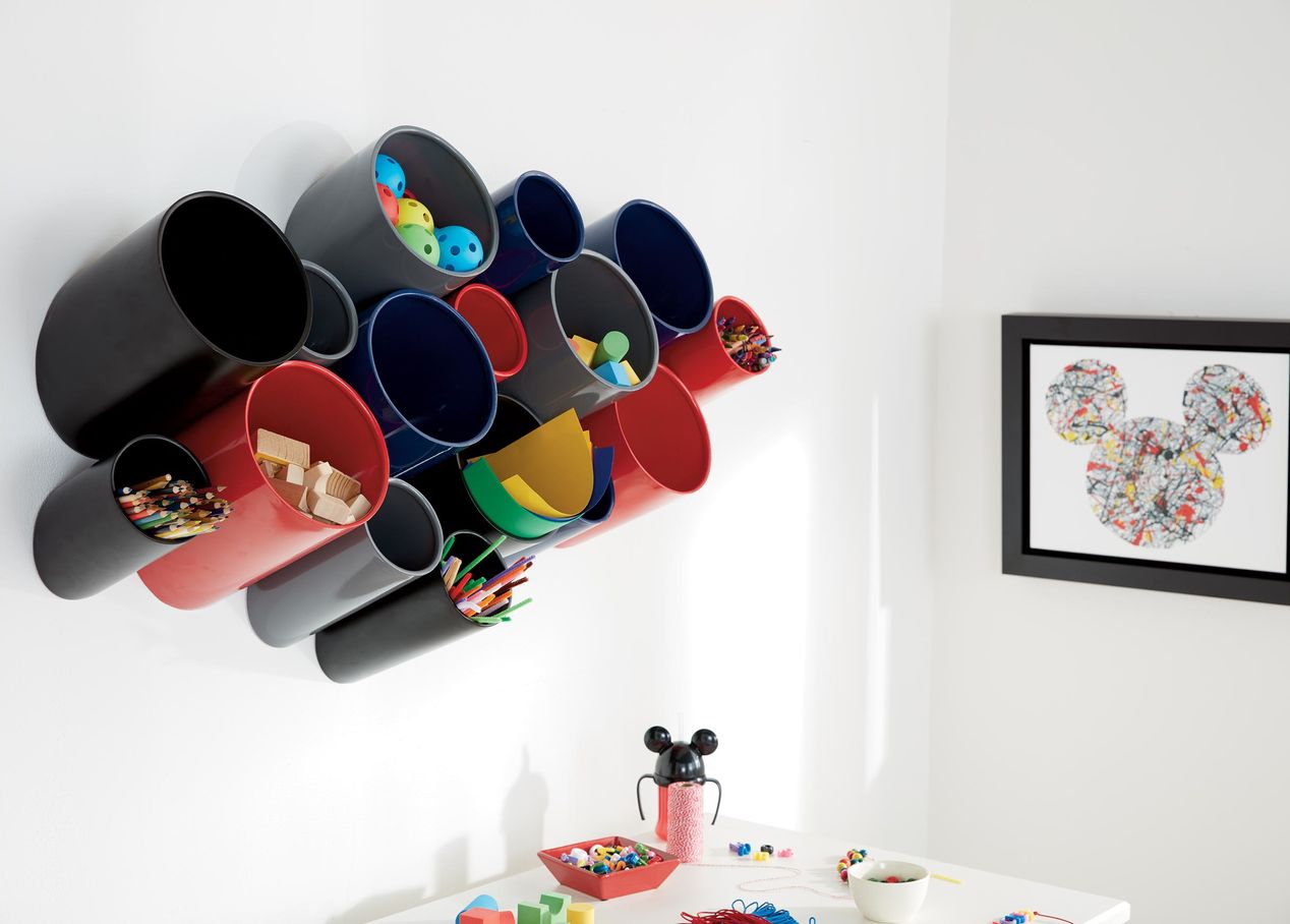
ON THE WALL. It’s bright, fun, modular storage for the kids’ room, playroom, kitchen, hub, hall, or anywhere you need it. Our WOW organizers can be mounted directly to the wall with ease—or group a few together and stand them on a counter, desk, or table.

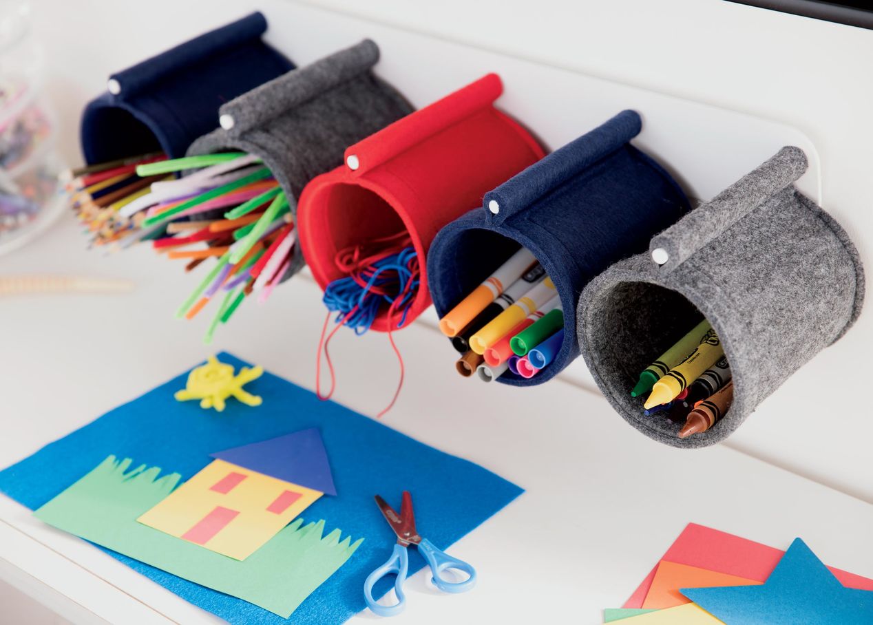
NEVER FELT SO GOOD. Our Fantastic Felt baskets provide the perfect storage space for pillows, blankets, toys of all sizes, clothes, books, and so much more. Clever zippered corners let these baskets fold flat for easy storage when they’re not in use; available in small, medium, or large. Add a Felt Desk Caddy (with sturdy spinning base and four spindle rods), which is designed to hold small Fantastic Felt holders.

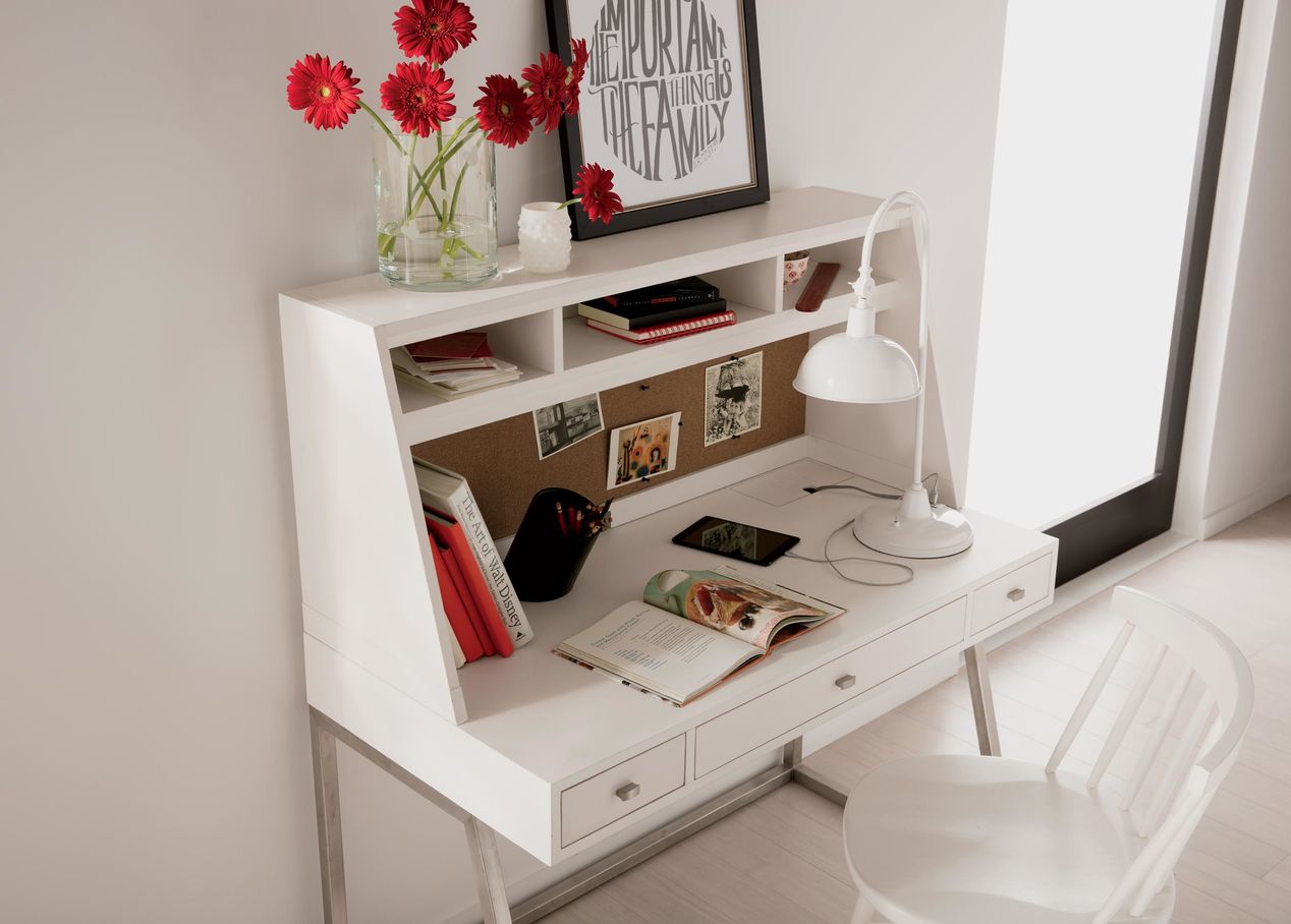
ONE SMART DESK. There’s no getting around homework, so why not do it in style? The Animator’s Desk features three drawers and three cubbies for filing stuff, a corkboard back for pinning stuff, and a roomy hutch with a charging station. Available in Snow and Mouse Grey, we give it an A+ in both functionality and stylish good looks.


This spring, designers Kate Marchesini and Andrea Pinto from our Somerville, New Jersey, Design Center participated in the area’s prestigious Mansions in May Showhouse and Gardens to benefit the Women’s Association for Morristown Medical Center.

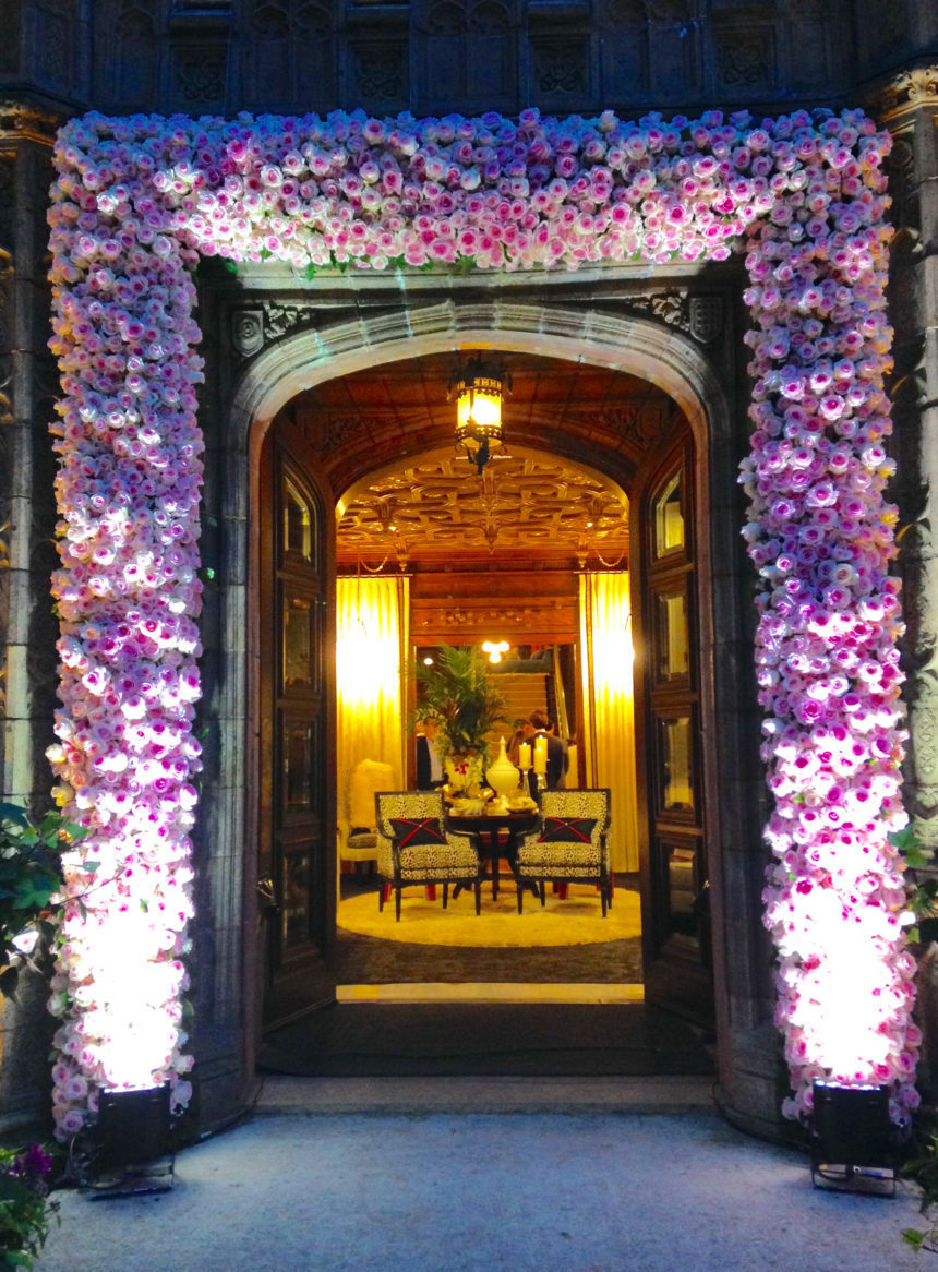
The designer duo had the honor of transforming the Grand Foyer of the historic Alnwick Hall  – The Abbey mansion into an impressive statement of modern glamour.  Check out how they reimagined the entranceway of this spectacular estate—and steal some of their ideas!

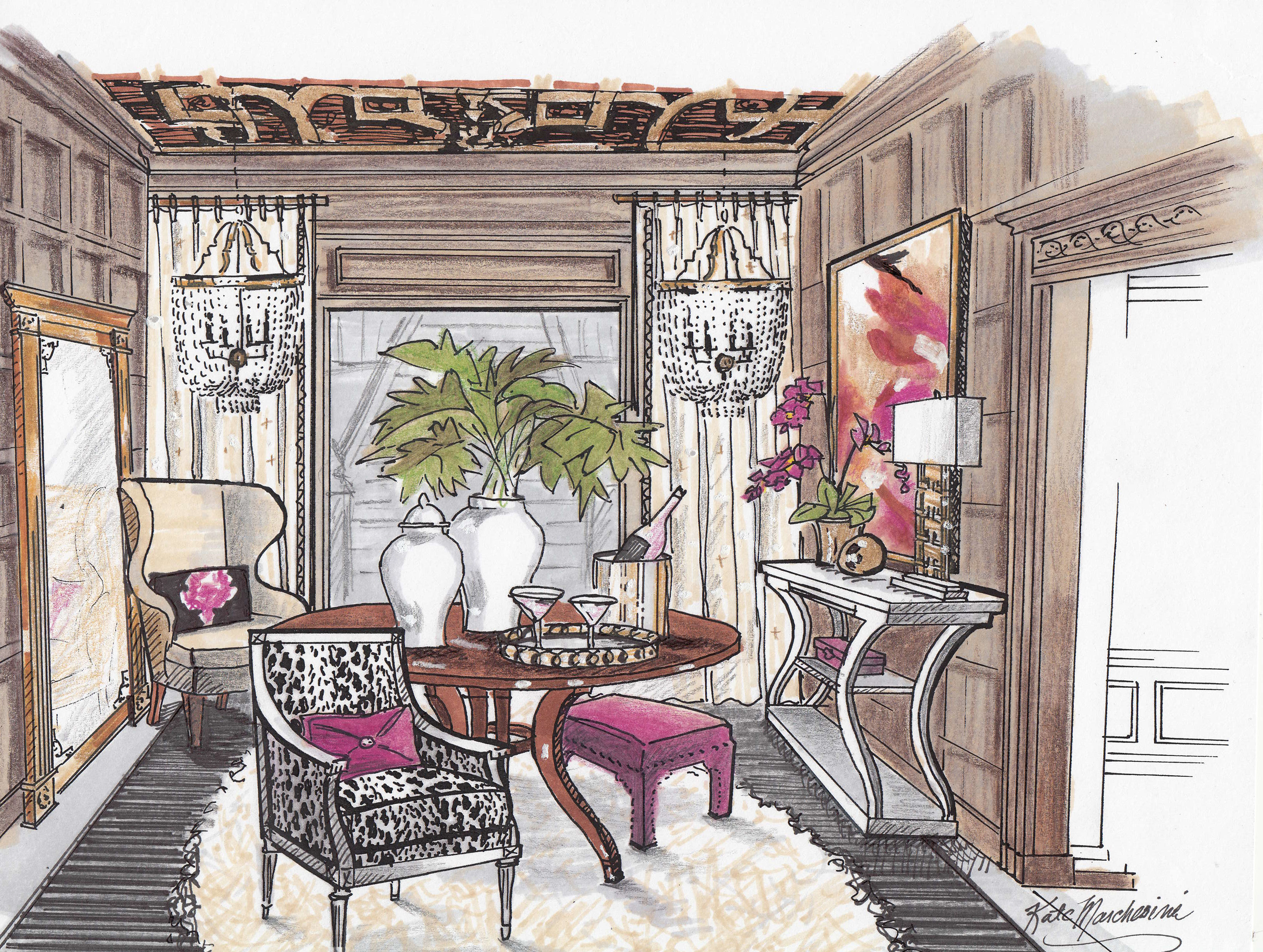
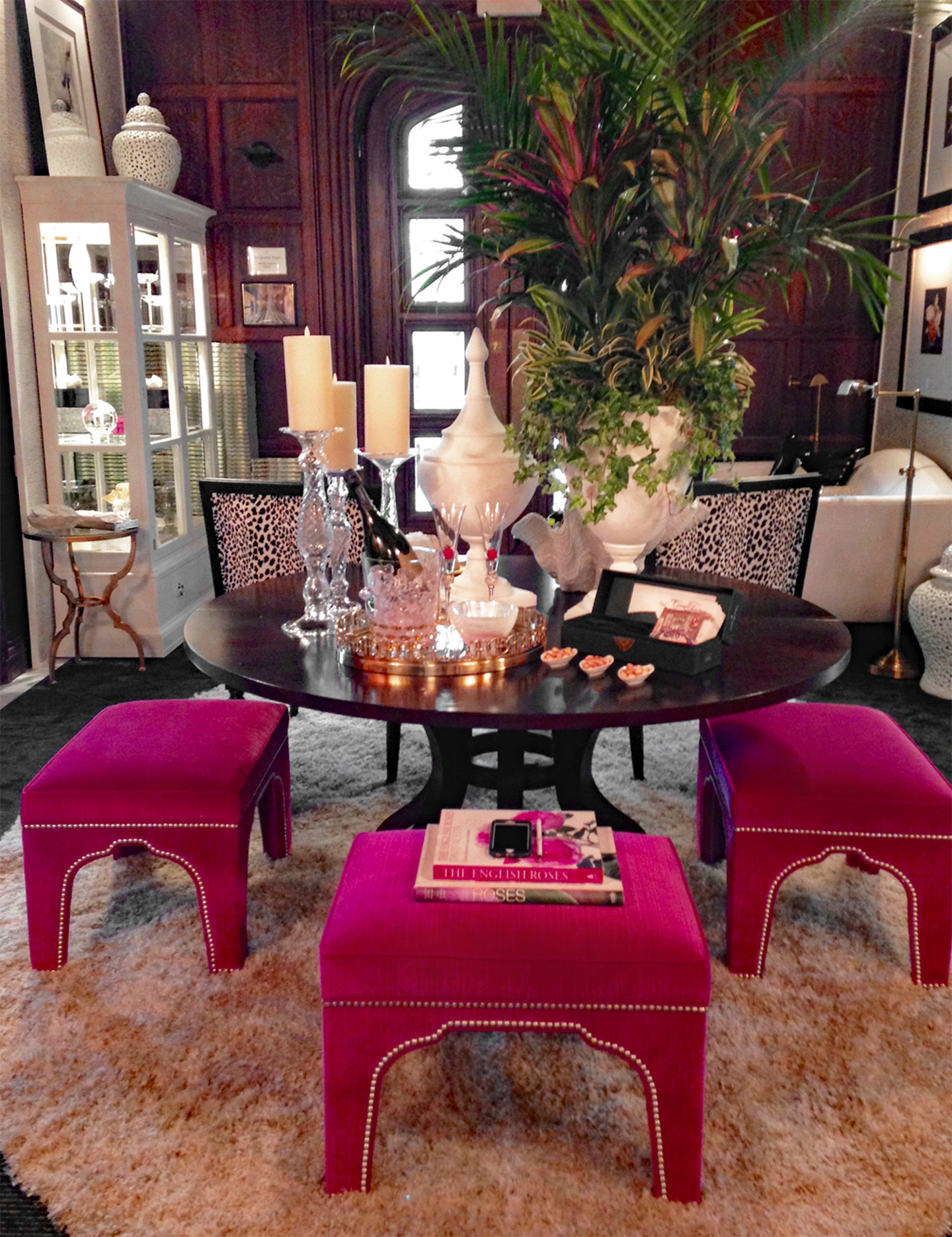
Built in 1904, Alnwick Hall is an example of Tudor Gothic design. Its interior draws from several historical periods and boasts ornate quatrefoil ceilings with gold leafing and mahogany raised paneled walls. To complement this opulent space, Kate and Andrea conceptualized a dynamic, glamourous design, choosing stylized silhouettes and a high-fashion, high-contrast color scheme of black, fuschia, and gold.

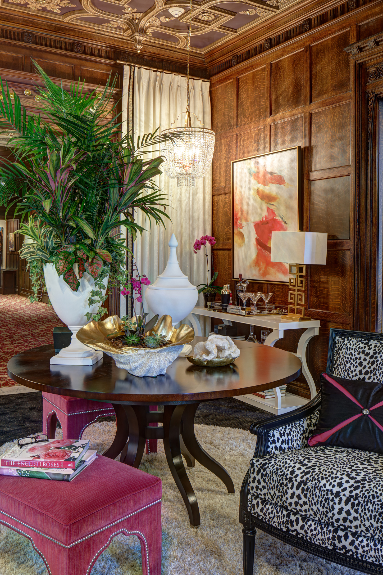
As the first room in the showhouse, the Grand Foyer serves as a place for imagined guests to await reception. Kate and Andrea chose the rich and refined Ashcroft table in a mahogany finish to serve as a focal point. Then, they gave it a fashionable twist with a luxurious shag rug, a trio of Gavin bunching ottomans upholstered in a hot pink velvet, and dazzling white, gold, and glass tabletop accents. The designers also added the Brighton cabinet with interior lighting to display artifacts they envisioned to be of interest to the imagined guests of the estate.

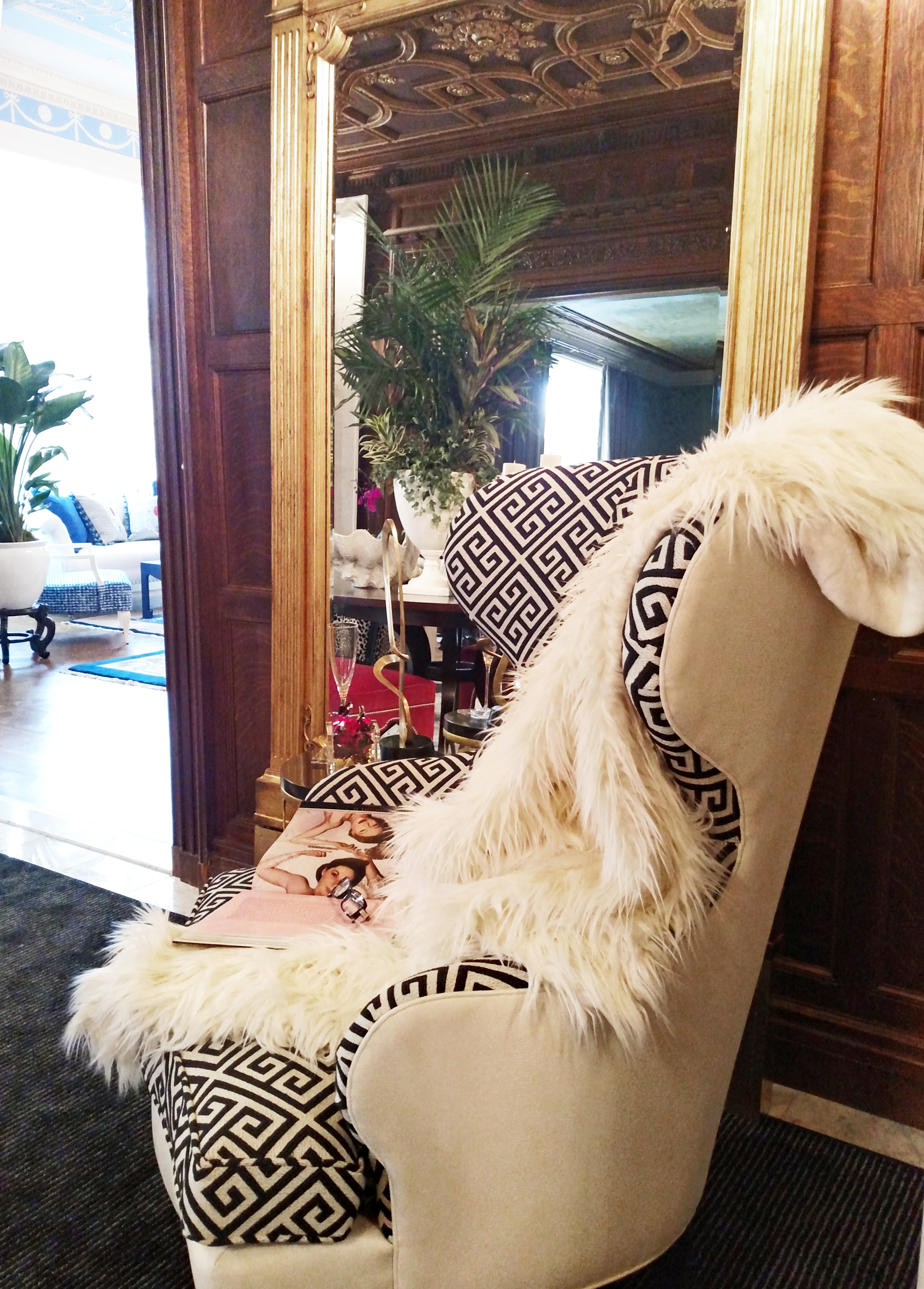
The sinuous Selby wing chair in a dual Greek key and solid fabric treatment, paired with the Madeleine Trumeau floor mirror in antique gold, echoes the rich decorative motifs of the mansion while adding a fresh glamorous vibe.

To lighten up the heavy Gothic architecture in the space, the designers framed the archway leading to the rest of the home by adding overscaled panels of cream and gold wallpaper and white floor-to-ceiling drapery. The curvy Donatella console table in white and the vibrant abstract artwork add a modern, glossy pop to the traditional space.


You don’t have to have a Grand Foyer to make a grand style statement. Here three tips for making a great entrance of your own:

  • CREATE A FOCAL POINT

A focal point draws guests in the moment they arrive. A console table or cabinet with a work of art is a quintessential and powerful pairing. Give it your own twist with additional pieces that fit your space, such as accent wallpaper, a chandelier, ottomans, or chairs.

  • GO FOR “WOW”

The entryway is an opportunity to make a great first impression about your style—so don’t be afraid to be daring! Consider pieces with striking silhouettes, captivating color and finishes, and unexpected details.

  • INTRIGUE YOUR GUESTS

Take a cue from Kate and Andrea’s creative use of the Brighton cabinet and add intriguing accents that spark conversation. Just one small unique piece can have an unforgettable effect.


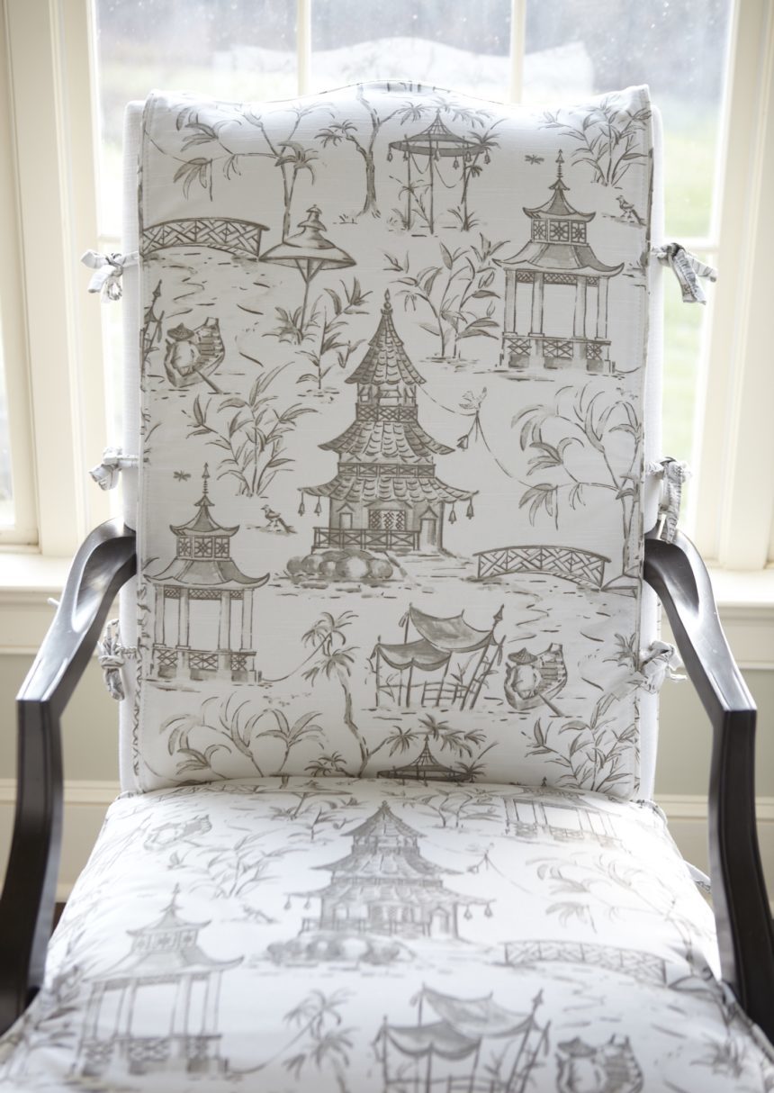
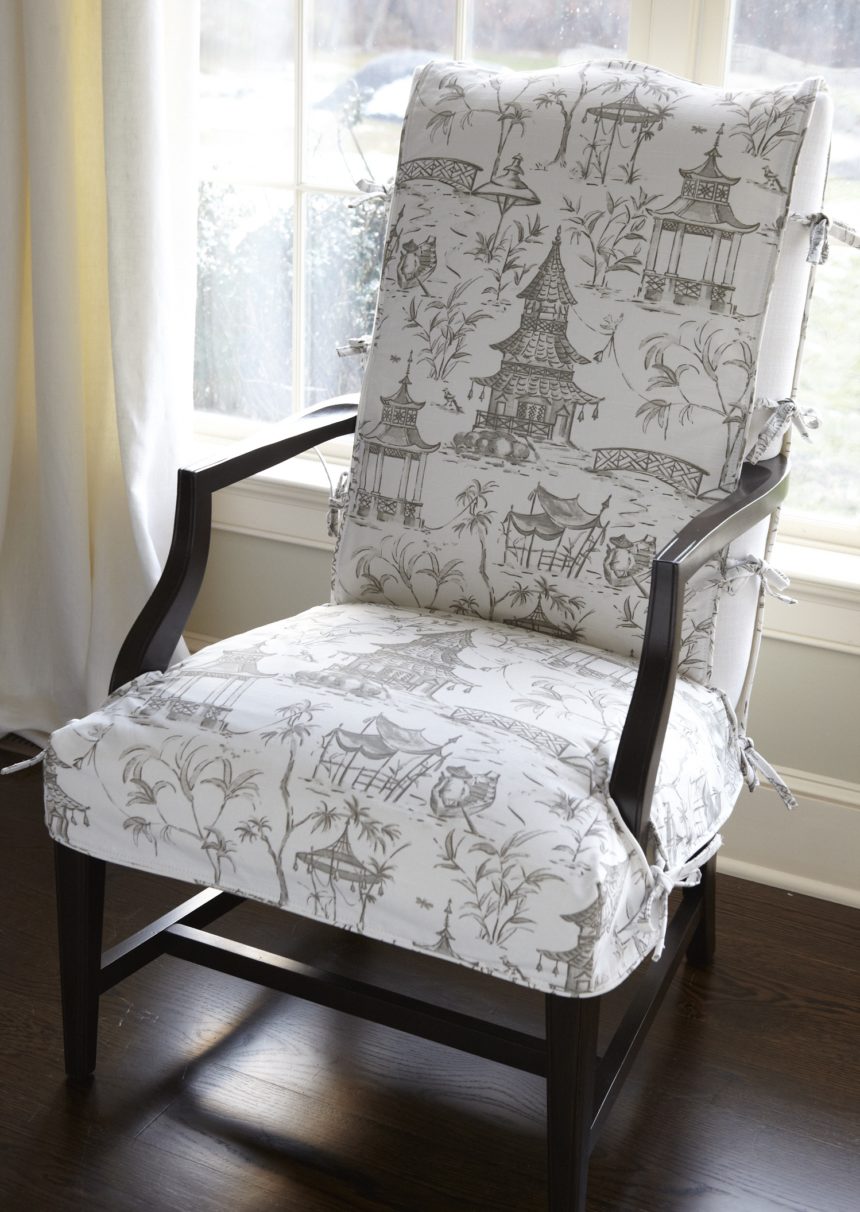
The Martha Washington chair is timeless. Inspired by eighteenth-century design, Martha is probably one of the most iconic (and versatile) chairs we offer. We love her as is, and we love how easy it is to update her classic style with a slipcover.

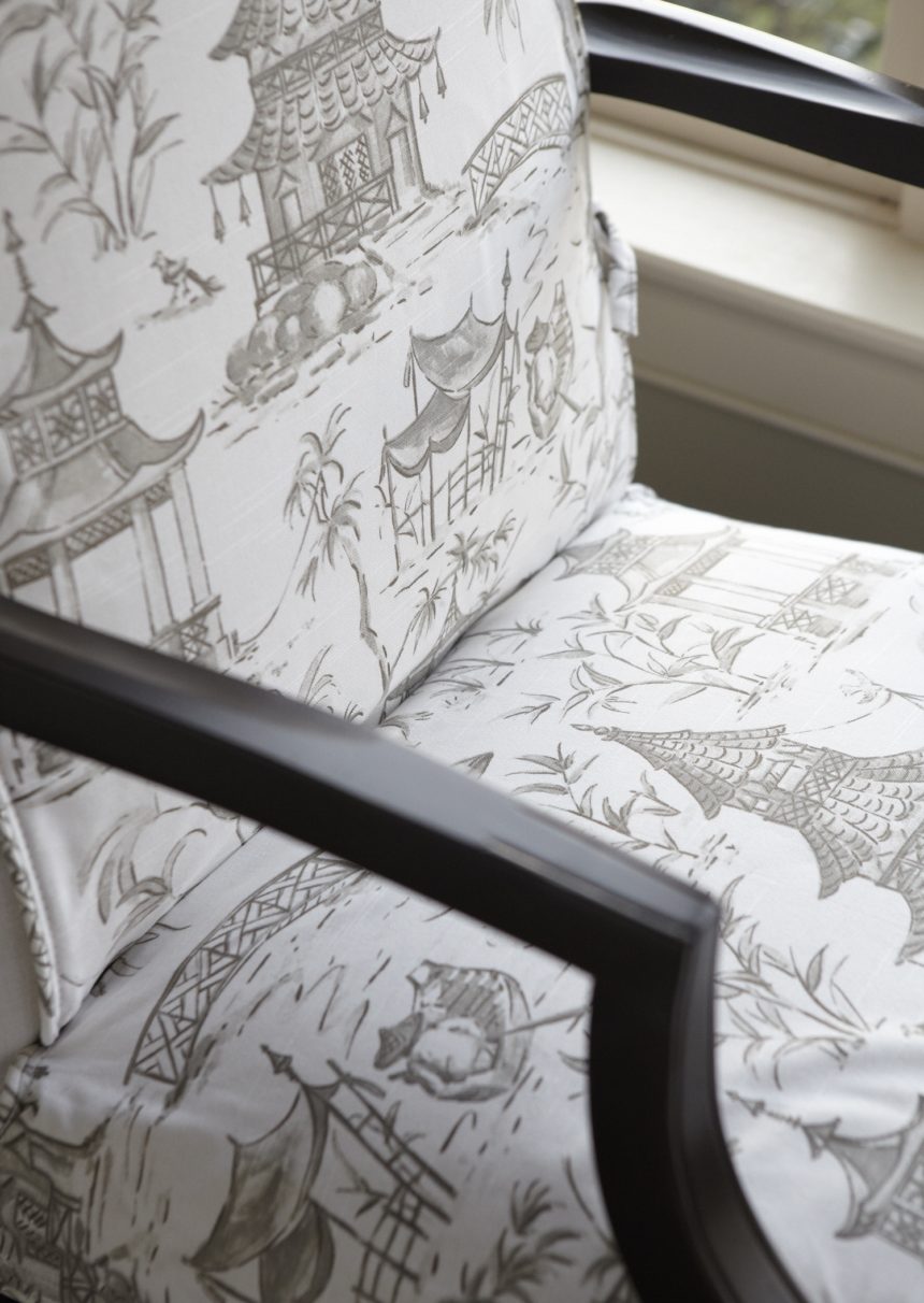
First, we designed the slipcover pattern to show off Martha’s graceful lines and year-round upholstered fabric underneath, then we chose a lighter-weight cotton Toile du Jouy fabric to get this delicate look. How easy is that? It’s almost like tying on an apron!


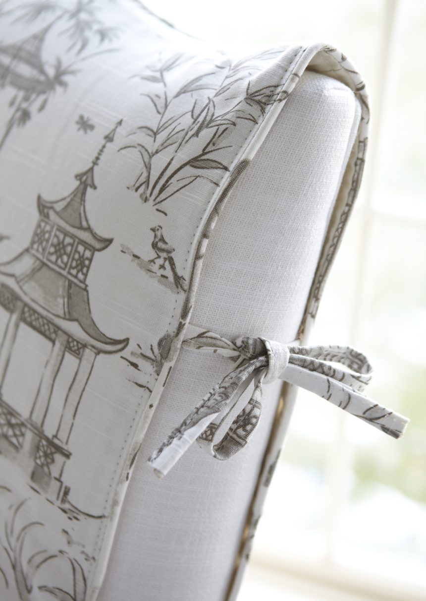
Pretty ties. Slim self-lined ties are long enough to create lovely bows.

Tuck it in. Keep the slipcover neatly in place by tucking it in between the seat and back.

Tailored detail. The slipcover edges are welted for a beautiful finishing touch.


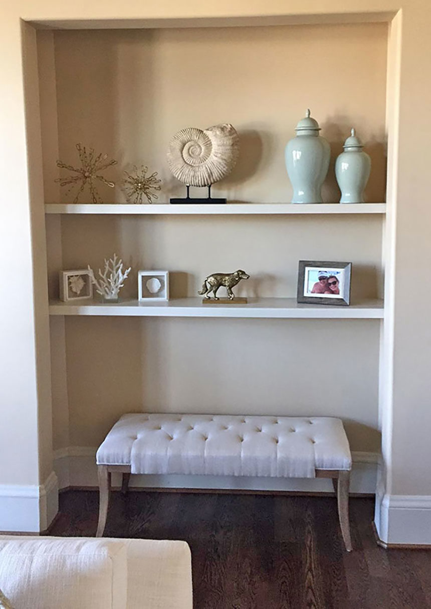
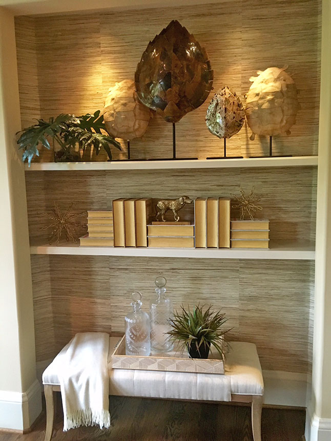
This bookshelf makeover was part of a larger project completed by Julie Goss of our Vienna, VA, Design Center. She transformed the space with a few simple moves.
BEFORE: Recessed shelving lends itself to a well-composed vignette. Unfortunately, it was styled more like a stiff repository than a compelling display space. A bunch of disparate pieces, similarly scaled, does not a pretty sightline make

AFTER: Hanging grass cloth on the walls of the alcove was transformative. It introduced texture and warmth and set the tone for a more organic look. Julie kept the client’s bench but gave it life by adding a tray, soft throw, decanters, and some greenery. For the shelves, she chose pieces that were better scaled to fit the space, including objet d’art and some sculptural books. Accent lighting brought everything into sharp focus. Done!