Everything small is big again—especially in today’s condensed dining spaces.

It’s official: The banquet-sized dining room is a thing of the past. Today’s dining room is smaller, more intimate—and no longer used for only two or three holidays a year. Today’s dining area still invites family gatherings, but it’s often simply an extension of the living room or kitchen. Naturally, smaller furniture had to follow. Scaled down with a modern vibe, our fall dining introductions are just the thing.

Check out some of our lighter menu options:

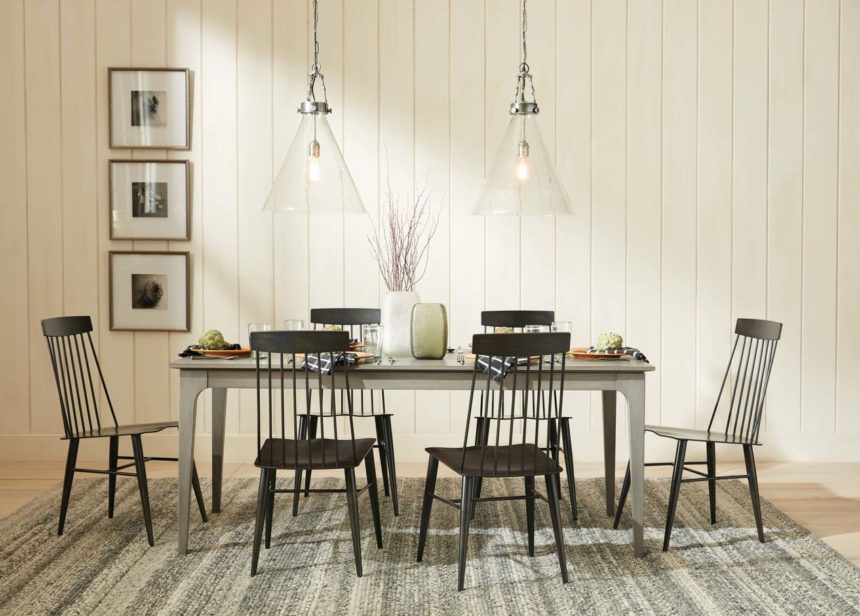
JEWEL DINING CHAIR
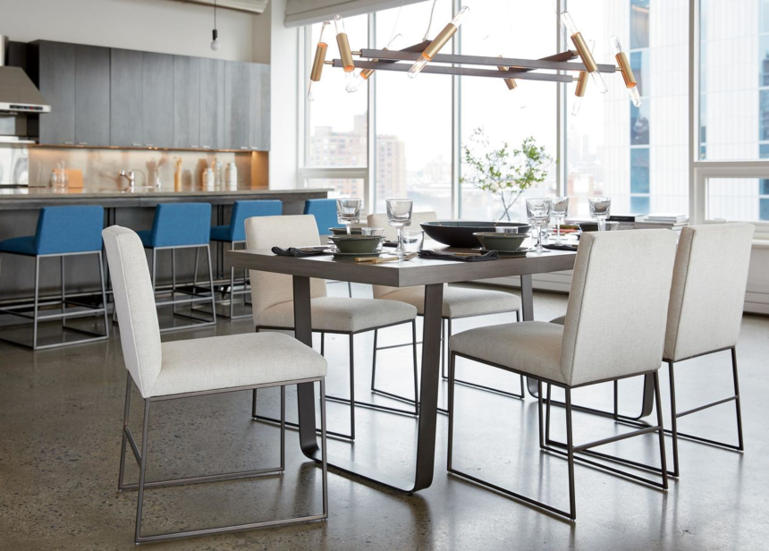
Smart, simple proportions give Jewel high marks in both function and form. An airy, understated feel makes it a new transitional classic. Also available as a counter stool.

HOYT RECTANGULAR TABLE
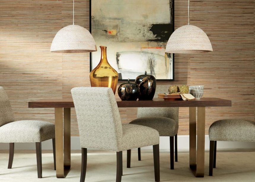
Hoyt mixes materials in the most stylish way, pairing a walnut veneered top with a free-form metal base that looks substantive without making a small dining space feel crowded.

HAZELTON TABLE
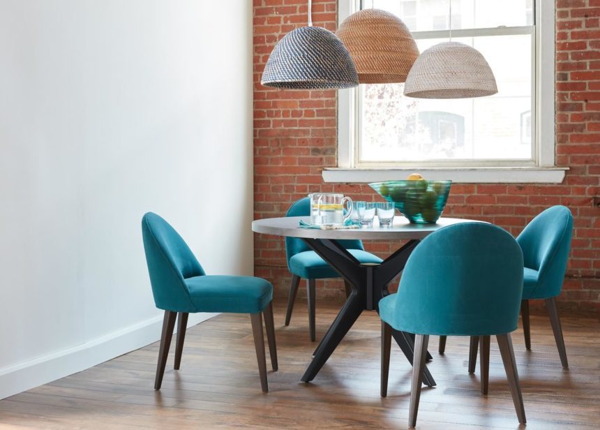
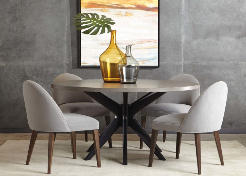
Table for two? Our Hazelton with its 36-inch top is ready when you are. With a starburst beauty of a base, this sculptural piece fits anywhere and elevates dining at home.

VERA DINING CHAIR
Sweet and understated, Vera’s petite silhouette, rounded back, and generously cushioned seat bring comfort and style to any dining area (super-sized spaces not required).

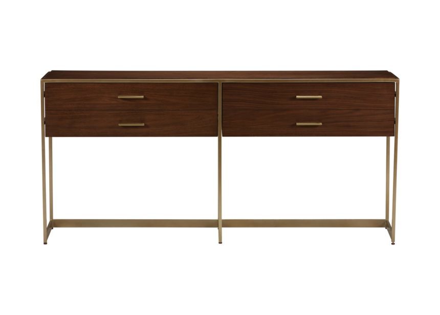
MONTCLAIRE CONSOLE TABLE
The modern Montclaire has a pleasing minimalist profile. Two spacious drawers (think table linens, flatware) atop a steel base form simple geometry that’s simply exquisite.

SOMERS SIDE CHAIR
Scale it down, clip its silhouette, minimize its twists and turns, and make it out of bronze-finished aluminum. Voilà! You have a modern Windsor chair updated for today.

See what’s new in Small Space Living Rooms. Never miss a new introduction: Subscribe to The Art of Making Home and check us out on Instagram @ethanallen.



How a stately old mansion in a historic neighborhood got its groove back.

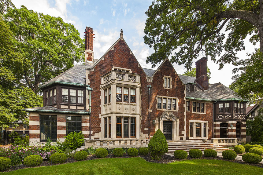
In the early part of the last century, Detroit was the place to be. Its population was booming, the automobile industry was revving up, and entrepreneurs with great wealth were building grand homes in the city, some of the grandest within a 36-block enclave known as Boston Edison. In 1922, Charles T. Fisher, founder of the Fisher Body Company (the world’s largest manufacturer of automobile bodies) and his wife, Sarah, commissioned an 18,000-square-foot estate in the upscale neighborhood. It was designed in the English Tudor style and featured fourteen bedrooms, a pub, a private chapel, a gym, and a carriage house.

Fisher Mansion stayed in the family for more than 50 years, until Sarah’s death in 1974. By that time, it had fallen into decline, much like the city itself. It was donated to a church, and then changed hands several times—seriously in need of some love—until Michael Fisher, a distant cousin, purchased it in 2008. A series of restoration projects brought the residence up to code, but there was still much work to be done.

Enter actor and philanthropist Hill Harper. After purchasing the residence in 2017, Harper, who is known for his work on such TV shows as CSI: NY and The Good Doctor, promptly set out to restore its architectural splendor while bringing it squarely into the 21st century. He worked with a Detroit-based design-build firm and contractors to bring the building back to life, and he partnered with the Junior League of Detroit to host its 22nd biennial Designers’ Show House in his new home. Thirty-nine talented designers (including three of our own) signed on to transform 44 distinct spaces.

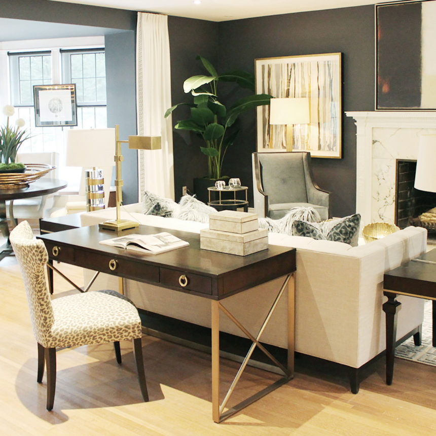
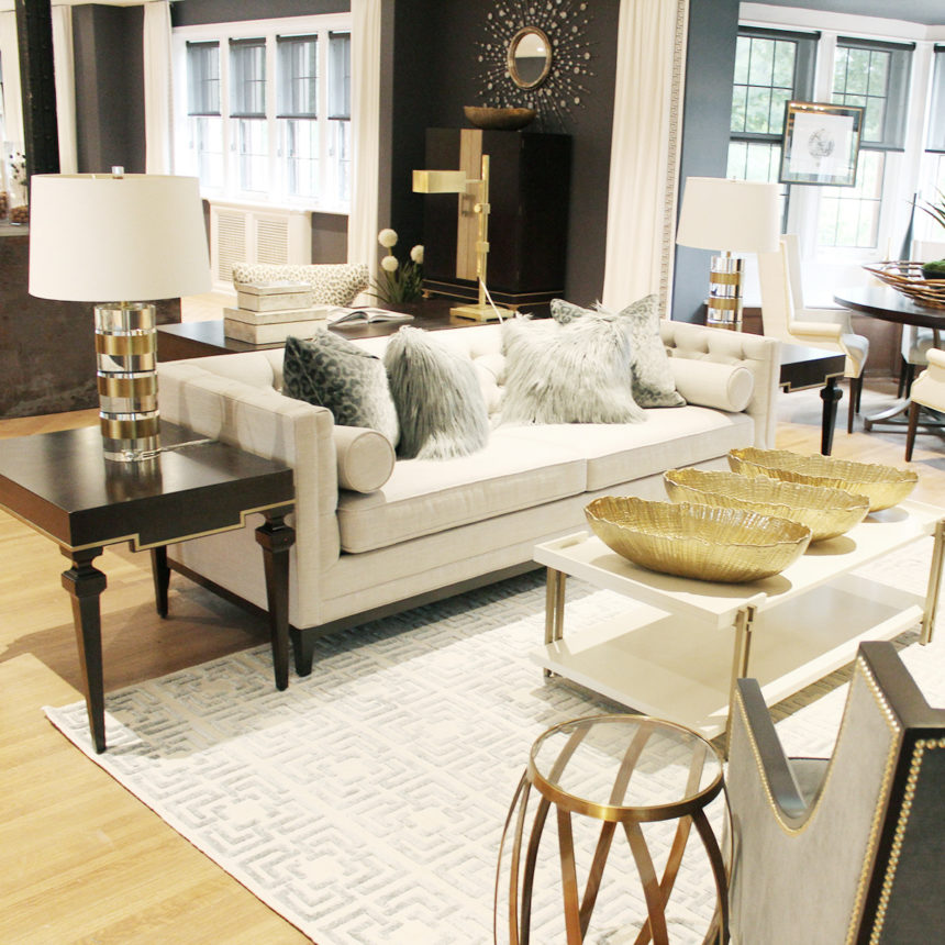
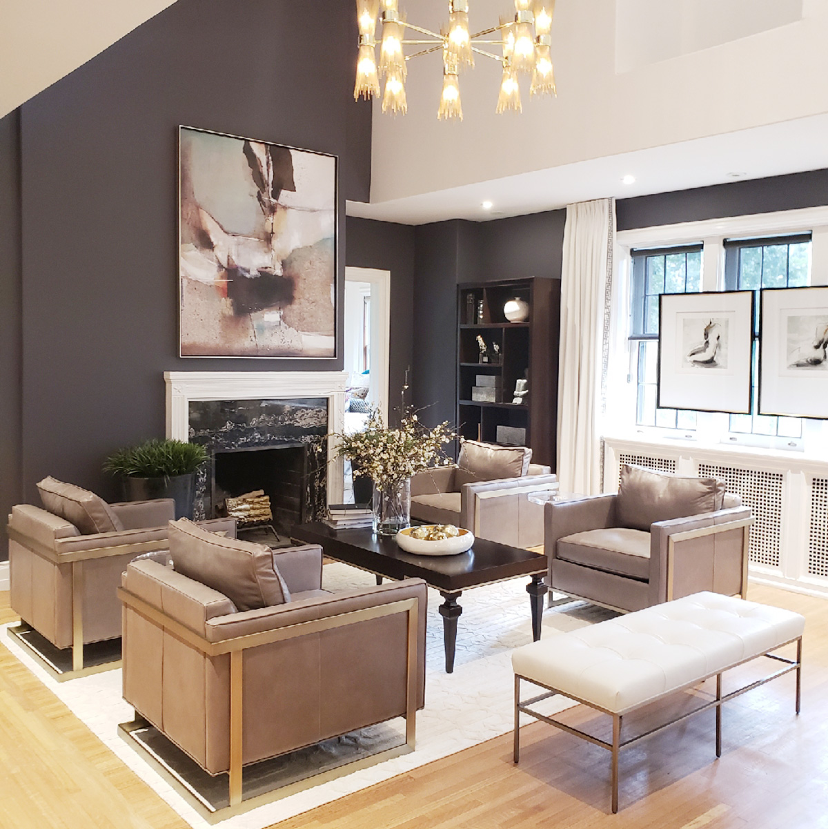
Since its inception in 1976, the JLD’s Designers’ Show House has raised more than $4.5 million for community programs in Detroit, so we were thrilled to take part! Michigan-based EA designers—Tamara Stone of our Birmingham Design Center, Colleen Gahry of Auburn Hills, and Gabriella Andersen of Sterling Heights—collaborated on the living room suite on the second floor. They call it “Uptown,” a modern and sophisticated loft designed for elegant entertaining. The space is richly layered with well-chosen pieces; it’s graceful, glamorous, and gorgeous—with a hint of glitz.

The Junior League of Detroit Designers’ Show House runs through October 7. For hours, information, and tickets, visit the JLD website: jldetroit.org

For more news, tips, and inside scoops on design, subscribe to The Art of Making Home and check us out on Instagram @ethanallen.

*Photo credit of exterior Fisher House by: Jeff Garland


He eats, sleeps, and breathes design. No wonder he finds inspiration everywhere he goes!

It’s safe to say that everything we sell at Ethan Allen has spent at least some time in Jimmy DeBernardo’s head.

That’s every stick of furniture, fabric swatch, rug, quilt, basket, bowl, and box. Every drapery panel, roll of wallpaper, giclée print, and chandelier. As the company’s Vice President of Style, it’s Jimmy’s job to work collaboratively with our in-house merchants to establish a look for every new introduction, to review the designs they bring to the table, and to take their collective vision from mind’s eye to reality.

Jimmy is a 29-year EA veteran who started out as an intern. Today, in addition to his role as the company’s style guru, he’s also responsible for setting up our Design Centers, from the ground up. He’s adept at juggling his many roles, but it’s the design process that drives him 24/7. When we interviewed him on a recent afternoon, he’d been up since 2 a.m., trying to finesse a concept he’d been working on. The lack of sleep didn’t faze him; if anything, he was more animated than usual. Here’s what he had to say about his job:

WHAT DID YOU STUDY IN SCHOOL?
I started out at Miami Florida International University as a psychology major, then switched over to marketing. But I knew I wanted to do something creative, so I added commercial interior design to my major. I later transferred to Youngstown State University in Ohio, where I graduated with bachelor’s degrees in marketing, psychology, and design—with an art minor. I’m one of the few people who is actually doing what they went to school for!

WHY HOME DESIGN?
As a young child, I used to draw houses and “decorate” them; I was always interested in dwellings. I wasn’t sure what I’d be—maybe an architect or a designer—but I always thought it would have something to do with houses. While I was in college, I freelanced as an interior designer, doing friends’ apartments, working with very tight budgets. I enjoyed the challenge, and it was then I decided what I wanted to do for the rest of my life. The first time I walked into Ethan Allen, back when I was hired as an intern, I knew it was where I wanted to be.

DESCRIBE A TYPICAL DAY.
There really is no typical day . . .  it depends on where I am in the process, and where I am in the building. In the morning I might be focusing on the next Design Center, and in the afternoon my focus is will be on product for the upcoming season. I never feel like I’ve done enough in a given day, so I never shut down. I check email all the time, day and night. The process never sleeps!

TELL US HOW THAT PROCESS WORKS.
When you’re involved in the design process you’re constantly finding inspiration in the most unexpected places. You use that inspiration to create a space for a particular person. When you’re doing it in the abstract—that is to say, not for a particular client, but for a type of client—you have to imagine who that person is, where they live, how they live, what they eat and drink, what kind of music they listen to, how they dress. Whether they’re real or imaginary, you’re creating a set for a person’s story.

HOW LONG FROM CONCEPT TO PRODUCT?
We usually work a year ahead, but it can vary depending on the category. After we come up with a concept, we create mood boards, or collages that convey the concept and take us on a journey. They’re an important part of storytelling. Every concept includes a palette to help establish parameters.

Next, we meet with merchants and discuss what we’ll need in terms of case goods, upholstery, decorative accessories, etc. Then they go off to apply the concept to their categories, in keeping with their business plans. When they bring back their ideas, we sift through everything to see what works, what doesn’t, and what we still need. Is there a tall piece, a short piece, an in-between piece, a one-of-a-kind piece, a utilitarian piece? When it’s time to put all the products together, we fast forward to end use and decide if a piece is relatable. If it’s not, then we haven’t succeeded—no matter how great a job we think we’ve done. At the end of the day, it’s about bringing joy to the customer.

HOW DO YOU COME UP WITH NEW PRODUCTS YEAR AFTER YEAR?
Research, research, and more research.  We’re not a trend-oriented company; we’re more about real life. Relevance. So, we take basic facts and data and think about how we can make something ours. How can we give it an EA point of view? I go for longevity. I like to take something that’s classic and make it new.

WHAT DOES YOUR HOME LOOK LIKE?
I’m a traditionalist at heart with a modern perspective. When you’re around color and pattern all day, you tend to go more toward neutral. I do love anything that’s Dynasty. I love ancient forms that can be interpreted as modern. Every time I go to change things up in my townhouse, I decide it looks better as it was.

WHAT DO YOU DO IN YOUR FREE TIME?
It’s always something to do with art. My partner is in the design field also, and we’re both artists, so we paint and draw, we go to galleries. Our idea of recreation is looking at what’s new in the design world, in fashion, and pop culture.

WHAT’S YOUR FAVORITE PART OF THE JOB?
Seeing dreams become reality. It’s very exciting and gratifying to me to see everything come together.

For more peeks behind the design, subscribe to The Art of Making Home and check us out on Instagram @ethanallen.


Mikel Welch is more than just one of the talented interior designers who participated in this year’s esteemed Hamptons Designer Showhouse, presented by Traditional Home, with proceeds benefiting the Stony Brook Southampton Hospital.

The owner of Mikel Welch Designs is also a set designer, a TV personality, and a self-proclaimed magician. Of course, Mikel is not really a magician, but he likes to call himself one.

“As an interior designer, so much of my job is making magic happen,” explains Mikel.

Mikel’s natural talent for design was evident from the time he was a young boy growing up in Southfield, Michigan, creating sofas and chairs for imaginary houses. Today, he runs his own interior design business in New York and works as an on-air personality and design expert for Steve Harvey.

He describes his style as transitional-primitive. “I like things that are from the past that really have a story but then I like to pair them with things that are nice and supple, and have texture.”

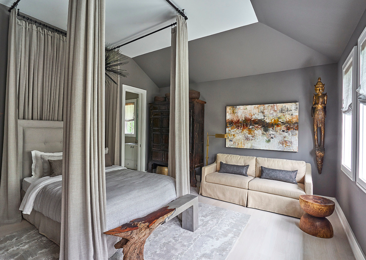
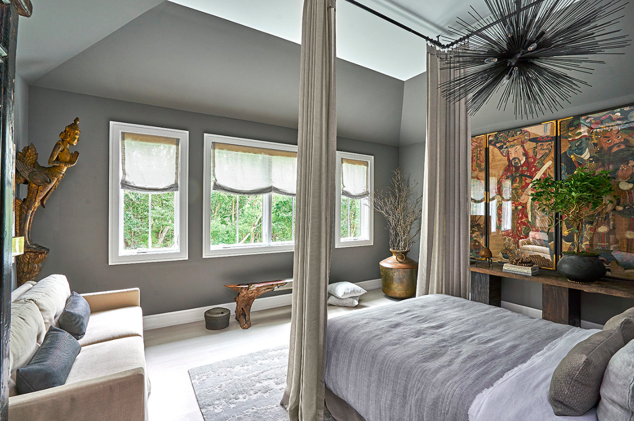
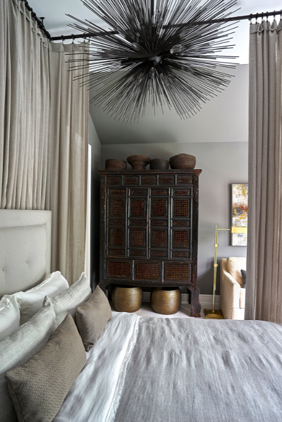
We recently had the pleasure of working with Mikel for the showhouse, transforming a guest bedroom into a junior master. Using deep saturated tones, a mix of styles, and custom drapery, Mikel worked his magic to create a dreamy yet dramatic retreat.

We asked Mikel to share the thinking behind his bedroom design.

THE HEIGHT OF CHIC

“I wanted to create something that was extremely tranquil,” explains Mikel, sharing his vision for the room. “Living in New York, you have all this sensory overload. I thought, ‘if I were in the Hamptons, what would be my area where I could go zone out and completely detox?’

Mikel went right to work on his vision. He chose a rich earthy gray and cream palette and immediately turned his attention the room’s massive fourteen-foot ceiling.

“Being an interior designer and a set designer, I’m all about drama! I thought the best way to bring drama into this room would be to actually work from the ground up.”

A TALL ORDER

To get started, Mikel went shopping at the Decoration & Design Building in Manhattan, seeking out a bed to fit his vision. It was during his trip there that he spotted the upholstered Jensen bed in the window of the Ethan Allen showroom and knew he had found the one.

“It was perfect. It had beautiful buttons; the detail was exquisite,” says Mikel.

HIGH DRAMA

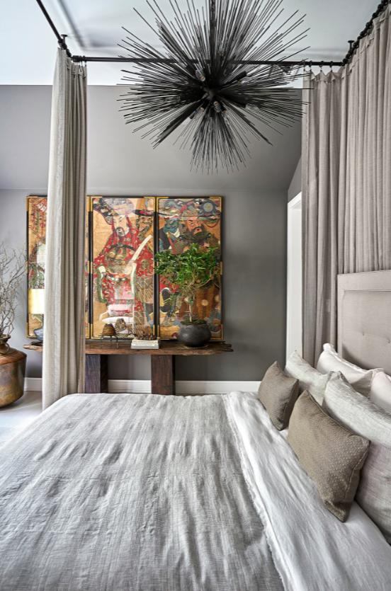
With a dreamy bed secured, it was time to create the drama. To bring the look together, Mikel hung custom lightweight drapery from the ceiling to create the illusion of a four-poster bed.

Mikel explains, “The drapes just nicely kiss the ends of the bed. It’s perfect. The room is very light and airy, but it’s moody, it’s drama—it’s all those things you want when you walk into a bedroom.”

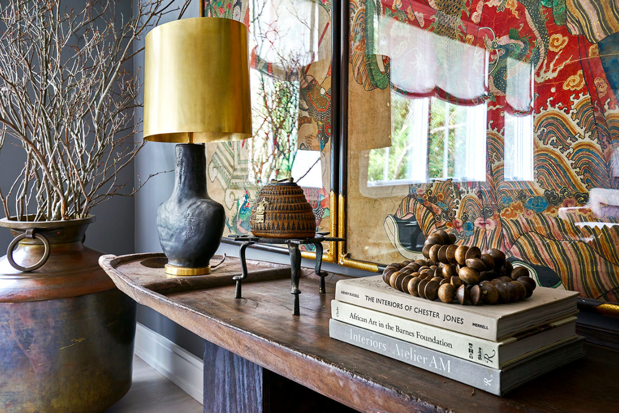
To continue maximizing the fourteen-foot ceilings and enhance the drama further, Mikel brought in three magnificent 91-inch, eighteenth-century Chinese paintings for the wall.

A SUITE IDEA

With the bed covered, Mikel started thinking about what else he could bring into the space.

“A big part of design is obviously function,” he shares. “If I were here in the Hamptons, I would want a place where I could actually lounge.”

Mikel set his sights on creating a seating area in the room and chose the Monterey slipcovered sofa for its crisp, casual style. He upholstered it in a muted cream tone to contrast with the room’s rich dark grays.

“I love this piece because, to me, it has a really tailored, regal elegance,” says Mikel. “You have beautiful cushions, which are very firm and tight, and a slipcovered effect on the bottom. It’s the perfect piece for lounging.”

To complete the look, Mikel chose accents that complemented the tones and textures of the room, including a work of abstract art and the Macie Pharmacy floor lamp in a polished brass finish.

“I’m just really excited that my room came together so nicely,” Mikel shares.  “I think a lot of times, interior designers get caught up in certain catch words or clichés. I didn’t want to do that. I wanted to stick to who I was as an interior designer, and that’s honestly what I did in this space.”

We were intrigued by Mikel’s passion and philosophy, so we asked him a couple of more questions about design:

What is your favorite Ethan Allen piece?

“It’s actually a tie! love the Lincoln upholstered poster bed and the Skyla brass chandelier. If I could pair them together, that would be the best of both worlds.”

What is the biggest thing you get out of interior design?

“To see the faces on my clients when I do the big reveal. I think that’s the biggest thing any designer can ask for. As an interior designer, it’s your job to help somebody take a vision and to expand it. Our job is to show you the full capacity.”

We couldn’t have said it better ourselves! Ethan Allen interior designers are always ready to help you expand your design vision. Get started with our free design service now.


Everything small is big again. Take a look at what’s new.

Our fall introductions all have a polished, up-to-date vibe and they play well with a variety of decorating styles. Some are petite, while others have visually lighter profiles or frames. Many of them have one awesome thing in common: They add loads of modern moxie to smaller spaces.

Here are some eye-catching choices for living rooms:

DILLONVALE DISPLAY BOOKCASE

Packing a lot into a small footprint, Dillonvale has form and function in equal measure. It’s finished on all sides, with a mix of materials and a few industrial notes.

ESTELLA TABLE

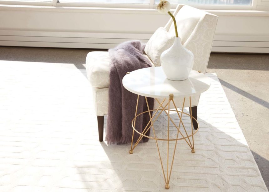
Graceful, graphic, and handcrafted in India, our Estella marble-top accent table delivers an air of modern luxury to any nook or niche in the house.

ARMOUR BAR CABINET

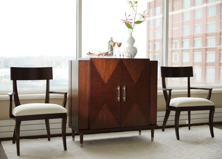
The secret to gracious entertaining, the Armour bar cabinet features storage to spare: a self-close drawer, removable wine rack, and room for your beverage of choice.

GALEWOOD TALL DISPLAY CABINET

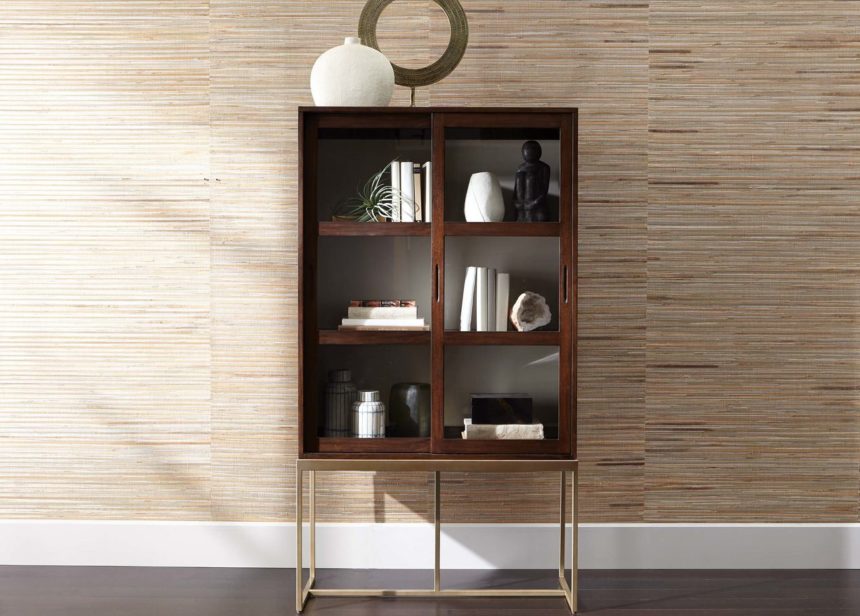
Resting on a simple, visually light contemporary steel base, the Galewood is a show-off; the slim display cabinet elevates anything you place in it.

LOYOLA SECRETARY DESK

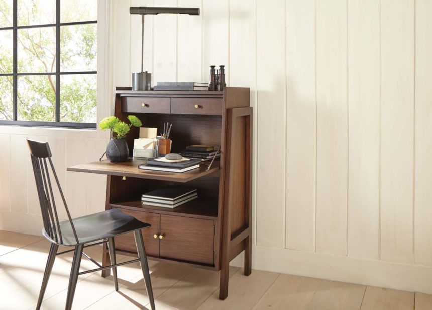
A drop-front desk designed for today, the Loyola is a modern piece perfect for storing laptops and other electronics, while adding style to any corner of the house.

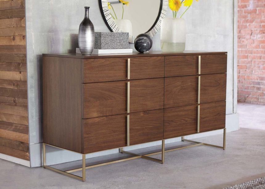
MONTCLAIRE DOUBLE DRESSER

The clean and simple Montclaire double-sided dresser looks modern, feels minimalist, and provides an overabundance of storage.

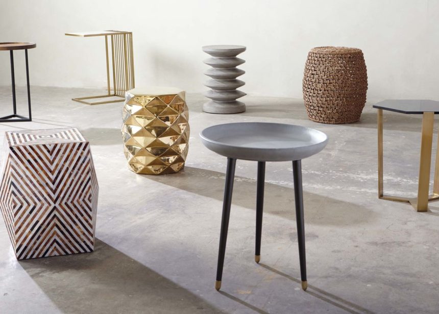
SMALL WONDERS

Form meets function in this fantastic array of accent tables. They’re made from a modern mix of materials: lightweight glass, reinforced fiber cement, mother-of-pearl, mango wood, smoky glass, steel, and marble.


See what’s new! Fresh looks inspired by midcentury modern style, updated for the way we live today.

Allow us to introduce our new introductions! They’re easy-to-live-with pieces inspired by timeless designs—from midcentury chic to Scandinavian fresh. They all have the same modern, polished vibe, so we’re showing them together, in rooms imagined for today’s lifestyles. But they play well with a variety of design aesthetics; you might be surprised at how seamlessly mid-modern can fit into more traditional spaces.

With that, we invite you to mix things up; you can do a whole room over if you like (how awesome would that be?) or meld something new (a slipper chair? glam bar?) with the things you already love. The options are endless.

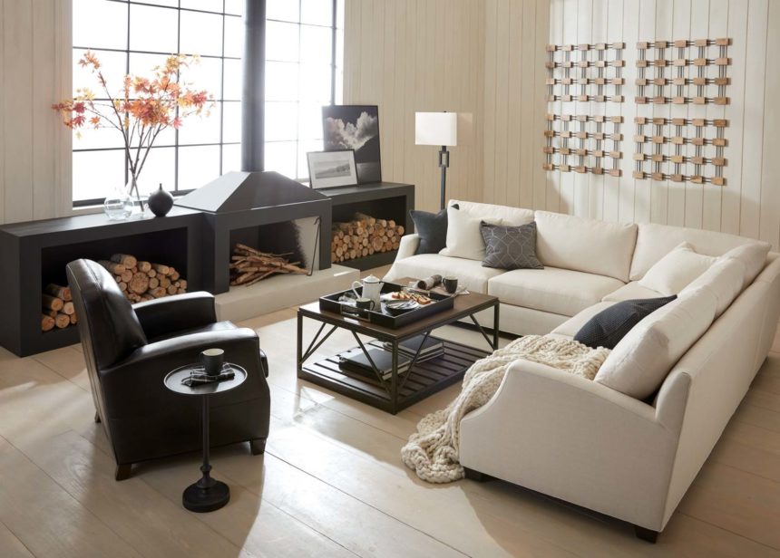
THINK FORM, NOT FORMAL. Simple, comfortable. All that, plus sleek and streamlined. We call it new modern, but you just call it home.

You’ll love:

  • The Marcus sectional, hand-upholstered and available in two Quick Ship fabrics, delivered in thirty days or less.
  • The minimalist Mira chair, with a barely there frame that embodies modernism.
  • The hand-knotted wool-blend Jahnu rug, an exclusive design with a fresh geometric pattern that looks carved but isn’t.

HOME IS A MIRROR OF YOU AND YOURS. It’s as unique and familiar as, well . . .  family. To you, decorating family style is like breathing.

You’ll love:

  • The Hazelton dining table and comfy Vera chairs, with their fab midcentury curves. They invite gathering in the dining room (or nook or corner).
  • The Nolita sofa and Marcus chairs, low to the ground and high on style. They just made the great room greater!

ALL THE COMFORTS OF COUNTRY, BUT FRESHER. When every piece has a story to tell (and they’re not all antiques) you want modern country, pure and simple.

You’ll love:

  • The new Rinna pedestal table, artwork, wall sculpture, and graphic pillows, all new introductions that add modern notes and visual interest to an already up-to-the-minute space.

Coming soon: A Nod to Mod: Small Spaces, posting later this month. We’ll be highlighting new pieces designed to suit—and wow—scaled-down living and dining rooms. Never miss a new introduction: Subscribe to The Art of Making Home and check us out on Instagram @ethanallen.


This post kicks off the Inside Story series, where we’ll show you how we design the beautiful rooms in our ads and magazines. Here, deconstructing one of our most popular living rooms so you can see for yourself how it came to be—and how you can create one like it.

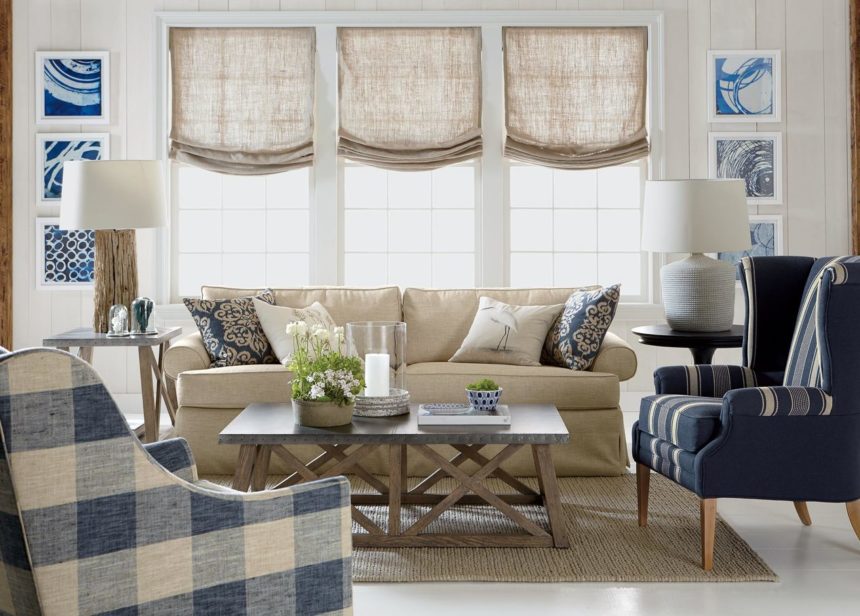
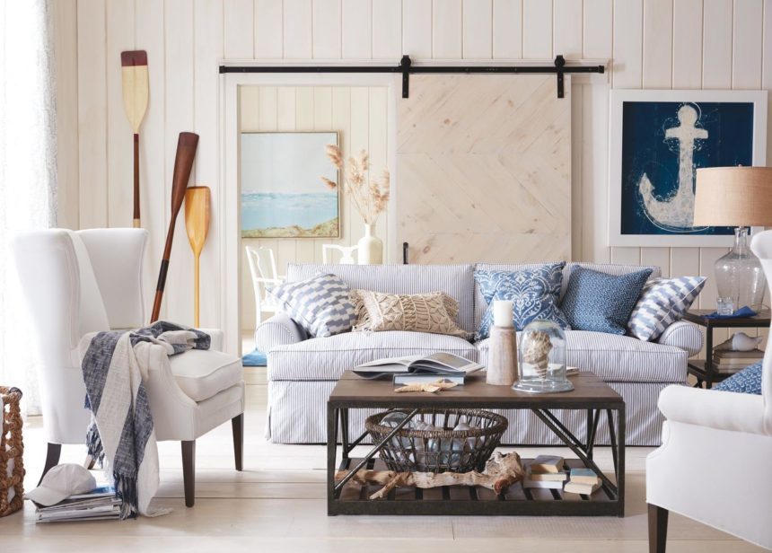
We call it Nautical by Nature because there’s just no getting around the inspiration: We went coastal, in a big way! But the room is proof positive that you don’t have to live at the shore to create the perfect seaside retreat (shhh … we shot it in our quite landlocked Connecticut studio). It has all the trappings of a fresh, inviting, and effortlessly composed cottage. It’s a relaxed, easygoing space that looks like it could live anywhere; it just feels like it’s steps from the beach.

Don’t worry if you’re not started with the same “canvas” we did (whitewashed beadboard paneling and painted floors, not to mention the sliding barn door), you most definitely can build your room around a timeless, crisp blue-and-white palette. Stay true to these hues and you’re halfway there.

Here’s how to get the look:

  • Keep seating relaxed and summery. Here, the Marina sofa is casual, comfortable, livable, and made to order. It’s covered in denim blue ticking for a beachy-keen vibe. Clara redefines the classic wing chair with its soft, gentle curves, and it looks even better in cool, white pairs.


  • Embrace the weathered look. Our go-anywhere Beam coffee table and end table—with knotty white oak planked tops resting on sturdy, rustic iron bases—are both pretty and practical.


  • Act naturally. The Glass Plum Jar lamp is mouth blown by a skilled artisan; a burlap shade gives it rustic charm. Dense bulrushes that grow in the Philippines are twisted into rope and woven over a metal frame to create our sturdy Bailey Island floor baskets and Wilsby woven bowls. Made of eco-friendly mango wood, Dillon white candleholders are lathed, sanded, and finished by hand.


  • Choose nautical accents, natch. Our Denim Anchor print was faithfully reproduced from an actual worn denim jacket with an image of an anchor bleached into it. The Triton Shell in Cloche was inspired by curiosities of the natural world. The Oxton oars were repurposed for a whimsical, preppy, summery touch, and Coastal View is a fine art giclée depicting an elegant shoreline view designed to soothe the senses and create a calming aura.


  • Show your soft side. Bring on some texture with mostly blue-and-white pillows (neutrals are welcome, too). Add lightweight cotton throws for a cool look (and a warming touch) to complete your restful (and refreshing) sea-worthy space.

For more decorating tips, subscribe to The Art of Making Home and check us out on Instagram @ethanallen.

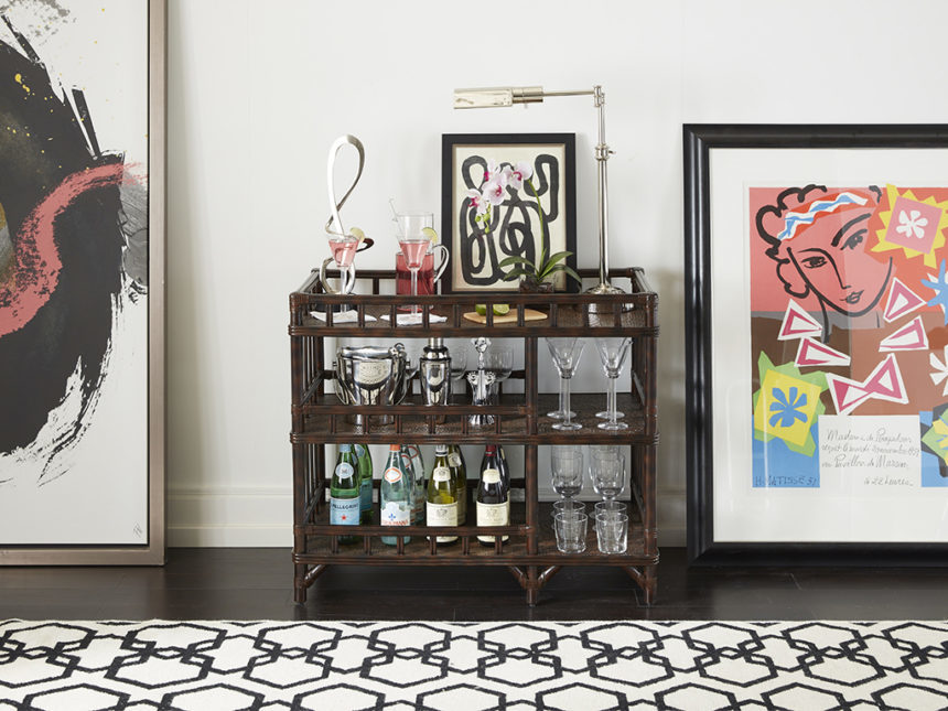
You’ve seen Lora dressed for the Kentucky Derby and kitted out as the star of the best guest room ever. This month, we’re sharing tips for turning this bar cart into a fab, functional, modern-looking marvel.

An uncluttered workspace is a good workspace! Leave plenty of room on the top shelf for prepping, mixing, and serving. When you’re not putting Lora to work, it’s easy to style her for the season with a bowl of fruit, a few succulents, or some flowers (fresh or faux).

Save some space and time when you’re hosting: Cut citrus in advance; spear some olives on toothpicks if martinis are on the menu, and keep them in a low jar in their brine.

A little task light can go a long way! If the base is small and the body is slender, you’ll add useful light without taking away from the utility of the space. (Check out our brand new Magnus desk lamp for inspiration – coming soon!)

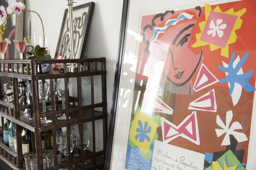
Give your hardworking bar a focal point: A small framed print or photograph propped on the top shelf (or even hung right above it) says that even the most functional space can have flair. For a modern look like ours, go abstract.

Add pops of color with bright glassware – or rely on the pretty hue of the delightful drink in your pitcher to jazz things up!

Now for the supplies: Ice bucket and tongs? Check! Cocktail shaker and a spiffy stainless steel 1 oz./2 oz. jigger? Check! Foil cutter, corkscrew, and bottle opener? Check times three! The second shelf is a great spot to stash the tools you’ll need for any occasion.

Even a petite bar like Lora has room for the ingredients for success: Bourbon, gin, rum, scotch, tequila, triple sec, and vodka are the building blocks from which most popular beverages are mixed.

Are you thirsty yet? A classic Cosmopolitan is pretty, pink, and perfectly refreshing. Here’s our favorite recipe – stir it up by the pitcher to satisfy a crowd.

Cosmopolitan Cocktail

  • 1 1/2 oz vodka
  • 1/4 oz lime juice
  • 1/4 oz triple sec
  • 1/4 oz cranberry juice
  • 1 cup ice
  • 1 lime wedge for garnish

Combine vodka, lime juice, triple sec, and cranberry juice in a cocktail shaker. Add ice, cover and shake until chilled. Strain into a chilled cocktail glass. Garnish with lime wedge.

*This classic Cosmopolitan recipe has been brought to you by, www.allrecipes.com


Check out the video to see five ways we set the bar with Lora!


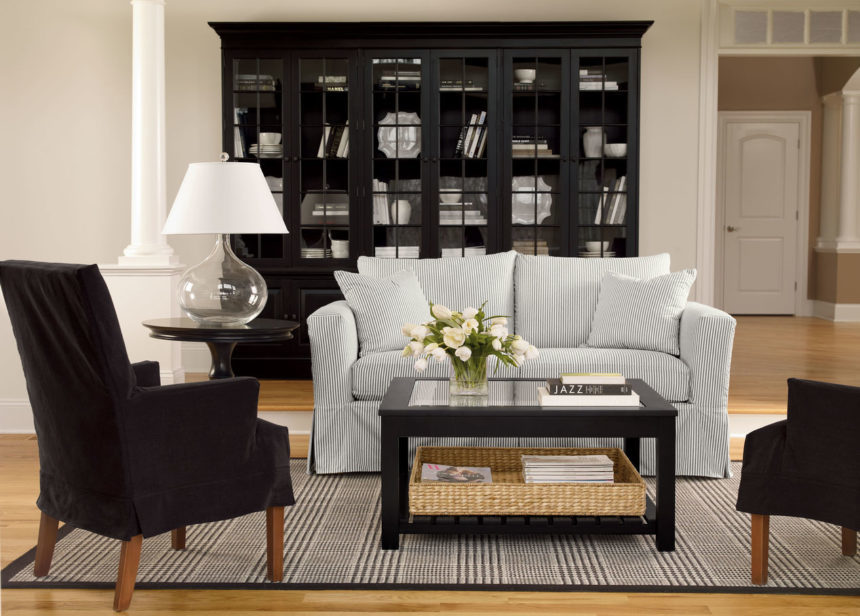
Our ever-popular Villa bookcases are currently enjoying a bit more than fifteen minutes of fame, thanks to the role they played in a recent Harper’s Bazaar makeover video (check it out at harpersbazaar.com). Here’s why they deserve the attention!

The library bookcase was an innovation of George Hepplewhite, one of three extraordinary cabinetmakers (along with Thomas Sheraton and Thomas Chippendale) who changed the face of furniture in eighteenth-century England and beyond. Well-known for his shield-shaped chairs with carved backs, Hepplewhite has been accused by some of sacrificing comfort for style. His extraordinary glass-front cabinets, however, had a very practical purpose so they were in great demand: They were designed to house the collections of fine books acquired by his wealthy patrons. These cases often consisted of several units that could span the length of a room; it’s an idea that still works! Check out Alia’s “Behind the Scenes” blog post here.

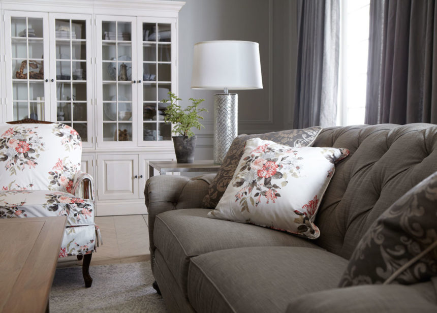
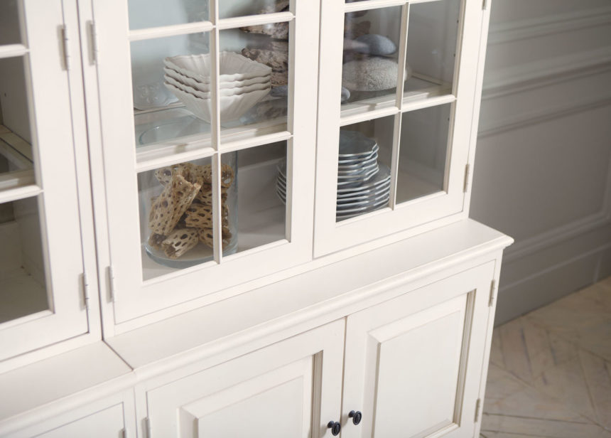
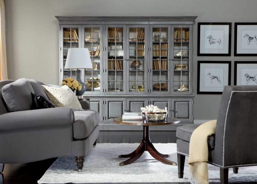
Our Villa bookcase design is an homage to Hepplewhite’s classic styling, updated for today. It has full crown molding and lower-than-usual base cabinets (maximizing display space), and it’s modular, offering dozens of possible configurations. Because it’s timeless, beautiful, and functional, Villa is, not surprisingly, one of our best sellers. Take a look at everyone’s favorite through the years (and the styles) and see for yourself just how versatile it can be.

For trivia lovers, here are a few fun facts:

  • Made from maple with a tight, uniform grain, and maple veneers, every piece in the Villa series is made in America.
  • The series is modular to the nth degree. Choose stand-alone units with complete crown molding or right- or left-facing units with molding that turns the corner on only one side; or units with nocorner molding at all, so you can line up any number of units, any way you like.
  • A single Villa bookcase consists of one upper shelf component and one lower base cabinet or file cabinet. You can also choose a standalone Villa bookcase with adjustable wood shelves.
  • Base cabinets have two raised panel doors, with an adjustable shelf behind each door.
  • File cabinet bases have drawers instead: one upper for general storage and one lower for file storage, both with soft-close glides.
  • Uppers have three adjustable glass shelves in wood frames with plate grooves.
  • Uppers can be ordered with open shelves or with glass doors and dimmable recessed lighting.
  • Villa is available in single, double, and triple widths.
  • There’s a media center, too! It includes left and right bookcase cabinets, a ventilated center media base, a bridge, and a video panel with a wire management cut-out.
  • Villa comes in a wide array of finishes. Many of them are available online; you can see them all at our Design Centers. The most popular by far is Cirrus White, a lightly distressed, crisp white paint with a medium sheen.

For more ways with Villa and other EA favorites, subscribe to The Art of Making Home and check us out on Instagram @ethanallen.


Style setter and guest blogger Alia Ahmed-Yahia shares her “ten percent further” strategy for unlocking your own personal style, your home’s best look, your brand.

By Alia Ahmed-Yahia

If I walked into your living room and you weren’t home, would I know it was yours? Does it look like you? Is it furnished with things you love? Does it reflect your style? You’d be surprised at the number of people who answer no to those questions—and how many tell me it’s because they think they don’t have a style. I believe everyone has a style. We’re all instinctively drawn to certain looks and I say go with it! The challenge isn’t inventing your style, it’s discovering what it is—and then tapping into it.

I wasn’t born a style expert—trust me, I didn’t land my first job as a fashion assistant at Vanity Fair because of my fashion sense. Back then if you had asked me to articulate my style I probably would have given you a blank stare. In those early years, I focused on learning about myself. For the first time in my life, I was living my personality out in my look—and it was different—but instead of feeling like I didn’t fit in, I felt empowered. When I look back, I can confidently say that the way I showed up to the world every day was one hundred percent me.

We live in a socially driven world with an overwhelming amount of inspiration at our fingertips. How do you want to be seen so you stand out? How do you want to communicate your “brand” to everyone around you? Unless you work in the style industry, you’ve probably never pressed pause long enough to ask yourself these questions. What’s the “secret” to unlocking your own authentic style? Look around, be aware, take note of the things you’re attracted to—and then borrow the ideas that appeal to you. Be bold. And remember, it isn’t about putting things together perfectly, it’s about understanding the small surprises and elements that make you—and by extension, your home—unique.

Visualize how you want to live. Allow yourself to experiment and dream. Get out there. Browse home furnishings stores. Look at shelter magazines. Check out interior designers’ websites. Try things out. Evolve, shift, stay put, move on. Remember there’s no absolute “right” or “wrong.” We think we don’t do it “right” on the first try, we must not have what it takes. In reality, that tension between something familiar and something completely new is what makes style interesting. The trick is finding that tipping point—the place you imagine you’d go if you couldn’t get it “wrong.”
My advice is to take your look “ten percent further”—to that exhilarating place you want to be. Make one little change that takes you outside your comfort zone. Try that thing you’ve never tried because you aren’t completely sure how to pull it off. Allow yourself to inexplicably react to things you love (even if you aren’t sure how to make them a reality) and commit to them as your “ten percent.”

Thinking in terms of ten percent gives you a tangible roadmap as you begin to design (or redesign) a space. It’s a little like taking baby steps; they make all the difference in the world. For example, if my ten percent is gilded objects and black high-gloss trim, and yours is layered Moroccan rugs, our rooms would be uniquely ours—even if we started with the same core pieces.  As you begin to develop your look, bring it to the forefront of your home, make it a focal point, repeat it multiple times, and downplay the elements around it so it can be a proper “hero.”

Keep doing this and before long, you’ll be getting credit for not only having style, but for having a signature style of your own.

Alia is a style and branding consultant and the creative force behind the #harpersbazaar #DesignGirlfriend series. See what’s she up to on Instagram @thestylescout and discover new ways to make your home your own every day: Subscribe to The Art of Making Home.