For those of you who haven’t yet checked out the first episode of Design Girlfriend, Alia Ahmed-Yahia’s fresh home décor miniseries on harpersbazaar.com, please do. To find out how it all came together, what went right, what went wrong, and what really went on behind the scenes, keep reading!

Design Girlfriend is a cool collaboration between Alia and the folks at Harper’s Bazaar. They showcase her mad style skills and passion for all things home, DIY, and fashion-forward on their website.

As a former ELLE editor, she already had a relationship with Hearst, Harper’s parent company. “When the video editor saw an Instagram story I did about painting my boyfriend’s dining room chairs high-gloss black, she called me and said, ‘That’s the show,’” remembers Alia. “We did a test run on my iPhone and the editors loved the reel so much they green-lit a three-episode pilot.”
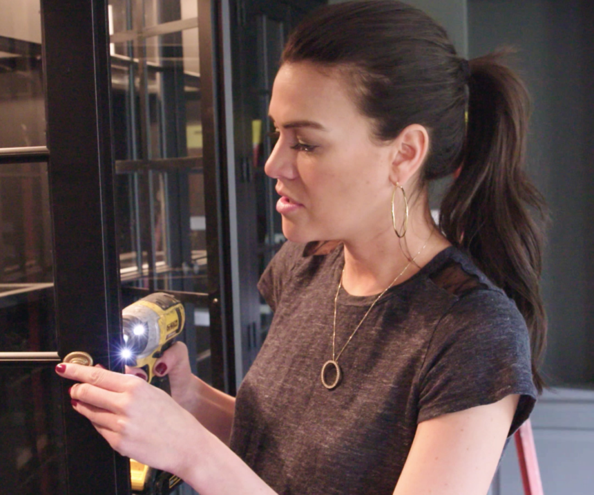
They decided on one transformation per episode—with mini craft tutorials: a living room turned into a Polo bar-inspired putting green room; a vintage armoire retrofitted to become a sophisticated bar; and a bedroom closet (sans doors) made into a cool office space. It took around three months to prep for the three-day shoot on location in Connecticut.

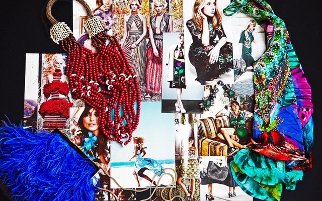
Alia created mood boards for each episode and then reached out for furnishings, materials, and workers. She found experts, including a master carpenter and putting green installer, who were willing to work within her tight timeframe.

“The Hearst film crew showed up each morning around 6 a.m. and left around 10 p.m. It was a whirlwind,” she says.  Every room in the house was turned upside down, as furniture was moved in and out, carpenters hammered away, assistants set up Alia’s DIY craft projects, Bazaar staffers kept tabs on the production schedule, a makeup artist kept the shine off Alia’s face, and videographers documented everything. All and all, there were some twenty people in the house every day.

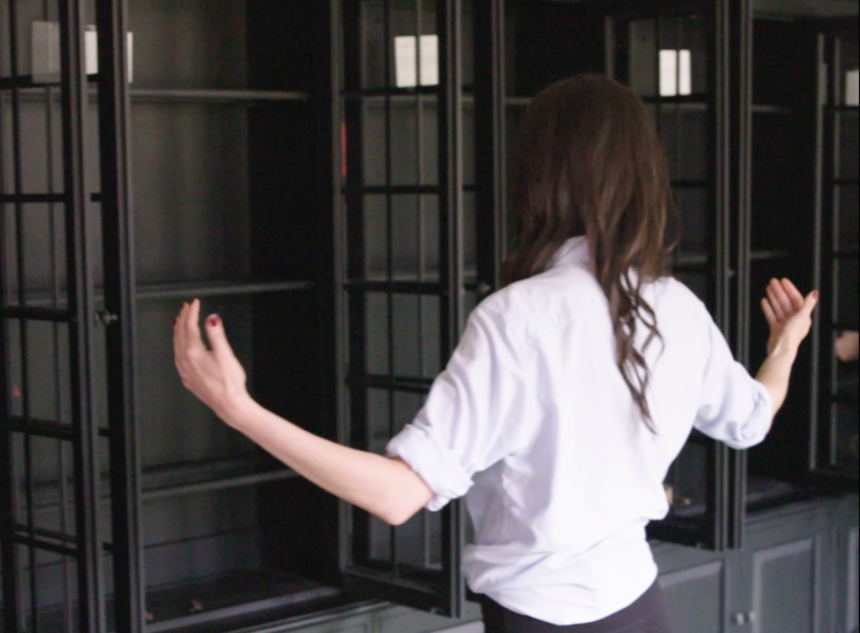
Ethan Allen’s part in the living room makeover involved providing key furnishings: seven Villa bookcases that Alia envisioned lined up along the back wall. The carpenters created custom panels to fill the spaces around the bookcases and topped them with crown molding to give the appearance of built-ins. That proved glitchy. First, a measuring mix-up created gaps at both ends of the room—one of them wide enough for Alia to stand in. The pre-cut filler panels would have to be redone, so it was off to the lumberyard for more wood. Second, there wasn’t enough black paint (painstakingly matched to the Villa finish), so they had to take a cabinet door down to the paint store to mix (and match) some more. In the end, the bookcase wall looked fabulous, and Alia styled the shelves beautifully.

Sounds crazy, right? Alia was barely fazed. Her takeaway: “It was such a cool experience, I would do it all over again in a heartbeat!”

We’re delighted to be partnering with Alia in even more creative ways in the future. For starters, you can read her first guest blog here on August 3. Subscribe to The Art of Making Home and you won’t miss a thing. Check us out on Instagram, too @ethanallen.
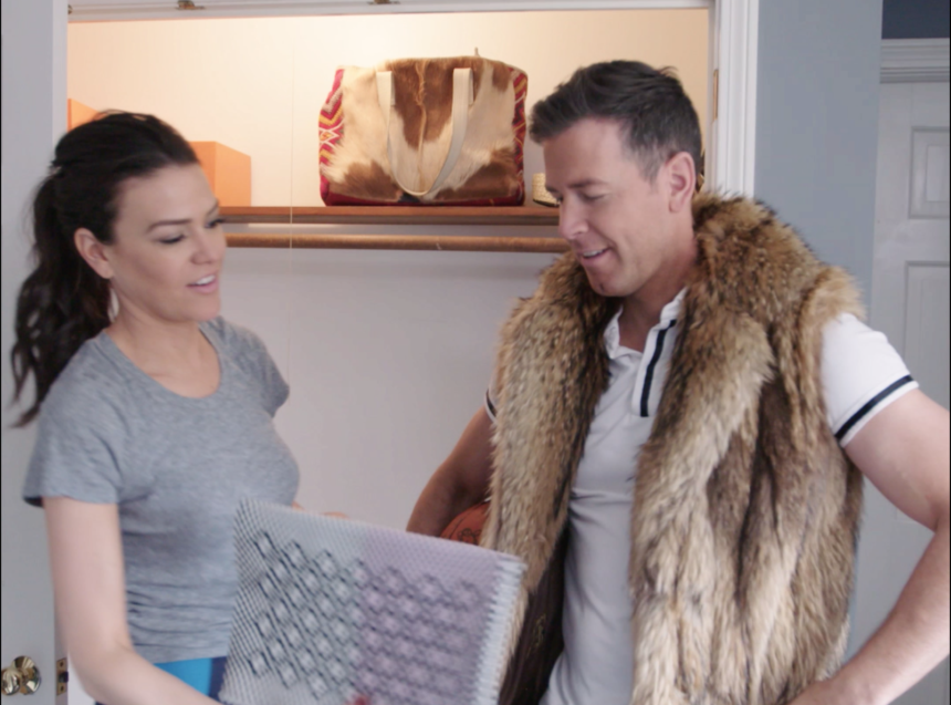


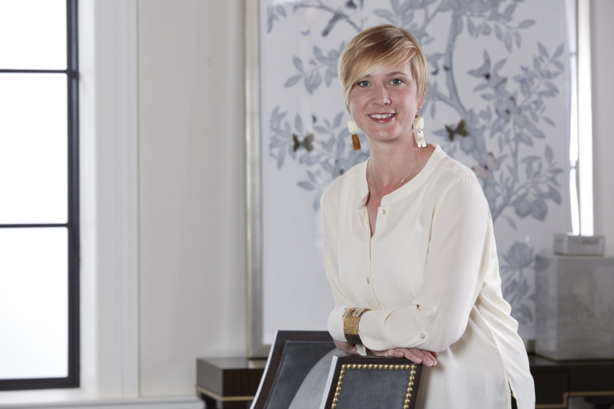
Meet Alia Ahmed-Yahia, a longtime fashion pro and blogger who is now bringing her style expertise to the world of interior design—and to Ethan Allen! Alia has fresh ideas and an imaginative perspective on the art of making home.

At first, we were a little skeptical of the idea of lining a wall with seven of our Villa bookcases in a room that would be transformed into a putting green. It seemed just a little too far outside the box. But the proposal came to us from Alia Ahmed-Yahia, a savvy style expert with street cred: She’s worked as a fashion editor and stylist at ELLE and Vanity Fair, and for six years was style director at Ann Taylor/LOFT. Turns out Alia wanted to parlay her years of fashion expertise into the world of interior design, so we leaned in.

Turns out these days, Alia’s producing The Design Girlfriend, a home décor web series for Harper’s Bazaar. “We want to create home content that feels more engaging and less ‘how to’ than what’s currently out there,” she says. “To that end, we created a hybrid of tutorials and reality. The series has a narrative, stakes that add drama and tension, and clever design takeaways that make projects feel aspirational, attainable, and personal.”

Now live on Harper’s Bazaar YouTube Channel,  The Design Girlfriend will also be available on some of Hearst’s other websites.

But why a putting green in the living room? The series’ first three episodes were shot at the Connecticut home she shares with her boyfriend and business partner, Jamie Bosworth, who happens to be a serious golfer and golf entrepreneur. Why our bookcases? Alia told us her vision was inspired by the classic décor of The Polo Bar, a New York restaurant designed by Ralph Lauren—and when she fell in love with Villa’s architectural details, she decided they’d be perfect for the room’s long statement wall. She imagined the rest of the furnishings would be more modern and transitional, save for an elaborate gilded mirror over the mantel.


As the home of “classic design, modern perspective,” Ethan Allen is all about versatility, and we could see that Alia’s unique perspective on style is really in sync with ours: Anything goes if you have the confidence to step up and try something new! We invited her to join us as a guest blogger, and we look forward to sharing her insights in the coming weeks—but first, meet Alia!

EA: Tell us a little about yourself.

ALIA:  I grew up as the oldest of seven kids in a small town in Wisconsin and moved to New York City the day after college graduation. I didn’t know a soul, but I had a resume, and two feet, and I was determined to do something creative.  I pounded the pavement until I got a very lucky break and was hired as a fashion assistant at Vanity Fair magazine. I didn’t land the job because of my fashion sense (back in those days if you had asked me to articulate my style I probably would have given you a blank stare); I succeeded because I was willing to learn and work hard. I spent my early days in a windowless room with a troupe of interns cataloging all the designer clothes, shoes, and jewelry the magazine’s editors were borrowing from high-end designers for celebrity photo shoots.

EA: Where did your fashion career go from there?

ALIA: After Vanity Fair, I went to a small startup, then Glamour, where I was accessories editor. I launched my own luxury e-commerce company, helped shape a fashion blog and video series for ELLE, and then went to work at Ann Taylor, where I was style director for six years; I like to say I got my MBA in retail there! Throughout my career, my ethos has always been to empower and help people identify their sense of style, and then translate it into the way they live, as in “what does that look like in your house?” and “what does that look like in your look?”

EA: What is your fashion POV?

ALIA: Style is an evolution, not a revolution. And experimentation is essential to evolution.  You won’t always get it right, but some of the best creations in the world were happy accidents.  Allow yourself the freedom to try new things but don’t have the expectation that everything will work.

EA: Why segue into the world of interior design?

ALIA: Great personal style steps out of your closet and into your life. The way you decorate, just like the way you dress, is a reflection of your personality.  I’ve always loved home décor and design. It’s visual like fashion, and like fashion, there are design principles that inform your decisions and your look. Your home is a living canvas for your personal brand

EA: What would you say is your home design POV?

ALIA: It’s conversation starting. I like to have something in every room that flips traditional design on its head, uses a piece differently from the way it was intended, or creates a moment to talk about.  I design each space with a feature focus (the place in the room your eye lands first), then layer in quieter vignettes that may be discovered as you move throughout the space. I am a “more is more” girl, so I love an abundance of bold color, graphic silhouettes, pattern, and layering. Defining my feature focus as a starting point helps me dial everything else back to make sure the focus is the hero.  There can only be one star!

EA: What drew you to Ethan Allen?

ALIA: You offer some incredibly modern pieces that have a lot of versatility and speak to different design styles. They can be styled in a conventional way to appear traditional, but there’s a huge opportunity to inspire new looks (and new customers)! People tend to be literal, so if you don’t show them a vision, very few will come up with one on their own.  It’s why Pinterest and Instagram are so popular; they’re places to discover new ideas and opportunities. When I oversaw style direction at Ann Taylor/LOFT, my styling philosophy was “show something familiar and mix it with one new idea.”  Taking a risk is hard, but it’s easier if you push yourself to step 10 percent out of your comfort zone.

EA: Tell us more about the Harper’s Bazaar project.

ALIA: It’s a concept that marries entertainment and valuable style/design ideas. We shot three episodes/three projects from beginning to end, in just three days! There were some hiccups along the way, but that’s what made it fun. We’re thrilled with the putting green room!

EA: Can we give readers a preview of the EA episode?

ALIA: Absolutely!

Don’t miss Alia’s guest blogs! Subscribe to The Art of Making Home and check us out on Instagram, too @ethanallen.

Put the finishing touches on your outdoor décor with gorgeous outdoor accents! These outdoor accessories stand up to the elements—and they look beautiful doing it.

The garden gnomes at Ethan Allen have been very busy this spring and summer!

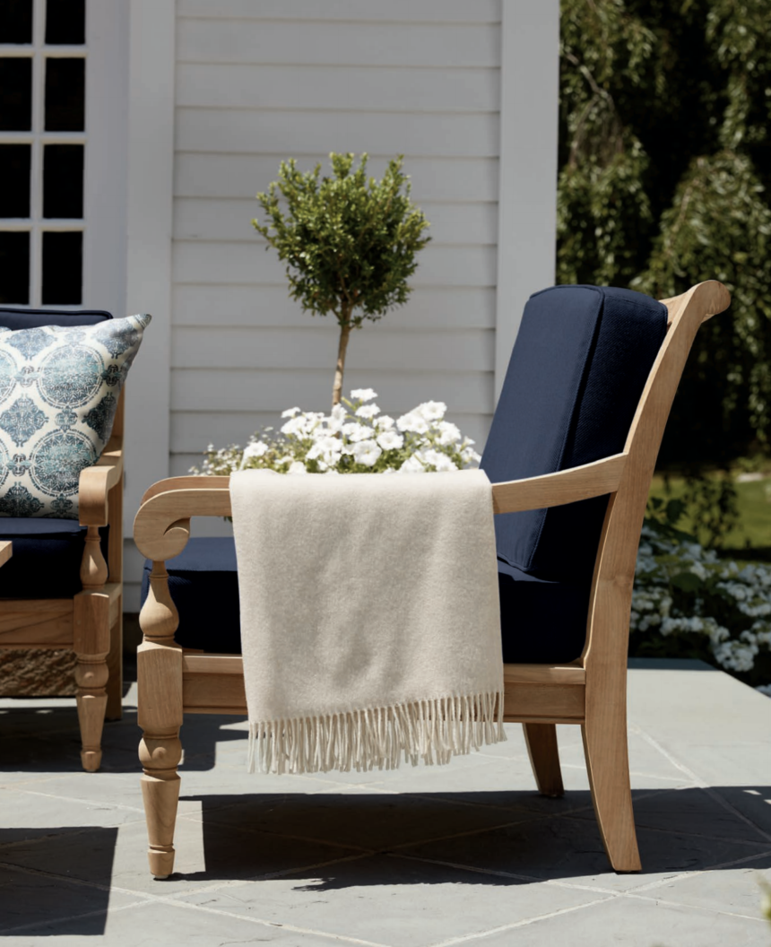
In May, we launched a new selection of pillows, cushion fabrics, umbrellas, and outdoor rugs. We’re also launching two new lines of patio furniture in August: Vero Dunes, an all-weather wicker wonder, and the modern teak Bridgewater Cove collection. In addition to having the durability and quality you expect from Ethan Allen, they have clean lines and deep, comfortable seats, perfect for chatting at a garden party, lounging with a good book, or relaxing and watching the fireflies.

Decorating an outdoor room is a lot like decorating an indoor room. Well-designed outdoor spaces, like their indoor counterparts, are perfected with carefully chosen finishing touches. Once you’ve settled on the perfect patio furniture, these products, from gorgeous outdoor fabrics to stunning accessories, will help you top off your patio in style.

Fabulous Fabrics

Our new fabrics are color coordinated for easy mixing and matching. We start with three choices for cushions (navy, taupe, and white) to form the base for your outdoor palette.

The next thing to consider are pillows. In most instances, you can just pick your favorites and feel confident that they’ll play well together. Even so, these hints will help you mix patterns like a seasoned design pro—and of course, if you get stuck, you can always schedule a complimentary appointment with an Ethan Allen designer!

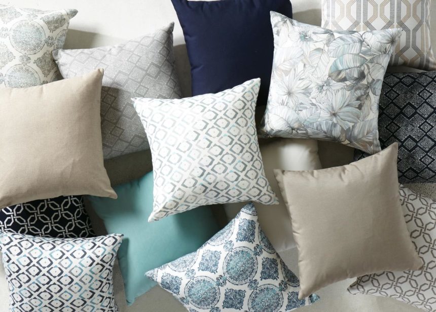
Take a look at this pillow-palooza from our recently released digital Home and Garden brochure. Here’s how we put it together:

  • You need a hero. Start with a hero pattern that’s bold and large in scale. We chose the Falco Indigo outdoor pillow, with its large medallion design, as our starting point.
  • Give it some sidekicks. Pair your hero with partners that share the same colors but have smaller patterns. Here, the Collins Indigo outdoor pillow, with its modern ikat pattern, and the Distin Navy outdoor pillow, with its diamonds, are complementary without being overwhelming.
  • Anchor it. The Reale Turquoise outdoor pillow has the dreamy appeal of an Caribbean oceanfront—but its solid styling helps your hero and sidekick grouping stay grounded.

The best thing about our outdoor cushion and pillow fabrics is that they’re as durable as they are beautiful. They’re made from Grade-D Sunbrella fabric that’s colorfast, stain- and mildew-resistant, and very easy to clean and maintain.

Of course, you have to be practical—no pillow left out in the elements, 24/7, is going to look perfect at the end of summer. It’s always a good idea to store your cushions or pillows when they’re not in use, and protect your furniture frames with sturdy, weather-resistant covers.

Ravishing Rugs

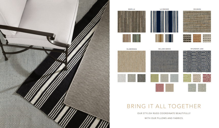
Once you’re chill-axing on your comfy cushions and pillows, it’s time to think about what’s underfoot. A rug really brings a room together, even outdoors. You can add pattern with rugs—either make the rug the hero or make sure it knows its place as a sidekick!—or choose a solid that fits your pillow pattern play.

For a bold, summery navy-and-white striped hero, choose our LaGrange rug.

Note that subtle patterns, like herringbone, can function as a solid while adding more visual interest. Our Willow Grove and Splendor Lake rugs, both available in five gorgeous color combos, make excellent sidekicks in any pattern story. Neutrals are also good, particularly when they add a textural touch. Check out our Marilla rug; its flat weave almost gives it the look of grasscloth, but it’s made from high-performance fibers. Finally, we’ll let you in on a little secret: both our pillows and our rugs are as lovely indoors as they are outdoors.

Unbeatable Umbrellas

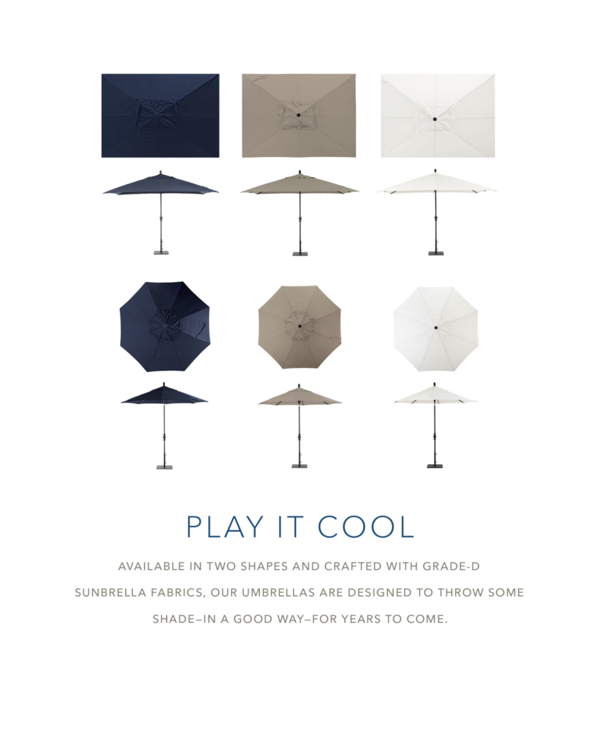
Our patio umbrellas are no shrinking violets. Our rectangular models are 8′ x 11′, and our round umbrellas has a 9′ diameter, which helps ensure your garden party goes forward, rain or shine. They’re also vented to help them handle wind gusts and summer storms—but again, be practical. Make sure to crank them closed when you’re not using them.

Our patio dining tables are available with and without holes for your umbrella. If you choose a patio umbrella, make sure to purchase one of our decorative stands to support it. Our umbrellas are easy to tilt, to keep you shaded at any angle.

Take a look at our Home and Garden brochure to see how these outdoor styles come together. We’ve made it easy to take the art of making home outdoors.

For more great decorating tips, indoors and out, subscribe to The Art of Making Home. You’ll get an email notice from one to three times a week letting you know it’s time to kick back with some tea or coffee and get your inspiration on.


In which we discuss unicorns, the secret society of blacksmithing, and the only definition of transitional you’ll ever need.

“Sometimes you can make a unicorn.”

This improbable statement comes from Laura Chapman, Ethan Allen’s normally quite rational senior director of product design, who sat down recently to talk about what she does and how and why she does it.

We weren’t expecting mythological creatures to play a part, but like any good designer, Laura isn’t one to let convention stand in the way of possibility. Also, it turns out, she had a solid, not-at-all loopy reason for saying it.

“I’m looking for unicorns all the time,” she explains. “That’s where design comes from, if you’re doing it right and doing a good job. You look at tear sheets [an interior design term for product information and specs] and do trend research and go to the shows [trade shows, where inspirational designs debut; kind of like Fashion Week for furniture], and you still have this thing in your head that you haven’t seen. That’s the unicorn.”

Laura started at Ethan Allen about four years ago, though she counts the time a little differently. “Nine introductions,” she laughs – nine distinct product launches of dozens of products each, to which she contributed. That’s more than two introductions a year, each requiring knowledge, inspiration, a fresh perspective, a willingness to jump into the unknown.

“For any designer, it’s hard not to repeat what you just did, maybe with a slight variation,” she says. “You have to go past what you know works, to take a bigger risk into something that’s unknown.”

Art in the Family

Furniture wasn’t always part of Laura’s plan.

She earned a degree in painting from the University of Cincinnati which, she says, “qualified me to be a starving artist.” She worked in bookstores; her boyfriend (now husband) was, and is still, an artist blacksmith. It was a paycheck-to-paycheck life, but also a flexible one.

Stop. An artist blacksmith?

“Not to be mistaken for a farrier,” she clarifies, “who might make shoes for unicorns.”

Laura’s husband, Andy, makes tools, furniture, and art, and he teaches at a local arts center and through the community youth agency, where children as young as ten can become amateur smiths, if they’re interested. “It’s always been like this underground subculture,” Laura explains. “These smiths know each other or find each other. Because of shows on the History Channel, it’s even more popular now, but also more like a cult following. People want to become weekend blacksmiths, so his classes are booked.”

Even their kids are in on the action. “Lucy will be five this month. She has a half-pound hammer and an anvil about the size of that computer mouse. Ben is eight, so his hammer weighs four pounds, and his anvil’s a little bigger. We give them things to mash –  bottle caps and copper wire. They’re both very interested!” Ben even knows how to use the vise, which he’s not supposed to do when mom’s not looking. “Of course, if I turn my back, something’s in that vise. It might be something that’s meant to be there, but it might be a Tonka truck.”

(We’d like to clarify here: Laura’s children are not in a forge! Theirs is a fire-free experience. So far.)

Time for a Change

Because they could, Laura and her husband packed everything into their car, took a month-long trip around the country, and landed in Austin, Texas. In the four years they lived in Texas, Laura volunteered in art galleries and found gigs at Whole Foods: first, managing the bakery, and then, as the beer buyer. “When you manage a department at Whole Foods, it’s like running your own business. I earned a really thick skin dealing with beer vendors every day. Some were great, but some thought they could take advantage, and I was not that person.”

OK, but how did she get from beer to product design? In Laura’s family, a lot of life-changing decisions are made over big, greasy spoon breakfasts in cafés. “It’s how we decided to move to Texas, and it’s how we decided, ‘Hey, someone has to make a living, I have these weird noodly drawings of furniture in my notebook, so why don’t I do that?”

Next stop: a tiny design school in western Michigan (once a hub of U.S. furniture manufacturing). She specialized in upholstery design because she liked the sculptural nature of the products, and she learned about manufacturing and research and development.

The first company she worked for after graduation sold furniture by the pound, as in, Buy two recliners, get the table that fits between them free! “That table was one of my first pieces,” she shares, “and that tough skin I got as a beer buyer really came in handy. These guys were the definition of old school.” From there, she networked her way to Mitchell Gold, where she eventually became the head of both upholstery design and R&D.

Form Follows Function

Rather than dreaming up something pretty, then figuring out how to make it, Laura says the process of good product design is the opposite. “You can build anything once; it’s a different ballgame to build something that will hold up to repeated use – or repeated production.”

Laura got her education in construction while designing upholstery for a firm where everything is manufactured on site. “Knowing the construction requirements and how to build for comfort – those are the pillars for everything else. I learned a lot about construction because I saw it happen and had it explained it to me. I can’t engineer a frame myself, but I can speak intelligently on how to problem solve thanks to that. I can then make the form around it whatever I want it to be. ”

Laura approaches each new design as an assignment. “An assignment might develop because we have a need in the line, or it might be that we’ve identified an emerging trend. Every once in a while, there’s a design we’ll fight for because no one else is doing it and we know should try it.” Of course, sometimes those designs turn out to be popular, which, Laura maintains, is proof that “people see the unicorns!”

She stays on top of style trends and knows what other manufacturers are doing, but for real inspiration, she has a favorite source: vintage. “I love getting abstract ideas from vintage furniture – collaging this leg with that seat with this arm. And because I’m the one sketching it up, I don’t have to explain to anybody what Frankensteining those pieces together should look like.”

Transitional might be the most common description of style in the last 20 years, even if few people can tell you exactly what it is. Laura can! In Laura’s mind, transitional style is about taking a vintage form and boiling it down to its essentials. “Picture a Queen Anne highboy: It has the big crown on top, the cabriole leg, carvings, details. To make it transitional, you’d take it down to just the shape. Maybe it still has the crown, but there’s no carving; it has the cabriole leg, but it isn’t ball-and-claw.” Taking timeless styles down to their essentials preserves the form, but delivers something more modern because the traditional elements have been eliminated. Transitional can also go the other way, relaxing a sleek modern form by giving it a new finish, for example, to make it more casual.

One of the most rewarding parts of Laura’s job is encouraging her team to chase those elusive unicorns. “When you’re pushing the whole team to do something new – the designers, the engineers, the manufacturing team – and then it happens, it’s exciting. You achieve so many different goals on the way to getting a really unique design. If we’re working on a new product and referencing something that’s truly vintage or antique – I have no problem with that. But this ephemeral it-doesn’t-exist-but-can-we-get-there? sort of thing; that’s when you know you’re really onto something.”

Laura never let go of her dream of being an artist of the non-starving variety; she just found an unexpected way to make it happen. “People love their furniture,” she says. “They love their homes. I think the idea of making functional art, art that performs a service, is ultimately how I ended up here.”


Summer brings warm days, cool drinks, and – sometimes! – vacationing visitors. With our Lora bar cart ideas for your guest room, you can be the host with the most.

They’ve traveled many weary miles, or maybe just across town. They’re staying for a week, or a weekend, or a night. You’ve opened your doors to them, and you want your overnight guests to feel like the VIPs they undoubtedly are.

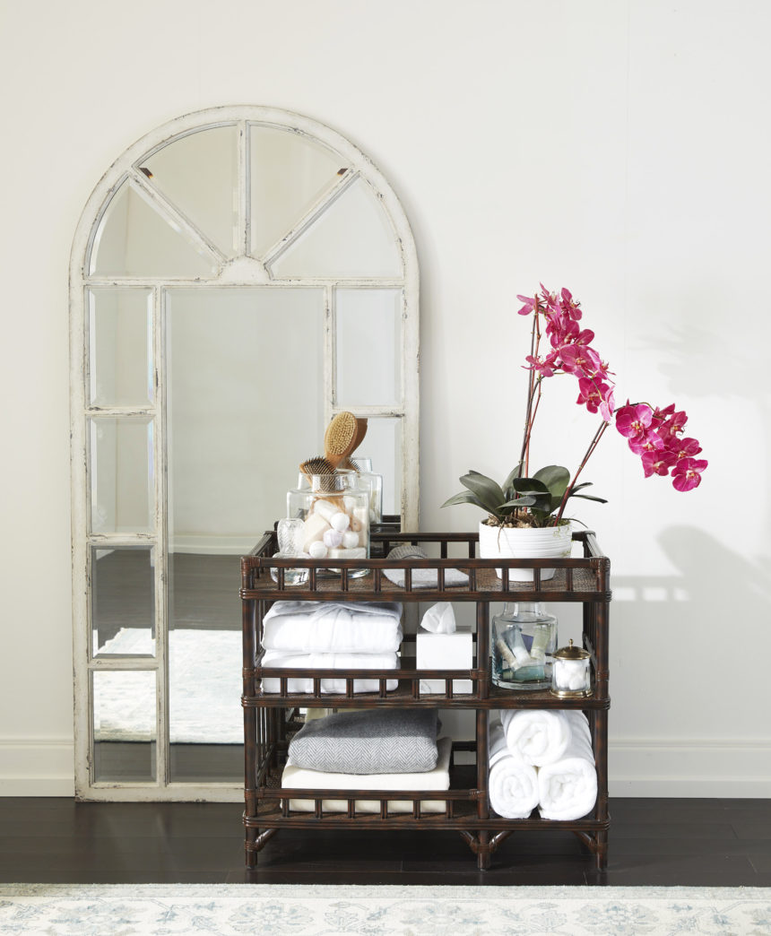
Help is on the way—in the form of our Lora rattan bar.

Now, we’re not suggesting that you tie one on, although that’s one way to relax with your guests! Instead, we’re going to give you ideas for how to style a bar cart in a whole new way. Making guests in your home (or even in your Airbnb rental!) feel at home comes down to providing a few simple conveniences. Lora, as the perfect combination of organization and presentation, has you covered.

1. Luxurious Linens

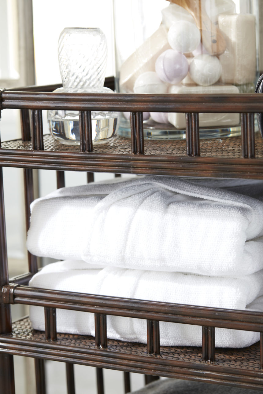
In addition to providing clean sheets and pillowcases for the guest room, stock Lora with some bedding basics, like an extra blanket, pillows, or a cozy throw, so guests can make themselves as comfy as they’d like. Retailers often carry inexpensive unisex waffle-weave robes – another item your guests might appreciate. These items fold easily and tuck into Lora’s shelves.

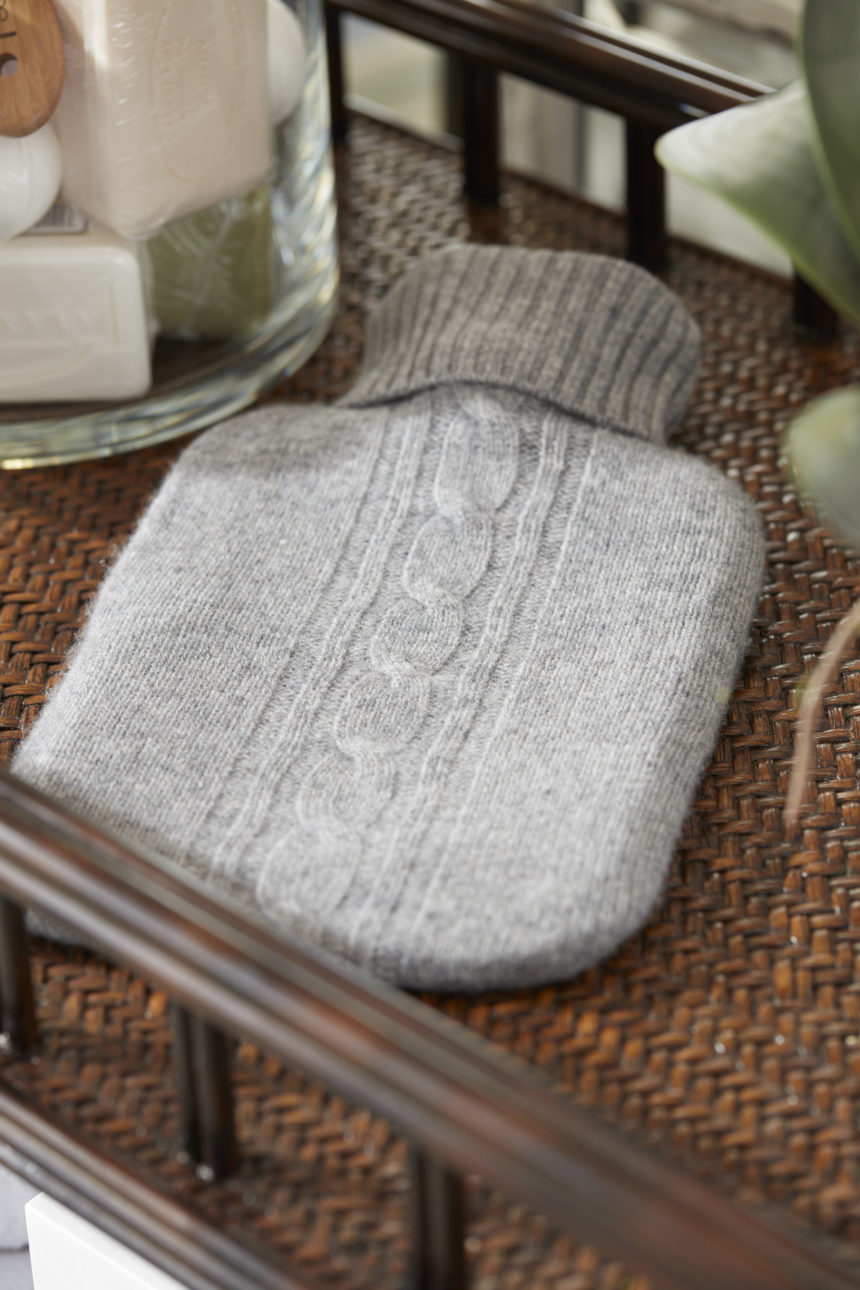
Bonus: For cold nights, we love Naked Cashmere’s Helen hot water bottle. It’s a hot water bottle tucked into a cashmere sleeve—a gorgeous way for your guests to stay warm.

2. Spa Serenity

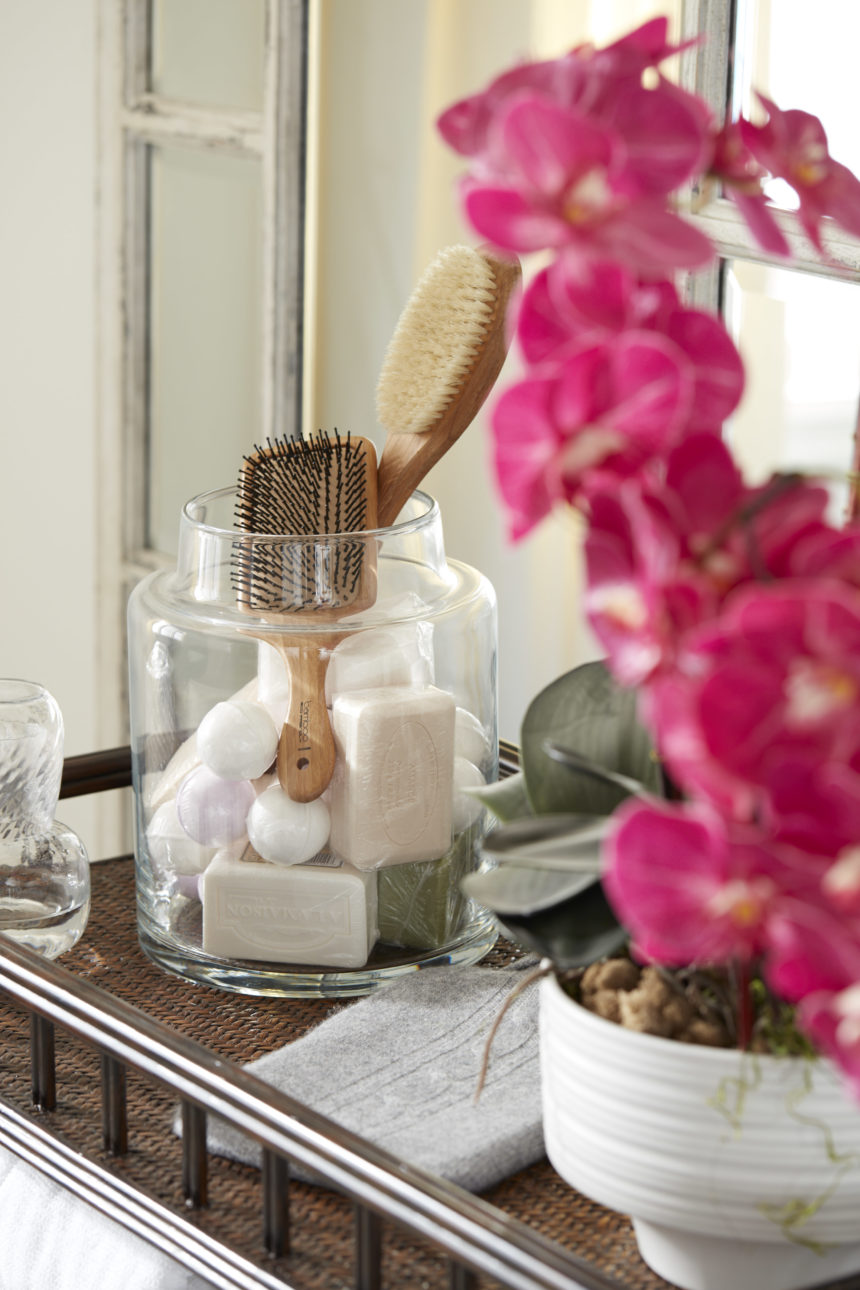
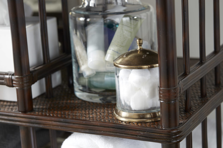
Provide guests with soaps, shampoo, conditioner, body wash, lotion, razors, toothbrushes, toothpaste, and other essentials. Place them in one of our Apollo apothecary jars and put the jar on one of Lora’s shelves. If there’s a tub and your guests are the soaking kind, bundle up some bath bombs or bubble bath to help them relax. Also, don’t skimp on the fluffy towels and washcloths! Lora has plenty of room for storage.

3. Everyday Electronics

Nothing is more frustrating than forgetting a hair dryer or a phone charger when you go on vacation. In addition to providing a spare hair dryer, keep an assortment of extra chargers, cords, and adapters for your guests—or even a charging pad if you’re feeling fancy! Roll the cords and secure them with hook and loop tape to keep them from getting tangled. Then, corral them in an Apollo jar, and place the jar on one of Lora’s shelves.

While you’re thinking of it, make sure there’s a visible, accessible electrical outlet or power strip, so guests don’t have to move your furniture to charge their phones or tablets. 

4. Marvelous Miscellany

As you’re coming up with ideas for your guest room cart, take a tip from Airbnb superhosts everywhere: It’s the little things that mean a lot.

  • Stock Lora with a stack of fun paperbacks or decorating lookbooks (stack heavy items on the bottom shelf to prevent tipping!);
  • light reading, like local magazines or The New Yorker, which has great fiction;
  • activities like Sudoku or crossword puzzles, a deck of cards, or a few board games; and
  • nonperishable sips and nibbles, like cookies, crackers, fruit, or nuts, plus a carafe of water.

As a finishing touch, top off your Lora guest cart with a vase of fresh flowers. And why not add a bottle of wine, a corkscrew, and some wine glasses? We’re talking about how to style your bar cart, after all!

With Lora in your corner, that little B&B down the road will have nothing on you! Whether you’re entertaining family and friends or making Airbnb guests at home, everyone will feel pampered and welcome – and you’ll earn that rep as the Best. Host. Ever.

Get handy decorating tips delivered to your inbox a few times a week! Subscribe to The Art of Making Home.


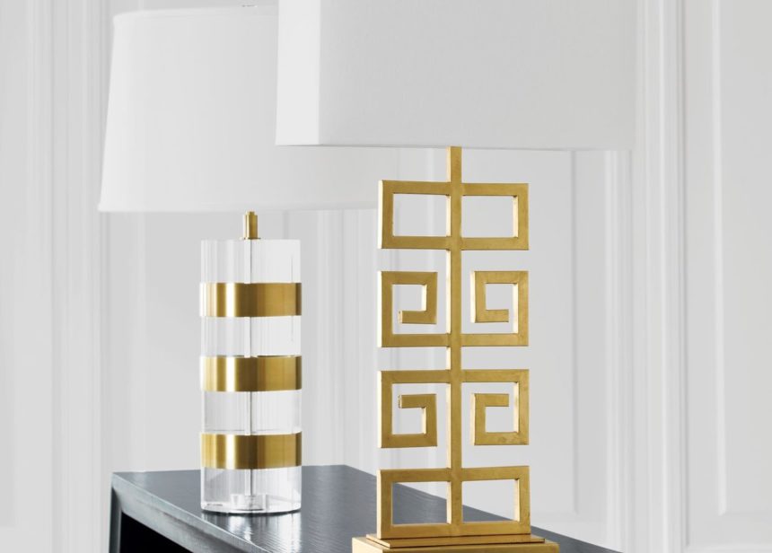
See how the Greek key motif has evolved from decorative border to noteworthy detail to centerpiece—and beyond.

They say everything old is new again, and that’s surely true of the Greek key. It’s a design pattern both classic and classical* that can be traced to the fifth century B.C., the Golden Age of Greece. Curiously, versions of the Greek key have been found in the artifacts of other civilizations predating (and following) this period, but the motif has always been most closely associated with Greece.

At its most fundamental, the pattern, also known as the meander motif, is made up of a long, unbroken line that repeatedly folds back on itself. It’s said to mimic the ancient Meander River of Asia Minor, notable for its many twists and turns. (It’s the same 250-mile river known as the Menderes that flows through Turkey today.) The motif was believed to symbolize infinity, or the eternal flow of life. Among many other things, it was used as a decorative border on Greek pottery, mosaic tiles, and temples.

Fast forward to the eighteenth century, by which time the motif had made its way into the design vocabulary of most of Europe. It was an ornamental favorite during the French Empire and English Regency periods. And in the nineteenth century, archaeological digs in Greece, Rome, Egypt, and Pompeii turned up Greek key-inspired styles in furniture and art on both sides of the pond.

The Greek key figured prominently in the U.S. during the Hollywood Regency period, where it appeared on everything from chair arms and table legs to cabinet hardware, and it has remained a constant in present-day neoclassical architecture. Because of its elemental simplicity, it lends itself beautifully to contemporary uses in furnishings—from textile and rug patterns to metal bases and wood inlays. The Greek key border provides contrast on draperies, pillows, and bedding. It brings a fresh, stylish sensibility to any interior; there’s a reason why it’s stood the test of time.

Here are some key interpretations from our recent introductions.

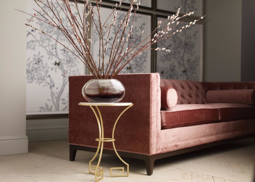
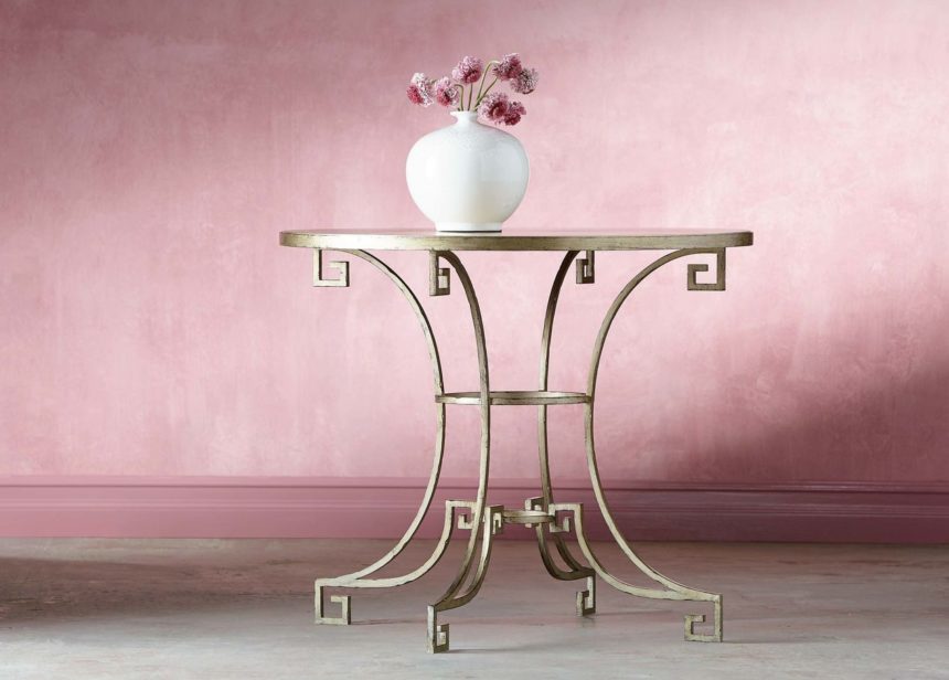
An open base with Greek key contours lends the Delos Island side table a classic look and a light and airy feel.

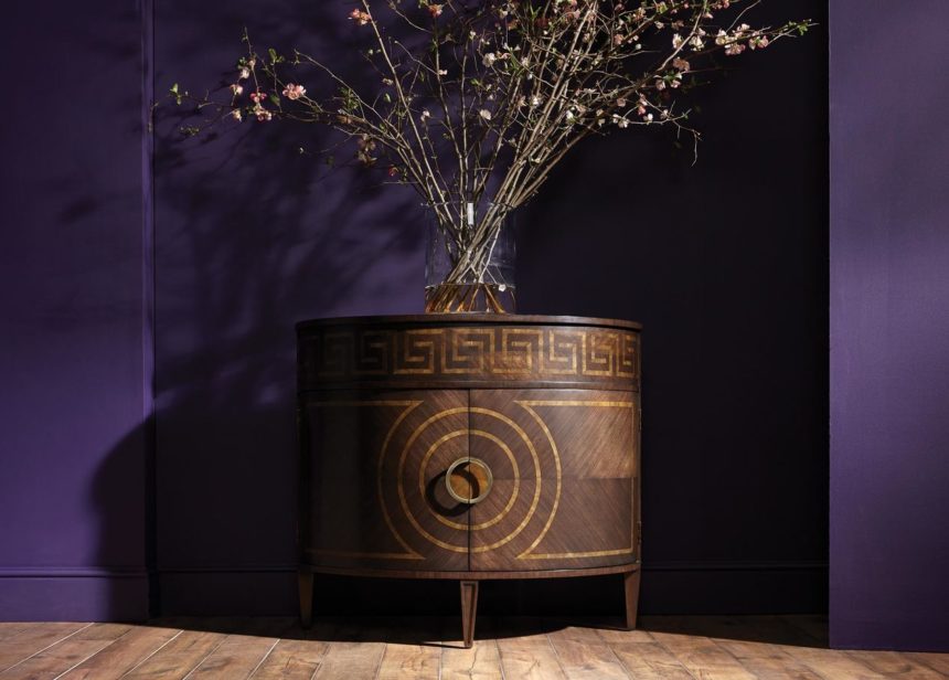
The bold Greek key border on the demilune Kronos chest takes the piece from petite and practical to sublime.

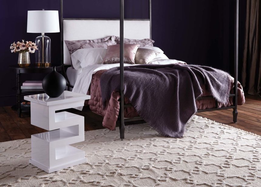
What happens when the Greek key is the piece? Our Zee lacquered accent table turns the motif on its head, with contemporary flair.

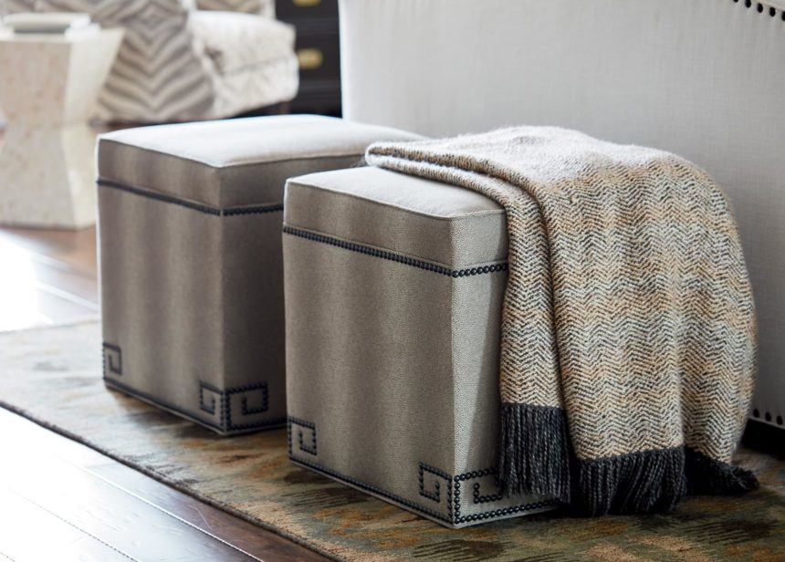
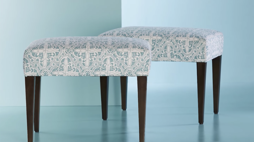
Full disclosure: the Greek key nailhead detail is optional. But just how fetching is the Madie square ottoman when embellished like so?

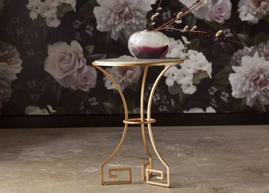
Greek key feet and a smooth marble top combine to create the Willow Key, a little goddess of a table that can live in any room.

*Classic is used to describe something traditional, enduring, serving as a standard of excellence; while classical relates to the ancient Greek and Roman world, especially to its literature, art and architecture.

For more inside design info, subscribe to The Art of Making Home and check us out on Instagram @ethanallen.


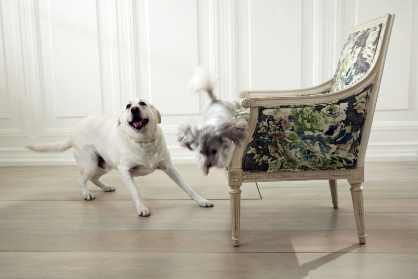
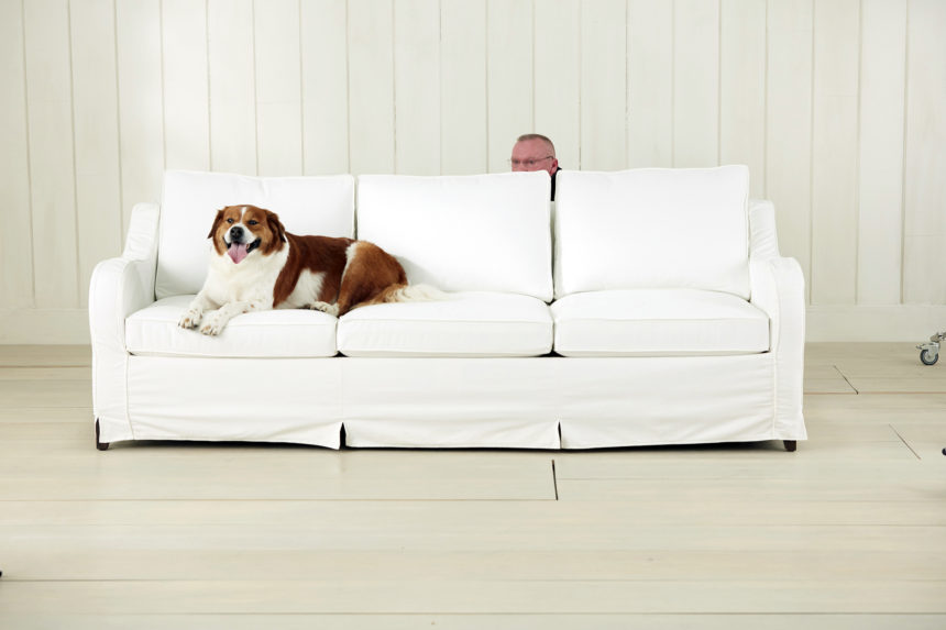
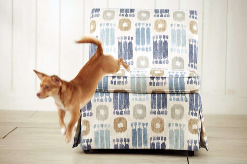
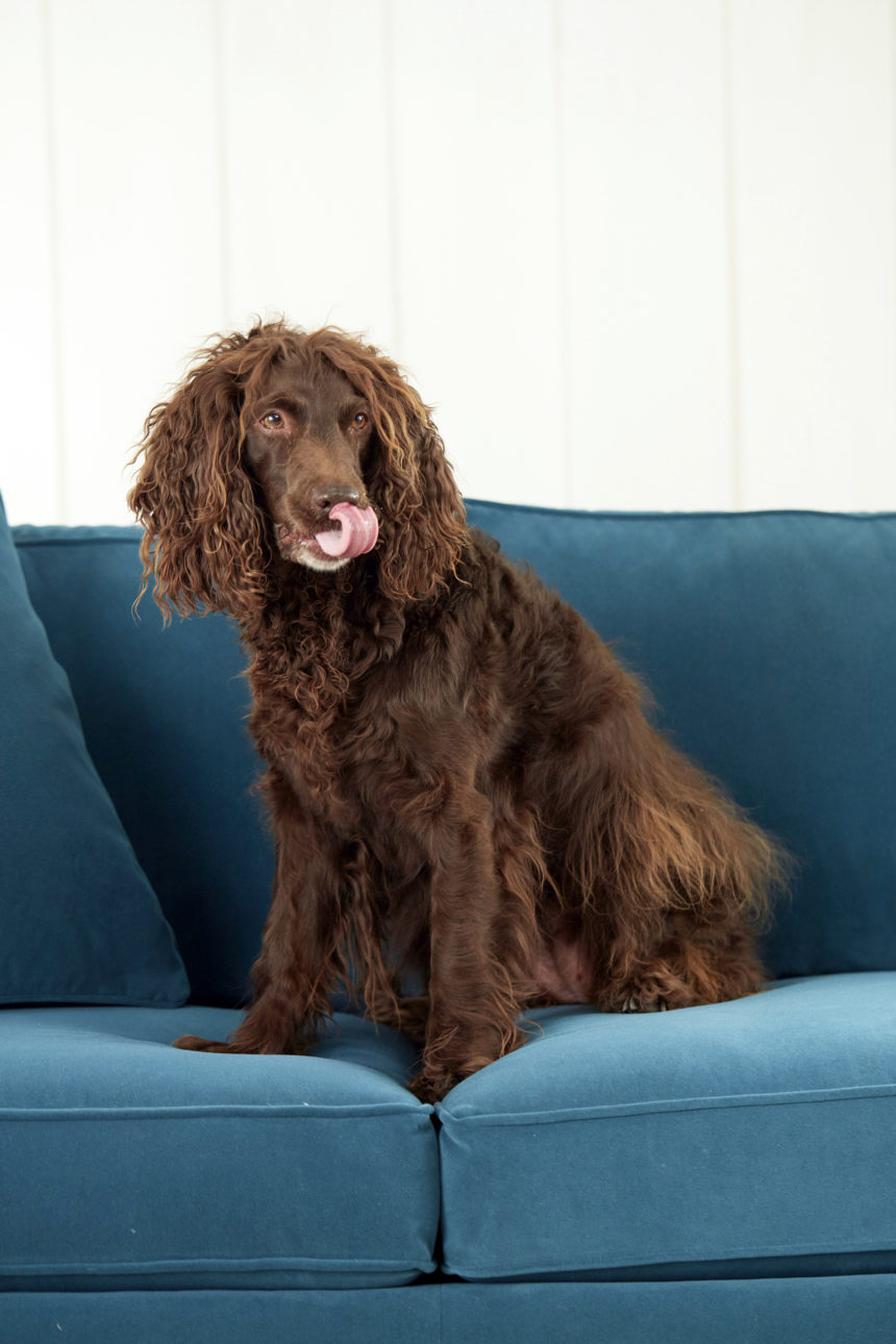
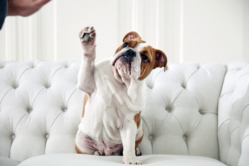
If you follow us on Facebook or Instagram (and if you don’t, please do!), you’ve probably seen the unbelievably cute collection of pet portraits we’ve shared this month. Are we using cute animals to make our furniture look irresistible? You bet we are! By the way—the pets in those cute pet photos are all owned by people who work at Ethan Allen.
So how did these pet pictures come together? Our photographers started by doing some sample shots with some very helpful fluffy (and not-so-fluffy) understudies:

Then, magic time! We invited our pets to the studio and asked them to pose for the camera. The atmosphere was electric. Our photographers called out, “Work it! You’re a goddess! Give us a big smile, beautiful!”

Just kidding. We bribed them with yummy treats. LOTS of treats.

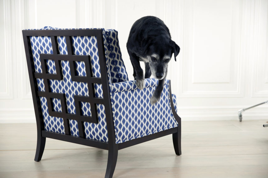
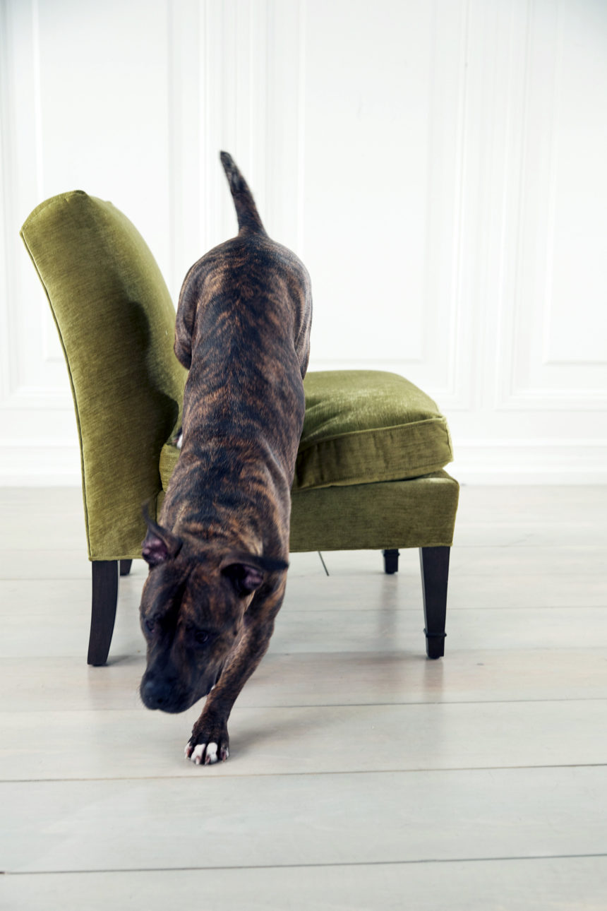
Of course, once they had curled up and gotten comfy on the furniture, they didn’t always want to jump down. So, we cajoled them. We begged. (Wait a minute—who owns whom?) Like great gymnasts, our pets nailed the dismount. Eventually. Okay, honestly, it took a lot of begging and bribing.
Not every photo we took made the collection. Check out our outtakes—the pet portraits  that were too “ruff” to post.

Now, for the finale: It’s our grand gallery, our Ethan Allen pet-palooza, a plethora of posed pet pageantry. And a reminder that Ethan Allen furniture isn’t just for looking at; it’s for living with—from high-performance fabrics that stand up to real life, to pet-friendly rugs that mix beauty with easy upkeep.

Without further ado, here’s our collection of cute pet photos:

It’s not too late to get in on the fun! Upload your more adorable pet pictures to Instagram and tag them #EthanAllenPets.


They resist stains and look great doing it: Meet our high-performance fabrics!

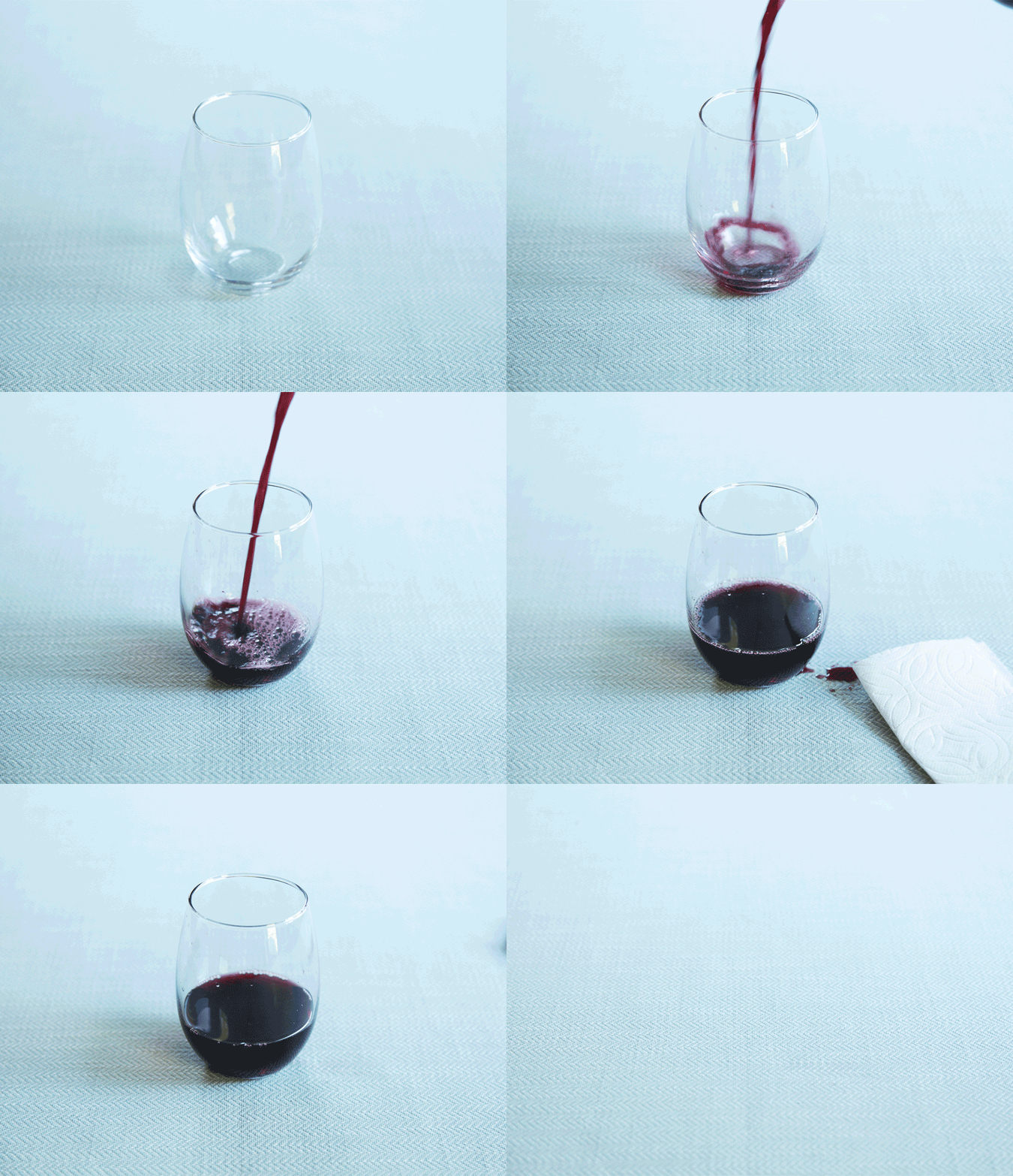
Do you find that the most memorable stains seem to happen in slow motion? The wine glass tips over, the cup of coffee wobbles, the kiddo squeezes the grape juice box and a purple fountain shoots upward. Slowly, torturously—because you’re too far away or too slow—the liquid falls through the air and lands before you can stop it. It leaves a permanent stain on your furniture and a sick feeling in the pit of your stomach.

And how about the stains you find after it’s too late? Like when your beloved pet stains the sofa during the night and leaves it for you to find in the morning. You try to laugh it off and tell yourself that “life happens”—except in this case, life just happened to soil your major furniture investment.

Never fear; high-performance fabrics are here! Ethan Allen introduced four lines of them in Fall 2017: a linen blend, a textured chenille, a herringbone, and even a plush velvet (yes, you read that right: velvet). In Fall 2018, we’ll be introducing even more high-performance upholstery fabric options, so you can dress your furniture in style and protect it, even in your household’s heavy-use areas.

What Is a High-Performance Fabric?

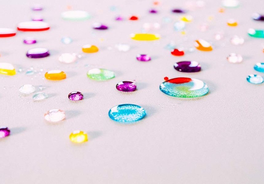
High-performance fabrics give you an extra line of defense against all kinds of stains: liquid spills, oil-based blotches, and even streaks left by crayons and markers. Red wine and soda can’t sink into a fabric designed to cause liquid to bead on contact with the surface. Muddy paws are no match for a fabric that can be easily cleaned with soap and water.

It may sound like magic, but it’s actually science: a stain- and liquid-repellent material covers the surface of each fiber to prevent stains from taking hold. And when you choose high-performance fabric, you don’t have to send style to the cleaners; these fabrics feel and look beautiful in all kinds of spaces.

What Happens when Life Happens?

When paw prints, coffee spills, crayon marks, and salad dressing dribbles come into contact with a high-performance fabric, they’re easy to clean. Mix enzyme-based detergent, like Tide laundry detergent or Dawn dish detergent, and warm water. We recommend a solution that’s about 1% to 2% detergent, or about one tablespoon of detergent mixed with a quart of water, which you can easily store in a spray bottle.

Once the slow-motion spill lands—or when you find the surprise stain—spray it lightly with solution. There’s no need to soak the fabric. Blot it—don’t rub—with a paper towel. This simple process cleans up fresh marks and removes most stains.

How About when Life REALLY Happens?

These fabrics are fantastic, but they’re not bulletproof. Some stains are more challenging than others. For tougher stains, like oil-based stains, let the detergent do the work. Spray, let soak, and blot, repeating the steps until the stain has dissipated.

Some substances are really tough to remove from a fabric. The worst culprits are lipstick, nail polish, and every parent’s worst nightmare: permanent marker. Ethan Allen offers Guardsman Gold Complete furniture protection plans for those times when even high-performance isn’t enough. These plans also protect your investment when fabric rips, tears, or gets punctured or burned—in other words, when life gets overwhelming.

Life-Proofing Your Space

In today’s world, formal living rooms are largely a thing of the past. We want our kids and our pets with us, and we want them to be free to climb, play, and explore without worrying that their messes can’t be undone. Ethan Allen furniture and accessories aren’t just for looking at; they’re for living with. For even more options that can help you kid-proof, pet-proof, and life-proof your space, check out our post on high-performance pet-friendly rugs.

To get even more great tips on designing great spaces that are easy to live in, subscribe to The Art of Making Home.


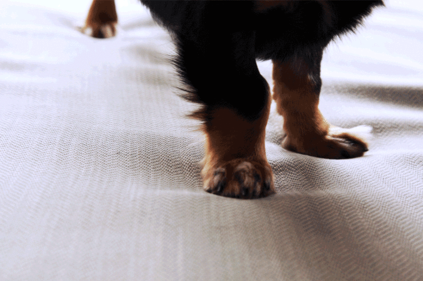
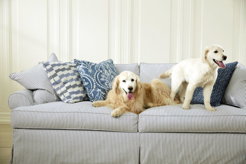
As any pet owner knows, keeping a stylish home looking its best can be a constant battle. From the entryway and living room to the bedroom and dining room, our beloved animal companions have no problem resting their cute paws and claws anywhere (as you can see in this recent photo shoot we did to celebrate National Pet Month)!

But that doesn’t mean your style has to go to the dogs. Here are five easy pet-friendly furniture and home design ideas that will make a difference.

1. TAKE COVER

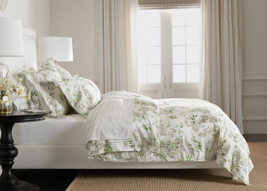
More than likely, your pets are sharing the bed with you—or taking it over! To keep the fashion factor high in the bedroom, invest in high-quality, machine washable bedding that can withstand the regular care that’s required with pets. Our bedding selection offers a wide array of beautiful styles in 100% cotton that can easily be brushed, vacuumed, washed, and ironed to keep your bed dressed in its best.

The Abriella floral duvet cover and shams offer fresh, pet-friendly bedroom style. The duvet cover features hand pockets and interior corner duvet ties that make it super easy to remove the duvet insert for cleaning.

2. DRESSED FOR SUCCESS

The best furniture for pets is dressed wisely. Our all-new selection of high-performance fabrics offers worry-free fashions for indoor upholstery pieces, including plush velvet, tailored chenille, herringbone, and linen in a variety of colors and patterns. These beautiful, durable, pet-friendly fabrics repel spills, resist moisture and odors, and are easy to clean so you don’t have to sacrifice your style for your pets.

The Borini Ivory high-performance fabric has the look and feel of a classic twill so you can finally have that cozy, light colored sofa you’ve always wanted.

3. TREAT YOUR EYES

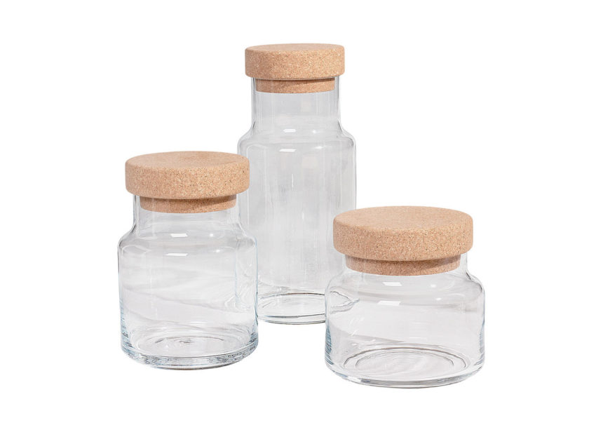
Food bags and pouches stuffed in cupboards can be an unruly annoyance, especially if you have multiple pets. Keeping colorful biscuits, jerkies, and other treats fresh in stylish glass containers on your kitchen counter is an easy, chic solution.

These Glass Cork jars are food-safe and come in three different sizes—great for storing different treats for multi-pet households.

4. HIT THE FLOOR

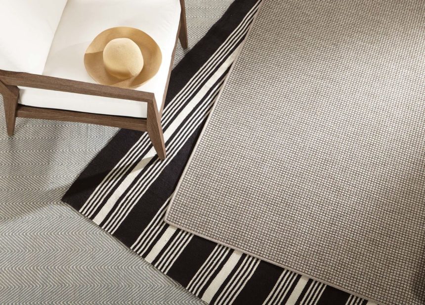
Every rug may not be suitable for a pet-friendly home but every pet-friendly home can definitely have a stylish rug! Save your pretty plush styles for low-traffic areas (if there’s such a thing) and opt for indoor/outdoor rugs for your active living spaces.

The La Grange rug has the stylish look of a flat-weave wool rug; you’d never know it’s woven from high-performance fibers that can withstand muddy or litter-laden paws. Plus, it’s reversible!

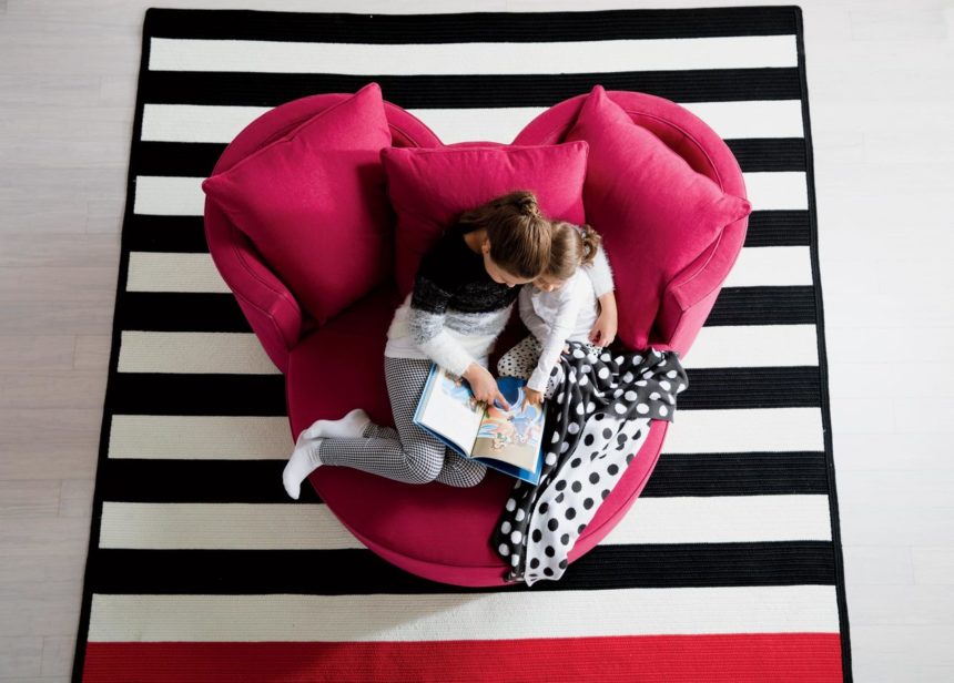
The Mickey Mouse stripe rug is braided, just like a classic rag rug, from durable fibers. It’s also reversible for double the style!

5. PLAY CATCH

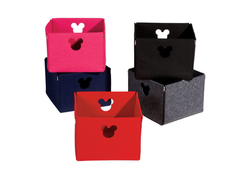
From chew toys and leashes to catnip-filled mice and bouncy balls, your pets’ playthings definitely need a home! Interesting boxes and baskets can catch the clutter in style.

The lightweight yet durable Fantastic Felt storage baskets have a fun, fetching look and can easily be moved from room to room for pickup and playtime.

Where do your pets like to make themselves at home? Tag photos of your pets getting comfy in their favorite spots with #ethanallenpets on Instagram so we can see and share them. And if you need some help with pet-friendly furniture and home design ideas, just ask one of our designers—their services are free! They’re available at your nearest Design Center or they can come to your place, if you’d like.